
Showing posts with label adobe. Show all posts

7 Easy ways to take your Adobe CC skills

Adobe Creative Cloud is the go-to suite of creative tools for many artists and designers in studios all over the globe, and so being familiar with its tools is a valuable skill to have. If you're looking to get started with Adobe apps or brush up on your skills within a certain software, these online courses could be just the solution. Plus, right now they're up to 97% off.

The Complete Adobe CC Training Bundle

With over 60 hours of lectures and 200 tutorials, The Complete Adobe CC Training Bundle is the perfect way to get more out of the Adobe CC programs you already use day-to-day. The seven-course training is geared toward various levels of experience, so no matter your level, you're likely to get something out of it. Great for work and play, this is a gem for both the budding and seasoned creative.
  • MSRP: $673 / Buy Now: $29 (95% OFF)

The Complete Master Photoshop & Adobe CC Bundle

If you're specifically interested in developing your Photoshop skills further, this 75+ hour training comes straight from the minds of creative professionals. Find tutorials on coding, app design, graphic manipulation, plus so much more. It even includes exclusive training on how to build a more productive workflow for yourself.
  • MSRP: $1,399 / Buy Now: $31 (97% OFF)

Adobe After Effects: The Complete Motion Graphics Course

This complete course takes the majestic world of video and motion picture graphics and bundles it into comprehensive tutorials to apply in Adobe After Effects. Dive deep into the world of VFX with 100 lectures, exclusive tips and tricks and content you can access 24/7.
  • MSRP: $297 / Buy Now: $18 (93% OFF)

Adobe Premiere Pro CC Masterclass: Video Editing Made Easy

If video editing is your summer project, this course certainly can't hurt when it comes to moving your skills along. Learn how to refine your editing techniques in Adobe Premiere Pro, and at the very least, get some great practice in with these easy-to-follow tutorials.
  • MSRP: $200 / Buy Now: $21 (89% OFF)

Getting Started with InDesign CC

You've got a great portfolio, but maybe you've yet to dive into the world of InDesign. There's no time like the present. Learn the ins and outs of InDesign with a hands-on course that explores layout best practices. Whether it be brochures, lookbooks, or your portfolio itself, this course will help you navigate through the sometimes overwhelming world of organizing your artwork.
  • MSRP: $49 / Buy Now: $19 (61% OFF)

Adobe Lightroom CC: Photo Editing Master Class

Learn to edit photos or adopt some new editing skills in this Lightroom Photo Editing Master Class. Taught by photographer Phil Ebiner, the comprehensive course will help you organize your photos and navigate through the powerful space that is Lightroom.
  • MSRP: $200 / Buy Now: $41 (79% OFF)

Getting Started with Illustrator CC

Illustrator is one of the most-used tools in design, which means there is always more to learn. This course explores best practices and shows you new techniques to navigate the flagship platform better. Logo design, typography, and advanced platform tutorials will help with fine-tuning your career skills.
  • MSRP: $99 / Buy Now: $25 (74% OFF)
Share:

Adobe Max 2019: News, rumours and predictions

Adobe MAX 2019 is the world's biggest design conference, gathering the world's most creative minds for a week of inspirational talks, workshops and networking events. This year's event will run from 2-6 November in LA, and from what we know so far it's going to be another awesome event.

In this article, we'll run through everything we know so far about Adobe MAX 2019 and take a look back at the highlights from last year's mammoth event.

Adobe MAX 2019: When and where?

The main Adobe MAX 2019 conference will run from 4-6 November, with pre-event training taking place on 2-3. Like last year, the conference will be held across various locations in the Los Angeles Convention Centre.


Adobe MAX 2019: rumours

Adobe traditionally uses MAX to announce major changes and new features in its suite of creative apps, Creative Cloud. We have our ear to the ground and will be making some predictions for 2019's big reveals very soon...

What happened at Adobe Max 2018?

Adobe MAX 2018 attracted the largest audience Adobe had ever seen, with almost 15,000 attendees gathering to join in the fun. Here's a little reminder of the biggest announcements from last year...

Photoshop CC comes to the iPad

The first big announcement was that Photoshop CC for iPad was on its way. The new app would include all the core tools of Photoshop CC, but optimized for touch devices, making the most of gestures and Apple Pencil capabilities, and sporting a new UI designed especially for the iPad. Adobe promised the tool would sync across devices, meaning designers would be able to switch between working on desktop/iPad with ease.

The release was scheduled for early 2019, but so far we're still waiting. Will Adobe MAX 2019 bring more news on this long-awaited tool?

Adobe pushes AR boundaries with Project Aero

Project Aero is a powerful augmented reality authoring tool from Adobe, and at MAX 2018 senior product manager Zorana Gee wowed the audience with a truly jaw-dropping demo. "AR is the next breakthrough medium for creative storytelling," said Gee. We can't wait to see how this tool will help us create more immersive experiences.

Digital art app Project Fresco unveiled

It's now called Project Fresco, but back then Adobe's painting and drawing app were known as Project Gemini. Kyle T. Webster took to the stage to demonstrate some of the features of this all-new creative tool – and boy, was it impressive. We're still waiting for Gemini to be released, with Adobe promising at MAX 2018 that 2019 would be the year it arrives in the masses.

Voice prototyping added to Adobe XD

Another crowd-pleaser last year was the revelation that voice prototyping was now possible on Adobe XD, and designers would be able to create prototypes for voice-activated devices. Voice trigger and speech playback capabilities enable designers to move seamlessly between voice and screen prototyping, and users can now add voice triggers that launch particular interactions (in the same way a tap or click would), while speech playback unlocks a powerful text-to-speech engine.

Adobe launches Premiere Rush CC

Adobe's long-awaited video editing app, dubbed Project Rush, was finally released at MAX 2018. And to quite the reception. It will be really interesting to see how Rush develops over the course of this year, and whether plans to extend it beyond just iOS are in motion.
Share:

How to make a logo in Photoshop

When it comes to actually design your own logo, you may need to start thinking about brand identity and style. For more inspiration, head to our pro guide to logo design, which tells you everything you need to know about the world of logos.

01. Create a new canvas


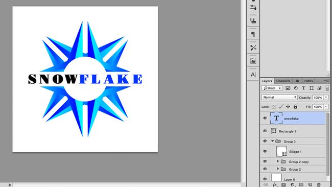
Open Photoshop and create a new document. I used a canvas size of 500px x 500px, but larger sizes would work just as well. You can change the canvas size at any point. Go into Photoshop > Preferences to set a gridline every 50px. Then turn the grids on, in the canvas, by pressing cmd + ' or View > Show in the Options bar. Make sure Snap to Grid is turned on, under View > Snap to.

02. Draw a basic shape


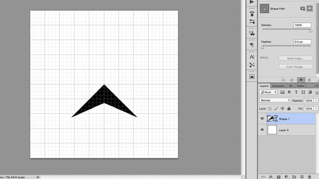
Select the Pen tool in the toolbar, or by pressing P, and make sure it’s set to Shape in the left of the Options bar, rather than Path. Use the pen to draw an arrowhead shape, starting at the centre-point of the canvas and using grid-line intersections for your other points. Naming the layers is not necessary for this project, but it can be helpful in more complicated documents, where there are many layers.

03. Duplicate and edit the shape


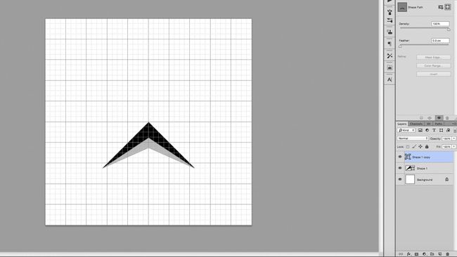
Duplicate the layer, by pressing cmd + J and click on the new layer to select it. Use the Direct Selection tool, shortcut A, to click on the top-most point of the arrowhead, located at the centre of the canvas. Move this point down a few grid squares, holding the Shift key to keep it locked on the y-axis.

04. Add colour with a gradient


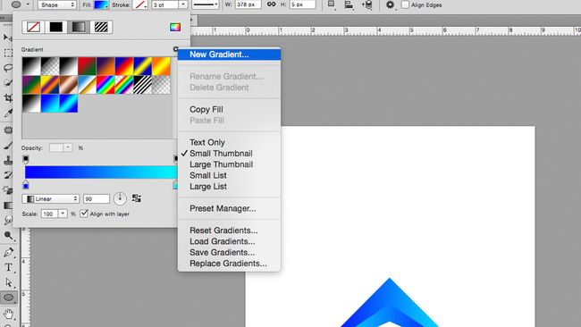
Create a new gradient in the Fill drop-down menu, to the left of the Options bar. In the gradient window, double click on the bottom sliders to bring up RGB options, where you can choose your colours; I went for a light and dark blue. Then apply this gradient to both objects, changing the gradient rotation so they oppose each other. If you can’t see the Fill options, it may be because you may have the Move tool selected, so switch to the Pen or Shape tool.

05. Group and duplicate your layers


Group the two layers by selecting them and pressing the group button, which looks like a little folder, located at the bottom of the Layers tab. This prevents the Layers tab from becoming messy and makes it easier to handle the two layers together.

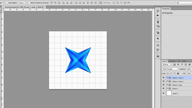
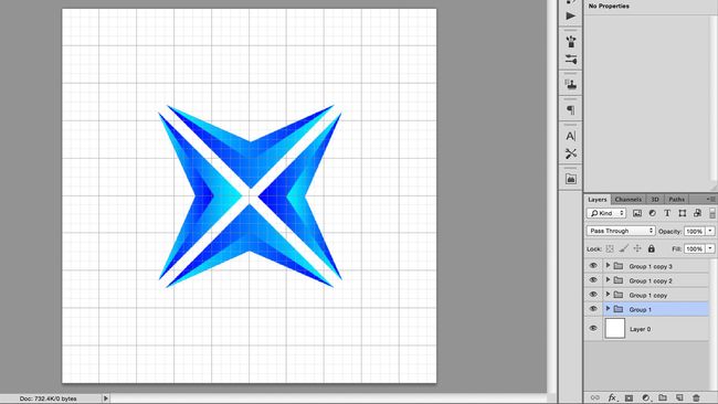
Duplicate this group and use the Free Transform function to rotate the new group ninety-degrees, holding down the Shift key to rotate in fifteen-degree increments. You can access Free Transform using cmd + T or under Edit > Free Transform. Now move the second group up, until it reflects the original shape, using the centre of the canvas as a line of symmetry.

06. Transform the shapes


Nudge each shape up or down one grid square, away from the centre point, using Shift + cursor key.

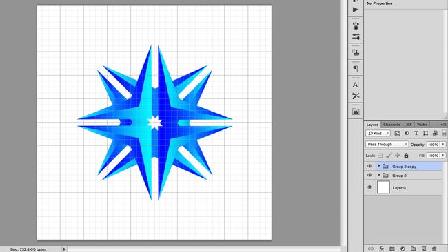
07. Group, duplicate, repeat


Using the same method from step #5 to group the layers together, duplicate the group and rotate by ninety-degrees. The new shape should resemble a sort of crosshair shape.

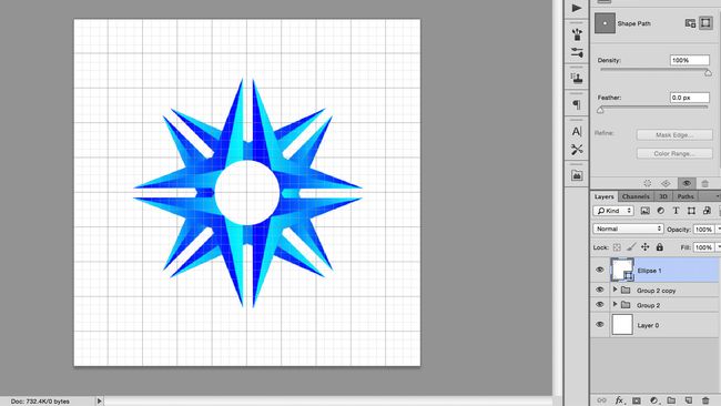
08. Draw a circle with the shape tool


Cycle through Shape tools until you find a circle, either by clicking-and-holding on the icon in the toolbar or pressing Shift + U. Click on the centre point of the canvas, holding Alt to draw a circle radiating from the centre, and Shift to keep the width and height proportional. If you make a mistake, you can undo or re-edit your shape using Free Transform.

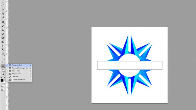
09. Draw a rectangle and align to the centre


Cycle through the shape tools again, until you find the rectangle tool. Draw a white box across the graphic, above the other layers, making enough space for text. You can align this to the centre of the canvas by clicking on the rectangle layer and the bottom layer (which should be a white square, the same size as the canvas) and using align tools, either found under Layers > Align in the Menu Bar or the align buttons in the options bar.
More advanced users could use this rectangle to subtract from the shapes below, using Layer > Combine shapes, but for now, we will just stick to using it as a white block.

10. Add your text


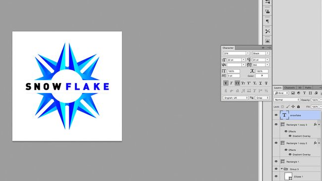
Draw a text box over the rectangle, by clicking on the T icon in the toolbar or pressing T, then dragging across the canvas. Type your text into the box and centre it, using the buttons in the Character tab. Use the align tool again to centre this to the canvas.

11. Choose an appropriate typeface


Choose a typeface that suits your brand. There are plenty of free fonts out there, but it is crucial to pick one that you have permission to use – see our free font roundup for some ideas to get you started. Since this logo may appear across many of your assets, it would be bad news to use an illegally downloaded typeface. Play around with size and colour until you like what you see.

12. Adjust your kerning


Kern the text. This means adjusting the horizontal spacing between individual letters, maximising the word’s readability. You can do this under the Type tab, marked with V | A, or by clicking between the letters and pressing alt + left or alt+ right. For more on kerning, see our post on how to kern type.

13. Add final details and export


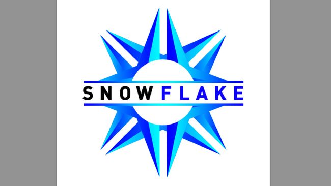
Make any final adjustments you need to give it that special something. For the main image at the top of this page, I added two smaller bars above and below the text, coloured with the same gradient. I also added a background, shadow and reflection, using similar techniques to the other steps, as well as using layer masks to add fade.

When you're happy, save the image out in whatever format you require. I used RGB jpg here for a web format but also saved it as a PSD so I could go back and make changes.
Share:

10 Things you didn't know you could do with Photoshop

If you think you could do with a skills refresh when it comes to Photoshop, we've got you covered. These ten tips will help you get to grips with the latest version of Photoshop CC, opening up new creative horizons and speeding up your workflow.

If you are in the learning zone and want to keep going, head over to our selection of the best Photoshop tutorials the internet has to offer. Or if you're looking for a standalone image editing app, some of these powerful alternatives to Photoshop might better suit.


01. Live blend mode preview

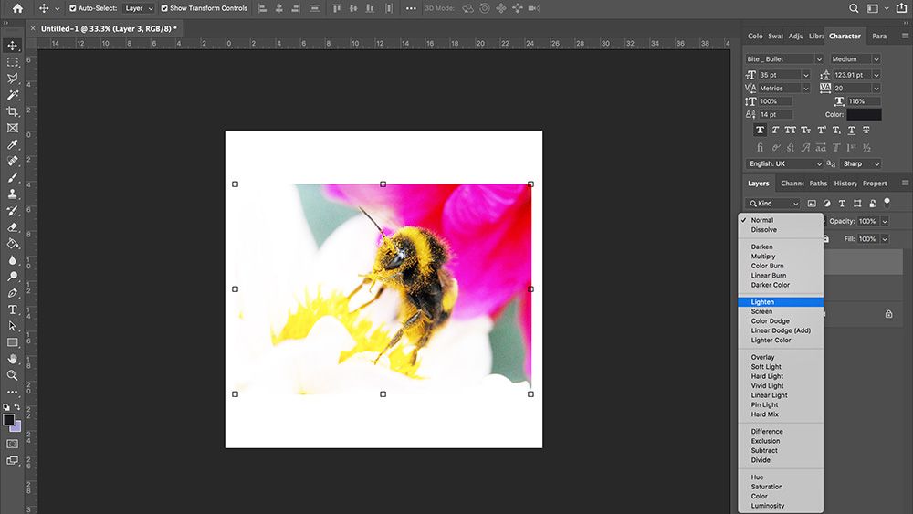
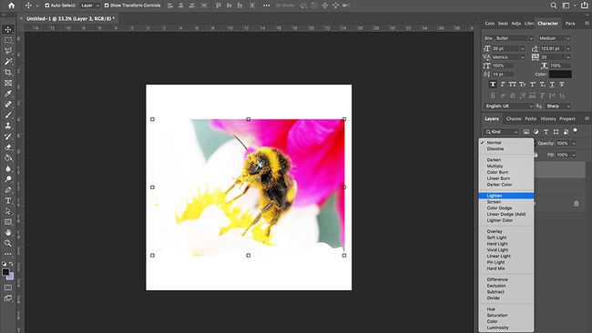
Switching blend modes is a quick way to dramatically alter an image, but it can be an inexact science, drawing a little on experience and requiring a lot of experimentation. Previous iterations of Photoshop have required the user to cycle through different blend modes in order to view the effect on the image, either clicking through the scroll-down list or using the Shift +/- keys.

But Photoshop CC is equipped with the blend mode preview function, which makes it possible to hover the cursor over any of the blend mode options for a live preview of the effect, on the canvas, before eventually clicking on the desired option. It also leaves a strip of unaffected pixels at the bottom of the canvas, showing the original image for direct comparison.

02. Match Font


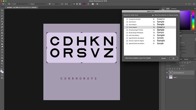
Once the magical world of typefaces has sucked you in and taken hold, you’ll find yourself noticing them wherever you go; shop signs, train stations, restaurant menus, ancient manuscripts. The Match Font function is to fonts what Shazam is to music, analyzing the text in an image and deducing what font is being used.

Use the marquee tool to select the text in an image, activate Type > Match Font and let technology take care of the rest. Match font will provide you with a list of fonts similar to the one selected, separating them into those already installed on your system and others available for download from Typekit (Adobe’s font library). This will also be a good tool to use if a client ever asks you to alter a pre-made design or recreate one from scratch.

03. Content-Aware Fill

Another great addition to CC is the updated Content-Aware Fill. To be perfectly frank, earlier versions of this function were a hit-and-miss affair, producing several unwanted effects, such as spawning extra limbs and warping horizons beyond recognition.

The latest version of CC puts the user back into the driving seat, giving them at least some control over the process. After selecting the unwanted content and clicking on Content-Aware Fill, you are presented with a green box, which highlights the parts of the image to be sampled from when creating the fill. You can then use a brush to add or subtract from the box, refining the parts to be sampled to improve the eventual output.

04. Symmetry mode


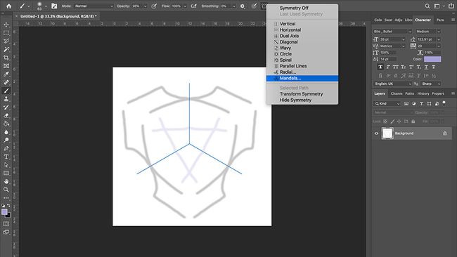
One tool certain to reflect the current trends in design is Paint Symmetry. First introduced in Photoshop CC 2018, the Paint Symmetry tool allows you to create mirrored, symmetrical patterns with the brush, pencil and eraser tool. The already generous list of symmetry modes has recently been improved with the addition of the Radial and Mandala options.

Access Paint Symmetry by clicking on the butterfly icon at the top of the screen, selecting your tool and creating a symmetry plane. As well as being used to draw directly onto the canvas, they can also be implemented when painting to reveal or hide a mask.

05. Maths in number fields

With most of your fingers already tied up in shortcuts, you won’t have many lefts to count with. This is where Photoshop’s new maths function steps in, making it possible to do basic calculations without having to resort to a calculator or using the Dashboard. It’s a function that has long been available in other applications, but sadly missing from Photoshop. It really is as simple as writing your sums out in any number field, using standard mathematical symbols, and pressing enter. This will be a major time-saver when making proportional changes, such as working out canvas or image sizes. A great addition to the application.

07. Undo

Do or do not, there is retry. The October 2018 release made ‘multiple-step undo’ the default mode, performed using Edit > Undo or ‘Command + Z’. You can set the number of undo steps in the Preference Panel > Performance, which can go up all the way up to one thousand.

As helpful as this is, undo can be a clumsy option to rely solely on, so here are a few alternatives to reverse actions and revert back to previous versions: Time travel is possible with the History panel, which allows you to view all the recent states of an image and jump between them. It also allows you to create a new document from any one of those states. File > Revert will revert the document to the last saved version, while the History Brush tool allows you to restore parts of an image to the last saved version.

08. Batch

With over a trillion photos being taken every year and rising, the prospect of processing images in batches has become a more attractive proposition. Photoshop offers a range of assembly-line-style actions, found under File > Automate, including adding vignettes and shadows, as well as creating Panoramas and HDR.

The real value of batching comes when you set-up and use your own Actions, allowing you to perform blanket edits across a large number of images; changing color space, resolution or cropping. When this is complete, you can open any specific image to make finer, bespoke alterations.

09. Refine edge


Hard, straight lines are easy to draw with the pen tool, but plenty of images contain less well-defined edges, which appear jagged or blurry, such as the hair on a person’s head. A quick and easy method for dealing with this is the Refine Edge tool.

This can be accessed by roughly selecting the area you wish to affect and clicking the ‘Refine Edge’ option at the top of the interface. It’s then a case of playing around with the settings, having selected an appropriately contrasting background, until you’re satisfied with the selection. Then click OK and use it for its intended purpose.

10. Select focus area

There are many ways to select objects in Photoshop, including the wand, marquee and color selection, but few people realize you can select an area based on the field of focus in the image. All you need to do is choose Select > Focus to bring up a dialogue box, where you can refine the selection and use a brush to manually add or remove areas. Once you’re happy with your selection, you get a choice of outputs, such as selection, a new layer, and layer mask. This works well on images with clearly defined focus distances and shallow depths of field.
Share:

Design a killer logo in Illustrator

The killer logo design will be different every time, depending on the brand's overall identity. Each identity project is unique. They all have their own issues to overcome and challenges to conquer. But you should still approach each brief in a similar way: develop a workflow that allows maximum creativity and is productive.

This tutorial will walk you through the core stages of creating a new identity for the ultra-modern HabiGym. I'll show you how this identity was conceived, explaining each stage of the process from when the ideas were born through to the final presentation. As well as demonstrating some of the essential tools and skills that you can learn to help streamline your workflow in Illustrator, I'll also share a few best-practice rules of thumbs for working smarter.

01. Always start on paper


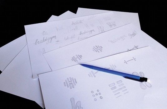
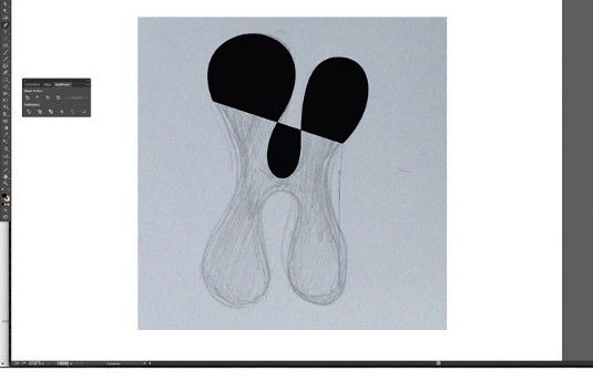
Everyone knows they should start with a plan, but with deadlines looming it's all too easy to forget this stage – don't. A major part of identity design involves solving a problem with a concept. For many, this happens much more fluidly on paper, as your mind bounces off each thing you sketch out.

02. Mobile scanner


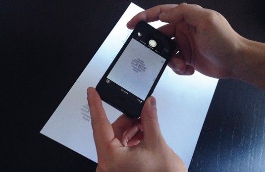
If you have a scanner, use that for the best results. If you don't have one to hand, take photos of your sketches. You can then use them as guides for digital recreation. When it comes to logos, precision is essential. Therefore, Live Trace needs to be ditched and the work needs to be done manually.

03. Practice makes perfect


The Pen tool is probably the most frequently used – but remains one of the trickiest to master. It's a very powerful tool and learning it will not only benefit your ability to create images in Illustrator, the skills you acquire will also boost any Photoshop Pen work you do.

04. Utilise the Shapes panel


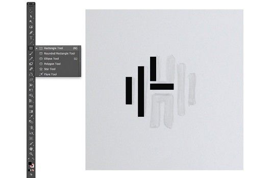
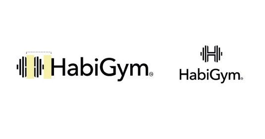
Create this logo by combining rectangles using the Rectangle tool. When building the vectors, try using the Shape panel for better accuracy. Hold Shift to draw shapes with equal proportions. Select any element, and its width and height are shown in the Control bar. You can type in sizes here too.

05. Duplicate elements and combine


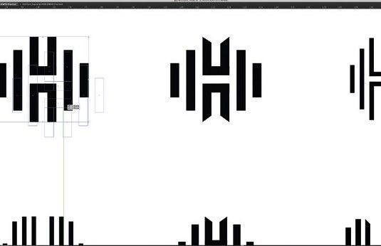
To compare variants, duplicate a master copy to edit (hold Alt and drag). Create shapes to align objects and use Smart Guides (View>Smart Guides). Use the Pathfinder tool to combine shapes and create new ones. You can combine rectangles to make the 'H' element: select both elements and hit Merge.

06. Tweak the type


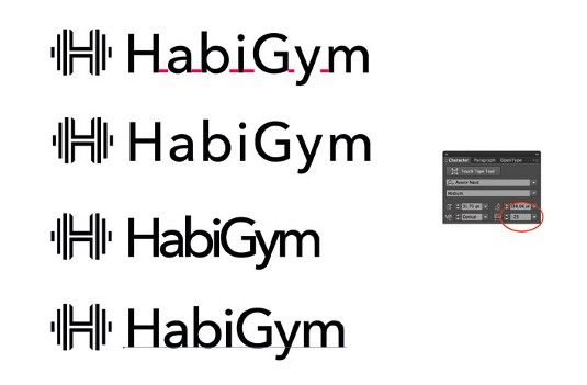
Alter the tracking and kerning of words to change the tone of a logo. Add character to the logotype by opening up the shapes into the native paths that make up the letters, altering the paths of each letter directly to make your type unique. To quickly convert the font to outlines (paths) hit Cmd/Ctrl+Shift O.

07. Keep changes subtle


Use the Direct Selection tool to rearrange the anchor points and alter the appearance of the letters. Keep changes small and subtle. Careful scaling of the logo mark with the type is crucial to achieve cohesion between the two. Hold Shift to keep everything in proportion as you scale elements up and down.

08. Time to add colour


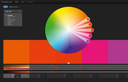
In CS4 and higher, you can integrate Adobe's Kuler app into your workspace to view colour palettes. Go to Window > Extensions > Kuler. Try to avoid gradients in logos, but don't take that as an absolute rule. Hit Cmd/Ctrl+F9 to access the Gradient dialogue. Try the logo on a variety of background colours and shapes.

09. Create delivery templates


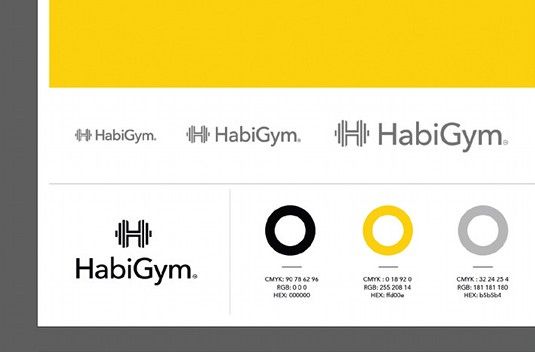
Go to File > Save As > Illustrator Template. Choose fonts that work well with the brand. Create style guides for designs: add CMYK colour breakdowns, Hex codes or Pantone codes, and font names – this is useful for designers and ensures brand consistency. Also give examples of the brand on various materials.
Share:

Boost your illustration career with these 6 tips

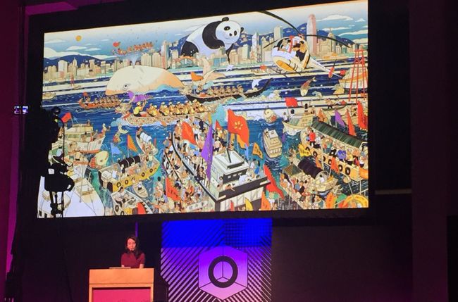
As a child, Victo Ngai didn't really fit in. She had moved to Hong Kong from mainland China, didn't really speak the local dialect and didn't have any friends. She discovered that she could create her own friends on paper, and those friends were actually "way cooler than the people at school". 


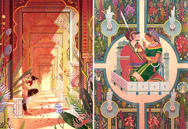
All that time drawing as a child has led to a successful career in illustration. Ngai has won multiple awards, including from the Society of Illustrators, and works for clients such as The New Yorker, Dreamworks and Apple. At OFFSET Dublin this weekend, she shared some insight into how she's got to where she is, and how all illustrators can approach their work and career differently in order to get where they want to go, and more importantly, take more joy from it. Here's her advice.

And if you are looking for a new career direction – in illustration or another creative field – then don't miss our design jobs page, which lists plenty of opportunities.

01. Don't take yourself too seriously


Ngai moved to the States to go to art school, and once there, she found she was bottom of the class, even though she was working hard. "While trying to pursue a passion, I stopped enjoying myself and lost my voice," she recalls.

In the end, once her teacher had pointed out what he really wanted to see was work more like the doddles in the sketchbook, she started enjoying drawing again. "I stopped worrying about coming up with something really grand, and instead just started documenting little funny moments in life," she says.

02. Don't worry about the future


Around the same period, Ngai became concerned that she would become a "one-trick pony. I was worried I was going to end up doing the same thing over and over until I died," she says. "I was 21 at the time."

I couldn't figure out how to get over this so I just ignored it and carried on, she explains. "It's kind of pointless to worry about things I'm not ready to tackle. My energy is much better spend focusing on the now and making sure I'm giving everything my best shot."

03. Push yourself


"Usually it's the last 10 per cent that separates a mediocre piece from a good piece," says Ngai. "And it's the last one per cent that really makes it."

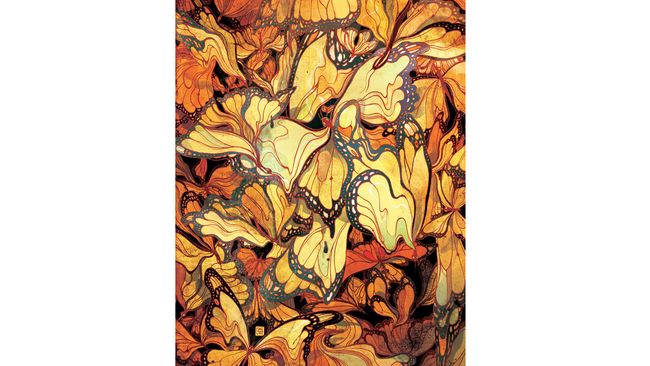
Ngai gives an example of when she was working on a piece for The New Yorker, which showed butterflies as leaves. It was approved, she says, but she wasn't happy with it. She asked for more time and discovered that she really liked a 'melty' sort of look she was able to achieve with the Liquify tool in Photoshop. But as using this tool meant the image wouldn't be high enough resolution for print, she ended up remaking the entire illustration. And she thinks the piece is much better for it.

04. Find the fun part

"There are no boring assignments," says Ngai. "Only boring solutions." There's always something you can find in an article that's interesting. When choosing a way to go for an image, aim for "something you'll enjoy that captures the spirit of the story without giving away the ending."

Don't be afraid of adding personal touches in your client work, either. In one piece of client work, Ngai added a fox, because she likes foxes. Though if the client had asked why it was there, she stresses, I would've said it's to bring out the red in another part of the piece. "But really it's just to make myself happy."

You also need to tell your story with strategic composition. "Illustration is like a puzzle," says Ngai. "You have to make every piece fit for the whole thing to work."

05. Turn limitations into assets


When you get a brief that seems like it might be dull or complicated, it's your job to think about what you want to draw, and see how you can work that into the brief, says Ngai.

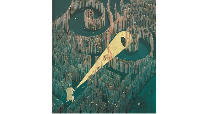
She gives the example of a piece of work for Cincinnati Magazine. The article was about new imaging technology that helps doctors accurately locate cancer cells. There were several potential problems in the piece, she didn't want the piece to be too dark or negative – for serious subjects like this, sometimes a lighter tone is needed – she didn't want to include images of breasts, as that isn't allowed in American magazines ("unless you're Playboy"). On top of that, she didn't know what this new imaging technology might look like.

Instead of despairing in this, she had to come up with a metaphor, and chose to use a maze. This is a cliché, she says, "but clichés are clichés for a reason, they're powerful signifiers. People know what you're talking about."

If you have one strong cliché in your work, you can use it as a "Rosetta Stone for the viewer to decode the other metaphors in your image," she says. "They should be used with caution, but if you can make them visually engaging, then go ahead."

In this image, she concludes, "The result is more interesting because of the limitations."

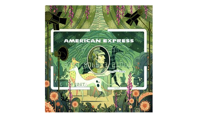
A similar thing happened with her illustrations for American Express. She found the edges of the card to be a limitation, and so turned them into an asset by making the card's border a key part of the piece.

06. Find your niche

Finding the right clients is key, says Ngai. "Why shouldn’t you find your own niche and cultivate your list of clients who appreciate what you do? The best work comes out when the other person trusts you, and you trust them to trust you."

You also should be careful of doing too much work that you're not interested in or not proud of. "What we get hired for is what goes into our portfolio, so if we keep making concessions, we’ll get further and further away from the feeling we had when we had when picking up tools as a kid." So if you ever feel you're making concessions, just remember it was when Ngai rediscovered that childlike delight in drawing that her career really began.
Share:

Create sets of product icons in Illustrator

Illustrated icons can be a super addition to your design portfolio, whether you include them to reach a new group of potential clients, or to add more elements to an illustrated scene. 

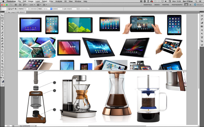
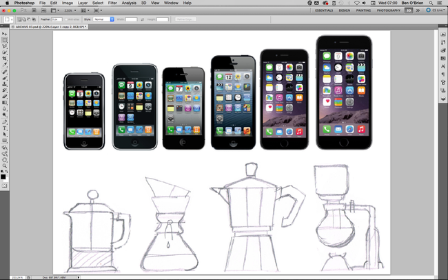
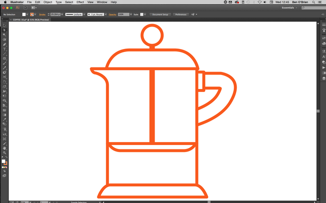
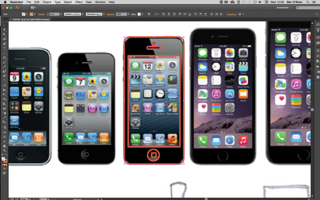
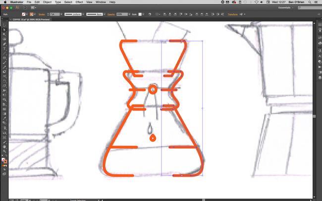
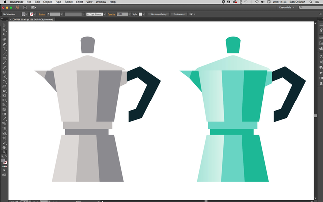
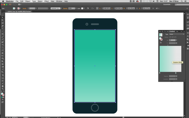
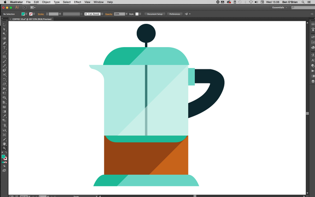
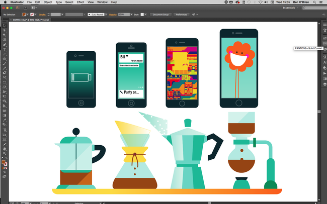
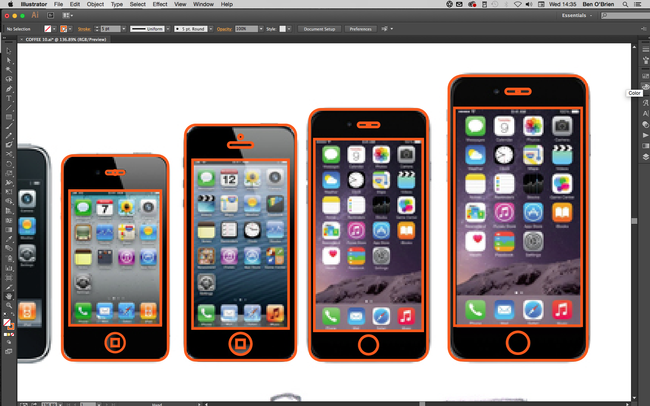
In this Adobe Illustrator tutorial I'll show you how to create icons simply and easily, so you can create large volumes of them in no time at all. I’m going to design two icon sets: a set of digital phone/tablets and a set of coffee-making items.

01. Know what you're representing


Whatever your set of products is, do your research! A client would want all the products to be correct, and you should too. Even if it’s a personal project, you can’t accidentally add a camera button to an original Nokia 3310 or put a two-pin plug on a British kettle. If you’re illustrating a product for a client, ensure you know how it looks all the way round, so you understand it as a real-world object.

02. Draw it in pencil


You can start off however you wish – I always draw everything in pencil, but for many products you can trace a photo. If you have a tricky shape to draw and it happens to be symmetrical – for example a lightbulb – you can just draw one half of it (I’ll come to that later!).

03. Get rid of kinks


When creating linework, always keep lines and angles straight and clean. Your illustrated product icons may be used quite small on the page or screen, and unnecessary kinks or curves can confuse the eye and make things unclear.

There are two main tips for this. First, with the Shape tool, hold down the Shiftkey to get perfect circles and squares or polygons that sit straight. And second, with the Pen tool hold down the Shift key to only draw angles at 45 degrees or 90 degrees to an axis.

04. Make use of symmetry


Many products are perfectly symmetrical, which makes things nice and simple. Once you have the linework, select it all with Selection tool (cmd+V) and you’ll see a range of Alignment buttons appear in the top bar. Click either the horizontal or the vertical Align Centre button, depending on what you need, and everything will snap into symmetry. You can also group objects together, and then align them with other objects or groups.

05. Reflect more complex objects


For symmetry on more shapely objects, illustrate one half perfectly, then select these halves and copy and paste them all in one go by holding down shift+altand hitting the right Arrow key, this will keep these lines level with their originals.

Still with the copied objects selected click Object > Transform > Reflect from the main menu, select the Vertical option and click OK. Place this side of the object to get the width correct (using only the left and right Arrow keys so they stay aligned with the other half).

Using the Direct Selection tool (cmd+A) join up the two sides of each line by selecting the two line ends and clicking cmd+J.

06. Maintain consistency


If you’re working on a collection of products, make sure you're always considering the other items in the collection. If buttons are the same across products, then copy and paste them, if the curved corner is always the same size, then make sure you’re using the same corner.

Often (with tech products especially) you can make one device, then copy/paste it and simply adjust the proportions to make the next icon, which can really speed up your workflow.

07. Add some colour


With your linework complete, move on to colour. Generally, you want to get the tones as close to reality as possible, but there are some exceptions. For example, most metals are a mid-grey, which is boring for everyone! Instead, I use a variety of blue-grey tones (light or dark) and usually stray into turquoises.

Try using a transparent blue for glass, too, as white can feel cold. I also recommend oranges and yellows for wood surfaces to really bring some warmth.

08. Explore gradients


As we’re creating illustrated icons, you don’t want to go too far on minor details and textures. However, you can really sell the surface of a product with a gradient. To get the best out of Adobe Illustrator, don’t create gradients from one colour to the next (it often results in banding when printed).

Instead, choose a flat colour for an object/shape, select the shape and duplicate it (in the layers panel), then add a gradient to this top object going from an opacity of 100% down to 0%.

09. Try including shadows and highlights


When I'm not using gradients, I often duplicate an object and then cut it at a corner. I use the Pen tool (again holding down the shift key) to create a shape cropped at a 45-degree angle, which I then colour in a lighter or darker shade to add a simple but effective shadow or highlight.

10. Add extra details


Finally, if the size you’re using the icons at allows, you can really bring them to life. A tech device looks uninspiring with nothing on the screen, so use this space to demonstrate its functions or sell an app. Graphic product illustrations used within a bigger illustration (for example, if these coffee facilities were part of a wider scene) will draw the viewer in.
Share:

Create your own Calligraphic brush in Illustrator

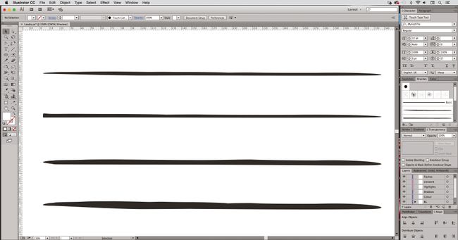
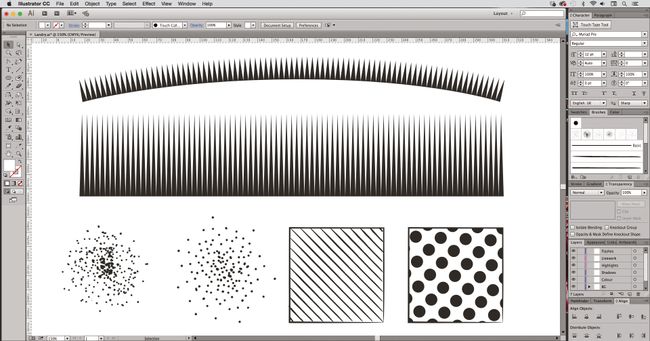
One of the best things about Illustrator is the ability to create your own brushes. You can find some amazing free Illustrator brushes online, but sometimes designing your own is the better option. I created my own shading and line work brushes to give my Spider-Man image (above) a more natural feel, while still keeping it 100 per cent vector-based.

Over time, I've developed a library of Illustrator brushes. This means I have precise control of drawing with the Pen tool, but I can also give my linework a more natural, hand-drawn appearance.

I create all my work in Adobe Illustrator CC. Getting to grips with the software can be tricky, but there are a lot of brilliant Illustrator tutorials around to help hone your skills.

01. Start with weighted lines


Create custom brushes by drawing your own weighted lines, either with a drawing tablet in Photoshop, the Blob brush tool in Illustrator, or good old-fashioned pen and paper.

Then, bring your linework into Illustrator and create outlines from the strokes by selecting them, and navigating to Object > Path > Outline Stroke.

02. Refine your lines


Once you have your brush stokes outlined, use the Pen tool or Anchor Point tools to refine any part of the line to get it just how you want it.

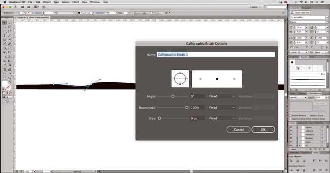
Next, create a new Calligraphic brush by selecting the shape you want to make into a brush. Open the Brush panel (Windows > Brush), click Create New Brush and select Calligraphic brush.

03. Create a brush library


You can follow this technique to create a library of different brushes and effects to suit your style. To create a new brush library, add the brushes you want to the Brushes panel (Window > Brush Libraries).

Then, in the Brushes panel, click Save Brush Library, and put the new library file in one of the following folders so that it will appear in the Brush Libraries menu when you restart Illustrator.

You can also use this technique to create Pen brush strokes, as well as shading effects such as stippling or half-tone effects – and you can create ‘fills’ as well as ‘strokes’.
Share:

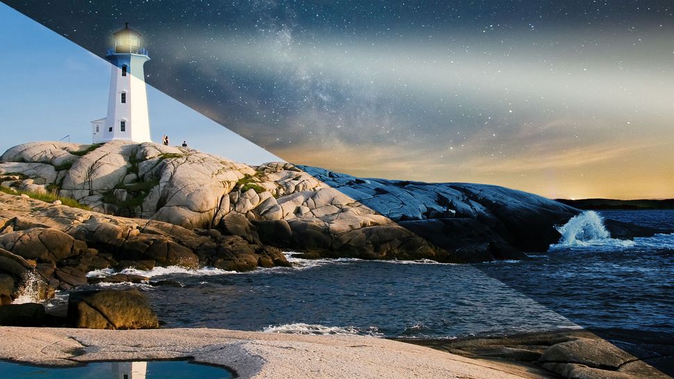
How to turn day into night in Photoshop

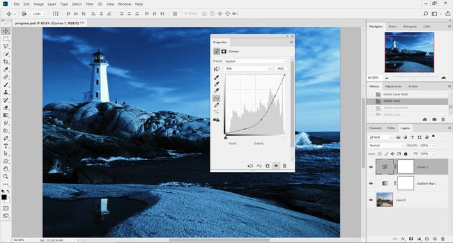
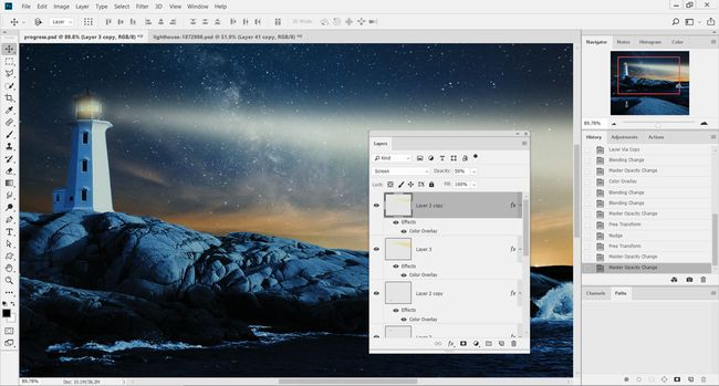
Day-to-night conversions have been around for as long as Photoshop has had adjustment layers, but mastering the effect takes lots of practice. The key to making a day picture look like night in Photoshop is in learning to navigate the various adjustments, such as the Gradient Map and Curves, to achieve a believable tone.


Darkening the image to such an extent that there's hardly any detail left in the shadows is part of the technique, and we can further the effect using brushes to alter the balance of light on layer masks. The deep-blue tone is created with the Gradient Map adjustment and some of the photographic presets in Photoshop CC. Selections then come into play, swapping out the day sky for a star-filled nightscape.

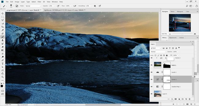
01. Begin with the Gradient Map adjustment


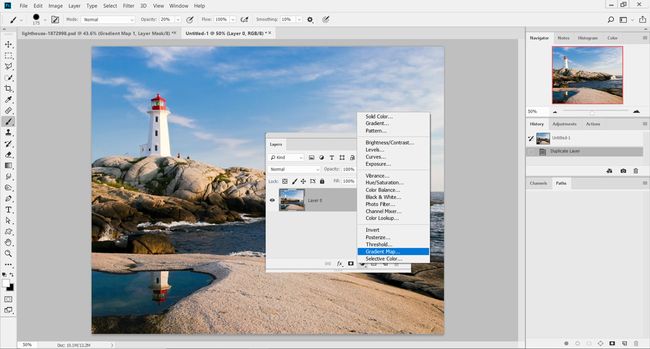
Load up the start image 'pix_lighthouse_1872998.jpg' into Photoshop, and head to the Layers palette. Locate the adjustment layer icon and select Gradient Map.

02. Initial tint


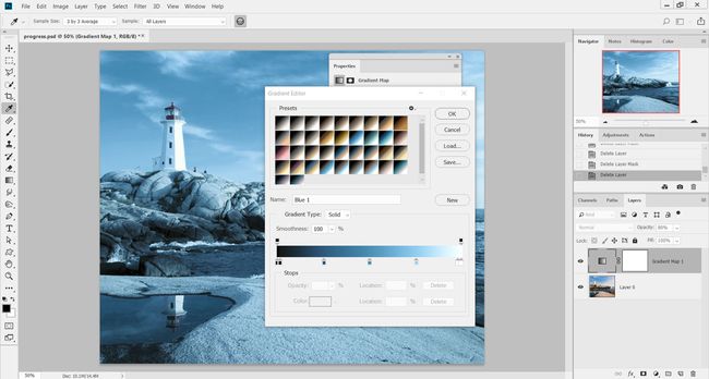
Inside the Gradient Map editor, select the Photographic Toning set of presets from the drop-down menu. From the array of thumbnail gradients, select the preset Blue 1 and hit OK. This will tint the image with a light blue all over.

03. Black of night


Lower the Opacity of the Gradient Map layer to 80% to reduce the effect slightly, head back to the adjustment layers and add a Curves adjustment. Darken the image by dragging the curve downward from the centre. The idea is to darken the shadows and midtones here.

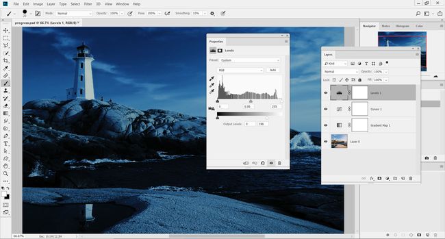
04. Darken even further


Add a Levels adjustment layer above the Curves adjustment. Inside the Levels dialog, set the midtones marker to 0.95. Then, under Output Levels, set to 0 and 196. This adjustment should darken the image further, making it appear as though it is night.

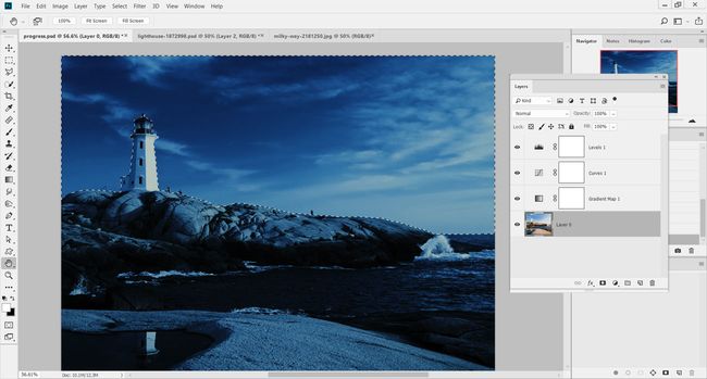
05. Select the sky


Now we've converted the image to night, we need to swap out the sky. Press W for the Quick Selection Tool and click on the image's layer. Drag a rough selection over the sky and around the lighthouse.

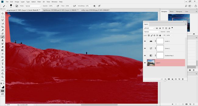
06. Improve the selection


Hold opt/alt to remove areas of the selection that spill over onto the rocks and lighthouse. Press Q to load the Quick Mask Mode and preview the selected area. Use the Brush Tool to refine the edge of the mask, and press Q to return to normal view.

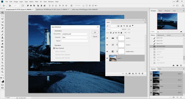
07. Save the selection


Go to the Select menu and down to Save Selection. In the pop-up menu, set Document to the current image, and set Channel to New. Leave Name as blank and hit OK to add the selection as a new Alpha Channel (Window > Channels to view).

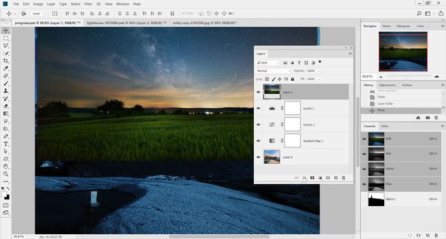
08. Quick copy and paste


Load up the image 'pix_milkyway_2181250.jpg' from the FileSilo and press cmd/ctrl+A to select the entire image, then cmd/ctrl+C to copy. Head back to the lighthouse image and press cmd/ctrl+V to paste the new sky onto the image. Move this image to the top of the layer stack.

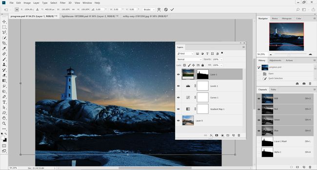
09. Apply a layer mask


In the Channels palette, cmd/ctrl-click on the thumbnail of the Alpha Channel created in step 7. On the new sky layer, add a layer mask to apply the selection. Click on the small chain link symbol between the mask and the thumbnail, and press cmd/ctrl+T to resize the sky to fit over the area.

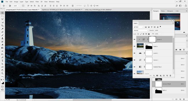
10. New Curves adjustment


Add a new Curves adjustment above the new sky layer and clip them together (opt/alt-click between their layers). Lower the brightness of the new sky layer by pulling down the centre of the Curves adjustment. Adding three points along the line and lowering them all slightly provides more accuracy.

11. Paint in light


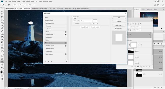
Add in a new layer and select the Brush Tool. Set the tool to black and 0% Hardness and paint in the small light for the lighthouse. To choose the colour of the light, double-click on the layer to load the Layer Style menu, and then select the Color Overlay option.

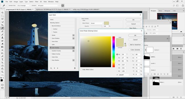
12. Add a Color Overlay


Change the colour of the Color Overlay style to an orangey yellow and set its Mode to Screen. Setting colour this way will enable you to change it later on, if needed. Hit OK and lower the Opacity of the layer down to 85% to fade it slightly.

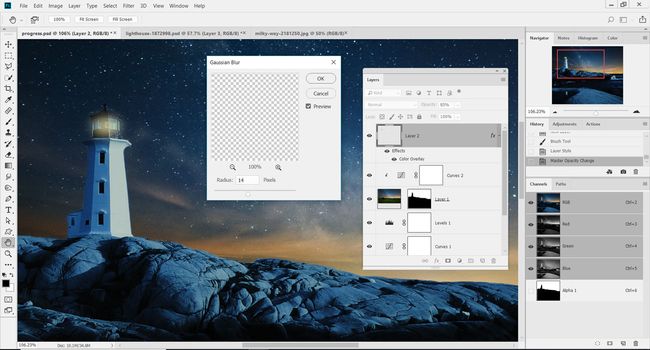
13. Blur the light


Head to the Filter menu and down to Blur > Gaussian Blur. Set the Radius slider to 14px and hit OK to soften the light in the lighthouse. Load up the Free Transform controls (cmd/ctrl+T) and resize or rotate the light to fit within the lighthouse.

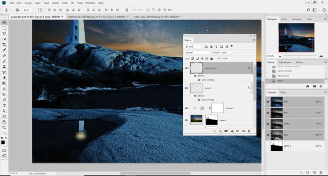
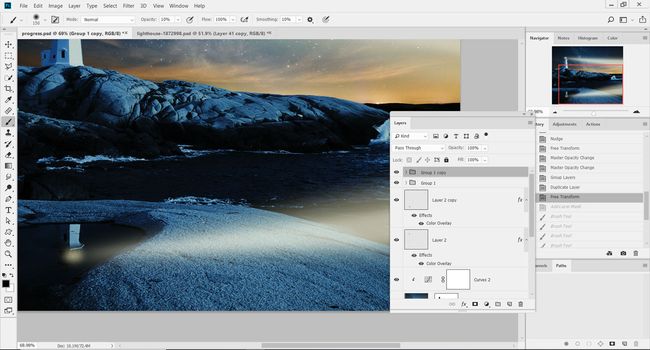
14. Create the reflection


Press cmd/ctrl+J to duplicate the light layer onto a separate layer. Go to Edit> Transform> Flip Vertical to rotate the light and flip it. Use the Move Tool to position it over the reflection of the lighthouse in the pool in the foreground.

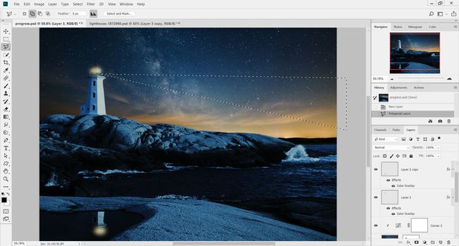
15. Light rays


To add the beams of light from the lighthouse, on a new layer (cmd/ctrl+shift+N) create a long rectangle using the Polygonal Lasso Tool (L). The shape should extend out from the lighthouse and across the entire image.

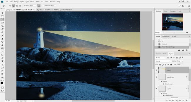
16. Fill with colour


Go to Edit > Fill and choose Color under Contents. Set this to a yellow colour that is similar to, but lighter than, the colour used for the main light in the lighthouse. Hit OK, then cmd/ctrl+D to remove the selection, and then reduce the layer's Opacity setting down to 70%.

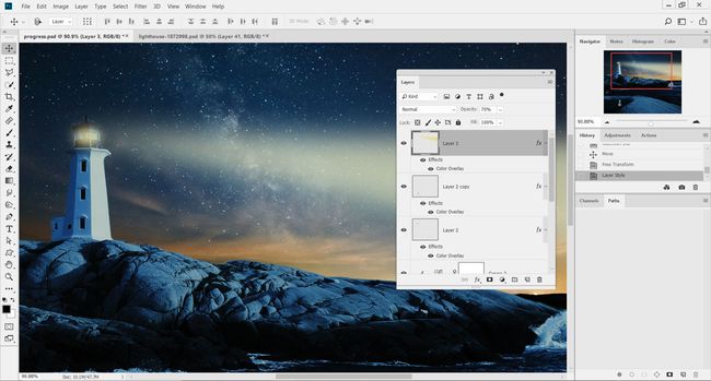
17. Soften and colourise


To soften the light beam, go to Filter and down to Blur > Gaussian Blur. Set the Radius for the blur to 36px and hit OK. Double-click on the layer and add a Color Overlay style to change the tone of the light, if you think it's required.

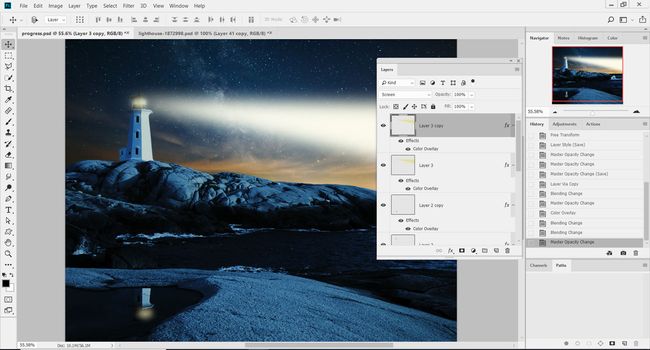
18. Double the light


Duplicate this layer (cmd/ctrl+J) and then change the Color Overlay style to a lighter yellow, almost white. Set the layer's blend mode to Screen in the Layers palette to blend into the light beam underneath.

19. Resize the second beam


Shrink the second light beam so that it's smaller than the one underneath. Lower the Opacity of this layer to 50% to make it fainter. The result should be two light beams coming out of the lighthouse, one on top of the other.

20. Duplicate and reposition


Group the two light beam layers together and press cmd/ctrl+J to duplicate the group. Flip the group vertically (Edit > Transform > Flip Vertical) and position so the light beams are included in the reflection of the lighthouse.

21. Control with masks


Add a layer mask to the group and brush away the light that falls outside the water. Also, on the Curves adjustment layer's mask, use a low Opacity brush over the sea in the foreground to reveal more detail on the water.
Share:

Popular Post

Web Design

5 Quick-fire portfolio tips from design experts

Your design portfolio is one of your most useful tools. It can win you commissions, help you snag a new design job, attract collaborators, a...

Labels

Most view post