

Showing posts with label illustrator. Show all posts

The 6 best Illustrator alternatives

Adobe's software might be the industry standard, but Illustrator alternatives are available. Why is Adobe's vector graphics editor so popular? Well, Illustrator was first released in 1987 and has dominated digital art, illustration, and graphic design for several decades. There are many benefits of using the software, you can find out more via our download Illustrator post.

However, as it's part of Adobe's Creative Cloud, to use Illustrator, you'll need a monthly subscription, either to the app itself or to the Creative Cloud suite as a whole.

1. Affinity Designer

In our view, the best all-round alternative to Illustrator is Affinity Designer. First launched in 2014, this vector editor from British software company Serif has gradually grown in popularity and influence, and for good reason.

And while Illustrator still isn’t available on iPad (although it's coming soon, and it looks very cool), you can now use the full version of Affinity Designer on iPad (for £19.99), with optimized features for the Apple Pencil.

Affinity Designer can also boast a few unique features that Illustrator doesn’t have, including the ability to switch between raster and vector workspaces within the same tool, one-million plus zoom, and unlimited redos. Unencumbered by legacy code, the software generally runs a little bit faster than Illustrator, and if you have a relatively new Mac, a lot faster (which is largely why it won an Apple Design Award).

2. Sketch

If your need for a vector drawing program is primarily for digital design, then Sketch is probably your best alternative to Illustrator: as long as you’re using a Mac.
It’s not a fully comprehensive drawing program, with all the features offered by Illustrator, so you wouldn’t use it to create complex illustrations or art. But by the same token, this means it has a simpler and more user-friendly interface that makes an icon and UI design quick and easy.

First launched in 2010, Sketch has a strong focus on UI and icon design that quickly led it to become the industry’s go-to for the app and website prototyping. A Sketch license costs $99 and will give you one year of free updates. Once your license has expired you can still use the app for as long as you want, but you will need to renew if you want the latest updates.

3. CorelDRAW

First launched in 1989, CorelDRAW is a vector drawing program with a big following among artists and illustrators. For most of this time, it was Windows-only, but this Spring a Mac version was finally released too. There’s no easy way to say whether CorelDRAW or Illustrator is the 'better' tool. Both are packed with features and both have their passionate advocates.

CorelDRAW is available for a one-off fee, but the upfront cost is relatively large: £599 at the time of writing. Essentially, then, the main reason to buy Corel Draw over Illustrator seems to be if you prefer the interface and workflow. What is the objective fact is that Illustrator is the standard software for the design and illustration industry, but that said, you can easily import and export AI and PDF files to CorelDRAW. The two tools can’t easily be separated on price, either.

4. Gravit Designer

Gravit Designer is a tool that allows you to work on a diverse range of design tasks, including illustration, UI and screen design, printed artwork and logo design. You save your work onto your computer in the .gvdesign format, and you can export it as SVG, PDV, PNG or JPEG files. Gravit Designer is available either online in your browser or on your desktop as a downloadable app for Mac OS, Windows, Linux or Chrome OS.

The tool supports a number of vector and raster file formats, including AI and Sketch files. It has a lot of similar features to Illustrator, including a freehand drawing tool that smooths the paths as you draw, the ability to create custom shapes and the equivalent of the Pen tool.

5. Inkscape

Inkscape is a free and open-source vector editor using Scalable Vector Graphics (SVG) as the native format. As well as Windows and Mac, it will also run on Linux. The main downside lies in its performance: it can be quite slow and laggy at times.

It’s lightweight, so will run on quite low-powered computers, but it’s surprisingly capable for a free tool, with a lot of useful features including layers, object grouping, drawing, shape, calligraphy, pencil and pen tools, path simplification with variable threshold, bitmap tracing and Boolean operations. Inkscape natively supports opening or importing a range of formats, including SVG, PDF, EPS, AI (Adobe Illustrator) and CDR (CorelDraw).

6. Vectr

Overall, Vectr is super-simple, which can be viewed as a positive or a negative. In other words, it’s never going to replace the feature-rich capabilities of Illustrator, Affinity Designer or Corel Draw, but that also means a very low learning curve (there are very good tutorials featured within the app itself).

Vectr is a totally free, browser-based tool that offers a quick and easy way to get started with vector editing via an intuitive interface. Because it’s based on the web browser, anyone with an internet connection can use it, and that makes it quite straightforward for multiple people to collaborate on a design, too. Each image has a bespoke URL you can share with others, and you can export your finished work as an SVG, PNG or JPEG file.
Share:

Design a killer logo in Illustrator

The killer logo design will be different every time, depending on the brand's overall identity. Each identity project is unique. They all have their own issues to overcome and challenges to conquer. But you should still approach each brief in a similar way: develop a workflow that allows maximum creativity and is productive.

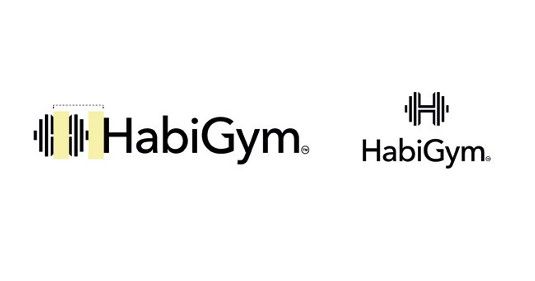
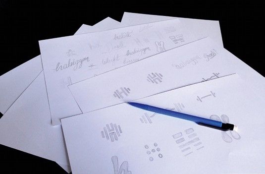
This tutorial will walk you through the core stages of creating a new identity for the ultra-modern HabiGym. I'll show you how this identity was conceived, explaining each stage of the process from when the ideas were born through to the final presentation. As well as demonstrating some of the essential tools and skills that you can learn to help streamline your workflow in Illustrator, I'll also share a few best-practice rules of thumbs for working smarter.

01. Always start on paper


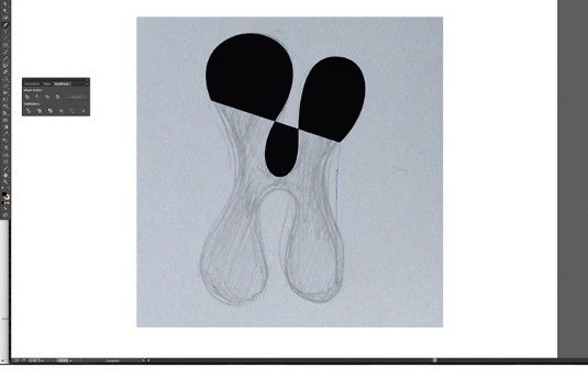
Everyone knows they should start with a plan, but with deadlines looming it's all too easy to forget this stage – don't. A major part of identity design involves solving a problem with a concept. For many, this happens much more fluidly on paper, as your mind bounces off each thing you sketch out.

02. Mobile scanner


If you have a scanner, use that for the best results. If you don't have one to hand, take photos of your sketches. You can then use them as guides for digital recreation. When it comes to logos, precision is essential. Therefore, Live Trace needs to be ditched and the work needs to be done manually.

03. Practice makes perfect


The Pen tool is probably the most frequently used – but remains one of the trickiest to master. It's a very powerful tool and learning it will not only benefit your ability to create images in Illustrator, the skills you acquire will also boost any Photoshop Pen work you do.

04. Utilise the Shapes panel


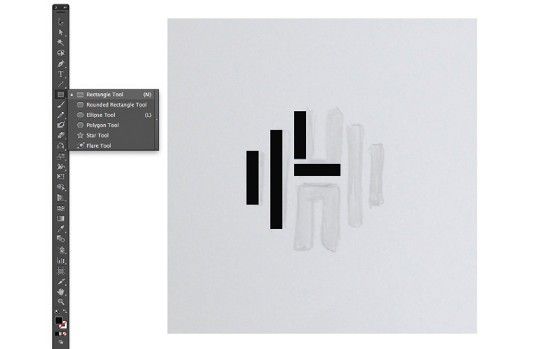
Create this logo by combining rectangles using the Rectangle tool. When building the vectors, try using the Shape panel for better accuracy. Hold Shift to draw shapes with equal proportions. Select any element, and its width and height are shown in the Control bar. You can type in sizes here too.

05. Duplicate elements and combine


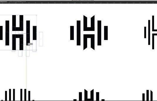
To compare variants, duplicate a master copy to edit (hold Alt and drag). Create shapes to align objects and use Smart Guides (View>Smart Guides). Use the Pathfinder tool to combine shapes and create new ones. You can combine rectangles to make the 'H' element: select both elements and hit Merge.

06. Tweak the type


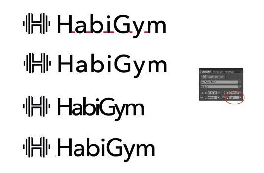
Alter the tracking and kerning of words to change the tone of a logo. Add character to the logotype by opening up the shapes into the native paths that make up the letters, altering the paths of each letter directly to make your type unique. To quickly convert the font to outlines (paths) hit Cmd/Ctrl+Shift O.

07. Keep changes subtle


Use the Direct Selection tool to rearrange the anchor points and alter the appearance of the letters. Keep changes small and subtle. Careful scaling of the logo mark with the type is crucial to achieve cohesion between the two. Hold Shift to keep everything in proportion as you scale elements up and down.

08. Time to add colour


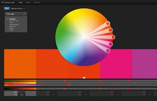
In CS4 and higher, you can integrate Adobe's Kuler app into your workspace to view colour palettes. Go to Window > Extensions > Kuler. Try to avoid gradients in logos, but don't take that as an absolute rule. Hit Cmd/Ctrl+F9 to access the Gradient dialogue. Try the logo on a variety of background colours and shapes.

09. Create delivery templates


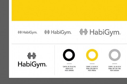
Go to File > Save As > Illustrator Template. Choose fonts that work well with the brand. Create style guides for designs: add CMYK colour breakdowns, Hex codes or Pantone codes, and font names – this is useful for designers and ensures brand consistency. Also give examples of the brand on various materials.
Share:

Boost your illustration career with these 6 tips

As a child, Victo Ngai didn't really fit in. She had moved to Hong Kong from mainland China, didn't really speak the local dialect and didn't have any friends. She discovered that she could create her own friends on paper, and those friends were actually "way cooler than the people at school". 


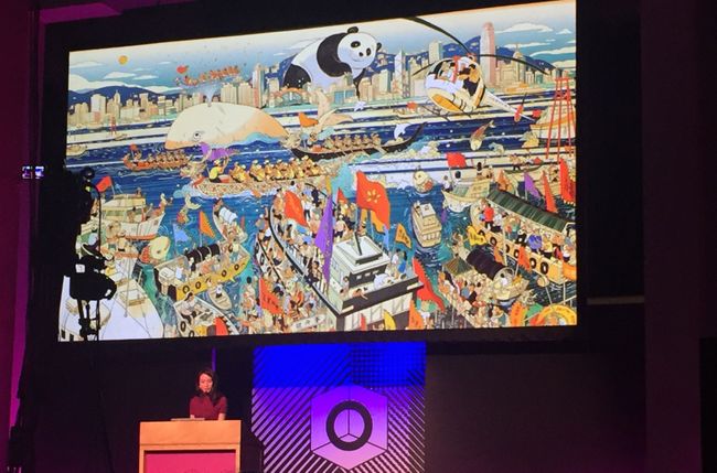
All that time drawing as a child has led to a successful career in illustration. Ngai has won multiple awards, including from the Society of Illustrators, and works for clients such as The New Yorker, Dreamworks and Apple. At OFFSET Dublin this weekend, she shared some insight into how she's got to where she is, and how all illustrators can approach their work and career differently in order to get where they want to go, and more importantly, take more joy from it. Here's her advice.

And if you are looking for a new career direction – in illustration or another creative field – then don't miss our design jobs page, which lists plenty of opportunities.

01. Don't take yourself too seriously


Ngai moved to the States to go to art school, and once there, she found she was bottom of the class, even though she was working hard. "While trying to pursue a passion, I stopped enjoying myself and lost my voice," she recalls.

In the end, once her teacher had pointed out what he really wanted to see was work more like the doddles in the sketchbook, she started enjoying drawing again. "I stopped worrying about coming up with something really grand, and instead just started documenting little funny moments in life," she says.

02. Don't worry about the future


Around the same period, Ngai became concerned that she would become a "one-trick pony. I was worried I was going to end up doing the same thing over and over until I died," she says. "I was 21 at the time."

I couldn't figure out how to get over this so I just ignored it and carried on, she explains. "It's kind of pointless to worry about things I'm not ready to tackle. My energy is much better spend focusing on the now and making sure I'm giving everything my best shot."

03. Push yourself


"Usually it's the last 10 per cent that separates a mediocre piece from a good piece," says Ngai. "And it's the last one per cent that really makes it."

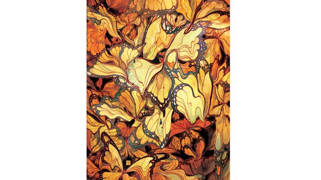
Ngai gives an example of when she was working on a piece for The New Yorker, which showed butterflies as leaves. It was approved, she says, but she wasn't happy with it. She asked for more time and discovered that she really liked a 'melty' sort of look she was able to achieve with the Liquify tool in Photoshop. But as using this tool meant the image wouldn't be high enough resolution for print, she ended up remaking the entire illustration. And she thinks the piece is much better for it.

04. Find the fun part

"There are no boring assignments," says Ngai. "Only boring solutions." There's always something you can find in an article that's interesting. When choosing a way to go for an image, aim for "something you'll enjoy that captures the spirit of the story without giving away the ending."

Don't be afraid of adding personal touches in your client work, either. In one piece of client work, Ngai added a fox, because she likes foxes. Though if the client had asked why it was there, she stresses, I would've said it's to bring out the red in another part of the piece. "But really it's just to make myself happy."

You also need to tell your story with strategic composition. "Illustration is like a puzzle," says Ngai. "You have to make every piece fit for the whole thing to work."

05. Turn limitations into assets


When you get a brief that seems like it might be dull or complicated, it's your job to think about what you want to draw, and see how you can work that into the brief, says Ngai.

She gives the example of a piece of work for Cincinnati Magazine. The article was about new imaging technology that helps doctors accurately locate cancer cells. There were several potential problems in the piece, she didn't want the piece to be too dark or negative – for serious subjects like this, sometimes a lighter tone is needed – she didn't want to include images of breasts, as that isn't allowed in American magazines ("unless you're Playboy"). On top of that, she didn't know what this new imaging technology might look like.

Instead of despairing in this, she had to come up with a metaphor, and chose to use a maze. This is a cliché, she says, "but clichés are clichés for a reason, they're powerful signifiers. People know what you're talking about."

If you have one strong cliché in your work, you can use it as a "Rosetta Stone for the viewer to decode the other metaphors in your image," she says. "They should be used with caution, but if you can make them visually engaging, then go ahead."

In this image, she concludes, "The result is more interesting because of the limitations."

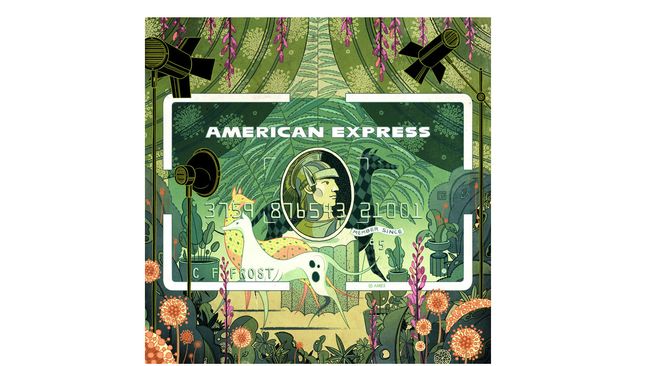
A similar thing happened with her illustrations for American Express. She found the edges of the card to be a limitation, and so turned them into an asset by making the card's border a key part of the piece.

06. Find your niche

Finding the right clients is key, says Ngai. "Why shouldn’t you find your own niche and cultivate your list of clients who appreciate what you do? The best work comes out when the other person trusts you, and you trust them to trust you."

You also should be careful of doing too much work that you're not interested in or not proud of. "What we get hired for is what goes into our portfolio, so if we keep making concessions, we’ll get further and further away from the feeling we had when we had when picking up tools as a kid." So if you ever feel you're making concessions, just remember it was when Ngai rediscovered that childlike delight in drawing that her career really began.
Share:

Create sets of product icons in Illustrator

Illustrated icons can be a super addition to your design portfolio, whether you include them to reach a new group of potential clients, or to add more elements to an illustrated scene. 

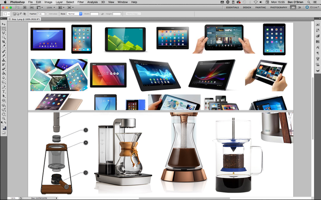
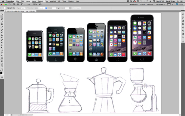
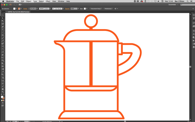
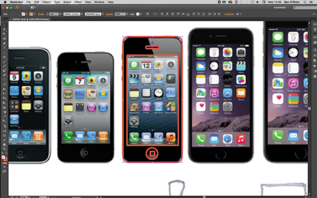
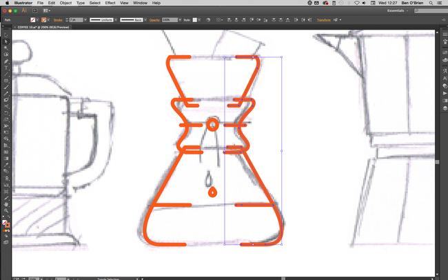
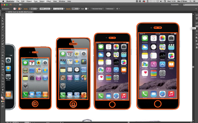
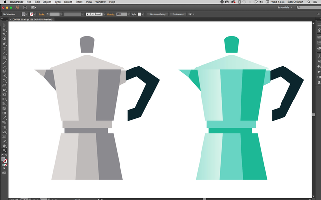
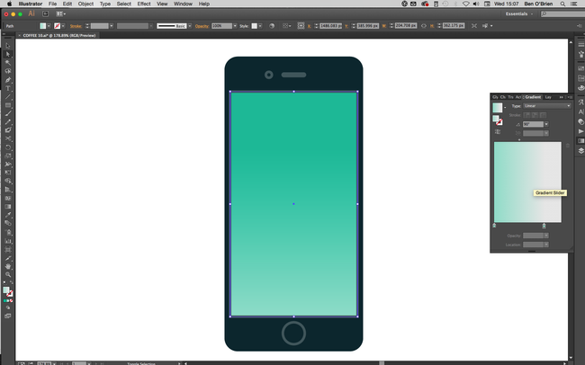
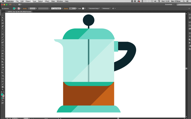
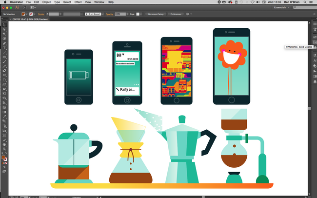
In this Adobe Illustrator tutorial I'll show you how to create icons simply and easily, so you can create large volumes of them in no time at all. I’m going to design two icon sets: a set of digital phone/tablets and a set of coffee-making items.

01. Know what you're representing


Whatever your set of products is, do your research! A client would want all the products to be correct, and you should too. Even if it’s a personal project, you can’t accidentally add a camera button to an original Nokia 3310 or put a two-pin plug on a British kettle. If you’re illustrating a product for a client, ensure you know how it looks all the way round, so you understand it as a real-world object.

02. Draw it in pencil


You can start off however you wish – I always draw everything in pencil, but for many products you can trace a photo. If you have a tricky shape to draw and it happens to be symmetrical – for example a lightbulb – you can just draw one half of it (I’ll come to that later!).

03. Get rid of kinks


When creating linework, always keep lines and angles straight and clean. Your illustrated product icons may be used quite small on the page or screen, and unnecessary kinks or curves can confuse the eye and make things unclear.

There are two main tips for this. First, with the Shape tool, hold down the Shiftkey to get perfect circles and squares or polygons that sit straight. And second, with the Pen tool hold down the Shift key to only draw angles at 45 degrees or 90 degrees to an axis.

04. Make use of symmetry


Many products are perfectly symmetrical, which makes things nice and simple. Once you have the linework, select it all with Selection tool (cmd+V) and you’ll see a range of Alignment buttons appear in the top bar. Click either the horizontal or the vertical Align Centre button, depending on what you need, and everything will snap into symmetry. You can also group objects together, and then align them with other objects or groups.

05. Reflect more complex objects


For symmetry on more shapely objects, illustrate one half perfectly, then select these halves and copy and paste them all in one go by holding down shift+altand hitting the right Arrow key, this will keep these lines level with their originals.

Still with the copied objects selected click Object > Transform > Reflect from the main menu, select the Vertical option and click OK. Place this side of the object to get the width correct (using only the left and right Arrow keys so they stay aligned with the other half).

Using the Direct Selection tool (cmd+A) join up the two sides of each line by selecting the two line ends and clicking cmd+J.

06. Maintain consistency


If you’re working on a collection of products, make sure you're always considering the other items in the collection. If buttons are the same across products, then copy and paste them, if the curved corner is always the same size, then make sure you’re using the same corner.

Often (with tech products especially) you can make one device, then copy/paste it and simply adjust the proportions to make the next icon, which can really speed up your workflow.

07. Add some colour


With your linework complete, move on to colour. Generally, you want to get the tones as close to reality as possible, but there are some exceptions. For example, most metals are a mid-grey, which is boring for everyone! Instead, I use a variety of blue-grey tones (light or dark) and usually stray into turquoises.

Try using a transparent blue for glass, too, as white can feel cold. I also recommend oranges and yellows for wood surfaces to really bring some warmth.

08. Explore gradients


As we’re creating illustrated icons, you don’t want to go too far on minor details and textures. However, you can really sell the surface of a product with a gradient. To get the best out of Adobe Illustrator, don’t create gradients from one colour to the next (it often results in banding when printed).

Instead, choose a flat colour for an object/shape, select the shape and duplicate it (in the layers panel), then add a gradient to this top object going from an opacity of 100% down to 0%.

09. Try including shadows and highlights


When I'm not using gradients, I often duplicate an object and then cut it at a corner. I use the Pen tool (again holding down the shift key) to create a shape cropped at a 45-degree angle, which I then colour in a lighter or darker shade to add a simple but effective shadow or highlight.

10. Add extra details


Finally, if the size you’re using the icons at allows, you can really bring them to life. A tech device looks uninspiring with nothing on the screen, so use this space to demonstrate its functions or sell an app. Graphic product illustrations used within a bigger illustration (for example, if these coffee facilities were part of a wider scene) will draw the viewer in.
Share:

Create your own Calligraphic brush in Illustrator

One of the best things about Illustrator is the ability to create your own brushes. You can find some amazing free Illustrator brushes online, but sometimes designing your own is the better option. I created my own shading and line work brushes to give my Spider-Man image (above) a more natural feel, while still keeping it 100 per cent vector-based.

Over time, I've developed a library of Illustrator brushes. This means I have precise control of drawing with the Pen tool, but I can also give my linework a more natural, hand-drawn appearance.

I create all my work in Adobe Illustrator CC. Getting to grips with the software can be tricky, but there are a lot of brilliant Illustrator tutorials around to help hone your skills.

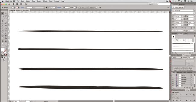
01. Start with weighted lines


Create custom brushes by drawing your own weighted lines, either with a drawing tablet in Photoshop, the Blob brush tool in Illustrator, or good old-fashioned pen and paper.

Then, bring your linework into Illustrator and create outlines from the strokes by selecting them, and navigating to Object > Path > Outline Stroke.

02. Refine your lines


Once you have your brush stokes outlined, use the Pen tool or Anchor Point tools to refine any part of the line to get it just how you want it.

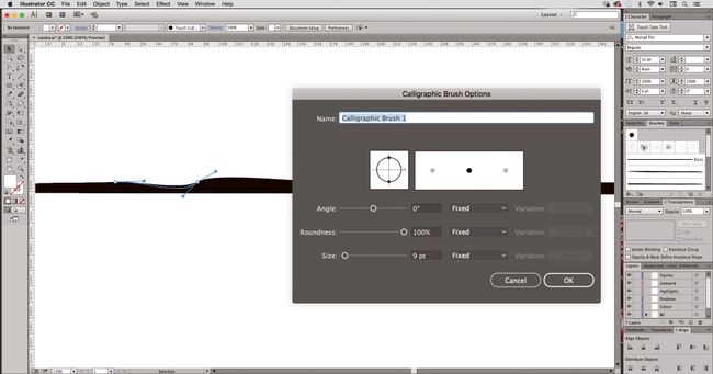
Next, create a new Calligraphic brush by selecting the shape you want to make into a brush. Open the Brush panel (Windows > Brush), click Create New Brush and select Calligraphic brush.

03. Create a brush library


You can follow this technique to create a library of different brushes and effects to suit your style. To create a new brush library, add the brushes you want to the Brushes panel (Window > Brush Libraries).

Then, in the Brushes panel, click Save Brush Library, and put the new library file in one of the following folders so that it will appear in the Brush Libraries menu when you restart Illustrator.

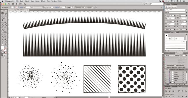
You can also use this technique to create Pen brush strokes, as well as shading effects such as stippling or half-tone effects – and you can create ‘fills’ as well as ‘strokes’.
Share:

Popular Post

Web Design

5 Quick-fire portfolio tips from design experts

Your design portfolio is one of your most useful tools. It can win you commissions, help you snag a new design job, attract collaborators, a...

Labels

Most view post