Showing posts with label jquery. Show all posts

10 Brilliant jQuery plugins

There have been tens of thousands of jQuery plugins written for the jQuery library. Created in 2006 by John Resig, the jQuery library is now the most popular JavaScript library on the web. It's a fantastic resource for designing and developing user interactions quickly.


Whether it's an image gallery or form, content-revealing CSS animation or an explosion effect, the library provides the core building blocks to allow you rapid prototyping and to deliver a unique user interface with minimum code and effort.

1. RTO+P Video Player

Sure, it's easy to embed video from YouTube or wherever, but if you want a little more control over your video then RTO+P Video Player is a must. It makes it easy to build and customize your own video player that gets its video either from your own server or CDN or from a public Vimeo stream. Use the HTML5 video tag to make life easy, or for better performance, you can use the lazy load option.

2. Slick

Is this the last carousel you'll ever need? It certainly could be; Slick's a jQuery plugin that gives you fully responsive carousels of just about every kind you could wish for, with all sorts of options to play with including lazy loading, autoplay, callbacks and more.

3. Muuri

For the ultimate in flexible layouts, Niklas Rämö's Muuri is well worth a look. Its layout system enables you to position grid items of assorted sizes within a container in pretty much any way imaginable, and it's responsive, sortable, filterable and draggable. By default, it'll arrange everything in a 'fit first' manner, but you can add your own layout algorithm for a different layout style.

4. AnchorScroll.js

There's nothing like a bit of ultra-smooth scrolling to help your site stand out from the crowd, and AnchorScroll is a lightweight and easy-to-use jQuery plugin for doing just that. It gives you smooth scrolling to anchor targets, with added classes and callbacks to elements on scroll events, and on top of that there's the option to add a blur effect to the body while scrolling, as well as a bounce effect that'll take you back to where you came from after scrolling to an anchor element.

5. Timeline.js

This jQuery plugin offers a twist on the carousel component: Timeline.js provides you with everything you need to create a carousel timeline (i.e. a slider that progresses based on chronological points). It includes plenty of visual and functional customization options.

6. Tilted page scroll

This plugin from Pete R. is an excellent way to grab people's attention and add a little extra depth to your site. With it installed, items will tilt into view as they scroll up the page, and tilt again as they scroll out of the top of the page. It's a great-looking effect that's nice and easy to implement.

7. Focus point

The great thing about responsive web design is being able to create a single page that'll look good on any device. However, if your site's automatically cropping images to fit certain viewports, it can often lose the focal point. With Focuspoint, you can make sure your image looks great in any container by specifying a focal point for each image, and the plugin will crop out unwanted parts before the important bits.

8. SVGMagic

Using SVG images is a good idea because they will look sharp at any size, and this plugin helps you to do that without having to worry about browsers that don't support them. It searches for SVG images and replaces them with PNG versions if SVG isn't supported.

9. Face Detection

Detect and get the coordinates of human faces in images, videos, and canvases with this plugin, which was written by Jay Salvat and uses Liu Liu's face detection algorithm.

10. Round Slider

This circular slider enables the user to select a range of values by mousing over the circle. The full slider is the default setup, but you can also use it to get quarter-circle, half-circle, and pie shapes. There are CSS styles you can adjust to theme it in various ways, for example, to look like a speedometer. No images are involved; it's all made with CSS and JavaScript.
Share:

Are you prepared for life after jQuery?

When jQuery was first introduced, it changed the world. It gave us all the ability to refer to elements on the page from JavaScript, like we could in CSS. Not only that, but it gave us an API for these elements that was miles ahead of what the browser had. We could hide them, add and remove classes, and even write our own plug-ins to do unprecedented things.

It also hid much of the complexity of dealing with that era of browsers from us. Through painstaking fixes, all of the various bugs that those browsers included were worked around, until you could be confident that if something was done with jQuery, it would work.


Before too long, jQuery became the vernacular of the internet. Scores of people learned it before they learned the DOM itself: it became an implied dependency in every library and tool out there. jQuery was ever-present.

But things have moved on since then. jQuery thrived in a time when browsers were broken and slow to change, but that itself is changing.

Since IE8, browsers have included the document.querySelector method, which gives us all jQuery's killer features right out of the box. IE9 gave us addEventListener, freeing us from onclick and onmouseover. In IE10, JavaScript programmers were granted the classList object, enabling us to add and remove classes without tricky string manipulation.

And this is without touching on all of the amazing things that CSS can do without any JavaScript at all. CSS is finally getting powerful enough to truly facilitate the separation of the JavaScript logic from its presentation. In modern browsers, classes can represent the state things are in and the CSS can define what that means visually – but you can't do that if your code is littered with calls to .hide().

And beyond all that, there are new, powerful APIs that you can't access through jQuery on its own: things like the new MutationObserver and WebRTC require you to talk to the browser itself. And, it turns out, that's not all that bad.

Use it: don't depend on it

We may not need jQuery any more, but what's the harm in using it if it makes your job easier? There isn't any! Keep using jQuery to build your sites and apps. But if you're building a library, consider not making it into a dependency.

Why? Because jQuery is a big, monolithic library. It includes Ajax, DOM manipulation and selection, events, promises, effects and a whole bunch of utilities. Having all of this in a single package locks us all into the jQuery way of doing things – which is also the 10-year-old way of doing things.

Alternative solutions

So what can we use instead? Q does brilliant things with chaining promises and exception-handling. CSS animations are much smoother than anything you could do with JavaScript. Soon, custom elements are going to provide the best possible way of building reusable components. If we live in a world where you can pick and choose which DOM manipulation library you want, or whether you want to use RSVP.js or Q for promises, we can end up with better open-source solutions to all of these problems.

Beyond all this, the jQuery plug-in style puts every library you include in the same, ever-growing namespace. Everything is $(el).colorPicker(), or $(el).chosen(). This doesn't play nicely with a future in which we have real modules. Modules will enable us to cleanly seperate our dependencies, and create optimised builds more easily. Whether you use Browserify, RequireJS or the modules added with ECMAScript 6, it's the future. A single, global namespace isn't.

So how do we reach this brave new world? The first step is for all the libraries we need to release their death grip on jQuery. If they become dependency-free, we can begin to imagine building a modern web app without it.

There is one important caveat: if you're targeting older browsers, including IE6 and 7 or Android 2.3, you aren't ready for this brave new world just yet. Enjoy jQuery to its limits and dream of a future when you can finally speak the browser's language.
Share:

To hell with jQuery

JavaScript library jQuery has divided industry opinion. Karolina Szczur asks if libraries cause substandard code – or if devs are to blame.

The popularity of JavaScript has grown over the past few years. Dozens of libraries have been created. Yet there’s one that fuels controversial opinion: from its dedicated lovers to haters (who question the programming abilities of anyone who uses this library), yes, we’re talking about jQuery.

A designer’s story

When I started my career, it became obvious that frontend development skills are essential; I needed to be able to code my own designs or at least have a good understanding of markup to create easy-to-implement interfaces.


Photoshop is a key tool for most designers. But the nature of this gigantic piece of software is very different from development environments. You’re not able to debug anything and you (probably) don’t have any idea how it works. It’s a black box compared to the open nature of the web and software.

Along with the ease of reading code, which came with GitHub, came problems. We failed to take advantage of so many codebases being available to learn from. We took it for granted and assumed that things just magically work rather than caring about how. It all comes down to two types of developers, or people in general, actually.

Operator vs engineer

An operator knows how to use a tool without understanding how it works. On the other hand an engineer has full awareness of the code so he can modify and adjust it to his needs. This leads to the question: how many of you have read jQuery’s codebase? My guess would be not many. How many of you read the codebase of any library you’re using? So many developers wave the flag of ‘RTFM’ (Read The Fucking Manual) while they should be encouraging ‘RTFC’ (Read The Fucking Code).

The web gives an insane amount of freedom to complainers and people saying bad things about software. These opinions don’t belong to code-aware programmers, but lazy ones who are judging things they don’t necessarily know or understand.

Libraries usually try to solve a broad spectrum of problems, which alters the level of complexity. While developing, we should strive for simplicity, preventing unnecessary complication and increased cognitive load. But sometimes the tools we use can be over engineered, bloated or poorly written. For some cases, microframeworks are the most reasonable approach; they’re more lightweight, modular, address specific issues and are easier to understand because of smaller codebase. What’s the root problem of jQuery (and other JavaScript libraries) then? Are they really poor quality and should we write our own? Well, no.

jQuery is good

For certain purposes (and use cases), when used by a seasoned programmer, it is redundant. There are exceptions to the rule though. The long-awaited parent selector is still unavailable in CSS. While stylesheets give us native execution, which is faster due to hardware acceleration and interpretation mechanisms, they introduce degradation and cross-browser issues. There are multiple arguments and cases for and against jQuery, but that’s not the point. The point is: how we can improve as developers.

Be a better developer

There’s no single, valid and best approach, but this consideration may help write and maintain libraries.

First, remember the separation of concerns. Manage the independent nature of functionalities while making them work together. Maintain readability and accessibility. Design for connection and consider the idea of piping from Unix systems. Bear in mind that most libraries and tools were never designed to work together, so prevent conflicts. Simplify debugging and use common approaches.

Don’t disapprove solutions just because you don’t know them or that’s a hyped opinion. Explore options. Read the code. Know the tools. Be better.
Share:

Five reasons to use jQuery mobile

With the proliferation of touchscreens on phones, tablets and laptops, we face an urgent need to build touch-friendly websites. Not only that, but website owners need to ensure that their content can be viewed by an ever-increasing, diverse set of devices. That’s where jQuery Mobile comes in. The jQuery Mobile framework is able to improve websites through adding touch-friendly form inputs, more efficient page loads and wider device support through the use of progressive enhancement.

I’ve been a longtime advocate of the jQuery, but wasn’t convinced straight-away that jQuery Mobile’s approach was the right one. I decided to investigate further by talking to the creators of jQuery Mobile, Scott Jehl and Todd Parker from Filament Group. I asked them why jQuery Mobile behaves the way it does, and as a result, pulled out five main things that jQuery Mobile does to help you build more touch-friendly websites that work across a wide range of browsers and devices:

The wide browser and device coverage - using progressive enhancement, your website is able to be seen by the widest number of browsers and devices.
Touch-friendly form inputs and UI widgets - form inputs are enhanced to be touch-friendly, including the addition of a set of touch-friendly UI widgets.

Responsive web design ready - jQuery Mobile is a 'mobile-first' framework, not 'mobile only'.
Layout and theming engine - highly extensible and customisable theme and layout engine.
Ajax page navigation model - load new pages faster using Ajax and HTML5 pushstate instead of full page refreshes. Let’s dive into each of these five reasons in-depth:

1. Wide browser and device coverage

'Don’t break the web' has been jQuery Mobile’s mantra. The great promise of the web was that anybody, anywhere in the world could access content by typing in a URL or clicking a link.


jQuery Mobile is the only major UI framework that's in-line with making sure everyone in the world can access content via a URL or link. jQuery Mobile embraces the concepts of the web and works with it, not against it. It embraces progressive enhancement where it delivers basic HTML to devices that can’t handle CSS and Ajax and then enhances the devices that do support it.

All devices in all parts of the world will be able to see your content if you use jQuery Mobile

2. Touch-friendly form inputs and UI widgets

If you’ve ever tried to hit a checkbox on a non-mobile friendly form, you know what a pain it can be to have to zoom in and out in order to hit poorly designed form elements. You want to make sure your form elements and UI widgets work well with touch. Touch is now in laptops and desktops so it's now completely inexcusable to make websites that aren’t being designed to support the onslaught of new touch-capable devices hitting the market. jQuery Mobile is designed touch-first (yet still works great with a mouse) so you get big, chunky tap targets that are finger-friendly for all of its form elements and UI widgets.

jQuery Mobile auto-enhances your forms to become touch-friendly. Checkboxes are wrapped in a very generous-sized label to create a nice tap-zone, so it's easy to hit the intended checkbox. Textareas are problematic on mobile once you go past the allotted text space (you have to two-finger scroll to see content in a scrollable textarea), so jQuery Mobile auto-grows textareas so the user can easily see the content they’ve entered at all times.


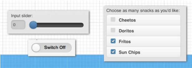
Many types of easily styled and enhanced form elements are in jQuery Mobile, such as the slider, checkbox and radio sets, search input and select menus. Also, each of these form elements comes with an alternate 'mini' version, which is ideal for inserting into header and footer elements on your page (such as a mini select element for navigation).

jQuery Mobile also has widgets such as persistent toolbars, buttons, dialogs and, my personal favourite is, the new popup widget, which allows you to popup any type of content from where you trigger it. This is useful for displaying in-page forms, dialogs, photos, maps and video etc. More widgets are added with each version of jQuery Mobile that are all touch-friendly and work across a myriad of devices and browsers.

3. Responsive web design friendly

You’ve always been able to develop responsive websites on top of jQuery Mobile because it's a 'mobile-first framework ... NOT 'mobile only'. And in the 1.3 version of jQuery mobile, a lot more focus is given to responsive web design features.

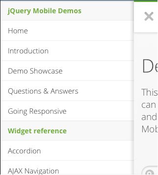
New panel widget

You know those menus that slide out from the side? Popularised by Facebook’s mobile application, this user interface pattern is very familiar to most users on mobile. View the panels in actions.


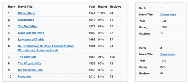
Tables can switch to a stacked label/data style presentation at narrow screen widths. jQuery Mobile calls this table reflow.


Responsive grid

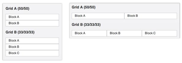
The grids for jQuery Mobile consists of simple grid blocks that can be stacked on top of each other when viewed on smaller displays.


4. Layout and Theming Engine

jQuery Mobile looks at your data-* attributes in your HTML and enhances it with behaviour and style. For instance, by applying data-role=”listview” to your unordered lists, CSS classes are auto-injected into your lists so that it looks like a mobilised list. And if there are links inside your list items, it will add the arrow on the list to show that you can click to go to a new page by touching that particular item.

The data-* attributes give you basic formatting and structure, but everything in jQuery Mobile is optional and the CSS classes are extensible, so you aren’t locked into the default theme.

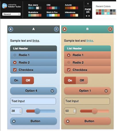
The first thing you should do to start out customising your application is to start with the jQuery Mobile Themeroller. It's so easy to create your own theme colours by dragging and dropping colors from the colour palette right onto the element you are styling. Themeroller even has integrated Adobe’s Kuler tool, which gives top user-rated colour schemes to choose from.


In the above example, I’ve built an 'A' and 'B' theme. jQuery Mobile comes with the ability to recursively apply your themes to elements using the data-themeattribute. If I wanted my page to use the default 'A' theme and my form to use the 'B' theme I would just apply data-theme=”b” to my form element and all the elements inside the form automatically will be styled with the 'B' theme.

5. Ajax page navigation model

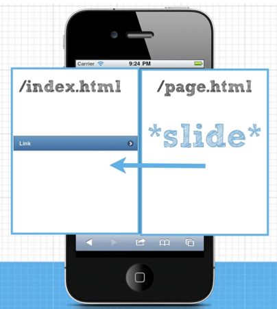
Instead of full page reloads, jQuery Mobile looks for links local to the domain you are on and fetches the new page content with Ajax. When a user clicks a link, the contents of the new page are then loaded it into a new div and then transitioned into the current viewport.

Let’s say you are on index.html and you then you click a link to page.html and the link to page.html has the following markup:
<a href="page.html" data-transition="slide">Link</a>
Note: The data-transition attribute here isn't required, this is just a demo of changing the page transition animation to slide instead of the default fade page transition. There are many other page transitions built into jQuery mobile from a simple fade to a more complex, flow transition.


How the new page, page.html content would first be loaded off to the side in jQuery Mobile and then slid into view

If the browser you're using supports HTML5 pushstate, the URL address in your browser window would then be updated to yourdomain.com/page.html once the new page finishes sliding in. Also, a spinning loading indicator is displayed while the new page is being loaded in to give the user feedback that the link was hit.

The main advantage of this way of loading pages is that you aren’t having to re-initialise all of the JavaScript and CSS requests on your second page load. Even if these assets are loaded from the cache, there are savings of execution time on mobile devices.

In the case of the first-page load using jQuery Mobile, all of your scripts and styles already initialised on your device so we don’t need to do that work again when loading a new page. The only thing needed to render a new page is the new fragment of HTML. With this method of loading pages, you’ll end up with faster subsequent page requests critical for developing a great mobile experience.
Share:

12 must-have code testing tools


New code and user testing tools and frameworks seem to pop up every day. Below is a varied list of code tools that accomplish various testing needs. Each one should be investigated to make sure it fits with your tech stack and technical needs.

01. Jasmine

Jasmine is a behaviour-driven development framework for testing JavaScript code. It doesn't depend on any other JavaScript frameworks and it doesn't require a DOM. However, it does have a clean, obvious syntax so that you can easily write tests.

02. Mocha

Mocha is a feature-rich JavaScript test framework running on Node.js and in the browser. Mocha tests run serially, allowing for flexible and accurate reporting, while mapping uncaught exceptions to the correct test cases.

03. Chai

Chai is a BDD / TDD assertion library for Node.js and the browser that can be delightfully paired with any javascript testing framework.

04. QUnit

QUnit is a powerful, easy-to-use JavaScript unit testing framework. It's used by the jQuery, jQuery UI and jQuery Mobile projects and is capable of testing any generic JavaScript code.

05. Sinon

Sinon.JS provides standalone test spies, stubs and mocks for JavaScript. It doesn't rely on dependencies, and works with any unit testing framework.

06. Karma

Karma is a framework-agnostic test runner for connected browsers. The results of each test against each browser are examined and displayed via the command line to the developer so they can see which browsers and tests passed or failed.

07. Selenium

Selenium has a straightforward aim: to automate browsers. It is used primarily for automating web applications for testing purposes, but it can just as easily take care of web-based administrative tasks.

08. WebdriverIO

WebdriverIO lets users control a browser or a mobile application with just a few lines of code, making test code simple, concise and easy to read. The integrated test runner also lets you write asynchronous commands in a synchronous way so that you don’t need to care about how to handle a Promise to avoid racing conditions. Additionally, it takes away all the cumbersome set up work and manages the Selenium session for you.

09. Nightwatch

Nightwatch.js is an easy to use Node.js based End-to-End (E2E) testing solution for browser-based apps and websites. It uses the powerful W3C WebDriver APIto perform commands and assertions on DOM elements.

10. PhantomCSS

PhantomCSS takes screenshots captured by Casper.js and compares them to baseline images using Resemble.js to test for RGB pixel differences. PhantomCSS then generates image diffs to help you find the cause.

11. PhantomFlow

PhantomFlow delivers UI testing with decision trees. It provides an experimental approach to UI testing, based on Decision Trees. A Node.js wrapper for Phantom.js, Casper.js and PhantomCSS, PhantomFlow enables a fluent way of describing user flows in code while generating structured tree data for visualisation.

12. Percy.io

Percy provides iterative and fast feedback about visual changes, delivering what is calls continuous visual integration. It does this by running with a test suite, taking DOM snapshots, and uploading the, to the Percy service where they are rendered in a modern browser.
Share:

Create animated infographics with CSS and jQuery

Combining both CSS3 animation and transitions, we'll be using CSS to animate a timeline infographic. For the data to unfold as you scroll down the timeline, each animation is triggered via the inview jQuery plugin when it comes into view. We'll look at the components of the three main animations we apply to each year in the timeline.

Every infographic tells a story. I chose the story of how Web Design Day, the conference I run, has grown over the last four years for my infographic. This is the data we'll be using in our example project.

Code snippets in the tutorial show the unprefixed W3C syntax for all CSS3 properties for easier reading. The final CSS in the example files has all necessary prefixes thanks to autoprefixer. Also note that demo files need to be run on a web server (local via something like MAMP, or FTPed up to your web host) to execute correctly.


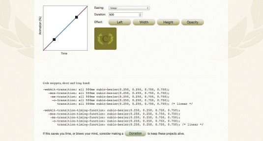
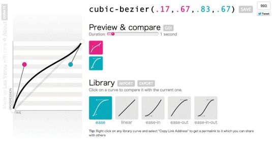
Ceaser is a great tool for creating custom cubic-bezier functions

Before coding any of the animations, consider what's the most interesting data and the overall feel you want to achieve. For Web Design Day, the total number of attendees, plus the furthest distance any one attendee travelled to attend, were interesting points to compare. Bar charts depicting things like the number of hot dogs consumed are fun. The story is light in subject, so colours in the design are bright and playful, maintaining a consistent style throughout.

As we scroll to each year, the date pops into view to mark a point on the timeline. To get these in motion, we start by writing a set of keyframes that describe the animation we want to see. After some trial and error and playing around on CodePen, I arrived at this:
@keyframes popIn {
  0%{transform:scale(0);}
  70% {transform:scale(1.05);}
  100% {transform:scale(1);}
}

Our popIn animation starts with a transform scaling our element to a size of 0, which essentially renders it invisible to start its entrance from. Then, 70% of the way through the animation, we assign a scale of 1.05, which will display our element just a bit bigger than its assigned 110px diameter. Finally, it settles at its true assigned size, a scale of 1, at the last keyframe of our animation (100%). This keyframe declaration won't animate anything on its own. The animation needs to be assigned to an element to take effect, using the .date-anim-in class:
.date-anim-in {
  animation:popIn .4s cubic-bezier(0.6, -0.28, 0.735, 0.045) both;
}

Any element we assign the .date-anim-in class to will take on the popIn animation, take 0.4 seconds to complete the animation, use the animation-timing-function property defined in our cubic-bezier function and have an animation-fill-mode of both.


Note that in our HTML we only assigned the class of .date to our year marker, not the .date-anim-in class that we've just created. We'll assign the .date-anim-in dynamically using jQuery to control exactly when the popIn animation executes. Without writing any additional CSS, we'll also be able to reuse it to animate the other date markers, or even other elements entirely if we wanted. Our date animation is set and ready to be used!

The bar chart animation

Our bar chart illustrates the number of veggie dogs, hot dogs and pierogi consumed at lunch each year. The width of each bar animates to its total length while the illustrated label for each bar fades in as the bars expand. The expanding motion is achieved with a CSS transition and some clever nesting. A CSS animation is used for the fading. There's a little bit of everything going on in this animation!

First, the HTML for each bar of our bar chart is structured like this:
<div class="veg item">
  <div class="bar"></div>
  <div class="label"><span>24</span><br/><img src="img/vegdog.svg"
  alt="veggie dogs"/></div>
</div>
Each food item contains a <div> that will represent its bar in the bar chart as well as a <div> with its label. There's an additional <span> around the total number for each item so we can easily pull that out with jQuery to assign the width to each bar later on. This helps keep the animation we're creating reusable across each year's bar chart. The CSS behind the motion of each chart is exactly the same, even though the data isn't. The <div>s with the class of .veg, .pierogi and .meaty will determine the width for each section of the chart. Each child .bar <div> is assigned the width of 100% in our CSS:
.bar {
  width:100%;
  height:2rem;}
Now, we can alter the timing of how each bar in our chart grows by assigning a transition to the parent element (.veg, .pierogi, and .meaty). For maximum effect, the bars expand in order and appear to grow on top of one another: first.veg, then .pierogi, then .meaty. This is achieved by assigning a transition property to each and staggering the associated amount of delay:
.veg {
  z-index: 100;
  width:0;
  transition: width .5s ease-in;}
.pierogi {
  z-index: 50;
  width:0;
  transition: width .75s ease-in .2s;}
.meaty {
  width:0;
transition: width 1s ease-in .2s;}
All three sections of the bar chart have an initial width of 0 to start with and a z-index set to preserve the visual layering order. For example, .veg will obscure the transition occurring on .pierogi until it transitions to a width wider than the .veg <div> layered above it. Each section also has a transition for its width with a slightly different duration (the first number in the shorthand) and delay (the second number in the shorthand) to create the staggered expanding effect. When the total width is assigned to each of these <div>s via jQuery, the transitions are triggered and the child .bar element will grow along with each.


Our nested label text and image get their motion in a similar manner. Our <div>with the class of label (containing both the text and the image) is absolutely positioned to the right side of its parent element. As the parent element expands via its transition, the label moves along with it too. That's one hard-working transition!

There's just one more thing I wanted to add to the expanding bar chart animation. It was really distracting to see the images and text of the labels awkwardly piled on top of each other near the beginning of the animation when all three bars were almost the same width. The labels overlapped and looked garbled until the bars expanded out a bit. To help minimise the visual overlap, I added an animation to fade in each label while the bars expanded.

The fadeUp animation's keyframes start with an opacity of 0 and end at an opacity of 1. We also have four different classes ready to assign this animation in various configurations. (We'll be using these classes in a similar way to the .date-anim-in class discussed previously.)
@keyframes fadeUp {
  from {opacity:0;}
  to {opacity:1;}
}
.fade-down {
  animation: fadeUp .15s ease-out reverse both;
}
.food1 .label {
  animation: fadeUp 0.5s ease-out 0.75s both;
}
.food2 .label {
  animation: fadeUp 0.5s ease-out 1s both;
}
.food3 .label {
  animation: fadeUp 0.5s ease-out 1.25s both;
}

The .fade-down class may look a little funny at first. We're assigning the animation of fadeUp but also setting the animation-direction property to reverse via the shorthand. This will execute the keyframes in the opposite order they're listed (opacity of 1 to an opacity of 0). So, we can use this one set of keyframes to fade elements in or out, depending on the animation-direction we set. That's not all! We create three additional classes to use for the fading in of our bar chart labels. We use the same fadeUp keyframes on each, but with a different animation-delay value for each.

When we assign the .food1, .food2 and .food3 classes via jQuery, the labels within each will be assigned to our fadeUp animation with staggered amounts of delay. We'll see them fade in one by one. By creating different configurations of the animation properties, you can get lots of mileage from a single keyframe declaration. This reusability is one of my favourite CSS animation features.


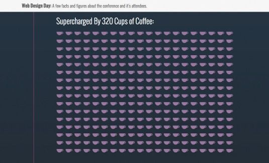
The amount of coffee drunk at the conference was begging to be displayed dramatically in this infographic. Each coffee cup image represents two cups of coffee consumed to prevent things getting too visually overwhelming. The coffee cups swing into place with a bit of spring to them and appear with staggered timing. We accomplish this with animated 3D transforms and a handful of nth-of-type rules.

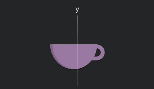
To make the coffee cups appear to rotate in 3D space, we'll rotate them around the y-axis. HTML elements lack any depth, so the cups are essentially postcards in space: they have a front and a back, but if we look at them from the side, they're essentially invisible because they're infinitesimally thin. The keyframes for our animation look like this:
@keyframes swingIn {
  0% {
  transform:rotateY(90deg);
  animation-timing-function: cubic-bezier(0.895, 0.03, 0.685, 0.22);}
5% {
  opacity: .5;
  animation-timing-function: linear;}
60% {
  transform:rotateY(-20deg);
  animation-timing-function: cubic-bezier(0.165, 0.84, 0.44, 1);}
100% {
  opacity: 1;
  transform: rotateY(0deg);}
}
We also set the perspective property on our parent element to be sure all our coffee cups are rotating using the same perspective:
ul.cups {
  perspective:800;}

Over the course of this animation, both the opacity and the rotation of the coffee cups are affected at different rates. It starts with a 90-degree rotation around the y-axis, which means our paper-thin image is rotated and can't be seen. It ends with a rotation of 0 degrees, which means it's flat to the screen. It rotates past its final position to create that little bit of a bounce back into place.

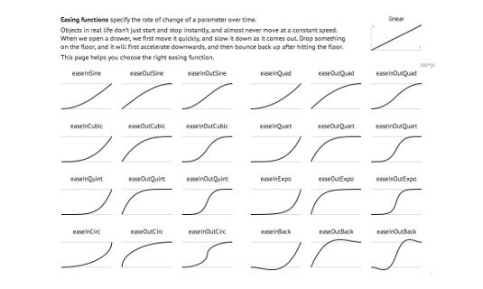
The animation-timing-function is also set differently between keyframes to maximise the 'snappiness' of the movement. You can't animate the animation-timing-function property, but you can set it to different values between keyframes as we have here. The animation-timing-function defined in our 0%keyframe will be used between the 0% and 5% keyframes and so on through our keyframes as each new animation-timing-function property is declared within a keyframe rule.

Similar to the fadeUp animation for the bar chart labels, the animation for the coffee cups is assigned to the <li>s in each list, using a number of classes. In this case, since the total number of coffee cups varies so greatly, the :nth-of-typepseudo-class selector is used to assign different animation-delay property values to the coffee cup <li>s in groups of 10. As the coffee cup list comes into view, each <li> will be assigned the class of .swing-in via jQuery. The :nth-of-typerules in our CSS will determine the animation properties assigned to each individual coffee cup <li>:
.swing-in:nth-of-type(2n+1) {
  animation: swingIn 0.9s 0.75s;
}
These classes use the .swing-in class to set an order for the elements to take on the swingIn animation. The elements also have varying values for animation-delay property (the second number in the shorthand). These override each other causing the coffee cups to animate in groups of 10, giving the animation an almost striped look as the cups all appear from assigning one class. I used a Sass loop to create these rules with incremental amounts of animation-delay. Now let's take a look at the JavaScript that's taking care of the logic and playing conductor to all our CSS animations and transitions in our infographic.

Triggering the animations

Each of our animations needs to be triggered as it comes into view based on how far down the page we've scrolled. There are a number of libraries and scripts that can give us that sort of information. I've chosen to use the inview jQuery plug-in. This plug-in can fire an event whenever a particular element is within the visible viewport area. Using that event, I assign the CSS classes containing my animation properties when the element in question is visible and then remove it when it's not. CSS animations execute when they are assigned. So, adding and removing a class with animation properties in this way essentially re-triggers an animation each time it's added. That's exactly what I want to do here. Remember our .date-anim-in class that had the animation properties we wanted our date markers to use? We can assign it to each year's marker as it comes into view, like so:
$(".date").bind('inview', function(event, visible, visiblePartX, visiblePartY) {
  if (visible) {
    $(this).addClass('date-anim-in');
  } else {
    $(this).removeClass('date-anim-in');
  }
});
Using the inview plug-in, we look for a <div> with the class of .date and add the .date-anim-in class when it's flagged as being visible. When added, the associated animation properties are applied and our date marker animates in with the popIn animation. 

When it's not visible, the .date-anim-in class is removed. The .date <div> is returned to its intrinsic styles and we're ready to re-assign the .date-anim-in class when it comes back into view. Our year markers are now popping in as we scroll down the timeline. While the coffee cups are controlled in the same way, bar chart animations have more going on:
$(".nine .food").bind('inview', function(event, visible, visiblePartX, visiblePartY) {
  if (visible) {
    $(".nine .veg").removeClass('fade-down').addClass('food1').css('width', $(".nine .veg .label span").text()*2);
    $(".nine .pierogi").removeClass('fade-down').addClass('food2').css('width',
    $(".nine .pierogi .label span").text()*2);
    $(".nine .meaty").removeClass('fade-down').addClass('food3').css('width',
    $(".nine .meaty .label span").text()*2);
  } else {
    $(".nine .veg").toggleClass('fade-down food1').css('width', '0px');
    $(".nine .pierogi").toggleClass('fade-down food2').css('width', '0px');
    $(".nine .meaty").toggleClass('fade-down food3').css('width', '0px');
  }
});
In this case, as our .food section for each year becomes visible, we make three changes to each of the three food items represented in our bar chart. First, we remove the class .fade-down from it (if it's there). For example, if we were scrolling back up through our infographic, the .fade-down class would be applied to charts we'd already scrolled past. 

Next the .food1 (or .food2 or .food3) class is added. This was the class that was associated with our staggered delay fadeUp animations. Lastly, we assign a width to our food item based on the total number wrapped in the <span> to trigger the transition we set earlier. On the flip side, when the .food section is no longer visible, we reverse the class assignment and set the width to 0 so that it's ready to play again should it come back into view. And with that, our infographic is fully animated!
Share:

Popular Post

Web Design

5 Quick-fire portfolio tips from design experts

Your design portfolio is one of your most useful tools. It can win you commissions, help you snag a new design job, attract collaborators, a...

Labels

Most view post