

In this Adobe Illustrator tutorial I'll show you how to create icons simply and easily, so you can create large volumes of them in no time at all. I’m going to design two icon sets: a set of digital phone/tablets and a set of coffee-making items.
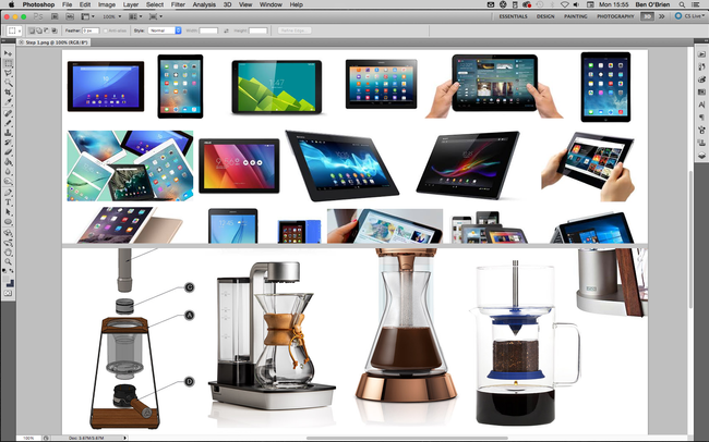
Whatever your set of products is, do your research! A client would want all the products to be correct, and you should too. Even if it’s a personal project, you can’t accidentally add a camera button to an original Nokia 3310 or put a two-pin plug on a British kettle. If you’re illustrating a product for a client, ensure you know how it looks all the way round, so you understand it as a real-world object.
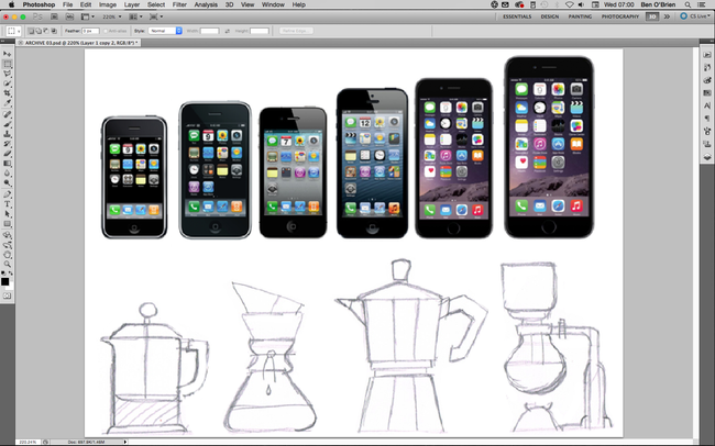
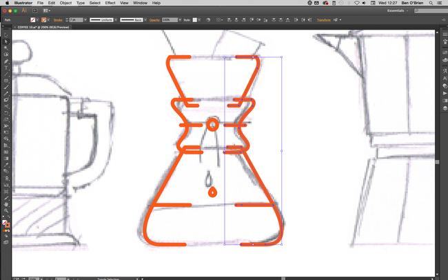
You can start off however you wish – I always draw everything in pencil, but for many products you can trace a photo. If you have a tricky shape to draw and it happens to be symmetrical – for example a lightbulb – you can just draw one half of it (I’ll come to that later!).
Many products are perfectly symmetrical, which makes things nice and simple. Once you have the linework, select it all with Selection tool (cmd+V) and you’ll see a range of Alignment buttons appear in the top bar. Click either the horizontal or the vertical Align Centre button, depending on what you need, and everything will snap into symmetry. You can also group objects together, and then align them with other objects or groups.
For symmetry on more shapely objects, illustrate one half perfectly, then select these halves and copy and paste them all in one go by holding down shift+altand hitting the right Arrow key, this will keep these lines level with their originals.
Still with the copied objects selected click Object > Transform > Reflect from the main menu, select the Vertical option and click OK. Place this side of the object to get the width correct (using only the left and right Arrow keys so they stay aligned with the other half).
Using the Direct Selection tool (cmd+A) join up the two sides of each line by selecting the two line ends and clicking cmd+J.
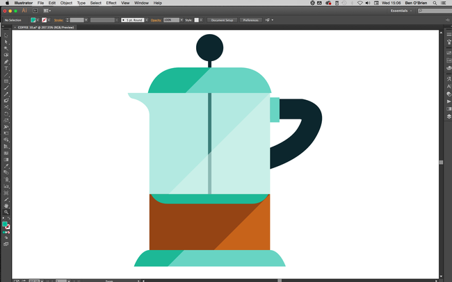
When I'm not using gradients, I often duplicate an object and then cut it at a corner. I use the Pen tool (again holding down the shift key) to create a shape cropped at a 45-degree angle, which I then colour in a lighter or darker shade to add a simple but effective shadow or highlight.
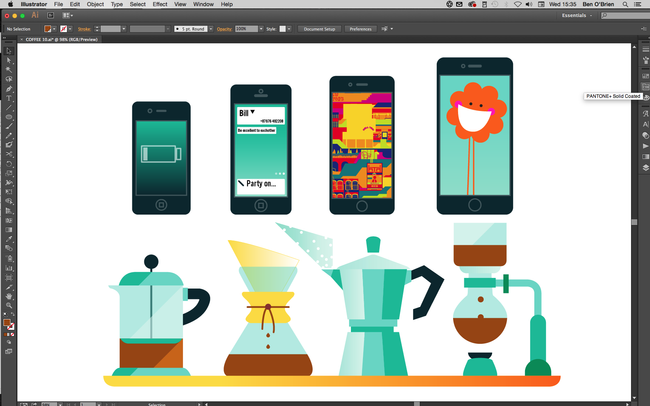
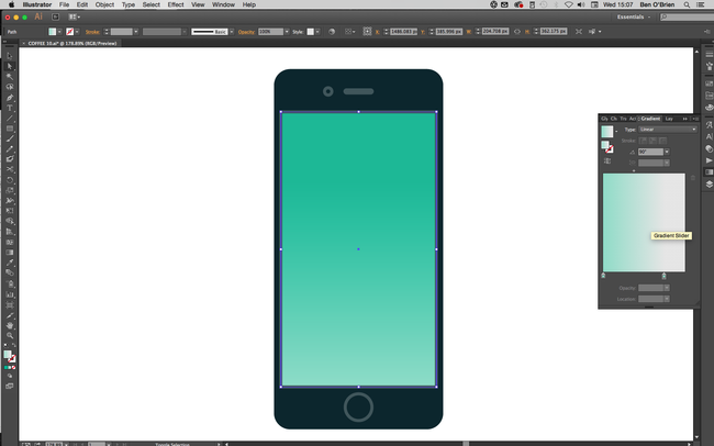
Finally, if the size you’re using the icons at allows, you can really bring them to life. A tech device looks uninspiring with nothing on the screen, so use this space to demonstrate its functions or sell an app. Graphic product illustrations used within a bigger illustration (for example, if these coffee facilities were part of a wider scene) will draw the viewer in.
01. Know what you're representing
02. Draw it in pencil
03. Get rid of kinks
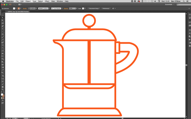
When creating linework, always keep lines and angles straight and clean. Your illustrated product icons may be used quite small on the page or screen, and unnecessary kinks or curves can confuse the eye and make things unclear.
There are two main tips for this. First, with the Shape tool, hold down the Shiftkey to get perfect circles and squares or polygons that sit straight. And second, with the Pen tool hold down the Shift key to only draw angles at 45 degrees or 90 degrees to an axis.
There are two main tips for this. First, with the Shape tool, hold down the Shiftkey to get perfect circles and squares or polygons that sit straight. And second, with the Pen tool hold down the Shift key to only draw angles at 45 degrees or 90 degrees to an axis.
04. Make use of symmetry
05. Reflect more complex objects
Still with the copied objects selected click Object > Transform > Reflect from the main menu, select the Vertical option and click OK. Place this side of the object to get the width correct (using only the left and right Arrow keys so they stay aligned with the other half).
Using the Direct Selection tool (cmd+A) join up the two sides of each line by selecting the two line ends and clicking cmd+J.
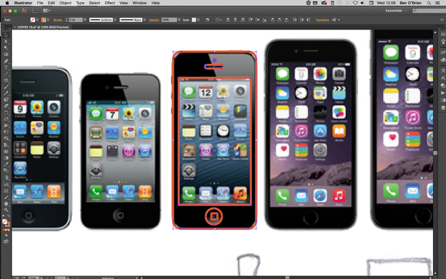
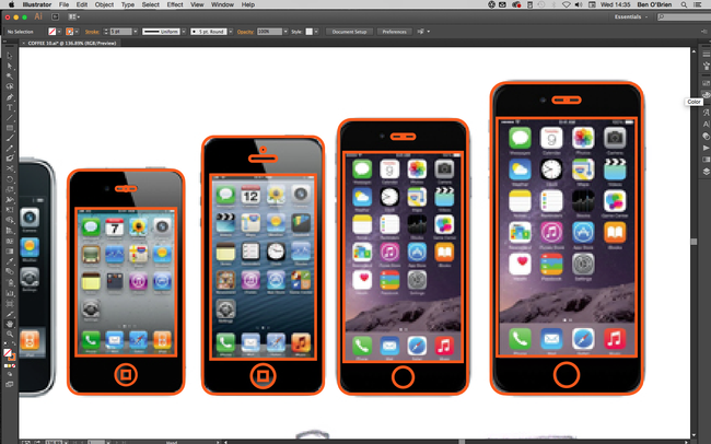
06. Maintain consistency
If you’re working on a collection of products, make sure you're always considering the other items in the collection. If buttons are the same across products, then copy and paste them, if the curved corner is always the same size, then make sure you’re using the same corner.
Often (with tech products especially) you can make one device, then copy/paste it and simply adjust the proportions to make the next icon, which can really speed up your workflow.
Often (with tech products especially) you can make one device, then copy/paste it and simply adjust the proportions to make the next icon, which can really speed up your workflow.
07. Add some colour
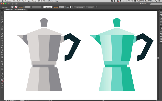
With your linework complete, move on to colour. Generally, you want to get the tones as close to reality as possible, but there are some exceptions. For example, most metals are a mid-grey, which is boring for everyone! Instead, I use a variety of blue-grey tones (light or dark) and usually stray into turquoises.
Try using a transparent blue for glass, too, as white can feel cold. I also recommend oranges and yellows for wood surfaces to really bring some warmth.
Try using a transparent blue for glass, too, as white can feel cold. I also recommend oranges and yellows for wood surfaces to really bring some warmth.
08. Explore gradients
As we’re creating illustrated icons, you don’t want to go too far on minor details and textures. However, you can really sell the surface of a product with a gradient. To get the best out of Adobe Illustrator, don’t create gradients from one colour to the next (it often results in banding when printed).
Instead, choose a flat colour for an object/shape, select the shape and duplicate it (in the layers panel), then add a gradient to this top object going from an opacity of 100% down to 0%.
Instead, choose a flat colour for an object/shape, select the shape and duplicate it (in the layers panel), then add a gradient to this top object going from an opacity of 100% down to 0%.
09. Try including shadows and highlights
10. Add extra details


No comments:
Post a Comment