And if you are looking for a new career direction – in illustration or another creative field – then don't miss our design jobs page, which lists plenty of opportunities.
01. Don't take yourself too seriously
In the end, once her teacher had pointed out what he really wanted to see was work more like the doddles in the sketchbook, she started enjoying drawing again. "I stopped worrying about coming up with something really grand, and instead just started documenting little funny moments in life," she says.
02. Don't worry about the future
I couldn't figure out how to get over this so I just ignored it and carried on, she explains. "It's kind of pointless to worry about things I'm not ready to tackle. My energy is much better spend focusing on the now and making sure I'm giving everything my best shot."
03. Push yourself
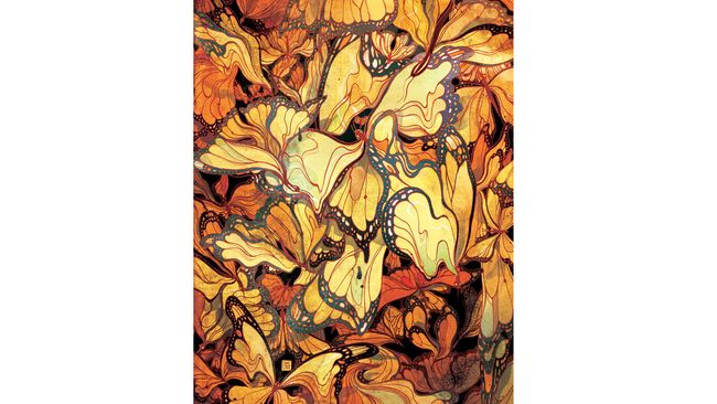
Ngai gives an example of when she was working on a piece for The New Yorker, which showed butterflies as leaves. It was approved, she says, but she wasn't happy with it. She asked for more time and discovered that she really liked a 'melty' sort of look she was able to achieve with the Liquify tool in Photoshop. But as using this tool meant the image wouldn't be high enough resolution for print, she ended up remaking the entire illustration. And she thinks the piece is much better for it.
04. Find the fun part
"There are no boring assignments," says Ngai. "Only boring solutions." There's always something you can find in an article that's interesting. When choosing a way to go for an image, aim for "something you'll enjoy that captures the spirit of the story without giving away the ending."Don't be afraid of adding personal touches in your client work, either. In one piece of client work, Ngai added a fox, because she likes foxes. Though if the client had asked why it was there, she stresses, I would've said it's to bring out the red in another part of the piece. "But really it's just to make myself happy."
You also need to tell your story with strategic composition. "Illustration is like a puzzle," says Ngai. "You have to make every piece fit for the whole thing to work."
05. Turn limitations into assets
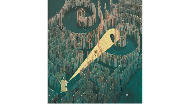
She gives the example of a piece of work for Cincinnati Magazine. The article was about new imaging technology that helps doctors accurately locate cancer cells. There were several potential problems in the piece, she didn't want the piece to be too dark or negative – for serious subjects like this, sometimes a lighter tone is needed – she didn't want to include images of breasts, as that isn't allowed in American magazines ("unless you're Playboy"). On top of that, she didn't know what this new imaging technology might look like.
Instead of despairing in this, she had to come up with a metaphor, and chose to use a maze. This is a cliché, she says, "but clichés are clichés for a reason, they're powerful signifiers. People know what you're talking about."
If you have one strong cliché in your work, you can use it as a "Rosetta Stone for the viewer to decode the other metaphors in your image," she says. "They should be used with caution, but if you can make them visually engaging, then go ahead."
In this image, she concludes, "The result is more interesting because of the limitations."
06. Find your niche
Finding the right clients is key, says Ngai. "Why shouldn’t you find your own niche and cultivate your list of clients who appreciate what you do? The best work comes out when the other person trusts you, and you trust them to trust you."You also should be careful of doing too much work that you're not interested in or not proud of. "What we get hired for is what goes into our portfolio, so if we keep making concessions, we’ll get further and further away from the feeling we had when we had when picking up tools as a kid." So if you ever feel you're making concessions, just remember it was when Ngai rediscovered that childlike delight in drawing that her career really began.


No comments:
Post a Comment