Many of us have been on the receiving end of that relationship. And many of us will remember a time when we've opened up that PSD file and thought: What on Earth is this?
So if you want to avoid damaging relationships and getting yourself a bad rep within the design community, you need to understand, and follow, these basic rules of Photoshop CC etiquette. These rules may seem like a pain, especially when you're used to working in your own way, but if you get into the habit of sticking to them, they'll save you a great deal more pain in the long run.
If you know your Photoshop skills could do with an update, why not make a start with our pick of the best Photoshop tutorials?
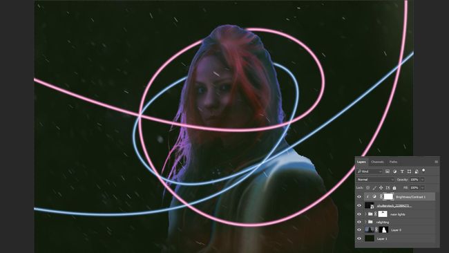
01. Name your layers
Once labelled, organise these layers into group folders, allowing you to move and show/hide various large sections with ease. Layers such as backgrounds or other solid elements that you wish to be preserved should be locked to ensure they don't get clipped or moved accidentally.
Once you've completed your task, it's always worth having a quick glance over your file to filter out and delete any unnecessary empty layers (a good way to check if a layer is empty is pressing cmd+T). You'd be surprised how many crop up.
02. Structure your files logically
Establish a simple naming convention that not only works for you, but would also make sense if your granny had to read it. Naming conventions such as 'New', 'Latest' or 'Website-Final' won't cut it (you can almost guarantee that it won't be the 'final').An example of a good naming structure could be: 'Name_Type_Size_Version'. Why this structure? The company name is the first thing you see to identify the brand of the file. 'Type' illustrates what the file is intended for (Website, Email, etc). 'Size' is only applicable in certain cases such as banners, whereby you will have various sizes (for example: 120 x 600 or 300 x 250), and finally 'Version', which could be simplified to 'v2', 'v3' and so on, can be applied when making revisions to the original file. It's good practice to save each progression as another file, in case you need to refer back to previous versions.
Including these variables in the file name is a smarter way to organise your files and will definitely eliminate any future confusion.
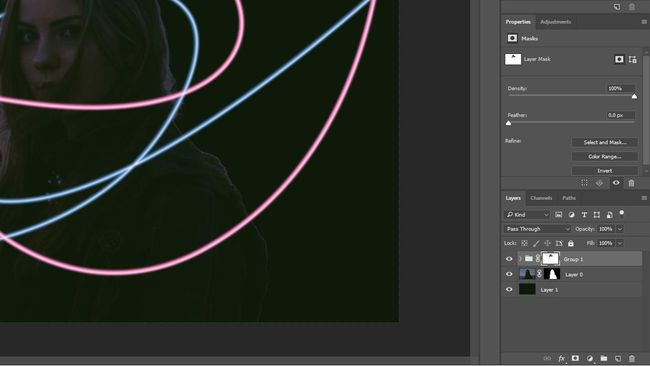
03. Mask once
04. Save your paths
The Pen tool to a designer is like the lightsaber to a Jedi. The better you are at using it, the more powerful your skills become. So once you're done spending hours making the perfect clipping path, be sure to save it, otherwise you risk having to do it again later in the job.
05. Don't stretch text or images
The same applies to fonts; kern, track and scale but whatever you do, absolutely do not stretch. Ever. It's very unprofessional.
Using smart filters where possible will ensure vector shapes can be made bigger and smaller with no distortions. It's handy to bear this in mind when designing for mobile and Retina displays.
06. Snap to something
One sign of a good designer is alignment, so switch on those rulers and get snapping: Snap to grid. Snap to Pixel. Snap to Layer. Snap to something! This ensures both that your designs are pixel-perfect and that all elements within them are easy on the eye.07. Apply effects gracefully
Avoid the temptation to apply Color Overlay, Drop Shadow, Bevel, Outer Glow and Strokes to each and every element of your design. It's a tool job – know the difference between each one and when to use it. The main objective should be to use effects that complement the design and elevate your user experience. Subtlety is the key.If you're applying the same effect on numerous elements then its always worth copy/pasting the layer styles to ensure the effects are exactly the same. Also, be aware of the Global Lighting option and when this needs to be applied. When in doubt, turn it off, so you can customise each element and effect to your liking. Otherwise one day you'll be wondering who changed all the styles in your design.
08. Collect up unused styles and images
After experimenting with various styles or images, it's good practice to put all these unused elements into one folder titled something like 'Unused'. Have it switched off at the bottom of the original file (it can be deleted on copied revisions thereafter to keep file size down).This rule is an exception to the general rule about removing unused layers. It follows the same logic as keeping various little elements such as icons and small imagery handy just in case you need to make quick changes or additions.


Such a really helpful article. terribly fascinating to scan this text. I would wish to thank you for the efforts you had created for putting this on ink awe-inspiring article.photoshop course in chennai
ReplyDelete