Showing posts with label graphicdesign. Show all posts

Top 5 best InDesign alternatives

If you're looking for InDesign alternatives, you've come to the right place. Launched in 1999, Adobe InDesign quickly became the industry standard for desktop publishing (DTP), and it’s remained so ever since. However, it’s now part of the Adobe Creative Cloud, and so to access it, you need a monthly subscription, either to the app itself or the Creative Cloud suite as a whole.

1. Affinity Publisher

Launched in 2018, and emerging from public beta this June, Affinity Publisher is our top pick if you’re looking for a subscription-free alternative to InDesign. This desktop publishing software offers excellent page layout features for both printed and online media, such as live master pages, including nested master pages; image frames with intelligent scaling options; text wrapping with fine padding control; advanced guides, grids and snapping; OpenType support, drop caps, text on a path and custom table formats.

You can import and export to all both raster and vector files with Affinity Publisher, including layered PSD, PDF and EPS formats. Until recently you couldn't import InDesign files; you could only save them as PDFs and import either the whole PDF or individual pages. However, IDML import will be in v1.8, which is already available in public beta for users to try.

2. QuarkXPress

Back in the 1990s, QuarkXPress was the king on the desktop publishing block. And many designers, publishing houses and corporations who started using it before InDesign arrived have continued to do so. The software can be used to create everything from posters and flyers to brochures, catalogues, and magazines, as well as ebooks and web and mobile apps.

First launched in 1987, this reliable and feature-packed software can do almost everything that InDesign can do, plus importantly, it can import InDesign files. Available for PC or Mac, it continues to be updated on an annual basis, usually around late spring/early summer, and the latest version is Quark XPress 2019.

3. Scribus

If you’re looking for a free and open source alternative to InDesign, then we recommend checking out Scribus. This excellent tool has an interface that’s very similar to InDesign and is surprisingly feature-packed for a zero-cost tool.

First launched in 2001, Scribus has an enthusiastic developer community around it that keeps it constantly updated with new features and ensures its stability. Available for Mac, Windows and Linux, it supports most of the desktop publishing features you’d find in paid software, including support for OpenType, CMYK colours, spot colours, ICC colour management and versatile PDF creation, as well as some unexpected touches, such as vector drawing tools, emulation of colour blindness and the rendering of markup languages like LaTeX or Lilypond.

4. Swift Publisher

Swift Publisher is a budget desktop publishing app for Mac only. It comes with more than 500 templates for a range of specific projects, including bi-fold and tri-fold brochures, catalogues, business cards, social media, disc labels and covers, address labels and more.

You’ll also have access to a collection of 2D and 3D heading presets, 2,000 free clipart images, 100 image masks, and it includes some sophisticated page layout features including two-page spreads, unlimited layers, master pages, customisable grids, rich text tools, printing to RGB or CMYK, and export to PNG, TIFF, JPEG, EPS and PDF.

5. LucidPress

Lucidpress is an intuitive, web-based, drag and drop tool that allows you to create content for print and digital, including flyers, brochures, business cards, invitations, leaflets, newsletters, magazines, photobooks and more. Largely targeted at people with minimal DTP skills or experience, it comes with both free and paid-for templates to make this super-easy.

The software is also integrated with Google Docs, YouTube, Dropbox, Flickr, Facebook, Unsplash and other tools to allow you to import existing content. Once you’ve completed your designs you can publish them online, embed them in emails or webpages, push to social media, download them as print-ready files, or order directly from the Lucidpress print shop.
Share:

Top best graphic design jobs in 2020

If you're looking for a brand new challenge in a different discipline, head over to our design jobs board, which has lots of active job listings from awesome employers just waiting for you to apply.
You might want to stay close to home or have an adventure elsewhere. Either way, we've got the hottest new job opportunities in the UK, USA and worldwide for you to explore.


Is it time you found a new graphic design job? If so, you'll want to find out what exciting opportunities are around. We will keep adding the newest graphic design jobs as soon as they become live, so if you don't find your perfect new career straight away, keep checking back to make sure you don't miss out.

Graphic design jobs: US

Motion Graphic Designer
  • Location: New York, NY
  • Salary: DOE
In this role, you'll design and create playful, colorful and inviting animated elements/assets, carrying them from concept to completion. A Motion Graphic Designer with excellent creative and technical skills is wanted for a three-month contract with a premier beauty brand.

Art Director – Games
  • Location: Atlanta, Georgia
  • Salary: DOE
You will execute and produce game art yourself, in this hands-on role. If gaming is your passion and you both love and consumes anime, don't miss this opportunity. An experienced Art Director who won't just direct, conceptualize or share opinions on their games is needed by Lionheart Games.

Senior Art Director
  • Location: New York, NY
  • Salary: DOE
You should have 5-8 years of relevant experience and a minimum of 3 years agency experience for this full time, contract position within a New York Agency. A Senior Art Director is required for this role within the spirits industry.

Junior Art Director
  • Location: New York, NY
  • Salary: DOE
The company is a baby care startup on a mission to make parents' lives easier by providing them with the best performing products. The ideal candidate will lead and manage the creative vision for Coterie. An experienced Junior Art Director is needed by Coterie. This position will report directly to the VP of Marketing and will be based out of its headquarters in NoHo.

You should also be an independent, action-oriented thought leader who works well in unstructured, fast-paced environments. This job will suit an original thinker with a passion for developing evocative and disruptive creativity.

Junior Graphic Designer
  • Location: Greater Los Angeles Area, CA
  • Salary: DOE
As a Junior Designer, you will work very closely with production and creative leads to develop engaging motion, still and multimedia content that inspires and delights audiences across platforms. This agency seeks a Junior Graphic Designer to join its team. This is one of the largest privately held agencies on the West Coast and it offers a holistic approach for brands in search of creative solutions to their marketing challenges.

Graphic Designer (Sports)
  • Location: Pittsburgh, PA
  • Salary: Competitive plus perks
The ideal candidate is capable of creating digital designs and graphics to tell the story of YinzCam's mobile fan experience through both print and digital channels.

If you have an eye and a talent for graphic design for sports and want to work in a career that involves sports and digital design on a daily basis, this entry-level designer position might be for you. Recent college graduates with a love of sports and design are encouraged to apply.

Graphic design jobs: UK

Head of Art
  • Location: London, UK
  • Salary: £55,000 - £60,000
As the Head of Art, you will oversee all creative content output across the account, from conception and ideation, through to creation and delivery. One of the most exciting creative content agencies in London wants a Head of Art to work on the most recognizable technology brand on the planet.

Graphic Designer
  • Location: The Lanes, Brighton
  • Salary: £10 per hour
A high level of graphic design skills is essential with the ability to work with customers discussing and interpreting the design brief quickly & efficiently. A Graphic Designer is required for a busy Brighton design and print company.

Art Director
  • Location: Leeds, UK
  • Salary: DOE
If you have knowledge of current game art production pipelines and workflows, plus experience working in game development as a senior member of an Art Department, this is a fantastic opportunity and an exciting role. An Art Director is needed at a northern-based, highly acclaimed company that makes mobile and console games whilst specializing in VR/AR.

Freelance Creative Director
  • Location: Shoreditch, East London
  • Salary: £250 per day
Your job will be to curate the client’s social media presence, ensuring every touchpoint of the brand is consistent and in-line with visual identity as outlined in brand strategy.

The OK COOL studio is turning UP. It's inflow state; winning dream clients on an international level. The team is tight. The vision is to move away from the fixed team model and continue sourcing and partnering with the hottest young freelance social media creatives in the world.

Creative Artworker
  • Location: Folkestone, Kent
  • Salary: Up to £26,000
You’ll be developing brand identities and campaigns using all types of media, from web graphics to print campaigns. This is a great opportunity to expand your skills as part of a growing, dynamic team. As a Creative Artworker at this agency, you’ll need 2-3 years’ agency experience in online and offline art-working and design.

This includes repositioning internal messaging to creating new experiences, exciting pan-European communications, destination branding and the curation of memorable live events. This agency has a reputation for high-end creative delivery.

Creative Video and Motion Designer
  • Location: Cardiff, Wales
  • Salary: £18,000 - £22,000
The ideal candidate should be passionate and self-motivated, with excellent video editing capabilities along with a strong motion design skillset. A creative video editor, with proficiency as a motion designer, is required. You'll be working in a fast-paced, demanding, but relaxed environment within the health, fitness and lifestyle market.

Junior Art Director
  • Location: London, UK
  • Salary: Up to £35,000
A rare and exciting opportunity to help shape and grow an agency's creative output from the very early stages – you will set the tone, not follow. A talented Junior Art Director is needed by an exciting new agency, to join its burgeoning creative department.

Creative Graphic Designer
  • Location: London, UK
  • Salary: £35,000 plus pension and healthcare
An experienced and versatile Creative Graphic Designer is required. They will also have a creative eye to enable them to produce beautiful content, but also a knack for data visualization and infographic creation. The ideal candidate will have previous B2B SaaS brand experience on either the client or agency side.
Share:

The best collage Maker Tools in 2019

There are many web and mobile applications that have built-in collage maker tools, as well as dedicated standalone programs in both app and browser format. However, the quality of these varies wildly, so we've tried some out to let you know which ones are up to scratch.

Another perfectly viable option to create a collage is to use general design software, such as Adobe's suite (get Adobe Creative Cloud here). We've got the pick of the best Photoshop tutorials to help you out with this. Or, if you want to use a high spec smartphone to use with these collage apps, why not check our selection of the best camera phones?


1. MOLDIV

Moldiv claims to be the all in one photo-editor that offers everything you need in photography, and it doesn't disappoint with its collage maker feature. The collage maker portion of the app is sleek and easy to use. We like that the workflow in the college setting is non-destructive (unlike the main editor mode) so you can mess around with layouts without touching your original version. You can also customize with stickers and play with different fonts.

2. Photo Joiner

Photo Joiner offers a range of different collage maker options. The one we're most interested in here is Collage; a classic collage maker tool. The process is easy to follow: upload images, choose a template, drag your images into the slots (you can zoom in and out, mirror or rotate to suit the layout), then save and share. You can narrow templates by the number of photos included, and set custom image sizes and borders.

If that's not what you're after, take a look at one of the other Photo Joiner tools. Stitch is a simpler tool designed for joining together photos vertically or horizontally, using one of Photo Joiner's preset layouts. Meme lets you add text and decorations to images. FB Cover offers a range of templates to fit Facebook's cover image dimensions, to take the effort out of creating an impressive cover collage.

3. Ribbet

Free online collage maker Ribbet has a smart interface, which is a delight to use. There are plenty of handy features to help you create a custom collage: pick a template, upload images, adjust sizing, round corners, edit lighting, exposure and so on. If you change your mind, you can easily adjust your template by adding extra rows or columns. The basic version is free, but to access the majority of the more complex templates you'll need to upgrade to the Premium version.

4. Adobe Spark

Spark is a free photo collage maker from Adobe. Its simple interface means it doesn't require the same learning curve demanded by most Adobe applications: simply name your project and use the various design options available to arrange your photos into an eye-catching collage. You need a Creative Cloud account for full CC benefits (sign up here), but it is perfectly useable without.

5. Canva Collage Templates

Canva offers one of the best free online collage makers around. This is an all-round design package you can use in the browser or as an app for iOS and Android. The basic package is completely free, but there are paid plans available if you want something more advanced.

Amongst Canva's tools is a big selection of collage templates, which look great and are easy to use. You can also spice up your collages with Canva's enormous selection of effects, filters, fonts, shapes and more.

6. BeFunky

BeFunky is one of the best free online collage makers around. It offers tons of templates, a simple interface and seamless integration with the BeFunky Photo Editor. The free version works well, but if you're after more photo effects, higher-resolution downloads and the ability to use your collages commercially, you'll need the BeFunky Plus account. As well as an online tool, BeFunky is available as an app for iOS or Android.

7. piZap

Ad-funded online collage maker piZap has the option of a Flash interface or a new HTML interface. The latter is currently in beta, and to be honest there are more intuitive free collage maker tools on this list. However, there are plenty of templates, stock images and fonts to choose from, and you can add text and stickers to liven things up. A nice feature is the inclusion of Facebook banner templates, to help you upgrade your social media branding with ease.

The Pro version offers ad-free designing, a much bigger selection of fonts, stock images and templates, the ability to download your collage in super high resolution, and more. You can suss it out via the free trial before you commit.

8. PhotoCollage

PhotoCollage has a does-what-it-says-on-the-tin name, and the web-based collage maker is no less straightforward. It works on Mac, Windows, Android and iOS platforms including touchscreens, and you can choose from collage templates or use your skills to create freeform collages.

You work with low-resolution images, then once you're happy with the arrangement you can choose to 'order' a high-resolution version of your design. One frustrating feature is that the editing tools aren't sticky, so you'll probably need to scroll up and down to find the ones you want. The interface also isn't as nicely designed as other tools on this list.

9. Photo collage maker

Fotor is a professional-level online collage maker. You can import a load of images, which are displayed on the right-hand bar, then choose when and where to place them in your collage. This simple feature makes it easy to put together attractive collages. The only glitch we ran into is that large images failed to load, with no error message to indicate the problem.

You can only get part of the way with the free version – you can design collages, but they'll feature the Fotor watermark, which isn't ideal. For advanced features, an ad-free interface, watermark-free collages, and cloud-based storage, you'll need to shell out for the Pro version.

10. Photovisi

Photovisi is a stand-alone collage maker with no fripperies and no photo editing tools to distract and confuse. You simply select a collage design, add your photos and drag them around till you're satisfied, then download it.

What could be easier? If you want to download a watermark-free college, you'll need to pay upon the Premium plan. Some of the templates are a little on the cheesy side, and overall this collage maker tool is looking a little dated.
Share:

How to create a fantasy beast

The creature design is built on the foundation of understanding real-life animals. Even when we design fantastical creatures like dragons or demons, pulling from nature can help make it more believable. Learning how to draw real-world animals, like how to draw a bear, can go a long way when tackling fantasy creatures.

First, I explore the animals themselves. Drawing each species helps me get to know their anatomy. I take note of certain traits, proportions, markings, and shapes as I draw.


Then I find a shape inspired by one of the animals, which acts as a foundation for where I'd like to go. With my best pencils to hand, I use a harder pencil lead to keep things light and workable. I'm only concerned with getting down big shapes, like the shape of the head and general body and tail.

Now I add detail and other shapes, looking at the secretary bird. Claws, spikes, scales, fur, and feathers help to flesh out its silhouette. It's important to make it iconic. Having too much detail or "stuff" happening on your creature could dilute the effectiveness of your design.
  • Materials you will need...
  • Blue Col-Erase pencil
  • HB Caran D'ache Graffwood pencil
  • Staedtler rubber eraser
  • Acid-free sketchbook paper

1. Find the general shape

Begin with the Col-Erase pencil by blocking in the general structure of the creature, working from light to dark

As usual, I start light and keep in mind the characteristics I want to combine. I'm always asking myself questions. What does this creature eat? How big is this creature? What is its general attitude? Is it male or female? Addressing these areas can help direct your design.

2. Build up forms

Next, I begin to lie in big forms. I want to find the anatomy of this creature. Because my beast has a skeleton, I'm careful to take note of where certain bones and landmarks are.

I indicate key elements like the shoulder blades, the pelvis, and the rib cage. These large forms will help me indicate where the muscles lie and help build a more believable creature. Remember to keep it light! We want to build on top of this drawing as we go.

3. Nail the muscles

Remember that vertebrate anatomy is similar between species. You can think of your own body as a reference point

From here, I begin to define muscle groups, being sure to understand where certain muscles are connecting. This is vital and is informed by producing lots of animal drawings.

It's important to know where muscles lie on your creatures for animation and modeling. Being able to show and tell where and how your creature moves are crucial when creating a grounded creature design. Keep the shapes big and light at this point. Think about where the muscles would attach to the bone.

4. Look at those details

Next, I begin to define certain details and shapes, always being careful to look at my reference. Here I'll begin to look at the tapir for the bulk of the body and the feet.

The spiny-tailed lizard helps with the tail, head, and texture of the creature. I also look to the secretary bird for ideas about feather placement, eye placement and eventually color. When I draw in a new body feature, I'm careful to start with a lighter touch. As I build up my creature, I push down harder on my lead.
  • Tip: Take advantage of the Col-Erase pencil
Because it's waxy, it takes a while to solidify forms, and this lends itself to exploration.

5. Now, really look at those details!

As you draw those tapirs, you notice that each toe has a different shape and that the front legs have more toes. You'll notice the shape of the secretary bird's eyelids and the way the skim folds on the face.

These small details can really push your creature's design into the realm of believability.
  • Tip: Rubber erasers
These are slightly more effective than a kneaded eraser and will do a better job of removing the Col-Erase lines that you put down. You can cut them with a sharp knife to create a nice corner for precision erasing.
Share:

7 FREE Portfolio hosting options for Designers

Having a good-looking portfolio website is one of the basic things you need to take care of as a designer. But if you're just starting out, or even if you're simply cost-conscious, you might be reluctant to spring for a paid portfolio hosting option.

Finding a free home for your design portfolio isn't easy – there are usually restrictions to the level of service that you won't get with a paid plan. But it's still possible to find a free hosting option for your portfolio that doesn't involve too much compromise; we've found seven of the best services.

1. Portfoliobox

Billed as offering everything you need to create a professional portfolio website, Portfoliobox is specifically geared towards creatives and offers a stack of ready-made templates and layouts that you can edit in the browser through a drag-and-drop interface.

The free version gives you a portfolio with room for 30 images and 10 pages, plus a zero-commission e-commerce platform; the pro version removes the Portfoliobox branding and also gives you a free domain and 24/7 support.

2. Behance

Behance might not be your first choice when it comes to finding some portfolio hosting, but as a hugely popular creative network, it's the perfect place to show your work. Even if you have your main portfolio elsewhere, it makes sense to have a presence on Behance and to keep it updated with your latest projects.

It's not particularly sophisticated in terms of options, but its straightforward interface makes it easy to design basic pages on which to share your work, and as a free service it's hard to beat, especially once you start picking up followers.

3. Adobe Portfolio

Another Adobe offering, Portfolio isn't strictly free – you need a Creative Cloud account to take advantage of it. But unless you're a staunch Adobe refusenik, always looking for the best Photoshop alternatives, you probably have a CC account, in which case Portfolio is definitely worth investigating.

It has plenty of themes to choose from, all of which can be easily customized – there are loads of examples on the Portfolio site to demonstrate just what the platform's capable of – and naturally it features Behance integration, as well as Adobe Fonts and the option to import photos from Lightroom. All of Portfolio's themes are fully responsive, and once your site's ready to share you can use your own domain name.

4. Crevado

Like Portfoliobox, Crevado offers a free portfolio hosting service alongside paid plans that offer more capacity and features. And while you might find the free plan a little restrictive – it gives you a maximum of five galleries and can hold 30 images, and doesn't provide a contact form – it's a good starting point that you can build upon later if you want to use a custom domain or sell your work online.

Crevado prides itself on taking care of all the technical issues so that you can simply create a fully responsive portfolio with minimum effort.

5. Coroflot

Portfolio hosting is just part of the deal with Coroflot; it's a serious online community created by designers for designers, aimed at helping creative professionals and hiring companies to connect with each other. So if you're looking for more work, having a portfolio on Coroflot is a must, assuming you get accepted.

That's the tricky bit; you can't simply sign up and get your portfolio space. Instead, you need to submit an application that demonstrates the quality of your work, and you'll only be accepted if it meets Coroflot's standards. Thankfully it's also provided a guide to getting your application right; make sure you read it before hitting Send on your application.

6. Dribbble

Dribbble, like Behance, isn't necessarily the place to host your main portfolio, but as a hugely popular design community it's definitely a place to show your work and also works in progress, and hopefully, get seen by potential employers and clients.

As a busy social network for designers, it's also a great platform for getting feedback from other designers and also for seeing what other creatives are working on. And our favorite feature? Dribbble automatically generates palettes based on each hosted shot, so if you see a color scheme you like the look of you can download it instantly.

7. Wix

It's hard not to be aware of Wix as it's made a name for itself with as an easy-to-use website builder with a generous free package. And while you might not think of it as the place to build a portfolio website, it's well worth a look. Among its vast assortment of customizable ready-made templates you'll find a good few options for building a good-looking portfolio.
Share:

The best new UX Books of 2019

UX is a profession that never stands still, but the latest theories, practices, and sub-disciplines can take quite a bit of explaining, and can't just be summed up in a quick tweet or Facebook post.

To keep your UX skills up to date, then, new and up-to-date books can be invaluable. And this year there have been a lot of excellent and important releases.


Here, we’ve selected seven books on user experience, all written by experts in the field and published in 2019, which have been making waves. Whether you’re a UX designer, a manager or just someone who needs to stay informed, they’re all well worth checking out.

1. Loops

In 2019, launching a new digital product is a careful balancing act between speed and quality. When budgets are limited and time is tight, how do you ensure you create a product that gets to market quickly but is also fit for purpose?

The founder and president of Nine Labs, J Cornelius has been building digital products since 1996 and shares the benefit of his experience in this superb new publication.

2. Strategic Writing for UX

When it comes to UX, visual design is usually the area that gets discussed the most, but getting the words right is just as important for the success of a website or app. And yet it’s a subject that’s often overlooked. This book sets out to fill that gap.

Author Torrey Podmajersky has written UX content for Google, OfferUp, Xbox, and Microsoft, and teaches at Seattle’s School of Visual Concepts (SVC), so she has some great advice to offer in this area. In Strategic Writing for UX, she explains how UX text patterns work with different voices, and how to produce text that’s purposeful, concise, conversational, and clear.

3. Building Design Systems

Design systems have been probably the most discussed topic among UX professionals in 2019. Essentially, they allow a design team builds a framework that meets their needs by bringing together all of the critical design components, including style guides, pattern and UI libraries, CSS frameworks and other resources, in one place.

Written by two leaders in the field, Sarrah Vesselov, and Taurie Davis, this book guides you through the process of defining a design language that can be understood across teams and explains how to sell it to key stakeholders and other contributors.

4. Design for How People Think

UX design is ultimately about user behavior, but how much do we really know about how people really think and act? This book aims to delve deeper into brain psychology to provide some practical answers.

John Whalen has a background as a psychology professor and now works as a strategic product/service researcher and designer, so he's the perfect person to write it. In the book, he shows you how anyone on your team, without any specialized training in psychology, can conduct what he calls "contextual interviews" to unlock insights into customer behavior.

5. Ruined by Design

Most books about UX are relentlessly positive and upbeat, and that can sometimes get a bit wearing. So here’s the perfect antidote, in the form of ever-controversial web designer Mike Monteiro.

As a starting point, he points out sardonically that “The world is working exactly as we designed it”. For example, “Facebook’s privacy settings, which have outed gay teens to their conservative parents, are working exactly as designed. Their ‘real names’ initiative, which makes it easier for stalkers to re-find their victims, is working exactly as designed.

6. Emotionally Intelligent Design

Another publication probing the moral and ethical issues of UX design, this book explores new research about emotion and examines how design can help promote emotional well-being.

To help you do so, author Pamela Pavliscak, a design researcher and advisor to Fortune 500, examines new technology that engages emotion, and new emotional design practices. In the process, she draws on both her own research and the latest thinking in psychology, neuroscience, and behavioral economics.

7. Think Like a UX Researcher

People are unpredictable, and so second-guessing how users are likely to behave in using your website or app is the road to failure. Instead, research is vital, but what’s the best way to go about it?

This book takes a deep dive into the theory and practice of UX research and offers practical advice on how to plan and conduct it, analyze data, and persuade people to take action based on the results.

Written by researchers David Travis and Philip Hodgson, who have 55 years experience between them, as well as each holding a PhD in Experimental Psychology, this book would be useful to UX researchers, designers, project managers, scrum masters, business analysts, and marketing managers.
Share:

6 Websites that use Illustration Brilliantly

If you want your website to be on-trend, bringing in some illustration is the perfect way to keep things looking bang up-to-date. It pays to do things properly, though, and software development to remember that illustration's more than just decoration.

The best use of illustration online can be seen when the designers have clearly put a lot of thought into how it can work with – and even enhance – the site's content or a brand's message. Here are six recent examples that have wowed us with their effective use of illustration.

1. Otis Studios

Otis Studios makes music – for adverts, films, games, and dance floors – and also specializes in sound design. The studio prides itself on writing, recording and re-recording until everybody's stoked, and its passion for music and sound comes across in the very first thing you see when you hit its site.

Created by Feral, it opens with an illustrated splash screen stating in rough brush strokes that UX-UI, accompanied by scratchy ink sketches of music gear that we're not going to even attempt to name. The real kicker is how the elements in the composition are arranged in 3D and move in response to the mouse, bringing the page to life and making it near-impossible not to scroll down to find out more.

2. The Food Dispensary

Canberra's Food Dispensary produces a tiny range of ready-made meals that are a cut above the rest. It describes itself as a kitchen of real people working with real ingredients and goes to great pains to point out that everything it produces is handmade, from its pasta to its ricotta and pancetta.

The Food Dispensary's site, built by Swell, reflects that handmade ethos; a swish parallax site peppered with mouth-watering photography, it's grounded with simple pencil sketches of ingredients on a background reminiscent of rough, recycled paper.

03. USELESS

Judicious use of illustration can really help get your message across quickly, and USELESS, built by Nice and Serious, does an excellent job in that regard. It uses illustration to highlight the problem of single-use plastic, opening with a torrent of plastic cups, bottles and carrier bags that pile up at the bottom of the page (and that you can try to shift with your cursor), accompanied by horrifying stats on the amount of disposable plastic thrown away in the UK every year.

04. A Map of Myth, Legend & Folklore

In an online world where it's all too easy to just bang in a boring Google map, we love this beautiful illustrated map of myth, legend, and folklore from English Heritage.

It's an engrossing guide to some of England's historic sites and the fascinating stories behind them, showcasing a small sample of the 400 sites in English Heritage's care, and also featuring local myths and legends as well as upcoming events across the country.

5. Sparky

Sparky is a marketing agency that promises to provide a fresh set of eyes for powerful brands to help them maximise moments, elevate experiences and ignite innovation, and its new site by Angle2 uses illustration to really drive that point home.

The opening page is scattered with pairs of adorable cartoon eyes in various styles that animate when you mouse over them; a neat gimmick that doesn't feel forced, and which should encourage visitors to scroll down and discover how Sparky can help their brands.

6. Finding ctrl

With the World Wide Web having celebrated its 30th birthday in March, and the internet itself coming up for its 50th in October, Nesta has put together Finding ctrl:, an 'online visions' book for the European Commission's Next Generation Internet initiative.

It's a weighty subject, and it's made more inviting thanks to a site built by ToyFight that brings in illustrations and particle-based 3D objects to set the tone for each article and provide visual interest.
Share:

8 Amazing new Graphic Design tutorials

Whether you're just starting out in graphic design or a seasoned pro, there's always something new to learn if you want to stay ahead of the game. Graphic design's such a vast discipline covering so many different areas that it's hard to know it all, so learning some new skills is always time well spent.

We've scoured the web for some of the latest and greatest graphic design tutorials, covering everything from basic techniques through to 3D art and logo design. Read on to level up your skills.


1. How to make icons

Icons seem like they ought to be easy to create – they're tiny, after all – but their minuscule size means that they need to work hard to stand out on a crowded.

This tutorial on how to make icons starts with the very basics of what icons are and what purposes they serve and goes on to cover everything you need to know about creating a pixel-perfect icon that does its job brilliantly.

2. How to solve a tricky brief

One of the toughest challenges for a graphic designer is likely to crop up before you even sit down at your desk. Some briefs are a joy to work with, while others can leave you utterly confused and unsure about how in the hell you're supposed to deliver.

That's why we spoke to some top designers at Jack Renwick Studio to get their pro tips on how to solve a tricky brief; if a brief's ever left you thinking about giving it all up to work in a bank, this will set you straight.

3. Create a gradient logo in Illustrator

Adobe Illustrator is best known for its vector abilities, but you can also do amazing things with its gradient tools, transforming line-based graphics into colorful and beautifully shaded imagery.

This tutorial by Dansky teaches you how to harness these tools to create a gradient logo in Illustrator; it's a perfect introduction to gradients and also provides some essential insight into making a professional-looking logo.

4. How to resize an image in Photoshop

On the surface, resizing an image in Photoshop is an easy and straightforward job, but if you're just starting out in design then you might not be aware of the many options it has to offer for resizing images, some of which may suit an individual task better than the standard resize tool.

5. How to create line patterns in Illustrator

If you want to create a great-looking repeat pattern to use in your designs, Illustrator is the perfect tool to help you do it.

In this beginner-level tutorial you'll learn how to create line patterns in Illustrator, starting with a few basic shape and building them up into intricate, colourful patterns that you can export as swatches and use in any design.

6. How to make a brochure

People keep claiming that print is dead, but it's still hard to beat a good old-fashioned brochure as a marketing technique, and most designers will find themselves making a lot of brochures over the course of their careers.

While it's not the most glamorous job in the world, a beautifully designed brochure can be a boon to a client and lead to more commissions down the line, so it pays to go the extra mile.

7. How to use the new isometric drawing tools in Affinity Designer 1.7

Illustrator's still the go-to vector package for designers, but Serif's Affinity Designer is giving it a run for its money with a strong set of tools and a friendly price point.

If you're intrigued by this plucky young challenger, this tutorial from Envato is worth a look; it demonstrates how to use Affinity Designer's new isometric drawing tools to create fantastically on-trend designs in isometric 3D.

8. Create a stack of 3D characters in Photoshop

Photoshop's 3D tools may not be a match for professional 3D packages, but you can still use them to add impressive-looking 3D elements to your designs.

Starting with some flat text and using Photoshop's 3D extrusion tools, it walks you through creating a set of long, extruded character shapes of different lengths, then adding life to them with a realistic perspective, shading, and lighting.
Share:

Top 7 best iPad apps for Designers

The iPad apps for designers that work best enable creatives to work just as well as they would on a laptop. But knowing which apps you should add to make your life as a creative professional better is key, which is why we've put together this list of suggestions.

Of course, there's a lot to be said for having the best drawing apps for iPad, but as you know, there's plenty more to the life of a creative pro than dreaming up ideas on a sketchpad.


So although we do have a small number of drawing apps on our list, these really are the best iPad apps for designers to take care of all aspects of the job.

01. Affinity Designer

  • Requirements: iOS 11.1 or later
  • Price: $19.99/£19.99
Affinity Designer is one of the most ambitious creative apps for the iPad. Taking all of the power and precision that the desktop version is known for and migrating it to the iPad, this iteration of Affinity Designer has been specially upgraded to fit the device. Affinity Designer is perfect for any part of the workflow and boasts over 100 brushes.

02. Pixelmator

  • Requirements: iOS 9.1 or later
  • Price: $4.99/£4.99
Packed with image editing and enhancement tools, Pixelmator contains everything you need for adjusting assets on the go. Thanks to Drag and Drop support, users can move images and graphics between iPad and other apps easily. 

Alternatively, you can store images in the iCloud Drive and access them anywhere. By taking advantage of the latest iOS 12 technologies, Pixelmator offers best-in-class Photoshop file support, precision drawing and painting with the Apple Pencil, plus much more.

03. Trello

  • Requirements: iOS 11.0 or later
  • Price: Free (IAPs)
Whether you're coordinating a big design project or just trying to organize a cleaning rota, Trello is a great tool for getting stuff done and staying organized. It makes it easy to invite people to collaborate on projects, and you can create custom boards for whatever you're working on. The iPad app is optimized for iPad Pro with plenty of tweaks to take advantage of its larger screen, and if you absolutely need project updates wherever you are, there are also apps for Apple Watch and even iMessage.

04. Procreate

  • Requirements: iOS 12 or later
  • $9.99/£9.49
Procreate is a truly wonderful natural media app, and it's very fast – especially on more recent iPads where it can take advantage of their huge power. What's more, it's optimized for the iPad Pro, with massive, ultra-hi-definition canvases, and will work with the Apple Pencil too. Procreate has also recently had an upgrade, and now includes the much-anticipated Text tool.

05. Parallels Access

  • Requirements: iOS 9.0 or later
  • Price: Free (IAPs)
However good an iPad app is, sometimes you just really need to use one of your full-fat desktop packages. And while there are plenty of remote desktop apps such as TeamViewer that you can use to get to your actual desktop from your iPad, they're heavy on bandwidth and there's something not quite right about wrangling a mouse-driven interface on a touchscreen.

Parallels Access does things a bit differently, giving you full access to your desktop and using its special 'Application' technology to render your desktop apps as native apps, making them much easier to use on the go and also ensuring you can work without a fast internet connection.

06. Noteshelf

  • Requirements: iOS 12.0 or later
  • Price: $9.99/£9.99
If what you want is the digital equivalent of a sketchbook, rather than a canvas – somewhere to write stuff down, doodle out a few ideas, take notes in a meeting – get Noteshelf. Its ability to mix typed, audio and handwritten notes – with beautiful ink effects – annotate documents and images, and even define custom paper designs to make it easy to create, say, iPhone wireframes for sketching app designs makes it an extremely handy iPad app for designers. It pairs with a range of third-party styluses too, for pressure sensitivity and wrist rejection.

07. Adobe Comp CC

  • Requirements: iOS 9.0 or later
  • Price: Free
Adobe makes loads of apps for iOS, but this one is especially great on the iPad. With it, you can quickly and easily create mockups and wireframes for designs for web design, print and more, and you can export them to Creative Cloud stablemates InDesign, Illustrator or Photoshop to work them up further. It's a great way to make productive use of commute time, say – though of course just staring blankly out of the window can be just as effective!
Share:

Top 6 Free online graphic design courses

There are some great graphic design tutorials available as well as plenty of free ebooks packed with useful information, but if you're after more depth then there are also some really good online courses that can give you a proper grounding in various areas of graphic design.

Even better, some of them are available for free. Here are six of the best available now; some will take a you a good few months to work through, and others will give you a quick schooling in under an hour.


1. Graphic Design Specialisation

Coursera's specialisations are series of courses built to help you master a particular skill, and its Graphic Design Specialisation takes you through four courses that'll give you a thorough grounding in graphic design. It starts with the fundamentals before moving on to an introduction to typography, then gets serious with an introduction to image making, and finishes off by putting everything in context with a look at ideas from the history of graphic design.

2. Introduction to Graphic Design History

Anyone serious about graphic design needs to have a sense of its history, and how the various design fundamentals that we all take for granted came into being, and the Introduction to Graphic Design History course from the faculty at Maryland Institute College of Art will give you just that.

Over seven sessions – with about six hours of work per session – this beginner-focused course kicks off with the origins of text and graphic design, and takes you through subjects such as the avant-garde, photomontage, typography and modernism.

3. Introduction to Graphic Design

If you want to pick up the basics of design but you're in a hurry, Udemy's free Introduction to Graphic Design course could be what you're looking for. It consists of just one 23-minute video and one article, but it promises to teach you the fundamentals of what is and isn't design, the basic elements and five main principles of design, how to identify design elements in the wild and more besides.

Naturally it's aimed at complete newcomers to the world of design, but if that's you and you fancy a swish certificate of completion at the end, then this one's well worth signing up for.

4. Applying Design Principles

Suitable both for graphic designers just starting their career and working designers wanting to refresh their knowledge, Alison's course in Applying Design Principles will guide you through some fundamental design concepts such as composition, balance, contrast and hierarchy, and demonstrate how to apply them to your work.

After that it moves on to the application of colour, shapes, tones and points in design projects. Using some of the most successful designs in recent years as reference, this two to three-hour course should increase your understanding of key graphic design concepts and give your work a real boost.

5. From Doodle to Logo

Want to create your own logodesign from scratch? From Doodle to Logo is a quick course that'll help you take a simple doodle into a finished logo using Adobe Illustrator.

Aimed at beginners and intermediates in need of a refresher, this straightforward course will lead you through the process of taking a hand-drawn image, scanning and importing it into Illustrator, then using image trace and layers to turn your doodle into a polished logo with a unique flare.

6. The Practical History of Typography

Even if you're not specifically a typographer, an understanding of typography is essential to a career in graphic design, and The Practical History of Typographyfrom New York's School of Visual Arts will give you an historical appreciation of both the art and science of typography.

Serving as an introduction to Kadenze's Complete Typographer paid course, it consists of four sessions, each with a number of lessons covering different aspects of the history of typography, from its very beginnings through to the latest developments. 

You'll also pick up an understanding of the principles and basics of typography along the way. As with other Kadenze courses, there are premium lessons only available to paying students, and you'll also need a premium membership to earn a certificate at the end.
Share:

10 Tips for better mobile UX design

Layouts, menus, forms, web fonts and gestures are all things you need to consider when designing your website. However, you also need to think about how these elements are going to be viewed by visitors using their smartphones and mobile devices.

Here are some key considerations that will help ensure you create the ideal user experience.

01. Include feedback where possible


Add support for touch gestures in your mobile designs

Rollovers hover states and animations are what bring websites to life. Add support for touch gestures, and subtle movements of iconography to draw the user’s eye. A static webpage won’t be as engaging as something that’s a bit more dynamic.

02. Forget the carousel

Every time a carousel changes, the impact of the previous slide is immediately lost. Google data suggests less than one percent of mobile users actually engage with carousels. Don’t hide key content behind a slider – stack it and the user will do the more natural vertical scroll.

03. Build-in scope for the future

If the approach is to get a release as early as possible, it’s easy to focus on only the most vital features. The problem with this approach is that it could make it impossible for developers to truly build a scope. Always try to design for the most complex first.

04. Remember that less is more

The mobile experience doesn’t have to be a replication of the desktop experience. Reduce certain features and content to accommodate the user’s device and screen size. For example, a long-winded product configurator to shopping basket journey could be cut down to a simple ‘quick add’ process.

05. Design for the fickle

There’s always a risk of mobile users losing engagement and being distracted by external variables. Ideally, try to make the interface easy to pick up from where they left off. Break big tasks and forms down, and make everything simple.

06. Reuse assets where possible

One of the key pillars of user experience best practice is consistency. It is always recommended to keep a consistent library of designed UX assets across all screens, devices, and resolutions. With a mobile-first approach to UX, it’s harder to ignore this rule than disregard it.

07. Listen to the best

Being the unchallenged leaders of the consumer mobile, both Google and Apple have regularly maintained documentation for UX best practice. This is hands-down the best starting point for any designer. Although guidelines could be seen to stifle creativity, it’s always best to find a happy medium.

08. Focus on real user preferences

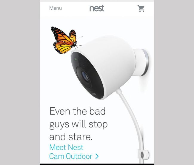
Nest gives the perfect example of how to scale down animation/function from desktop to mobile


It’s beneficial to use real users to test if a design actually works. You can make design decisions based on fact rather than preference, and reduce the chance of confusion when articulating features to developers. Real user data is also more powerful when being challenged by the subjective taste of a client.

09. Keep text alignment readable

Centered text content isn’t always bad. However, it is key to know when not to implement this. When there is lots of content, keep text to the left. If readability is a key goal of the website (it should be!), then center-align small text blocks only. Full-page article content is almost always best being ‘left to the left’.

10. Remember the basics

Ensuring any website has an up-to-date SSL certificate, fast loading speeds, and a lightweight SVG sprite sheet guarantees a better user experience. Security warnings and unnecessarily large then scaled down imagery will put barriers up, stopping users getting to key content.
Share:

9 Steps to perfect solo UX design

The UX design process itself is very flexible and can change significantly depending on the circumstances, with different design teams having different ways of implementing their process.

However, without a solid UX design process in place, a design team could be working completely in the dark. A clear and concise UX process, on the other hand, makes it possible to craft amazing and less problematic experiences for the user.


But how do you implement such a process if you're working as a solo designer – which is a common position to find yourself in these days? In this tutorial, we take a look at a simple UX process to help streamline your solo workflow – including which web design tools to use along the way.
Generate CSS is a bespoke conference for web designers: Grab an early bird ticket now

01. Define your problems

Define the problem(s) first! You need to understand clearly what you’re trying to solve: ask your clients if you are working in an agency and ask business stakeholders or the product manager if you are in a product team. UX design is a problem-solving discipline and helps the end-users to achieve their goals with ease. So discovering if your product idea will fulfill these needs is your first step.

02. Gather data from real users

Surveys enable you to get a decent amount of data from real users. By using clever questions, you can discover more about who they are, where they are and what their needs and goals are. You can use many available tools to carry out surveys, such as SurveyMonkey and Google Forms.

03. Analyze your competitors

By looking at who your competitors are, you can get a much better feel of how you can create something more unusual. However, this shouldn’t be a long process, as all you’re doing is seeing how viable your product idea is and whether or not it has a place within the market.

04. Create personas

With the data you have from the user surveys and analysis of your competitors, you can now create personas. Personas are not the customers you want but the customers that actually exist, whether they’re the ones you already have or potential customers in the market. Even though these personas are fictional, they should represent real people’s behaviors, motivations, goals, and needs. Although the effectiveness of creating personas has been hotly debated of late, it is a very good way to remind yourself that you’re not the user.

05. Define user flows

With the information we now have within our personas, we can begin to map out the flow our users would take. This is a user flow – the path taken by a prototypical user on a website or app to complete a task. The user flow takes them from their entry point, through a set of steps towards a successful outcome and final action, such as purchasing a product. In most cases, user flow is a visual chart that shows each screen a user will or could find themselves at. Even though this is a great way for designers to visualize and work with the site, it can also help developers see and understand the typical user journey.

06. Brainstorm!

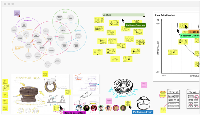
Brainstorming is a combination of informal problem solving and lateral thinking. It’s a great way to generate ideas that you would not be able to come up with by sitting down with just a pen and paper. However, this will be the hardest step to follow as a solo designer because, in most cases, this is done within a group. So here are some steps you can follow to make your solo brainstorming a success.

Firstly, break out of solitude, get outside and look around as small scenes can lead to big ideas. If you’re working for a company, go and ask questions of the developers, project managers, receptionist – even the boss! Getting fresh perspectives can spark all kinds of ideas. Now using sticky notes or a blank sheet of paper, spend 15-30 minutes writing down as many ideas as you can. Don’t judge them; just keep writing down what you’re thinking.

07. Create paper wireframes

By now you should have a decent number of ideas, either on sticky notes stuck to a wall or scribbled on paper. Now it’s time to get even more creative and start sketching out those ideas on paper – sometimes referred to as paper wireframes.

Sketching things out is a very efficient way of trying out a multitude of ideas and iterating them before settling on the best one. Using a pencil first, we can draw a lot of basic sketches to look at the problem from many angles and consider different solutions. Once you’ve settled on the solution, you can now go over your sketches with a pen and then rub out the pencil.

To make things clearer, make sure you add annotations and notes where possible. Once you’ve done a few sketches, go and have a break and come back to your sketches a while later. Take a look at them and see if they still make sense.

08. Develop the wireframes

Low-fidelity wireframes include the most basic content and visuals and are usually static (non-interactive). They are often used to help map out the shell of the interface, its screens, and basic information architecture.

There are many wireframe tools available nowadays, including Figma, Sketch and even Photoshop. Whatever tool you use, your low-fidelity wireframes usually serve as a checkpoint for the beginning of the design process for stakeholders and product teams and you should be able to present clear solutions to them.
09. Build a basic prototype

At this point you have all these nice wireframes designed with your favorite design tool, so now what? Well if you’re using a tool such as Figma, Sketch or InVision Studio, then it’ll be nice and easy to create a low-fidelity prototype. 


The prototype is a simple and easy translation of the product and design concepts. It’s used to turn the design ideas into testable and tangible artifacts, collecting and analyzing the user demands at this early stage, refining your product as you go.
Share:

How to become a UX expert

Good web design is imperative to attracting users to your site, but in order to keep them when they arrive, you have to make sure the user experience is spot on too. When it comes to creating an excellent website, user experience (UX) and user interface (UI) go hand-in-hand.

The UI & UX Design Bootcamp is an online training course that will teach you how to build digital products that both look and work beautifully. Across six lessons and over 39 hours of premium content, you'll get to grips with what makes the world's most visited websites tick.


The training covers everything from UX and UI basics and essential design principles to how to design apps from start to finish and top tips for creating habit-forming products. And if you're in need of some resources to help you along, check out our round-up of the best UX tools from around the web. Here's a sneak peek of what to expect from the UI & UX Design Bootcamp course:

Mobile User Experience: The Complete Guide to Mobile

This course covers the design process involved in building mobile apps that not only look great but work beautifully too. You'll be introduced to the design principles and considerations behind the world's most popular apps, get to grips with understanding users' specific needs and testing designs that resonate with them and run usability tests to find the design that would get people hooked. To fortify your learning, you also get to ask questions and consult the instructor on course material.

How to build habit-forming products

This two-hour course revolves around mastering the art of building a successful product with an active user base. Instructed by Hooked: A Guide to Building Habit-Forming Products Author Nir Eyal, you'll explore habit formation principles and how they can be applied to the design process, as well as comprehend common design patterns of popular digital products. You'll also learn how to optimize products for user retention and get acquainted with the Hook Model, a framework that highlights the design components that influence user behavior.

Become a Senior UX Design Strategist

Want a career as a UX professional? This course will equip you with the knowledge and skills to build a successful UX consulting career. In the three-hour lesson, you'll get an overview of UX strategy fundamentals, learn how to develop and streamline a UX strategy, and acquire tips on how to lead a design team. You'll also get to master essential skills like interviewing users, developing projects from start to finish, and a whole lot more.
Share:

10 Free Resume Templates

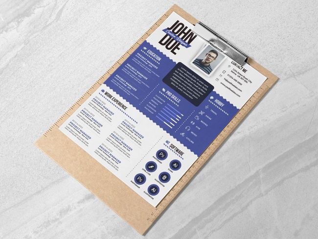
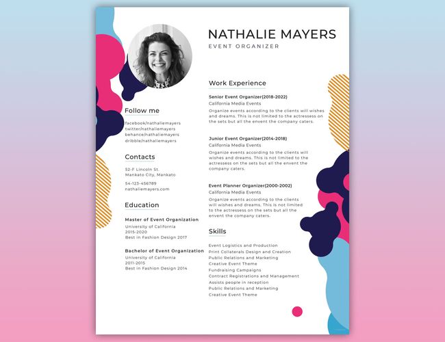
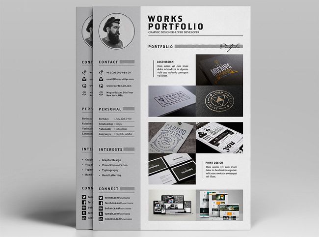
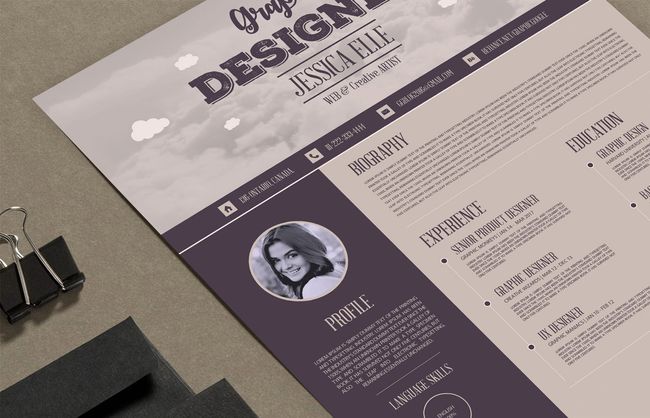
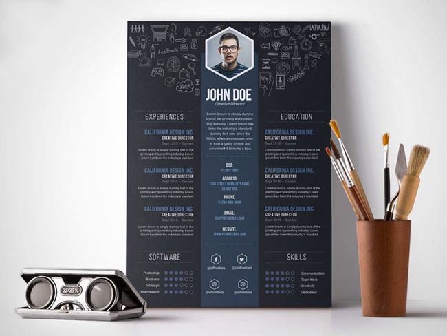
If you need some quality resume inspiration before you start, take a look at these creative resumes, which are brilliant examples of how to stand out from the crowd.

01. Anam free resume template


Download here
Kicking off our free resume template list is this stylish design from graphic designer Fadhli Robbi. Created in Adobe Illustrator, with this template you can edit to create new colour schemes, add or delete selected sections and change fonts so the overall design fully reflects your style. An attractive design and great starting point to developing your own stand out creative resume.

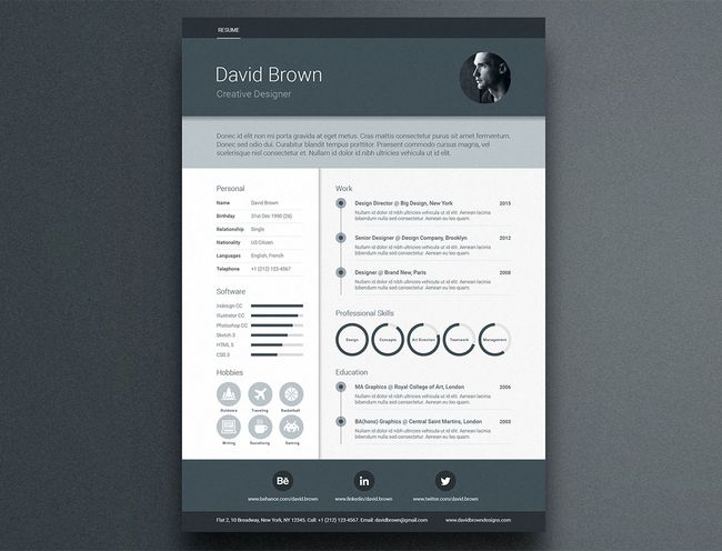
02. Clean and professional resume


Download here
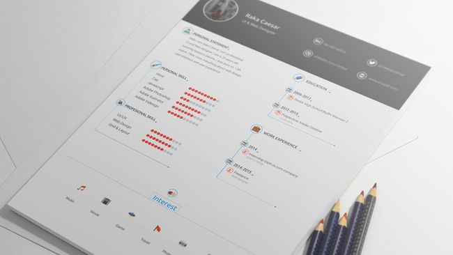
Simple but elegant, this free resume template designed by Raka Caesar has nothing but need-to-know information on it, making everything very clear for prospective employers. More of a visual guide, this resume template uses icons to reveal interests and a chart-type system for strengths in various skills. The file is in .psd format, so fully customisable if you wanted to replace or add any content.

03. Free resume template with business card


Download here
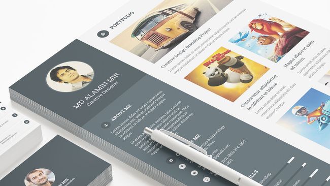
This standout free resume template design created by Alamin Mir, in collaboration with Grapphiora (was Pixelll), provides the perfect starting point to update your CV. A multi-page resume including cover letter, CV, image portfolio page and bonus two-sided business card, this free pack is fully customisable. It also uses a free font, which is great for anyone wanting to keep the same design as displayed.

04. Graphic designer resume


Download here
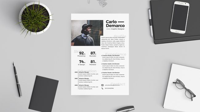
This A4-sized free resume template is a great starting point for any graphic designer looking to update their CV. The PSD file is fully customisable within Photoshop, with multicolour options and well labeled and organised layers ready for making your own. It's clear, professional and there's room for a mug shot right at the top – smile!

05. Material design resume


For a stand-out resume with an on-trend look, this template, inspired by Google's Material Design framework, is excellent. It includes areas for professional profile, work experience, education, skill circles, skill bars, social media icons and images, and it's supplied in A4-size format for Adobe Illustrator, InDesign and Photoshop. 
It uses free fonts, and if you'd like a covering letter and portfolio template to go with your resume, there's a premium version that also includes new colour options plus matching business card templates and custom icons.

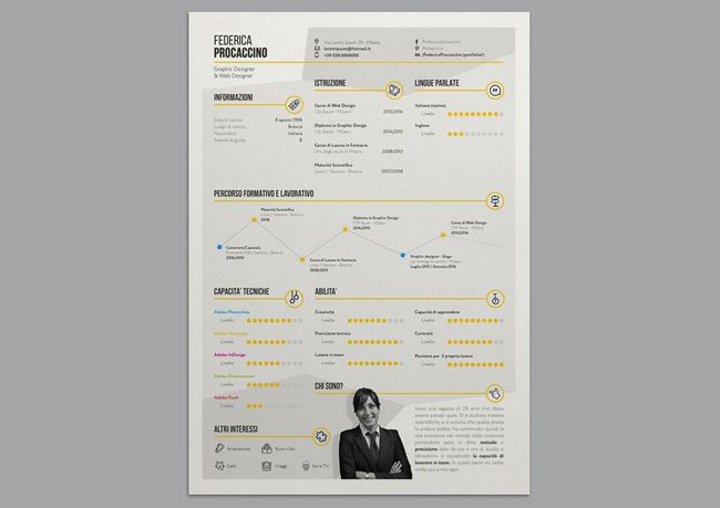
06. Stylish infographic resume


Download here
Want to get all your relevant information across in an eye-friendly, graphical way? Why, you'll be wanting some kind of best infographic, then! And this stylish template by Federica Procaccino delivers just that, enabling you to get your message across on a single page without overwhelming everyone with text.

07. Creative resume


Download here
If you know your way around Adobe Illustrator and don't mind getting your hands dirty, then this template is perfect for producing a great-looking resume that you can customise to your personal taste. You can either use it as-is, changing the text and adding a photograph, or you can spend time editing the colours and tweaking the layout until you have something that more accurately reflects your personality.

08. YA free resume template


Download here
Created by Indonesian graphic designer Angga Baskara, this elegant template covers all the bases with three sections – a main CV info page featuring eye-catching progress bars to illustrate your main skills, a covering letter and a portfolio section where you can add a selection of your work in the form of images and short descriptions.

09. Creative Vintage Resume


Download here
This is a splendidly vintage-looking resume template in deliciously earthy tones, and it comes as an .AI file so that you can adjust it to your heart's content. Be aware, though, that the fonts aren't included, so you'll either have to hunt them down yourself (they're all free fonts, luckily) or substitute your own.

10. Creative Designer Resume Template


Download here
Fully layered and well-organised to keep customisation nice and easy, this bold and punchy visual template enables you to get yourself and your skills across quickly, without any messing around. It comes as a print-ready 300dpi A4 PSD, ready for editing in Photoshop.
Share:

12 Best collaboration tools for Designers

In this article, we gather together some of the best online collaboration tools that enable creatives to work together in real-time. Some are created specifically for designers, others serve as a concept crafting whiteboard. We've also included some more full-on project management tools for when you need to take your collaborative project to the next level.

After something different? Take a look at our guides to the best infographic tools, web design tools, or tools for graphic designers.

01. Slack


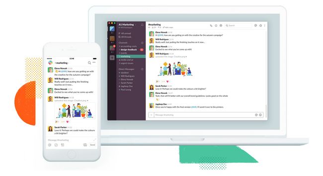
Want to improve communication within your team? Or work remotely but still stay in touch? Collaboration tool Slack is a fantastic solution for clear, real-time communication that keeps everyone in the loop. It's so popular now, chances are you're using it already.
Perfect for anyone managing a team of remote employees, Slack enables project development to move forward more smoothly. Different channels help keep conversations on track, while having all team communication in one place ensures no one gets left out of the loop. Slack can also help you grow your design business by reducing email and meeting times.

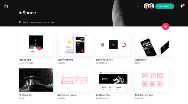
02. InVision


Created specifically for designers, InVision is a web-based tool and mobile app that turns your designs into fully active prototypes, complete with gestures, transitions and animations. 

Clients can provide feedback in the form of comments on your designs , and you can keep them up to date with the project’s progress in real time through actionable to-do lists. Getting started on your first project with InVision is free, but any more than that and you'll need to move to a paid plan.

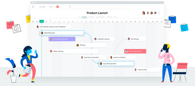
03. Asana


Asana will help you stay on top of your workflow by enabling you to create to-do lists, keep track of tasks via a project 'board', set deadline reminders, comment on others' posts, and send requests to colleagues. Employers can also use it to keep track of how projects are progressing. This collaboration tool first launched in 2008, and is still very popular.

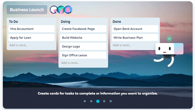
04. Trello


This project management tool is like a magical customisable to-do list on a single interface, which you can share with others in real time. Based on a system of 'cards' (which are essentially Post-it notes), you can categorise and order text, photos, drawings and mockups whichever way you want. There's also a nice progress gauge so you can keep an eye on your project's pipeline, as well as the ability to set appointment reminders. Most brilliantly of all: Trello is completely free.

05. Visme


Browser-based collaboration tool Visme collects all your team activities in one place. It's especially good for designers because it enables you to create a variety of visual projects, including presentations and infographics. There are built-in features to help you monitor on each user’s workload, progress, and activity on ongoing jobs.

06. Google Keep


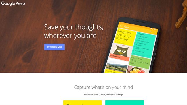
Google Keep is a fantastic way to share lists and ideas (or keep them to yourself). You can access Google Keep through its website or using the iOS or Android App. If you're looking for an easy-to-use list app, the check is a collaboration tool that's definitely worth checking out.

07. appear.in


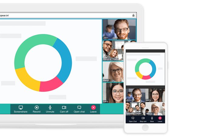
You want to see all your team's smiling faces, right? That's not always possible when working remotely, but online collaboration tool appear.in is the next best thing. This brilliant video conversation app allows up to eight people to converse in a chatroom, with no login or downloads required. It's free to use, or you can bump up to a paid Pro plan for extra features.

08. Basecamp


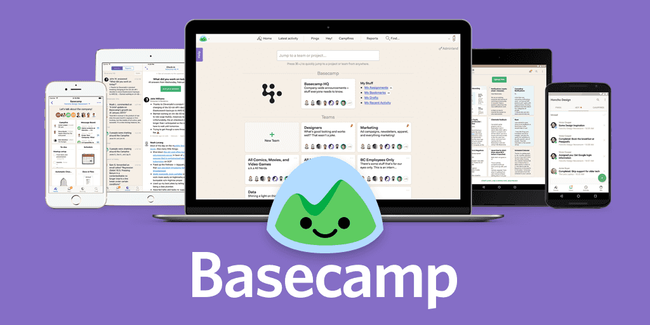
The daddy of project management, Basecamp was created when 37Signals couldn't find a project management app that wasn't insanely complicated, and so decided to build its own. It worked so well that clients wanted to use it, too, and things grew from there.

Featuring a whole suite of collaborative tools including to-do lists, wiki-style documents, file sharing and messaging, it packs in just about everything you need to keep any project running smoothly. You can use it via the web or with iOS and Android apps, and if you want to get a feel for it you can sign up for a 30-day free trial.

09. Podio


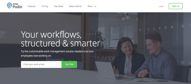
Online collaboration tool Podio aims to help you improve the structure of your workflows by offering a way to organize unwieldy stacks of work and assign different employees specific tasks. It enables you to share files, get feedback on work, and view the status on ongoing projects. One of the most enticing features is its third-party integrations – it works with a whole load of services, from Dropbox and Google Drive to Evernote. There are also mobile apps for use while you're out of the office.

10. Red Pen


More fun than a teacher's marking pen, this feedback tool is particularly great if you're a freelancer looking for some constructive criticism on a project. Specifically created for designers, Red Pen lets you drag and drop your designs into a dashboard and invite specific colleagues (or even clients) to let you know their thoughts in real-time as you roll out your latest updates. One of Red Pen's best features is that it keeps track of the numerous versions so you can always reclaim that earlier design if you change your mind.

11. Mural


Mural is a creative tool for you to drag-and-drop rich media files, links and documents onto a big HTML5 drawing board, which is a great way to collect inspiration and gather your thoughts. It also supports collaboration that allows designers to brainstorm cool ideas remotely. Plus, it is optimised for iPad and gesture-friendly.

Mural is not just designed as a pinboard like Pinterest – its main goal is gathering and organising ideas. Anyone can join you to edit and collaborate, and changes are reflected on the board in real time. Just send an email invitation or set up a password for the board and you are ready to go.

Tools like Mural are lighter than some of the more traditional brainstorming tools, and if you're new to collaborative brainstorming then this could be a good place to get started.

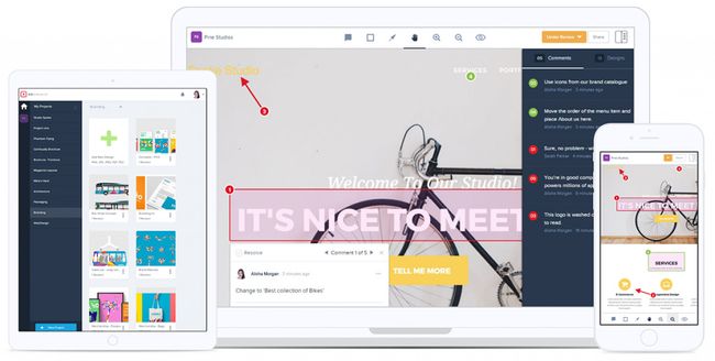
12. GoVisually


Free tool GoVisually allows you to mark annotations and place comments on any part of your project. With it, designers and clients can collaborate to revise projects online without sending painful emails, which should ultimately increase productivity.

For your annotation you can chose an elliptical, rectangular or lasso selection, as well as customising its colour and weight. These functions are very useful, and are as simple to apply as you'd find in a basic drawing app.
Share:

How to use color to shape UX

The validity of colour psychology and colour theory as a marketing strategy is an often-debated topic because we each have different preferences. Your favourite colour may be blue. Or it may be orange. Or purple. Red? You get the point.

But couldn’t that suggestion also relate to any design methodology? When designing a website, are you trying to design it for one person or are you trying to connect with a generalised audience that is representative of your ideal customer? The base of a successful design requires you to remove the bias of an individual and step back to see how it affects a larger audience.


Design around audience expectations

When it comes to selecting the 'best' colour for a brand, research has found that predicting consumer sentiment toward the relevance of colour and a brand is more important than the colour selection itself.

For example, when thinking of health, many people correlate that to the colour green. If a new health initiative for a large organisation or food product decided to brand themselves with bright red, something would feel off about that choice. We may not always consciously realise why it feels that way but behind the scenes that feeling is our brain's way of filtering through what aligns with past experiences that were learned or conditioned. This is even more apparent in colour choices.

Much like in UX, it's important to consider how jarring things that don't match user expectations can be.

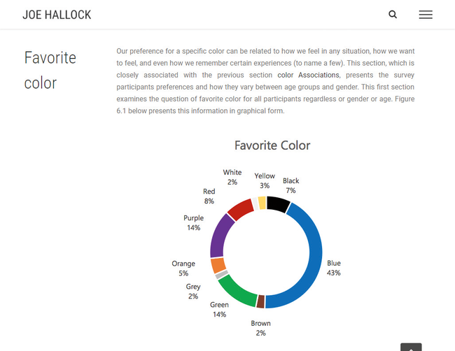
In 2003, Joe Hallock wrote an undergraduate paper on colour assignment. He surveyed a sample size of 232 people and was able to distil core colour associations by gender and age. For example, he was able to determine that the emotional resonance of trust correlated mostly to blue (34 per cent of all survey participants).


Again, whether you personally feel blue best represents a trust or not isn't the focus. There were plenty of others that felt white (21 per cent) or green (11 per cent) conveyed trust.

When designing for larger audiences or market segments, we want to assess the ideal customer over anyone else's personal bias. If you are Microsoft and you'd like to position Bing in the marketplace to imply trust, you look at it as a numbers game. Internet Live Stats suggests there are over 3.5 billion searches per day on Google; it has a market share of about 93 per cent of all searches. If Microsoft is looking to gain more of a market share, a focal point of that effort may be establishing trust through design and branding.

According to a recent survey facilitated by SurveyMonkey, 65 per cent of all participants said that trust influences either a lot or a great deal in their decision making when supporting a brand. If blue represents trust in 34 per cent of that (1.19 billion) audience, that’s a large segment of people over white (735 million) or green (385 million).

Percentages on a graph can be misleading until you apply the context of what they really represent. Building trust with the colour blue is often used with businesses that carry out transactions using personal or financial information. It’s why you see banks and social media rely on blue as a primary colour in their branding. Leveraging small subconscious triggers, like using blue in branding, can help new customers connect quickly.

It's not magic but meeting the expectation of an audience will prevent their brain from firing off a warning signal that something isn’t quite right. Buying a few extra seconds to solidify sentiment toward your brand is highly valuable.

Know the financial power of a single colour

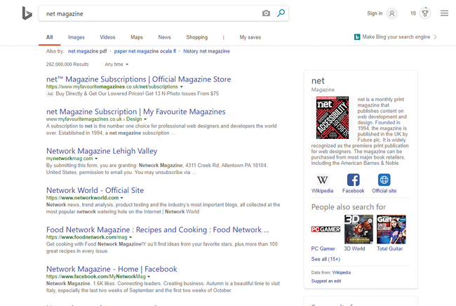
Bing’s three top colours are white, grey and blue. The top two are neutral, meaning anything blue pulls the user’s primary attention toward it

Did you know that 84.7 per cent of a customer's purchasing decision is influenced by colour usage? Selecting the right colour can have a large impact on revenue and conversions.


When Microsoft was designing what would eventually become Bing, its design team explored a large variety of colours to represent links. In 2010, Bing's user experience manager Paul Ray gave a presentation at MIX10, a long-gone Microsoft conference. He discussed the level of multivariate testing done on the factors of colours and typography – among others – and the impact they had on revenue, return rate, time to first click and more.

Microsoft's testing was so granular that it included multiple shades of blue for the link colour. It found that a specific colour blue (#0044CC) drove an estimated $80m to $100m dollars a year more than the lighter blue that was originally used.

This shade of blue is special. It goes beyond the colour psychology 101 understanding of blue being a representation of trust. What's fascinating is that this particular shade of blue uses the golden ratio mathematically.


The golden ratio – closely tied to the Fibonacci sequence – is best known as the rule of thirds. It's used in photography to frame composition by dividing the image into three equal vertical rectangles and three equal horizontal rectangles. This is something designers do innately as our brains are conditioned to perceive value in compositions that align to that ratio.

So how does this golden rule of thirds factor into a website Hex code for Bing’s blue? Hold on. We’re almost there.

Hex codes represent the red, green and blue markers of a pixel. The first two numbers of a hex code determine the value of red, the second two the green, and the final two blue. Bing's blue is #0044CC. Converting that to a standard RGB colour spectrum results in Red: 0, Green: 68, Blue: 204. Still with me?

What do you get when you divide the blue value by the green? Exactly three. Paul Ray’s presentation defined Bing’s shade of blue as a perfect mathematical blue.

Keep in mind your design context

It’s important to note that the perfect blue doesn’t increase conversions by itself, much in the way that having a red button doesn't magically generate more sales. Selecting a single colour for an element of your design is a portion of the collective design psychology. As with user experience, colour theory is best understood in context.

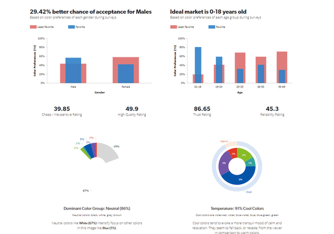
Bing's blue stands out because it's paired with a large percentage of neutral colours. Eighty-six per cent of the 'above the fold' search results on Bing is neutral according to a study done by UX Triggers (UXT).

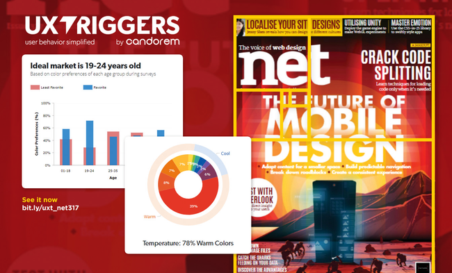
UXT is a colour psychology analysis tool that breaks down each pixel of an image to determine the percentage of colour use in relation to other colours and how that context impacts the perception of different genders and age groups in terms of factors such as trust and quality.


In the study, neutral colours (predominantly white with 67 per cent of the image) intensifies the focus on secondary non-neutral colours. In this case, blue was the most prevalent colour used at 5 per cent of the screen. The overall design focuses heavily on cool colours (91 per cent). Cool colours tend to evoke a more calm or tranquil mood. Which is important when looking at the context of the design itself.

Search results pages contain a massive amount of information. Each page only has ten total results but includes hundreds of words describing each page, the website URL, the page title and additional sidebar callout information that may be pertinent to the user.

This is why colour selection plays such a crucial role in user experience and design overall. It’s not about the colour blue or red: it’s actually about all of the colours surrounding it.

Bing’s three top colours are white (67 per cent), grey (19 per cent) and blue (5 per cent). The top two are neutral, as already discussed. Because of this, anything blue pulls the user’s primary attention toward it. When you factor in that the blue text links are also larger than the secondary description text (20px for the enlarged links versus 13px for body copy), it creates tunnel vision and enables users to focus on the page titles, which provide the most value on the page.
Share:

Popular Post

Web Design

5 Quick-fire portfolio tips from design experts

Your design portfolio is one of your most useful tools. It can win you commissions, help you snag a new design job, attract collaborators, a...

Labels

Most view post