When it comes to actually design your own logo, you may need to start thinking about brand identity and style. For more inspiration, head to our pro guide to logo design, which tells you everything you need to know about the world of logos.
01. Create a new canvas
Open Photoshop and create a new document. I used a canvas size of 500px x 500px, but larger sizes would work just as well. You can change the canvas size at any point. Go into Photoshop > Preferences to set a gridline every 50px. Then turn the grids on, in the canvas, by pressing cmd + ' or View > Show in the Options bar. Make sure Snap to Grid is turned on, under View > Snap to.
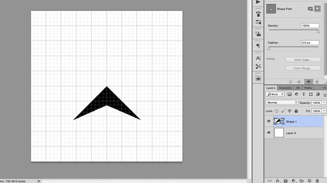
02. Draw a basic shape
Select the Pen tool in the toolbar, or by pressing P, and make sure it’s set to Shape in the left of the Options bar, rather than Path. Use the pen to draw an arrowhead shape, starting at the centre-point of the canvas and using grid-line intersections for your other points. Naming the layers is not necessary for this project, but it can be helpful in more complicated documents, where there are many layers.
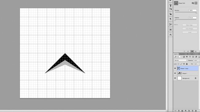
03. Duplicate and edit the shape
Duplicate the layer, by pressing cmd + J and click on the new layer to select it. Use the Direct Selection tool, shortcut A, to click on the top-most point of the arrowhead, located at the centre of the canvas. Move this point down a few grid squares, holding the Shift key to keep it locked on the y-axis.
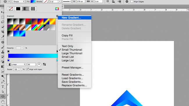
04. Add colour with a gradient
Create a new gradient in the Fill drop-down menu, to the left of the Options bar. In the gradient window, double click on the bottom sliders to bring up RGB options, where you can choose your colours; I went for a light and dark blue. Then apply this gradient to both objects, changing the gradient rotation so they oppose each other. If you can’t see the Fill options, it may be because you may have the Move tool selected, so switch to the Pen or Shape tool.
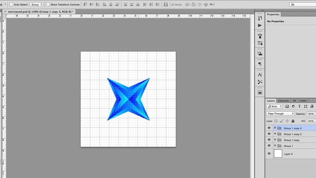
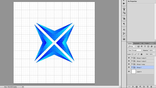
05. Group and duplicate your layers
Group the two layers by selecting them and pressing the group button, which looks like a little folder, located at the bottom of the Layers tab. This prevents the Layers tab from becoming messy and makes it easier to handle the two layers together.
Duplicate this group and use the Free Transform function to rotate the new group ninety-degrees, holding down the Shift key to rotate in fifteen-degree increments. You can access Free Transform using cmd + T or under Edit > Free Transform. Now move the second group up, until it reflects the original shape, using the centre of the canvas as a line of symmetry.
06. Transform the shapes
Nudge each shape up or down one grid square, away from the centre point, using Shift + cursor key.
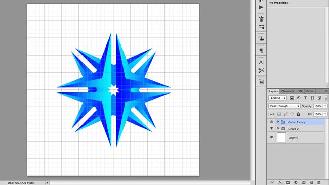
07. Group, duplicate, repeat
Using the same method from step #5 to group the layers together, duplicate the group and rotate by ninety-degrees. The new shape should resemble a sort of crosshair shape.
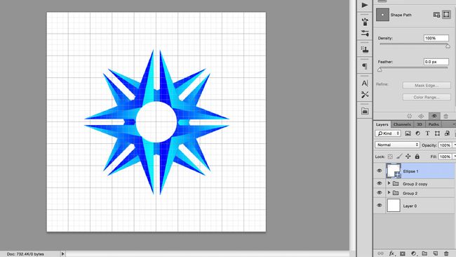
08. Draw a circle with the shape tool
Cycle through Shape tools until you find a circle, either by clicking-and-holding on the icon in the toolbar or pressing Shift + U. Click on the centre point of the canvas, holding Alt to draw a circle radiating from the centre, and Shift to keep the width and height proportional. If you make a mistake, you can undo or re-edit your shape using Free Transform.
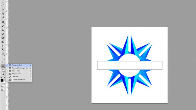
09. Draw a rectangle and align to the centre
Cycle through the shape tools again, until you find the rectangle tool. Draw a white box across the graphic, above the other layers, making enough space for text. You can align this to the centre of the canvas by clicking on the rectangle layer and the bottom layer (which should be a white square, the same size as the canvas) and using align tools, either found under Layers > Align in the Menu Bar or the align buttons in the options bar.
More advanced users could use this rectangle to subtract from the shapes below, using Layer > Combine shapes, but for now, we will just stick to using it as a white block.
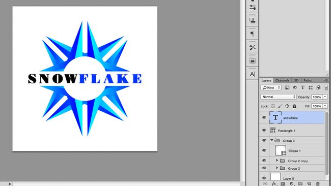
10. Add your text
Draw a text box over the rectangle, by clicking on the T icon in the toolbar or pressing T, then dragging across the canvas. Type your text into the box and centre it, using the buttons in the Character tab. Use the align tool again to centre this to the canvas.
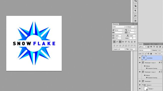
11. Choose an appropriate typeface
Choose a typeface that suits your brand. There are plenty of free fonts out there, but it is crucial to pick one that you have permission to use – see our free font roundup for some ideas to get you started. Since this logo may appear across many of your assets, it would be bad news to use an illegally downloaded typeface. Play around with size and colour until you like what you see.
12. Adjust your kerning
Kern the text. This means adjusting the horizontal spacing between individual letters, maximising the word’s readability. You can do this under the Type tab, marked with V | A, or by clicking between the letters and pressing alt + left or alt+ right. For more on kerning, see our post on how to kern type.
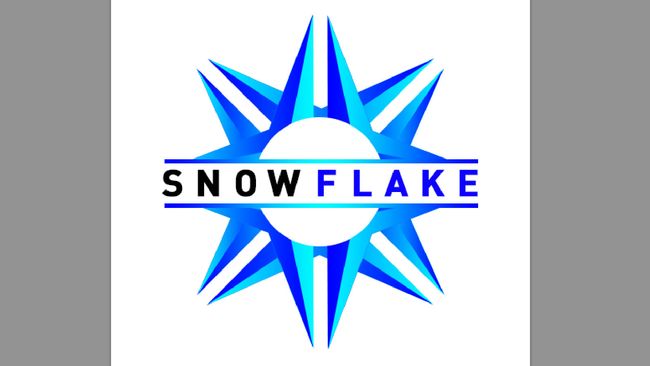
13. Add final details and export
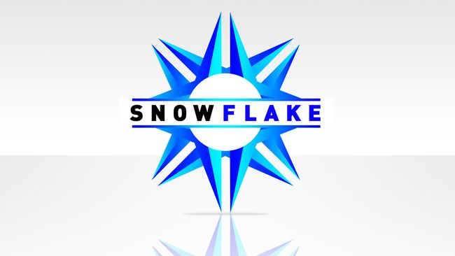
Make any final adjustments you need to give it that special something. For the main image at the top of this page, I added two smaller bars above and below the text, coloured with the same gradient. I also added a background, shadow and reflection, using similar techniques to the other steps, as well as using layer masks to add fade.
When you're happy, save the image out in whatever format you require. I used RGB jpg here for a web format but also saved it as a PSD so I could go back and make changes.


No comments:
Post a Comment