The killer logo design will be different every time, depending on the brand's overall identity. Each identity project is unique. They all have their own issues to overcome and challenges to conquer. But you should still approach each brief in a similar way: develop a workflow that allows maximum creativity and is productive.
This tutorial will walk you through the core stages of creating a new identity for the ultra-modern HabiGym. I'll show you how this identity was conceived, explaining each stage of the process from when the ideas were born through to the final presentation. As well as demonstrating some of the essential tools and skills that you can learn to help streamline your workflow in Illustrator, I'll also share a few best-practice rules of thumbs for working smarter.
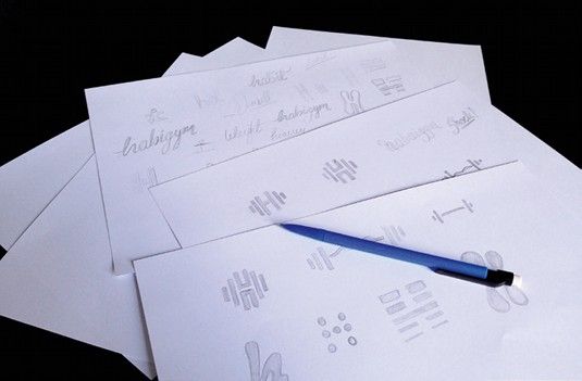
01. Always start on paper
Everyone knows they should start with a plan, but with deadlines looming it's all too easy to forget this stage – don't. A major part of identity design involves solving a problem with a concept. For many, this happens much more fluidly on paper, as your mind bounces off each thing you sketch out.
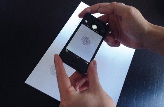
02. Mobile scanner
If you have a scanner, use that for the best results. If you don't have one to hand, take photos of your sketches. You can then use them as guides for digital recreation. When it comes to logos, precision is essential. Therefore, Live Trace needs to be ditched and the work needs to be done manually.
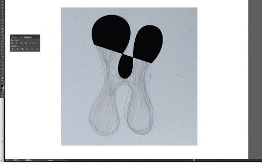
03. Practice makes perfect
The Pen tool is probably the most frequently used – but remains one of the trickiest to master. It's a very powerful tool and learning it will not only benefit your ability to create images in Illustrator, the skills you acquire will also boost any Photoshop Pen work you do.
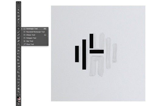
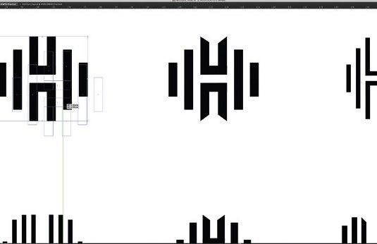
04. Utilise the Shapes panel
Create this logo by combining rectangles using the Rectangle tool. When building the vectors, try using the Shape panel for better accuracy. Hold Shift to draw shapes with equal proportions. Select any element, and its width and height are shown in the Control bar. You can type in sizes here too.
05. Duplicate elements and combine
To compare variants, duplicate a master copy to edit (hold Alt and drag). Create shapes to align objects and use Smart Guides (View>Smart Guides). Use the Pathfinder tool to combine shapes and create new ones. You can combine rectangles to make the 'H' element: select both elements and hit Merge.
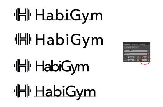
06. Tweak the type
Alter the tracking and kerning of words to change the tone of a logo. Add character to the logotype by opening up the shapes into the native paths that make up the letters, altering the paths of each letter directly to make your type unique. To quickly convert the font to outlines (paths) hit Cmd/Ctrl+Shift O.
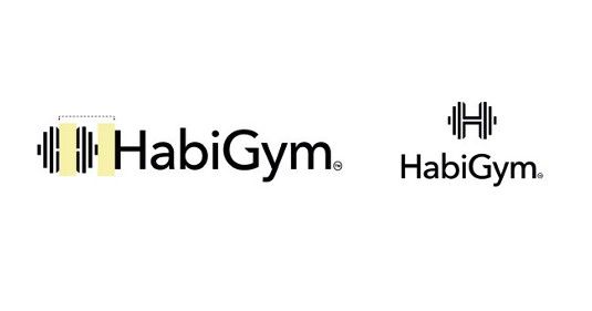
07. Keep changes subtle
Use the Direct Selection tool to rearrange the anchor points and alter the appearance of the letters. Keep changes small and subtle. Careful scaling of the logo mark with the type is crucial to achieve cohesion between the two. Hold Shift to keep everything in proportion as you scale elements up and down.
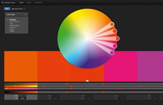
08. Time to add colour
In CS4 and higher, you can integrate Adobe's Kuler app into your workspace to view colour palettes. Go to Window > Extensions > Kuler. Try to avoid gradients in logos, but don't take that as an absolute rule. Hit Cmd/Ctrl+F9 to access the Gradient dialogue. Try the logo on a variety of background colours and shapes.
09. Create delivery templates
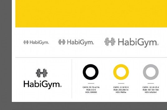
Go to File > Save As > Illustrator Template. Choose fonts that work well with the brand. Create style guides for designs: add CMYK colour breakdowns, Hex codes or Pantone codes, and font names – this is useful for designers and ensures brand consistency. Also give examples of the brand on various materials.


No comments:
Post a Comment