But couldn’t that suggestion also relate to any design methodology? When designing a website, are you trying to design it for one person or are you trying to connect with a generalised audience that is representative of your ideal customer? The base of a successful design requires you to remove the bias of an individual and step back to see how it affects a larger audience.
Design around audience expectations
When it comes to selecting the 'best' colour for a brand, research has found that predicting consumer sentiment toward the relevance of colour and a brand is more important than the colour selection itself.For example, when thinking of health, many people correlate that to the colour green. If a new health initiative for a large organisation or food product decided to brand themselves with bright red, something would feel off about that choice. We may not always consciously realise why it feels that way but behind the scenes that feeling is our brain's way of filtering through what aligns with past experiences that were learned or conditioned. This is even more apparent in colour choices.
Much like in UX, it's important to consider how jarring things that don't match user expectations can be.
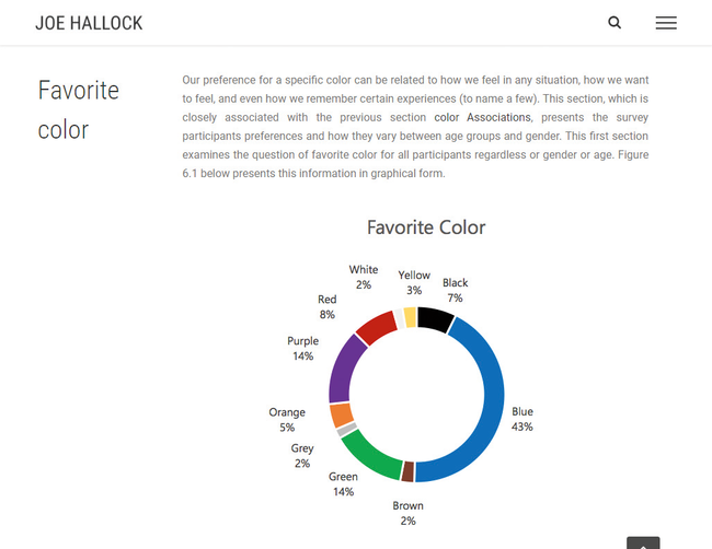
In 2003, Joe Hallock wrote an undergraduate paper on colour assignment. He surveyed a sample size of 232 people and was able to distil core colour associations by gender and age. For example, he was able to determine that the emotional resonance of trust correlated mostly to blue (34 per cent of all survey participants).
When designing for larger audiences or market segments, we want to assess the ideal customer over anyone else's personal bias. If you are Microsoft and you'd like to position Bing in the marketplace to imply trust, you look at it as a numbers game. Internet Live Stats suggests there are over 3.5 billion searches per day on Google; it has a market share of about 93 per cent of all searches. If Microsoft is looking to gain more of a market share, a focal point of that effort may be establishing trust through design and branding.
According to a recent survey facilitated by SurveyMonkey, 65 per cent of all participants said that trust influences either a lot or a great deal in their decision making when supporting a brand. If blue represents trust in 34 per cent of that (1.19 billion) audience, that’s a large segment of people over white (735 million) or green (385 million).
Percentages on a graph can be misleading until you apply the context of what they really represent. Building trust with the colour blue is often used with businesses that carry out transactions using personal or financial information. It’s why you see banks and social media rely on blue as a primary colour in their branding. Leveraging small subconscious triggers, like using blue in branding, can help new customers connect quickly.
It's not magic but meeting the expectation of an audience will prevent their brain from firing off a warning signal that something isn’t quite right. Buying a few extra seconds to solidify sentiment toward your brand is highly valuable.
Know the financial power of a single colour
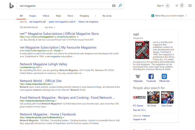
Bing’s three top colours are white, grey and blue. The top two are neutral, meaning anything blue pulls the user’s primary attention toward itDid you know that 84.7 per cent of a customer's purchasing decision is influenced by colour usage? Selecting the right colour can have a large impact on revenue and conversions.
Microsoft's testing was so granular that it included multiple shades of blue for the link colour. It found that a specific colour blue (#0044CC) drove an estimated $80m to $100m dollars a year more than the lighter blue that was originally used.
This shade of blue is special. It goes beyond the colour psychology 101 understanding of blue being a representation of trust. What's fascinating is that this particular shade of blue uses the golden ratio mathematically.
So how does this golden rule of thirds factor into a website Hex code for Bing’s blue? Hold on. We’re almost there.
Hex codes represent the red, green and blue markers of a pixel. The first two numbers of a hex code determine the value of red, the second two the green, and the final two blue. Bing's blue is #0044CC. Converting that to a standard RGB colour spectrum results in Red: 0, Green: 68, Blue: 204. Still with me?
What do you get when you divide the blue value by the green? Exactly three. Paul Ray’s presentation defined Bing’s shade of blue as a perfect mathematical blue.
Keep in mind your design context
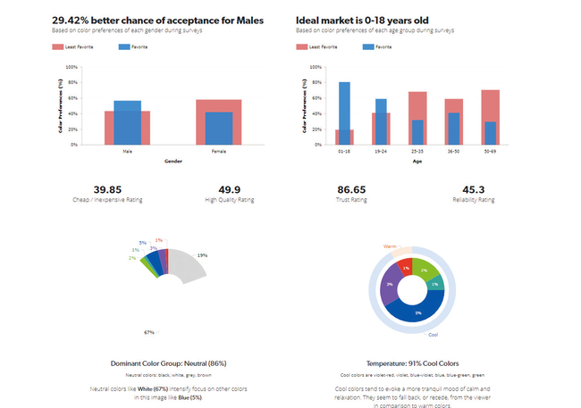
It’s important to note that the perfect blue doesn’t increase conversions by itself, much in the way that having a red button doesn't magically generate more sales. Selecting a single colour for an element of your design is a portion of the collective design psychology. As with user experience, colour theory is best understood in context.Bing's blue stands out because it's paired with a large percentage of neutral colours. Eighty-six per cent of the 'above the fold' search results on Bing is neutral according to a study done by UX Triggers (UXT).
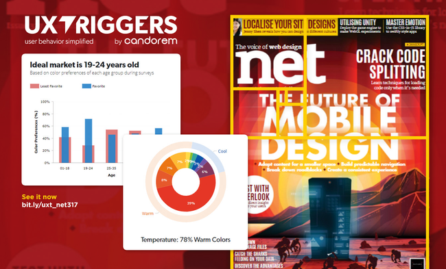
UXT is a colour psychology analysis tool that breaks down each pixel of an image to determine the percentage of colour use in relation to other colours and how that context impacts the perception of different genders and age groups in terms of factors such as trust and quality.
Search results pages contain a massive amount of information. Each page only has ten total results but includes hundreds of words describing each page, the website URL, the page title and additional sidebar callout information that may be pertinent to the user.
This is why colour selection plays such a crucial role in user experience and design overall. It’s not about the colour blue or red: it’s actually about all of the colours surrounding it.
Bing’s three top colours are white (67 per cent), grey (19 per cent) and blue (5 per cent). The top two are neutral, as already discussed. Because of this, anything blue pulls the user’s primary attention toward it. When you factor in that the blue text links are also larger than the secondary description text (20px for the enlarged links versus 13px for body copy), it creates tunnel vision and enables users to focus on the page titles, which provide the most value on the page.






No comments:
Post a Comment