

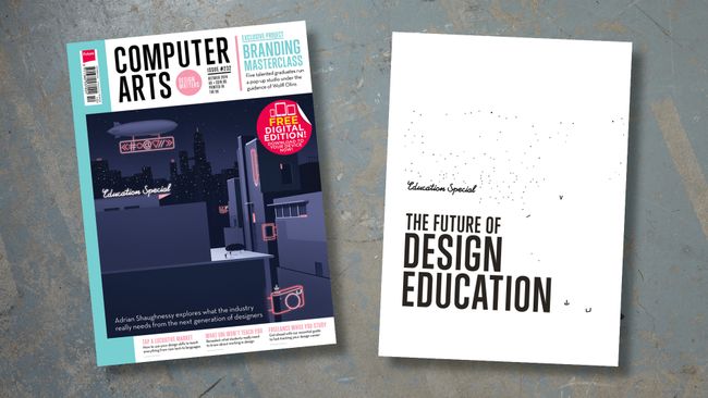
To illustrate each print finish, I'll use an example of a cover I created for Computer Arts in collaboration with Celloglas, a specialist in decorative paint finishes. At the bottom of each page, you'll find a video showing each design being brought to life at the printers.
On this page, I'll teach you how to create foil block designs in Photoshop CC. Use the drop-down above to find out how to tackle spot varnish (page 2), die cuts and folds (page 3), and embossing and debossing (page 4).
Foil blocking

Generally, you'll get the best results when you're not trying to line the foil blocking up with a printed image, as paper stretch/shrinkage can cause the foil to misregister.
Best practice for foil blocking
- Avoid using any foil lines thinner than 0.5mm/1pt.
- Leave at least 1mm space between the separate foiled elements to stop shapes bleeding into one another.
- Don't try and align the foil to fine details such as small type (especially series) or thin lines.
- When lining up the foil with a printed image, add a 1mm to the foil guide to allow for misregistration.
- Large areas of solid foil can be tricky to get right and you may not always get the best results.
Create foil blocking in InDesign
This means you can see the closest example of how the final printed product will look, and reduces the risk of any misregistration issues. It also means you have a mockup version ready to send to the printers. Here's my process:
- Finalize your design, with the foil block elements in a solid color on a separate layer over the top of your print artwork.
- Duplicate the page three times. One page will be your mockup, one will be the final artwork for printing, and one will be the foil block.
- Delete the unwanted elements from the relevant pages, and save each version with the relevant name.
- Open the files and delete the unwanted pages from each file.
- In your foil document, change the color to solid black, and check to make sure you've covered everything by turning off the black ink and looking in your Separations Preview panel.
- Some printers may require you to set up a spot color and work with one document. In this case, make sure the spot color is set to Overprint (via Window > Attributes) so you don’t lose any of the detail underneath the foil block element.
It’s always best to talk to your printers or finisher to check how they would like the file to be provided and for any special requirements. If you have any concerns, ask if you can send over an early example and get a professional's input.


No comments:
Post a Comment