Consequently, sharpening up your knowledge of colour theory and psychology can go a long way to helping increase conversions, and can in many instances improve the usability of your interfaces.
Here are some factors you need to bear in mind when making colour decisions in your designs.
Reinforce your message with colour
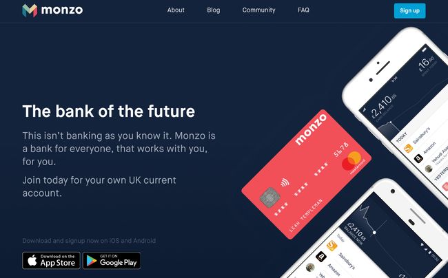
Monzo's dark blue background signifies stability
To avoid undermining your brand’s message, choose colours for your interface that reinforce its values or proposition. It’s easy to fall into the trap of choosing eye-catching colours and fashionable gradients, but functional choices could be better in the long term.Although Monzo’s physical bank cards are an eye-catching and very practical coral, the colour scheme of the website tells a story of stability and trustworthiness, using a dark blue backdrop combined with light blue highlights that are bright enough to draw your attention but muted enough to maintain an air of integrity.
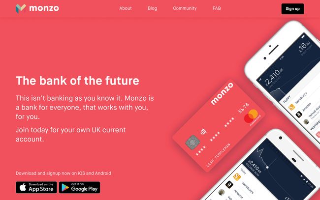
By playing with the CSS values of the homepage, we can make coral the primary background colour, creating a youthful and energetic-looking homepage. It’s undeniably attention-grabbing, but would potential customers be more likely to trust a financial organisation based on these qualities? You’d have to test it with users to be sure, but colour psychology would suggest a big no.
 |
| Would you trust Monzo if its homepage was this colour? |
Colour and accessibility
Approximately one in 12 men and one in 200 women are affected by colour blindness. This, paired with the fact that screen readers do not communicate colour to visually impaired users, means we should be mindful that colour alone is not always an appropriate means of conveying meaning within our interfaces.Understand what colour means to your audience
 |
| Mailchimp's bright yellow has a very different meaning in China |
Red
- Positive connotations: Energy, passion, strength, warmth, excitement
- Negative connotations: Anger, aggression, fear, rebellion, evil
- Used to: Create urgency, stimulate appetite, signal stop
- Positive connotations: Happiness, optimism, warmth, playfulness, fun
- Negative connotations: Critical, cowardly, impatient, pessimistic, impulsive
- Used to: Brighten spirit, demonstrate playfulness, show warmth
- Positive connotations: Growth, vitality, natural, earthly, balanced
- Negative connotations: Greedy, materialistic, envy, devious, indifferent
- Used to: Demonstrate growth, show eco credentials, signal go
- Positive connotations: Trust, stability, calmness, integrity, loyalty
- Negative connotations: Sadness, coldness, predictability, conservative, rigidity
- Used to: Promote calm, gain trust, show cleanliness
- Positive connotations: Authority, control, strength, sophistication, seductiveness
- Negative connotations: Secretive, negative, dark, depressing, aloof
- Used to: Create mystery, assert confidence, demonstrate sophistication
In China, for example, yellow has become synonymous with pornographic publications, so while Mailchimp’s Cavendish Yellow homepage (above) beautifully signifies happiness, optimism and warmth to some, those cheeky monkeys may be interpreted a little unexpectedly in the world’s most populous country.
Once you know who you’re designing for, take into account the impact of your use of colour to ensure you don’t send users the wrong message by assuming that everyone will react in the same way.


No comments:
Post a Comment