

I’ve been a longtime advocate of the jQuery, but wasn’t convinced straight-away that jQuery Mobile’s approach was the right one. I decided to investigate further by talking to the creators of jQuery Mobile, Scott Jehl and Todd Parker from Filament Group. I asked them why jQuery Mobile behaves the way it does, and as a result, pulled out five main things that jQuery Mobile does to help you build more touch-friendly websites that work across a wide range of browsers and devices:
The wide browser and device coverage - using progressive enhancement, your website is able to be seen by the widest number of browsers and devices.
Touch-friendly form inputs and UI widgets - form inputs are enhanced to be touch-friendly, including the addition of a set of touch-friendly UI widgets.
Touch-friendly form inputs and UI widgets - form inputs are enhanced to be touch-friendly, including the addition of a set of touch-friendly UI widgets.
Responsive web design ready - jQuery Mobile is a 'mobile-first' framework, not 'mobile only'.
Layout and theming engine - highly extensible and customisable theme and layout engine.
Ajax page navigation model - load new pages faster using Ajax and HTML5 pushstate instead of full page refreshes. Let’s dive into each of these five reasons in-depth:
1. Wide browser and device coverage
'Don’t break the web' has been jQuery Mobile’s mantra. The great promise of the web was that anybody, anywhere in the world could access content by typing in a URL or clicking a link.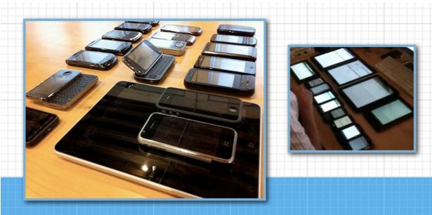
All devices in all parts of the world will be able to see your content if you use jQuery Mobile
2. Touch-friendly form inputs and UI widgets
If you’ve ever tried to hit a checkbox on a non-mobile friendly form, you know what a pain it can be to have to zoom in and out in order to hit poorly designed form elements. You want to make sure your form elements and UI widgets work well with touch. Touch is now in laptops and desktops so it's now completely inexcusable to make websites that aren’t being designed to support the onslaught of new touch-capable devices hitting the market. jQuery Mobile is designed touch-first (yet still works great with a mouse) so you get big, chunky tap targets that are finger-friendly for all of its form elements and UI widgets.jQuery Mobile auto-enhances your forms to become touch-friendly. Checkboxes are wrapped in a very generous-sized label to create a nice tap-zone, so it's easy to hit the intended checkbox. Textareas are problematic on mobile once you go past the allotted text space (you have to two-finger scroll to see content in a scrollable textarea), so jQuery Mobile auto-grows textareas so the user can easily see the content they’ve entered at all times.
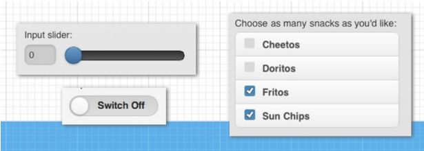
jQuery Mobile also has widgets such as persistent toolbars, buttons, dialogs and, my personal favourite is, the new popup widget, which allows you to popup any type of content from where you trigger it. This is useful for displaying in-page forms, dialogs, photos, maps and video etc. More widgets are added with each version of jQuery Mobile that are all touch-friendly and work across a myriad of devices and browsers.
3. Responsive web design friendly
You’ve always been able to develop responsive websites on top of jQuery Mobile because it's a 'mobile-first framework ... NOT 'mobile only'. And in the 1.3 version of jQuery mobile, a lot more focus is given to responsive web design features.New panel widget
You know those menus that slide out from the side? Popularised by Facebook’s mobile application, this user interface pattern is very familiar to most users on mobile. View the panels in actions.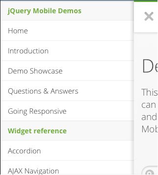

Responsive grid
The grids for jQuery Mobile consists of simple grid blocks that can be stacked on top of each other when viewed on smaller displays.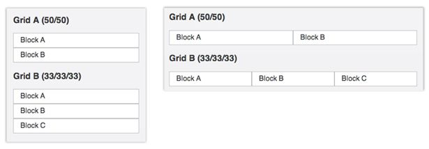
4. Layout and Theming Engine
jQuery Mobile looks at your data-* attributes in your HTML and enhances it with behaviour and style. For instance, by applying data-role=”listview” to your unordered lists, CSS classes are auto-injected into your lists so that it looks like a mobilised list. And if there are links inside your list items, it will add the arrow on the list to show that you can click to go to a new page by touching that particular item.The data-* attributes give you basic formatting and structure, but everything in jQuery Mobile is optional and the CSS classes are extensible, so you aren’t locked into the default theme.
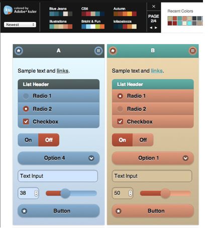
The first thing you should do to start out customising your application is to start with the jQuery Mobile Themeroller. It's so easy to create your own theme colours by dragging and dropping colors from the colour palette right onto the element you are styling. Themeroller even has integrated Adobe’s Kuler tool, which gives top user-rated colour schemes to choose from.
5. Ajax page navigation model
Instead of full page reloads, jQuery Mobile looks for links local to the domain you are on and fetches the new page content with Ajax. When a user clicks a link, the contents of the new page are then loaded it into a new div and then transitioned into the current viewport.Let’s say you are on index.html and you then you click a link to page.html and the link to page.html has the following markup:
<a href="page.html" data-transition="slide">Link</a>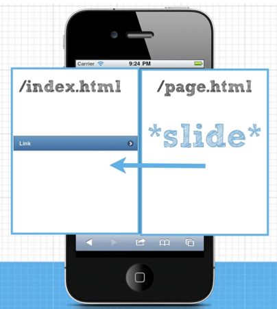
If the browser you're using supports HTML5 pushstate, the URL address in your browser window would then be updated to yourdomain.com/page.html once the new page finishes sliding in. Also, a spinning loading indicator is displayed while the new page is being loaded in to give the user feedback that the link was hit.
The main advantage of this way of loading pages is that you aren’t having to re-initialise all of the JavaScript and CSS requests on your second page load. Even if these assets are loaded from the cache, there are savings of execution time on mobile devices.
In the case of the first-page load using jQuery Mobile, all of your scripts and styles already initialised on your device so we don’t need to do that work again when loading a new page. The only thing needed to render a new page is the new fragment of HTML. With this method of loading pages, you’ll end up with faster subsequent page requests critical for developing a great mobile experience.


No comments:
Post a Comment