4 Tips to develop your developer skills

For those of you with less than five years’ experience in web development, it’s likely you’re still finding your feet in regards to language features, frameworks, architecture and best practices. And although you may start each site with the best intentions, by the end, chances are all you want is for the thing to work well enough that you get paid.


I’ve spent the past few years rescuing a variety of well-known brands’ sites that in theory should have been simple, but for a variety of reasons – successions of freelancers, a lack of top-down supervision – have turned into spaghetti-junctions of technical debt.

01. Follow the formula

The thing I want to get out of the way is to assure you that we’ve all been there and there’s nothing wrong with not knowing everything. Programming is brilliant fun and the reason you want to do it every day is probably because you get to rise to a challenge, take the lead and deliver innovative solutions.

But here’s the catch: what makes programming fun (being inventive and thinking on your feet) can inadvertently contribute to technical debt on larger, team-led projects.

There exist established best practices, principles and patterns that have proven themselves over the years. It’s your job to research, learn and implement them – and, in the process, sacrifice a little of your individuality in return for maintainability and reliability. There’s a blog post called ‘You’re not paid to write code’ that sums it up rather well.

02. Sweat the small stuff

Programming is very much about clarity, and when you can’t see the wood for the trees, the chances of your codebase staying purposefully lean and mean will be severely diminished. As such, your primary strategy for staying on top of things should be a fastidious focus on the basics.
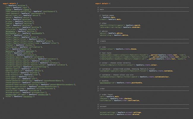
Be ultra-organised: worry about folder structures and file locations (frameworks can help here), ensure modules have consistent API orders, group common functionality, and use templates with delimiters.

Make your code readable: use white space judiciously, and use comments to annotate grouping and clarify intent (but not bad code). You’re working as a team and you’re paid to be clear.
Don’t cut corners: saving time now might seem like a good idea, but you can be sure that as the project grows, any sneaky laziness will be compounded and cost the project later.

Throughout the process, make sure you correct mistakes as you go along. Sooner or later other code will end up relying on these errors. Stop the rot as soon as possible. If you make changes, make them consistently. Database columns, backend functions, API calls, JavaScript functions, DocComments, annotations, HTML attributes, CSS class names, and so on – make sure it all cascades down.

03. Stay structured


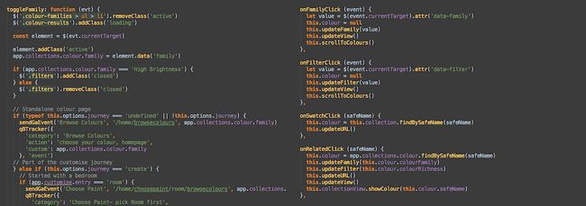
There’s a temptation when building a self-contained site to quietly ignore encapsulation, and to litter the code with global references to app or to reach up through components with parent.parent.parent or such like. This quickly builds technical debt.

Where possible, try to think of your app as a series of independent modules, and build on your framework’s best practices to eliminate tight coupling and interdependency. If it helps, try imagining you’re going to reuse parts of the app in other projects, and think how you would structure files, markup and code to facilitate this.

You need to be vigilant for conflating responsibilities and ask yourself constantly: does this belong here? If code feels ‘icky’, it probably is.

On team projects, lack of code reuse and copy/pasted code is a big problem. When you see repeated code, bite the bullet and refactor all instances to a function, module or template. Again, a good folder structure will make it easy for you to work out where to put things.

04. Beware over-complexity


The key problem with complexity is that it masks and distracts from the original problem you were trying to solve and in turn ends up generating more code and more complexity, either in the same place or in other parts of the application. You end up in a vicious cycle.

If your code is starting to look more like an algebra lesson than a well-maintained API, you need to take a step back. It may be that you need to refactor that particular chunk of code, refactor the class it’s in or reconsider your current approach to the problem you’re trying to solve.

In extreme cases, you may need to look outside yet again. I recently refactored an extremely complicated view setup that I realised was the victim of a badly thought-out routing schema. By redesigning the convoluted routes into something sensible, I was able to ditch hundreds of lines of dense spaghetti-code in various classes, and remove some long-standing router hacks/bugs in the process.

The one thing you should not do after writing some particularly obtuse code is sit back and marvel proudly at how difficult it is to read! The best code is elegant (read: not tricky); if yours isn’t, you have work to do.
Share:

Kick start your developer career with this bundle

Web developers are responsible for keeping the internet running. They work behind the scenes to make sure the gears keep turning for all of your favourite applications and sites. It's a career that rewards structure and creativity, and you can join their ranks by working your way through the Ultimate Front End Developer Bundle.


For any aspiring developer, the Ultimate Front End Developer Bundle is the ideal starting place for the start of your career. This collection of eight courses taught by experts can help anyone learn how to code using the most important languages in web development, from JavaScript to HTML5 and CSS3. Work your way through this bundle of courses and you'll pick up the skills you need to bring your dream designs to life and just may launch a new and lucrative career.

You can get the Ultimate Front End Developer Bundle on sale for just $39 (approx. £28), 96% off the retail price. That’s a massive savings on a bundle that could help you find work in a growing industry, so grab this deal today!

About deals

We all like a special offer or two, particularly with creative tools and design assets often being eye-wateringly expensive. That's why the Deals store is committed to bringing you useful deals, freebies, and giveaways on design assets (logos, templates, icons, fonts, vectors and more), tutorials, e-learning, inspirational items, hardware and more.
Share:

How to use an HTML boilerplate: A guide

Although websites are all unique from a content and design perspective, the underlying foundations of the vast majority of sites are very similar. Using an HTML boilerplate for the initial work is a great way to save time and effort, and here we'll show you how you can use one to kick-start your website projects.


Typically, site designers and developers want to deal with the quirks of individual browsers, stripping out any proprietary styling that such software might add to specific website layout elements. 

Additionally, they may use scripts to deal with the shortcomings of older browsers, and drop in basic default styles for horizontal rules and elements that are supposed to be hidden.
Doing this again and again for every project is a massive waste of time and energy. Not only will you mostly be repeating yourself, you might also make unique errors during every attempt to start afresh. An HTML boilerplate gives you something ready-made to work with, thus avoiding the horror of staring at a blank document and trying to figure out where to begin.

What is an HTML boilerplate?

Boilerplates are similar to templates, but more helpful, in that they often contain text and graphics to start you off rather than just layouts that include these elements. An HTML boilerplate is a set of downloadable files that provide a foundation for any website you might want to create. Typically, they have been built by industry professionals but freely released to the community. Adapting them for your own projects helps speed things up and ensure the basics of your site are sound.

Note that the term 'HTML boilerplate' doesn't mean you just get an HTML document or even a bunch of them. Boilerplates may contain a range of file types, including HTML documents, but also add CSS, JavaScript, placeholder images, and documentation on how to use what you've just downloaded.

Popular boilerplates

HTML5 Boilerplate is a good place to start. The self-described "web's most popular frontend template", is a sleek and simple HTML5 template that's the result of the pooled knowledge of hundreds of developers. It provides the basic scaffolding or framework for building an entire website.

We're on version 7 at the moment, but you can get a gist of how this works by watching the introductory video designed for v5. The latest version is mobile-friendly, with an optimised Google Analytics snippet and minified versions of jQuery and Modernizr included.

Another popular option to explore is Bootstrap. This calls itself a 'frontend component library', and offers more comprehensive options than the HTML5 Boilerplate framework. Some argue that the industry's reliance on Bootstrap has led to increasing homogeneity in web design over recent years.

Whether you opt for a simple HTML5 boilerplate, or something that offers more control, will depend on your level of ability, confidence and needs.

Using HTML5 Boilerplate

When downloaded, this free, open-source boilerplate provides you with documentation and licensing information, some CSS, placeholder images in various aspect ratios, two HTML files, some JavaScript, and some server config files.


On downloading the archive, it's a good idea to make a copy and keep it clean and untouched. It can then serve as reference for any changes you make.

For your new site, first replace the favicon.ico and icon.png files with your logo – these will appear as your site's favicon and the icon when your site is saved to someone's iOS homescreen. An online generator can help you create new images.

In the HTML, there might be some things that you're not familiar with. The majority of these additions deal with issues relating to legacy browsers. The final script element is for Google Analytics and can be removed entirely if you don't use that. Leave the other script elements that are found towards the end of the file, because they load jQuery.

Add content to the body of the document after the 'Add your site or application content here' comment. You'll also need to give the page a title and fill the 'content' value in the 'description' meta tag.

Note also that all links are relative in this document, and so you may need to change them to root-relative or absolute links if you start nesting web pages in folders. You can add comments if you make any major changes to the HTML, to remind yourself later.

CSS edits

HTML5 Boilerplate is a great way to save time when creating new websites. Of the two CSS documents included with HTML5 Boilerplate, there's no need to touch normalize.css. This is the reset document that ensures all browsers start on a level playing field when it comes to your website. By contrast, main.cssincludes what the document terms "opinionated defaults", including some basic styles for selections, horizontal rules, images, and forms, helpers for item visibility, and @media rules for responsive web design and print.

Everything here is fair game for updating, although carefully consider whether you should do so. There's an area set aside for the author's custom styles (ie, yours) or you could create an entirely separate CSS document and attach that to your HTML as well.

Whatever your choice, be mindful of how you'll deal with subsequent updates to HTML5 Boilerplate itself. If you edit any of the default main.css styles, changes made in future versions of HTML5 Boilerplate (which would either be added by replacing files, or replacing parts of files) won't necessarily come across to your site, or will override your own edits. Therefore, again make use of comments for any changes, thereby making later comparisons much easier.

Advanced boilerplates


Once you gain experience, it's worth considering a custom build using Initializr, retaining the components you need and ditching those you don't. Also, if you're creating a WordPress site, explore a WordPress-specific blank theme, such as HTML5 Blank.

These downloads and services are all free, so you can check out and experiment with them at your leisure. Still, whatever you do, a little work and investigation now should save you a whole lot of time later, when you just pull out your boilerplate to get cracking on a new website.
Share:

The best website builders in 2019

When it comes to the best website builders, knowing which one to pick from a plethora of options can be tricky. But if you're ready to get started with a new site, we're here to help.


For a start you'll be looking for a website builder that can create your website in the latest version of HTML. And secondly, you'll want a tool that simplifies the process of web design and enables you to create a great site without needing a lot of programming or coding knowledge.

We've scoured the web to find you the best website builders – in no particular order – that fit these requirements and more. Or, if it's a hosting service you're after, take a look at our guide to best web hosting 2019.

01. Duda


Kicking off our list of the best website builders is Duda. Designed with online stores, business sites, blogs and one-pagers in mind, this quality responsive website builder has a stack of ready-made templates for you to choose from, and a drag-and-drop editor to make it easy to put your site together. It features plenty of widgets to help turn visitors into paying customers, plus integration with web-based solutions such as OpenTable, Disqus and PayPal, and even features website personalisation tools that can trigger a variety of individualised actions that'll make your customers feel extra-special.

02. Shopify

If the website you need to build is an online store, Shopify is one of the best website builders around. It powers over 325,000 online shops and the pricing plans and features are flexible enough that it will work for you whether you have a tiny fledgling business or something much larger. 

There are loads of templates and themes so you can put your store together exactly as you want, and if you think you might need something more advanced in the future, it's easy to find an expert to help you. Prices start from $29 per month.

03. Silex


Free and open source, Silex can be used entirely within the browser and works with you, whatever your skill level. There's a friendly WYSWIG editor drang and drop interface that you can use to put everything together, with all your changes visible immediately, and if you're comfortable with CSS and JavaScript, then you'll find integrated editors that enable you to get down and dirty with code in order to add styles and interactivity to your elements.

There are plenty of templates – both free and paid – and widgets to choose from, plus built-in SEO. Bear in mind, though, that Silex won't host your site, however it offers advice to help you get sorted.

04. Jimdo


If you want to create a site for free without getting hobbled by a lack of features, give Jimdo a try. All of its plans offer everything you need to create a professional-looking HTML5-powered website, including templates, photo galleries, Google Maps integration, plenty of storage and unlimited bandwidth, and it's easy to put everything together. Step up to one of its paid services from $5/month and you'll get your own domain, an online store, SEO, widgets and stats.

05. BigCommerce


Got something to sell? BigCommerce is a great way to create beautiful ecommerce websites with off-the-shelf responsive templates featuring plenty of customisation options. Its storefront editor enables you to change your site's look without coding, while you can also go completely custom using HTML, CSS and other code libraries.

The basic plan will cost you $29.95/month for a full-featured online store, and if your business takes off then BigCommerce can scale to suit your needs.

06. Webflow


Californian-based website building company Webflow is an astonishingly simple platform that gives everyone the power to build their perfect site across a range of devices.

Suited to designers, creative professionals and entrepreneurs, Webflow is a web design tool, CMS and hosting platform all in one. Create your dream site and update it personally without having to touch a single line of backend code. Paid plans start at $12 per month.

07. BuilderEngine


Promising to help users set-up and launch their site in seconds, BuilderEngine is an intuitive platform capable of creating any type of website.

Users can get started with a free trial package, complete with template themes and hosting, then choose add-ons from the constantly updating collections of apps. Capable of creating complex sites without coding, BuilderEngine goes beyond basic text and images. If you ever get stuck you can also find one-to-one support by using their forums and Ticket Support Systems.

08. IM Creator


The IM Creator was introduced in 2011 and it quickly became one of the top HTML5 website builders online. The IM Creator hosts a huge library of stunning website templates in a long list of categories ranging from sports and medicine to business and academics.

You can start using the IM Creator immediately after registering for free. Start off with a blank page or choose a design of your choice from a library of hundreds of fully customisable website templates. Since the IM Creator is an HTML5 website builder, every website you create with it should work fine with all major mobile platforms.

09. SquareSpace


SquareSpace is a popular web-based HTML5 website builder that will help you create beautiful sites in a matter of minutes.

It offers a diverse range of website designs tailored for different occasions and industries. All the templates are compatible with mobile devices as well and contain high-resolution images and graphics to add further color to your website. Squarespace is a paid application but you can also use its free trial with limited options.
Share:

To hell with jQuery

JavaScript library jQuery has divided industry opinion. Karolina Szczur asks if libraries cause substandard code – or if devs are to blame.

The popularity of JavaScript has grown over the past few years. Dozens of libraries have been created. Yet there’s one that fuels controversial opinion: from its dedicated lovers to haters (who question the programming abilities of anyone who uses this library), yes, we’re talking about jQuery.

A designer’s story

When I started my career, it became obvious that frontend development skills are essential; I needed to be able to code my own designs or at least have a good understanding of markup to create easy-to-implement interfaces.


Photoshop is a key tool for most designers. But the nature of this gigantic piece of software is very different from development environments. You’re not able to debug anything and you (probably) don’t have any idea how it works. It’s a black box compared to the open nature of the web and software.

Along with the ease of reading code, which came with GitHub, came problems. We failed to take advantage of so many codebases being available to learn from. We took it for granted and assumed that things just magically work rather than caring about how. It all comes down to two types of developers, or people in general, actually.

Operator vs engineer

An operator knows how to use a tool without understanding how it works. On the other hand an engineer has full awareness of the code so he can modify and adjust it to his needs. This leads to the question: how many of you have read jQuery’s codebase? My guess would be not many. How many of you read the codebase of any library you’re using? So many developers wave the flag of ‘RTFM’ (Read The Fucking Manual) while they should be encouraging ‘RTFC’ (Read The Fucking Code).

The web gives an insane amount of freedom to complainers and people saying bad things about software. These opinions don’t belong to code-aware programmers, but lazy ones who are judging things they don’t necessarily know or understand.

Libraries usually try to solve a broad spectrum of problems, which alters the level of complexity. While developing, we should strive for simplicity, preventing unnecessary complication and increased cognitive load. But sometimes the tools we use can be over engineered, bloated or poorly written. For some cases, microframeworks are the most reasonable approach; they’re more lightweight, modular, address specific issues and are easier to understand because of smaller codebase. What’s the root problem of jQuery (and other JavaScript libraries) then? Are they really poor quality and should we write our own? Well, no.

jQuery is good

For certain purposes (and use cases), when used by a seasoned programmer, it is redundant. There are exceptions to the rule though. The long-awaited parent selector is still unavailable in CSS. While stylesheets give us native execution, which is faster due to hardware acceleration and interpretation mechanisms, they introduce degradation and cross-browser issues. There are multiple arguments and cases for and against jQuery, but that’s not the point. The point is: how we can improve as developers.

Be a better developer

There’s no single, valid and best approach, but this consideration may help write and maintain libraries.

First, remember the separation of concerns. Manage the independent nature of functionalities while making them work together. Maintain readability and accessibility. Design for connection and consider the idea of piping from Unix systems. Bear in mind that most libraries and tools were never designed to work together, so prevent conflicts. Simplify debugging and use common approaches.

Don’t disapprove solutions just because you don’t know them or that’s a hyped opinion. Explore options. Read the code. Know the tools. Be better.
Share:

Five reasons to use jQuery mobile

With the proliferation of touchscreens on phones, tablets and laptops, we face an urgent need to build touch-friendly websites. Not only that, but website owners need to ensure that their content can be viewed by an ever-increasing, diverse set of devices. That’s where jQuery Mobile comes in. The jQuery Mobile framework is able to improve websites through adding touch-friendly form inputs, more efficient page loads and wider device support through the use of progressive enhancement.

I’ve been a longtime advocate of the jQuery, but wasn’t convinced straight-away that jQuery Mobile’s approach was the right one. I decided to investigate further by talking to the creators of jQuery Mobile, Scott Jehl and Todd Parker from Filament Group. I asked them why jQuery Mobile behaves the way it does, and as a result, pulled out five main things that jQuery Mobile does to help you build more touch-friendly websites that work across a wide range of browsers and devices:

The wide browser and device coverage - using progressive enhancement, your website is able to be seen by the widest number of browsers and devices.
Touch-friendly form inputs and UI widgets - form inputs are enhanced to be touch-friendly, including the addition of a set of touch-friendly UI widgets.

Responsive web design ready - jQuery Mobile is a 'mobile-first' framework, not 'mobile only'.
Layout and theming engine - highly extensible and customisable theme and layout engine.
Ajax page navigation model - load new pages faster using Ajax and HTML5 pushstate instead of full page refreshes. Let’s dive into each of these five reasons in-depth:

1. Wide browser and device coverage

'Don’t break the web' has been jQuery Mobile’s mantra. The great promise of the web was that anybody, anywhere in the world could access content by typing in a URL or clicking a link.


jQuery Mobile is the only major UI framework that's in-line with making sure everyone in the world can access content via a URL or link. jQuery Mobile embraces the concepts of the web and works with it, not against it. It embraces progressive enhancement where it delivers basic HTML to devices that can’t handle CSS and Ajax and then enhances the devices that do support it.

All devices in all parts of the world will be able to see your content if you use jQuery Mobile

2. Touch-friendly form inputs and UI widgets

If you’ve ever tried to hit a checkbox on a non-mobile friendly form, you know what a pain it can be to have to zoom in and out in order to hit poorly designed form elements. You want to make sure your form elements and UI widgets work well with touch. Touch is now in laptops and desktops so it's now completely inexcusable to make websites that aren’t being designed to support the onslaught of new touch-capable devices hitting the market. jQuery Mobile is designed touch-first (yet still works great with a mouse) so you get big, chunky tap targets that are finger-friendly for all of its form elements and UI widgets.

jQuery Mobile auto-enhances your forms to become touch-friendly. Checkboxes are wrapped in a very generous-sized label to create a nice tap-zone, so it's easy to hit the intended checkbox. Textareas are problematic on mobile once you go past the allotted text space (you have to two-finger scroll to see content in a scrollable textarea), so jQuery Mobile auto-grows textareas so the user can easily see the content they’ve entered at all times.


Many types of easily styled and enhanced form elements are in jQuery Mobile, such as the slider, checkbox and radio sets, search input and select menus. Also, each of these form elements comes with an alternate 'mini' version, which is ideal for inserting into header and footer elements on your page (such as a mini select element for navigation).

jQuery Mobile also has widgets such as persistent toolbars, buttons, dialogs and, my personal favourite is, the new popup widget, which allows you to popup any type of content from where you trigger it. This is useful for displaying in-page forms, dialogs, photos, maps and video etc. More widgets are added with each version of jQuery Mobile that are all touch-friendly and work across a myriad of devices and browsers.

3. Responsive web design friendly

You’ve always been able to develop responsive websites on top of jQuery Mobile because it's a 'mobile-first framework ... NOT 'mobile only'. And in the 1.3 version of jQuery mobile, a lot more focus is given to responsive web design features.

New panel widget

You know those menus that slide out from the side? Popularised by Facebook’s mobile application, this user interface pattern is very familiar to most users on mobile. View the panels in actions.


Tables can switch to a stacked label/data style presentation at narrow screen widths. jQuery Mobile calls this table reflow.


Responsive grid

The grids for jQuery Mobile consists of simple grid blocks that can be stacked on top of each other when viewed on smaller displays.


4. Layout and Theming Engine

jQuery Mobile looks at your data-* attributes in your HTML and enhances it with behaviour and style. For instance, by applying data-role=”listview” to your unordered lists, CSS classes are auto-injected into your lists so that it looks like a mobilised list. And if there are links inside your list items, it will add the arrow on the list to show that you can click to go to a new page by touching that particular item.

The data-* attributes give you basic formatting and structure, but everything in jQuery Mobile is optional and the CSS classes are extensible, so you aren’t locked into the default theme.

The first thing you should do to start out customising your application is to start with the jQuery Mobile Themeroller. It's so easy to create your own theme colours by dragging and dropping colors from the colour palette right onto the element you are styling. Themeroller even has integrated Adobe’s Kuler tool, which gives top user-rated colour schemes to choose from.


In the above example, I’ve built an 'A' and 'B' theme. jQuery Mobile comes with the ability to recursively apply your themes to elements using the data-themeattribute. If I wanted my page to use the default 'A' theme and my form to use the 'B' theme I would just apply data-theme=”b” to my form element and all the elements inside the form automatically will be styled with the 'B' theme.

5. Ajax page navigation model

Instead of full page reloads, jQuery Mobile looks for links local to the domain you are on and fetches the new page content with Ajax. When a user clicks a link, the contents of the new page are then loaded it into a new div and then transitioned into the current viewport.

Let’s say you are on index.html and you then you click a link to page.html and the link to page.html has the following markup:
<a href="page.html" data-transition="slide">Link</a>
Note: The data-transition attribute here isn't required, this is just a demo of changing the page transition animation to slide instead of the default fade page transition. There are many other page transitions built into jQuery mobile from a simple fade to a more complex, flow transition.


How the new page, page.html content would first be loaded off to the side in jQuery Mobile and then slid into view

If the browser you're using supports HTML5 pushstate, the URL address in your browser window would then be updated to yourdomain.com/page.html once the new page finishes sliding in. Also, a spinning loading indicator is displayed while the new page is being loaded in to give the user feedback that the link was hit.

The main advantage of this way of loading pages is that you aren’t having to re-initialise all of the JavaScript and CSS requests on your second page load. Even if these assets are loaded from the cache, there are savings of execution time on mobile devices.

In the case of the first-page load using jQuery Mobile, all of your scripts and styles already initialised on your device so we don’t need to do that work again when loading a new page. The only thing needed to render a new page is the new fragment of HTML. With this method of loading pages, you’ll end up with faster subsequent page requests critical for developing a great mobile experience.
Share:

10 Best pieces of user testing software

The process of user testing could be extremely time-consuming. Imagine running your own testing lab, hiring and firing your own target consumers and developing the required hardware: expensive and long-winded. 

Luckily, there is loads of user testing software around that will help you to avoid all of that. They offer the tools to monitor user behavior and gather important feedback so you can iron out any issues, and craft your design into the best version it can be.


In this article, we'll take a look – in no particular order – at some of the most useful and popular user testing software to get you started. Which one becomes your go-to user testing tool will depend very much on what your requirements are and which interface appeals most to you. We suggest trying out the free trial versions of the user testing software in this list (where it's available), to see how well each one suits your needs before taking the plunge.

01. Userlytics


Userlytics is the perfect remote user testing platform, designed to enable you to record users’ interactions with a website, mobile app or prototype. This tool uses picture-in-picture remote testing software to capture the user's facial expression and audio commentary as they test your asset, in order to provide a full picture of how they respond and react to your asset in real time.

There is no hardware or complicated setup required to get started with Userlytics. It’s a great way to quickly and inexpensively uncover the frustrating points on your mobile app, or discover why users are doing what they’re doing on your website.

02. UsabilityHub


Should you put the navigation toolbar on the left or the right? Will people prefer to design A or design B? Making design decisions can be frustrating, especially when it comes to figuring out which design is the best solution to release. This is where UsabilityHub comes in: It’s designed to help you settle any design debates once and for all. UsabilityHub includes five different test suites to enable you to capture and analyze users’ preferences and make a confident decision.

Simply upload an image of your website interface, mobile app UI or software design and assign a task for users to complete, then wait for the results. UsabilityHub will provide a report that includes heatmaps indicating where users clicked. You can even set a five-second test to capture the user’s first impression of your design.

With this user testing software, you can also upload multiple designs and ask users which version they prefer and why to create navigational tests to pinpoint dropout points (ideal for complicated user journeys) and arrange a survey to gather user feedback.

There is a basic free option of this software – you'll only need to pay if you want UsabilityHub to provide test subjects for you. 

03. Lookback


Lookback is a user experience recording software made simple. With it, you can record a user’s computer or mobile device in-house or remotely, without any additional equipment.

What makes Lookback unique is that you can join the live testing session and speak to the user while they’re exploring your design, to ask questions or conduct an interview. A lot of other user testing software only provides a report or recording after the testing has been completed, but with Lookback, you can schedule tests and watch them as they are conducted in real time, and speak to the user directly with follow up questions. It’s an easy way to get an immediate answer.

04. TryMyUI


TryMyUI is a usability testing service aimed at helping you discover how you can improve your website or mobile app. With it, you can set up your own custom test with specific tasks for users to carry out and find the right user base through a wide range of demographics. You can also watch the recording of the users conducting the tests you’ve set.

Alternatively, you can use TryMyUI Stream service. This is installed on your website to collect real-time information of how the user interacts with your website, enabling you to find pitfalls and identify bad UX with Stream’s AI frustration finder. This helps to identify paths users are taking, and which ones lead to success and failure.

05. Hotjar


Hotjar contains a host of useful tools to help you analyzing and receive helpful feedback for your website. Crazy Egg (number #6 in our list) may be the user testing software that springs to mind when you think of heat maps, but Hotjar has them too. These help you see which parts of your interface your audience is being drawn to, and are getting the most clicks and taps.

With Hotjar you can also see recordings of people's mouse trails to indicate exactly how they're navigating your site, and the Conversion Funnels utility lets you know at which point people are dropping out of a purchase or sign-up process. These features can be very insightful. The funnel helps you pinpoint exactly which part of your site needs tweaking in order to get better results from your design.

There are a few other great bits of functionality within this tool, including form analysis and feedback polls. Hotjar should definitely be on your shortlist of user testing software.

06. Reflector


Screen mirroring app Reflector isn't designed specifically for usability testing, but it's useful for testing how your app design works on mobile. This tool wirelessly sends your phone or tablet screen to your PC or Mac so you can watch how people use your app. Reflector also includes recording capabilities so you can review your testing sessions later or share and present them to an audience.

07. UserTesting


One of the best and most simple ways to record users interacting with your website, alongside their responses, is via video using UserTesting.

With this user testing software, you can pick your target audience and assign users a task to perform on your website or app. Your test can be run on a desktop, tablet or a mobile device. In return, UserTesting will record real people giving their thoughts whilst interacting with your website/app, so you can truly understand why users do what they do. You can try out UserTesting for free.

08. Crazy Egg


Uncover how visitors interact with your website with x-ray glasses using Crazy Egg. This user testing heat map software helps you understand what people are doing on your website and why visitors may not be converting into regular users or customers. Heat maps identify which objects on your website are being clicked on and which traffic sources they are being referred from.

An extremely helpful feature in Crazy Egg is the scroll map, which identifies how far visitors scroll down a page before they abandon it entirely. Other useful features include the ability to monitor the numbers of clicks on each element of a page and to do A/B testing.

09. Inspectlet


Inspectlet is a user testing software that records your visitors and monitors exactly what they are doing on your website, including what links they click on, mouse movement, scrolling and key-presses. You can watch each visitor as if you were looking over their shoulder.

Beyond recording user interaction on your website, Inspectlet includes a heat map, which allows you to identify the sections visitors are paying attention to. The heat map also includes eye tracking, information about what has been clicked on the most and how far visitors scroll down pages. And as an added bonus, the form analytics tool highlights which form elements are the most troublesome for visitors and where they are failing the most.

10. Optimizely


A/B testing is an extremely effective way to test planned changes on a web page compared to the existing design (or an alternative proposed update) to determine which version produces the most positive results. Google offers its own A/B testing software called Google Optimize, which allows you to perform experiments on your website.

However, more robust software for A/B testing is Optimizely. This tool offers several easy-to-use features to help you build your tests, including multivariate testing – a technique to test multiple variables on a given web page. You can create personalized experiences and target specific audiences when unveiling new designs to visitors, including targeting different URLs, browsers and geographic regions.

Optimizely is a comprehensive suite of tools, but it is aimed at serious businesses, which is reflected in the price.
Share:

Conduct free and fast user tests with UserLook

Assumptions are bad for business. They’re bad because, by nature, we hold opinions based on the way we see the world and biases based on things that have happened to us. When it comes to design, making assumptions is dangerous because design costs money, time and resources. 

And it costs much more money, time and resources than it does to conduct some simple user testing that can help prove (or disprove) the theories we hold.


Following assumptions often result in at least one of the following outcomes:
  • Designing the wrong thing first
  • Not designing the right thing at all
  • Designing the right thing but doing it in the wrong way

What exactly is user testing?

User testing is where users actually use an app or website (or, at the very least, a prototype of it) and offer feedback and insight that can be used to improve it. User testing goes above and beyond a simple feedback survey and involves watching actual users (or the target market) as they test our design.

In this article we’ll self-service our own user tests using UserLook – this is where, after defining the questions that we’d like to ask, we send the user a link where they can conduct their user test remotely in their own time. This helps us automate user testing (which saves time), while sourcing user testers from our own user-base (which saves money).

Note: If you’d rather have UserLook recruit testers for you, that’s fine too – the pricing page lists various options.

When to user test

You might be wondering how often you should run user tests. The short answer is: constantly – always be user testing. When decisions are fuelled by what users are outright asking for, you’ll feel way less anxious and far more confident of success when the product you’re designing finally becomes publicly available.

The majority of the time, teams throw in the towel with user testing because they don’t understand why they’re doing it and therefore ask all the wrong questions, which results in vague answers that don’t offer much insight. Before asking questions in a user test, we first need to ask ourselves ‘Why are we doing this?’ and ‘What do we want to learn from this user test?’

Before we begin, we first need to consider whether we’re testing an MVP (a minimum viable product) – for which user testing is the right approach – or the usability of an already validated product, in which case usability testing is the right approach. If you’re testing an MVP, then you’re probably best off focusing on user testing.

When it comes to user testing the core question is: ‘Does this solve the problem?’ However, with usability testing, the defining question is: ‘How well does it solve the problem?’

User testing comes first and this happens as soon as we have an MVP. Usability testing happens once the core product has been validated and it’s time to flesh out the wider scope of functionality that the app or website is supposed to offer. To summarise:
  • User testing = user needs
  • Usability testing = usability/UX

01. Set up UserLook


In this step we’ll set up UserLook and define our question set, discussing test length, compensation and more along the way.

Start by signing up to UserLook, then choose:
  • Start testing
  • Self-service w/my own users

Some of the form fields are fairly self-explanatory (for example Name of Test) but we’ll run through some of the less-obvious options that can impact the outcome of our tests.

02. Choose the URL of the website to test

Obvious? Actually not so much! While you might think to add a live website URL here, we can actually include prototypes built with InVision Studio, Adobe XD, Sketch and basically any screen design tool that syncs mockups to the cloud – which means we can test sooner (ie before investing valuable money, time and resources getting into the various complexities of development).

To make this work, simply sync your design to Sketch Cloud, InVision or whatever the equivalent is in your design tool of choice, then paste the given share link into the form field.

03. Set a time limit


You’re probably wondering why you would want to set a time limit on your user test. Here’s one example: the five-second user test. In this day and age, where users are typically impatient, forgetful and easily distracted, a five-second user test can reveal what the user really remembers about what they just saw.

Was it immediately clear what the webpage was about? If the answer is no, then the user is likely to hit the back button. A five-second user test can determine whether or not the screen or webpage clearly communicates what the user needs to do.

04. Compensate users

While only optional, some level of compensation will create an incentive for users to offer quality feedback. Compensation doesn’t have to mean financial compensation though, it can be something as simple as free access to whatever you’re building.

05. Consider your questions carefully

Naturally, the questions themselves are the most defining aspect of the test. The truth is you probably have lots of questions but it’s important to remember that we can conduct as many user tests as needed, so before each test, have a long and hard think about what you want to learn in each one.

For instance, an initial free exploration test might reveal that users have trouble signing up, so after designing another iteration one of the questions in a follow-up performance test could be: ‘What frustrations did you have signing up?’

06. Create a context intro

A context intro is the first thing users see when they start their test – this is where we introduce ourselves, explain what we’re doing (and why) and set expectations. If the user is required to complete a specific task, this is where we’d introduce that task and state that there are a few questions to be answered (these will appear in the sidebar during the test process).

07. Set participant info requirements

Participant info includes name, email, age, occupation, location, household income, and gender. If we wanted to see how different types of recurring feedback correlate with different demographics, we could segment this data to contribute to what are called user personas, a sort of written story that describes a certain user type as well as their needs and objectives.

For example, 18- to 29-year-olds and 48- to 59-year-olds will naturally have different needs and objectives when using, say, Facebook – where younger users might want to engage with brands and older demographics might want to stay in touch with friends. Although optional, this data can offer more context to the user feedback and contribute to the development of these personas.

08. Share test

After defining the scope, we should receive a URL that we can share with user testers. After that, users can complete tests in their own time, leaving us free to work on something else.

If the test questions have been defined correctly, we should have some high-quality feedback that’s both actionable and consistent; this means it’s clear what we need to change in the next iteration, with some feedback recurring more than others.

Next, it’s simply a case of organizing the feedback.

09. Organize your data

Affinity mapping is a grouping technique used to organize various data, including insights, ideas, sketches, feedback and snippets of research; in this scenario we could organize our user feedback based on common themes.

If we were user testing, for example, these common themes could help us create what’s called a product roadmap, essentially a timeline of features and fixes focusing primarily on commonly occurring feedback while making less common feedback a secondary concern.

After implementing all of these high-priority improvements, features and fixes from the current sprint cycle, another round of user testing could then reveal a fresh collection of opportunities for improvement, laying the foundation for the next sprint cycle (which, by the way, could also include some or all of the low-priority tasks from the previous sprint). Then just rinse and repeat: always be testing!
Share:

5 golden rules of UX

When we think of UX, we tend to think usability, or at least we used to. However these days UX is a much broader church with many more aspects to consider than straightforward usability. Like web design tools, UX rules and best practices keep on evolving, and if you've been sticking to the same UX process for the past few years then they're almost certainly in need of an update.


Whether you need to overhaul your UX workflow completely or just want to check that you're ticking all the right UX boxes, take a look at the 7 essential rules of UX for 2019 and beyond.

01. Design for users


Falling in love with 'good' ideas is easy. Too easy, in fact, and seemingly harmless until we realise that it's not love at all – it's infatuation, and infatuation inevitably fades with time. This is what causes freelance designers to constantly redesign their portfolio; they're motivated by their temporary infatuation with visual aesthetics rather than the user's needs.

Thankfully, figuring out whether or not ideas have user-value (or at the very least, business-value) isn't too difficult. It revolves around asking users two core questions:
  • "Do you want this?" (asked during user testing)
  • "Can you use this?" (asked during usability testing)

Not very romantic, we know, but at least we won't end up wasting resources and time designing the wrong thing (or the right thing in the wrong way). It's safer to simply ask users what they want and need. Scarier, sure – but safer, and when the results are in, you'll feel relieved, even if the feedback is negative.

Substituting guesswork for qualitative feedback from users should be observed as more of a blessing than something to be feared, and when done correctly, it can bring huge amounts of motivation, positivity and clarity to the product roadmap. With the right attitude, feedback can be our mightiest resource!

User testing

It's likely that you already know what user testing is, and have heard the benefits of doing so countless times, so here are some undervalued testing tips that often end up taking the back seat:
  • Maintain a list of loyal testers and use them often
  • Award free access in exchange for regular feedback
  • Have fun automating the workflow with various apps
  • Regularly sit down with the team and organise the feedback

All-in-all: don't overthink it (too much) and simply enjoy building high-quality relationships with your main advocates.

Gathering feedback

Getting face-to-face with users, either in real life or with remote user testing tools, is what designers fear most about user testing, but it's actually really useful, not to mention the best way to build relationships with our main advocates.

That being said, don't let it be known that face-to-face interviews are the only way to receive quality feedback.

Here are a few excellent tools that are not only useful individually, but can be superhumanly powerful when linked up using automation software like Zapier.

02. Provide absolute clarity


When users become confused, a number of things happen. They become stalled, they trust our brand a little less, and most importantly, they hit the back button, never to return again.

Sadly, we live in an increasingly impatient world, where a cheaper, faster, better alternative is always right around the corner. Users cannot be taken for granted, so being clear is an absolute must. But, what exactly do we mean when we say clarity?

Let's take a look at a few examples.

Colour

Colour is one of the many ways users learn how to use and understand how an interface works. Where it's human nature to recognise rather than recall, colour is subtly one of the most recognisable aspects of everyday life, despite colour meaning different things in various cultures, and in different contexts.

Want to convey error? Well… the best choice is to use red.

Design principles

As well as colour, a combination of contrast, repetition, proportion and proximity* can help to establish clarity.

Contrast

Contrast, in short, helps elements stand out. We can optimise contrast with colour, size, depth and more, which in turns aids clarity by shifting the user's attention. It's a non-verbal way of clarifying what the user should be looking at above all else.

Proximity

A tap target by itself is just that – a tap target – however, where the link is displayed can say a lot about what it does and in which scenario users should click on it. A tap target in the main navigation tells users that it's a link to somewhere else, but it might not necessarily be the link the user needs.

Alternatively, a set of horizontal cards each containing a button (think: a pricing table on a pricing screen) illustrates that a choice needs to be made. So, as you can see, proximity conveys how various elements are related, whether that's for choice-based interactions or navigational items.

UX copy

Last but not least, there's the wording itself. Imagery is subjective, but words offer a chance to be literal. The intent of a button saying 'Let's do this' could be inferred from the context, but the added cognitive load from this (and other contributing factors) just isn't worth the chance to sound cool.

Hitting the submit button on a contact form infers that the user's email was sent, however, a properly worded confirmation can go a long way, especially in the event of a lost connection.

Words matter!

03. Give users control


As humans, we haven't yet evolved to mind-read, and given the endless options that some apps and websites offer, that's a shame. Let's take eCommerce stores for example, which often have a ton of items in a ton of categories. On top of that, items can be further distinguished by defining features such as colour.

This means that search results are often further narrowed by filters and tags, requiring more interactions than the average interface, but that that's not a bad thing, and this doesn't get mentioned enough. Users want to customise their experience.

The benefits of control

A holidaymaker isn't just looking for an Airbnb, they're looking for their Airbnb; the home that's going to make their holiday special in a way that no (or not very many) other Airbnbs can, indicating that control goes way beyond the considerations of usability; it actually enriches the overall customer experience.

Control can also lead to the development of new features and boosted engagement. Think about it: despite a few usability setbacks, Slack users could create 'Private Groups' long before they existed, simply by direct messaging multiple users at once.

These setbacks would eventually warrant the implementation of the feature itself, but until then, control allowed users to tailor their experience in a way that suited their own agenda.

The negatives of zero-control

Micro-interactions are often hindered by a lack of control, but even when user flows are designed to be relatively linear (for instance, a sign-up flow or some other form-based interaction), the control means the user can fix and edit without any trouble. If we compared this to a human-to-human interaction, a lack of patience would surely make the encounter less than friendly.

Consider splitting up lengthy forms into several smaller micro-interactions (where the user can save their data periodically and even navigate back-and-forth between the different sections), and also adding a confirmation screen so that the user can check over their input before hitting the magic button. As an added bonus, if the user can log in and correct mistakes after they've been 'sent', that's even better.

In short, let the user take the wheel.

04. Predict, then adapt


Hick's Law states that the time it takes to make a decision correlates with the number of choices the user has to make — too long, and the user won't make a choice at all.

This kind of cognitive overload is known as analysis paralysis, the act of not being able to make a choice when there are too many options. Let's take a look at two ways to reduce choices.

Context

Luckily, by keeping layouts minimal, both conceptually and visually, we can help users make decisions faster, and thus increase the likelihood of conversion. But, is this a task easier said than done? After all, it can be quite difficult to force an element to take the back seat in favour of something else, especially when said element is also somewhat important.

The solution? Context

What's important on one screen may not be important on another screen, in which case tucking away not-applicable-in-the-current-context menu items in a hamburger menu actually makes sense (yep, the hamburger menu isn't as bad as we might think!).

If that seems risky, there are a number of data-driven ways to lesson the risk. Firstly, there's analytics tools that track user behaviour, and then there's heatmap tools, which can show us where users are actually clicking (or not clicking), which in this scenario is the better option. If you'd rather take a toe-dip approach, A/B testing can help us test layout changes with a fraction of our audience before committing them app/site-wide.

05. Maintain consistency


Consistency has long been a key element in branding, but consistency also contributes heavily to user experience as well.

Brains are designed to learn mental shortcuts, right up to the point where we don't even realise we're doing it. When traffic lights turn green, we don't analyse the situation and then make a conscious decision to accelerate, we just do it instinctively.

Now imagine that one day, the typical green, yellow, red setup was replaced with Go, Get Ready and Stop. You'd be taken aback for sure, and even if just for a few seconds, you'd contemplate what the hell is going on before accelerating off.

Problem is, these few seconds are critical when it comes to design. Users simply expect things to make sense, and can quickly become frustrated when they don't. Let's take a quick look at a more digital example: sharing something on Facebook.

You already know that to share something on Facebook, you'd flick to the top of the screen and write your status in the input field. To share something in a group, even if you'd never done so before, you'd mimic that behaviour because it's what you'd expect. This is an ideal example of consistency.

Measuring consistency

Back to colour. We fill out an online form, then submit by clicking, say, a blue button. Then we fill out another form, and the submit button is also blue. Eventually, we decide to subscribe, and the call-to-action is… blue. Every time we interact, we become better, faster and overall more efficient by learning how things work and recognising design patterns.

The time that it takes, known as task time, is one of the metrics used to measure the level of usability, which again shows the benefits of usability testing as mentioned earlier.

Consistency and innovation

Naturally, consistency limits innovation; however, innovation can be a game-changer so long as the lack of consistency is worth the value it brings to users in the long run. In this scenario, a well-thought-out onboarding UX that introduces users to the app (or certain features) can be a suitable alternative.

In a nutshell, don't underestimate the power of sameness!
Share:

The best new web design tools of 2019 so far

The world of the web moves quickly, and keeping up to date with new web design tools can often be a job in itself; no-one wants to be using old tools and techniques when there are new ones available that make your life easier and enable you to implement the latest techniques in your builds.

To help you ensure that your workflow's up to date, here's a selection of some of the best new web design tools we've seen so far this year, covering everything from CSS animation and accessibility through to colour management and dealing with user feedback, and many of them are completely free to use!

01. CSSFX


A little bit of movement on your website is a great way to draw the visitor's eye to important interaction and make navigation easier, and here's an easy way to implement it. CSSFX features a collection of open source animations that provide visual feedback when users click or hover over elements; simply select the ones you need and the CSS is automatically copied for you.

02. Humane by Design


Ever felt that you're being manipulated by mobile apps? Often they're designed specifically to be addictive, to exploit psychological vulnerabilities through dark patterns, and to monetise our personal information, and Humane by Design, created by product designer Jon Yablonski, is a resource that aims to combat this. It provides guidance on creating ethically humane digital products that put people first and encourage healthy user behaviours; why not be one of the good guys?

03. Accessibility Insights


Accessibility is one of those things that everyone agrees is a vital element of good web design, but which many designers leave until the last minute. Accessibility Insights, a Chrome extension and Windows app from Microsoft, makes it easy to identify and fix accessibility fails on your sites, with a quick check that'll point out the most common problems in seconds, and an in-depth audit to help you make your site WCAG 2.0 Level AA compliant.

04. Absurd Design


Illustration is a popular way to give a landing page a bit of visual interest, but it often ends up being groups of colourful cartoon figures doing stuff that sort of reflects the company's product or service. If you want something a bit different, Absurd Design is the place to go; it has a whole load of fantastic-looking free-to-use images, and they're all wonderfully whimsical and utterly surreal.

05. Social Sizes


Getting images and video the right size can be hard enough when you just work with one CMS, but once you throw in social media things can get really complicated, so keep Social Sizes bookmarked to make your life easier. It contains images and video templates for Sketch, Photoshop and Adobe XD that'll help you get things right across all of the right major social sites: Facebook, Instagram, LinkedIn, Twitter, Snapchat, YouTube, Pinterest and Twitch.

06. Colour Harmonies


If you're in search of the perfect colour palette for a new site, Colour Harmoniesis a fun way to find eye-catching combinations that you might not have considered. It's styled like a set of paint colour swatches, and by playing with the various sliders you can create well-matched palettes of all sizes and see how well they fit with each other. Once you find a combo that you like, you can simply copy the hex values and you're good to go.

07. Velocity


Creating a whole design system from scratch is a daunting prospect even for the most seasoned designer, but with Velocity the whole process can feel a lot more manageable. It's a combined design system and UI kit that works with InVision Studio, Sketch and Photoshop, and features 30 screens covering all manner of common app functions in small, medium and large sizes. With over 300 UI elements and 70 components to play with, it's an excellent way to approach building an app.

08. Nolt


User feedback can be a vital element in ensuring that your build does all the right things, but actually collecting and managing that feedback effectively can be a task in itself. Nolt provides a great way of handling it; it integrates with tools such as Slack, Jira and Trello, and enables users to leave anonymous suggestions that others can vote and comment on, while allowing you keep your users up to date on how updates are progressing.

09. CodeTalks


There's nothing like a good conference to bring you up to speed on the latest trends and techniques in web design and development, but it's not always convenient to attend. At CodeTalks, however, you can catch up with all those great conference keynotes that you missed – or get a refresher on the ones you did see but forgot to take notes. 

All of them are arranged by event and topic, and there's a full list of categories to make it easy to find a talk on the subject you need to know about.
Share:

Popular Post

Web Design

5 Quick-fire portfolio tips from design experts

Your design portfolio is one of your most useful tools. It can win you commissions, help you snag a new design job, attract collaborators, a...

Labels

Most view post