01. Design for users
Thankfully, figuring out whether or not ideas have user-value (or at the very least, business-value) isn't too difficult. It revolves around asking users two core questions:
- "Do you want this?" (asked during user testing)
- "Can you use this?" (asked during usability testing)
Not very romantic, we know, but at least we won't end up wasting resources and time designing the wrong thing (or the right thing in the wrong way). It's safer to simply ask users what they want and need. Scarier, sure – but safer, and when the results are in, you'll feel relieved, even if the feedback is negative.
Substituting guesswork for qualitative feedback from users should be observed as more of a blessing than something to be feared, and when done correctly, it can bring huge amounts of motivation, positivity and clarity to the product roadmap. With the right attitude, feedback can be our mightiest resource!
User testing
It's likely that you already know what user testing is, and have heard the benefits of doing so countless times, so here are some undervalued testing tips that often end up taking the back seat:- Maintain a list of loyal testers and use them often
- Award free access in exchange for regular feedback
- Have fun automating the workflow with various apps
- Regularly sit down with the team and organise the feedback
All-in-all: don't overthink it (too much) and simply enjoy building high-quality relationships with your main advocates.
Gathering feedback
Getting face-to-face with users, either in real life or with remote user testing tools, is what designers fear most about user testing, but it's actually really useful, not to mention the best way to build relationships with our main advocates.That being said, don't let it be known that face-to-face interviews are the only way to receive quality feedback.
Here are a few excellent tools that are not only useful individually, but can be superhumanly powerful when linked up using automation software like Zapier.
02. Provide absolute clarity
Sadly, we live in an increasingly impatient world, where a cheaper, faster, better alternative is always right around the corner. Users cannot be taken for granted, so being clear is an absolute must. But, what exactly do we mean when we say clarity?
Let's take a look at a few examples.
Colour
Colour is one of the many ways users learn how to use and understand how an interface works. Where it's human nature to recognise rather than recall, colour is subtly one of the most recognisable aspects of everyday life, despite colour meaning different things in various cultures, and in different contexts.Want to convey error? Well… the best choice is to use red.
Design principles
As well as colour, a combination of contrast, repetition, proportion and proximity* can help to establish clarity.Contrast
Contrast, in short, helps elements stand out. We can optimise contrast with colour, size, depth and more, which in turns aids clarity by shifting the user's attention. It's a non-verbal way of clarifying what the user should be looking at above all else.Proximity
A tap target by itself is just that – a tap target – however, where the link is displayed can say a lot about what it does and in which scenario users should click on it. A tap target in the main navigation tells users that it's a link to somewhere else, but it might not necessarily be the link the user needs.Alternatively, a set of horizontal cards each containing a button (think: a pricing table on a pricing screen) illustrates that a choice needs to be made. So, as you can see, proximity conveys how various elements are related, whether that's for choice-based interactions or navigational items.
UX copy
Last but not least, there's the wording itself. Imagery is subjective, but words offer a chance to be literal. The intent of a button saying 'Let's do this' could be inferred from the context, but the added cognitive load from this (and other contributing factors) just isn't worth the chance to sound cool.Hitting the submit button on a contact form infers that the user's email was sent, however, a properly worded confirmation can go a long way, especially in the event of a lost connection.
Words matter!
03. Give users control
This means that search results are often further narrowed by filters and tags, requiring more interactions than the average interface, but that that's not a bad thing, and this doesn't get mentioned enough. Users want to customise their experience.
The benefits of control
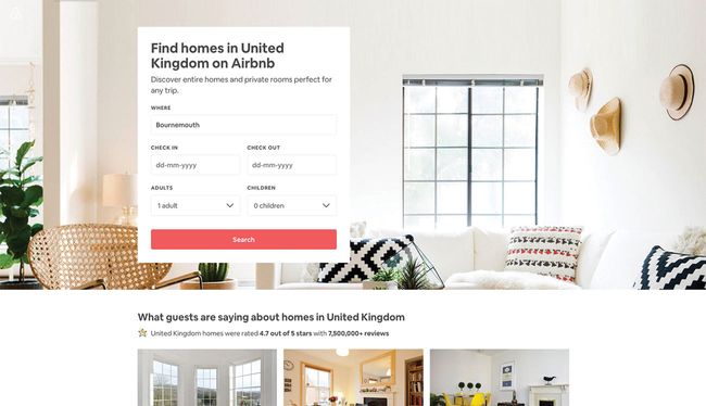
A holidaymaker isn't just looking for an Airbnb, they're looking for their Airbnb; the home that's going to make their holiday special in a way that no (or not very many) other Airbnbs can, indicating that control goes way beyond the considerations of usability; it actually enriches the overall customer experience.Control can also lead to the development of new features and boosted engagement. Think about it: despite a few usability setbacks, Slack users could create 'Private Groups' long before they existed, simply by direct messaging multiple users at once.
These setbacks would eventually warrant the implementation of the feature itself, but until then, control allowed users to tailor their experience in a way that suited their own agenda.
The negatives of zero-control
Micro-interactions are often hindered by a lack of control, but even when user flows are designed to be relatively linear (for instance, a sign-up flow or some other form-based interaction), the control means the user can fix and edit without any trouble. If we compared this to a human-to-human interaction, a lack of patience would surely make the encounter less than friendly.Consider splitting up lengthy forms into several smaller micro-interactions (where the user can save their data periodically and even navigate back-and-forth between the different sections), and also adding a confirmation screen so that the user can check over their input before hitting the magic button. As an added bonus, if the user can log in and correct mistakes after they've been 'sent', that's even better.
In short, let the user take the wheel.
04. Predict, then adapt
This kind of cognitive overload is known as analysis paralysis, the act of not being able to make a choice when there are too many options. Let's take a look at two ways to reduce choices.
Context
Luckily, by keeping layouts minimal, both conceptually and visually, we can help users make decisions faster, and thus increase the likelihood of conversion. But, is this a task easier said than done? After all, it can be quite difficult to force an element to take the back seat in favour of something else, especially when said element is also somewhat important.The solution? Context
What's important on one screen may not be important on another screen, in which case tucking away not-applicable-in-the-current-context menu items in a hamburger menu actually makes sense (yep, the hamburger menu isn't as bad as we might think!).If that seems risky, there are a number of data-driven ways to lesson the risk. Firstly, there's analytics tools that track user behaviour, and then there's heatmap tools, which can show us where users are actually clicking (or not clicking), which in this scenario is the better option. If you'd rather take a toe-dip approach, A/B testing can help us test layout changes with a fraction of our audience before committing them app/site-wide.
05. Maintain consistency
Brains are designed to learn mental shortcuts, right up to the point where we don't even realise we're doing it. When traffic lights turn green, we don't analyse the situation and then make a conscious decision to accelerate, we just do it instinctively.
Now imagine that one day, the typical green, yellow, red setup was replaced with Go, Get Ready and Stop. You'd be taken aback for sure, and even if just for a few seconds, you'd contemplate what the hell is going on before accelerating off.
Problem is, these few seconds are critical when it comes to design. Users simply expect things to make sense, and can quickly become frustrated when they don't. Let's take a quick look at a more digital example: sharing something on Facebook.
You already know that to share something on Facebook, you'd flick to the top of the screen and write your status in the input field. To share something in a group, even if you'd never done so before, you'd mimic that behaviour because it's what you'd expect. This is an ideal example of consistency.
Measuring consistency
Back to colour. We fill out an online form, then submit by clicking, say, a blue button. Then we fill out another form, and the submit button is also blue. Eventually, we decide to subscribe, and the call-to-action is… blue. Every time we interact, we become better, faster and overall more efficient by learning how things work and recognising design patterns.The time that it takes, known as task time, is one of the metrics used to measure the level of usability, which again shows the benefits of usability testing as mentioned earlier.
Consistency and innovation
Naturally, consistency limits innovation; however, innovation can be a game-changer so long as the lack of consistency is worth the value it brings to users in the long run. In this scenario, a well-thought-out onboarding UX that introduces users to the app (or certain features) can be a suitable alternative.
In a nutshell, don't underestimate the power of sameness!


No comments:
Post a Comment