
Create sets of product icons in Illustrator

Illustrated icons can be a super addition to your design portfolio, whether you include them to reach a new group of potential clients, or to add more elements to an illustrated scene. 

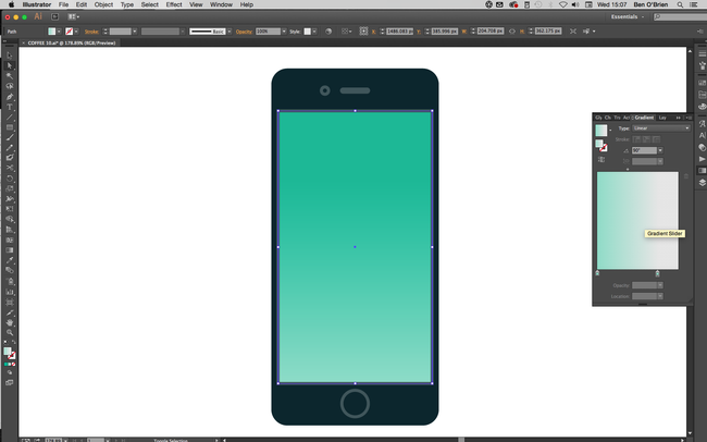
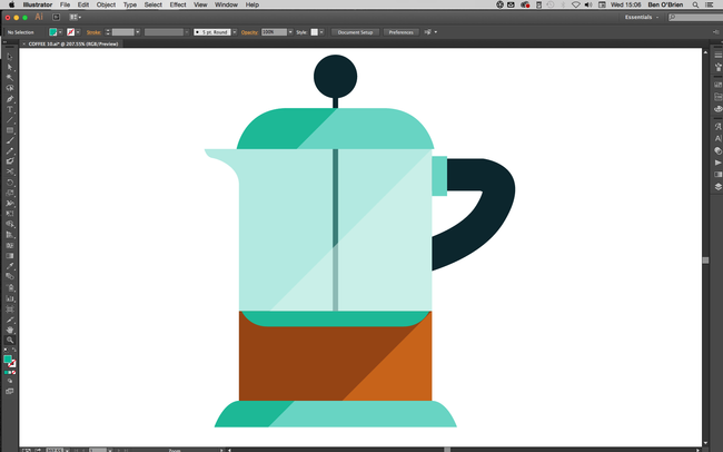
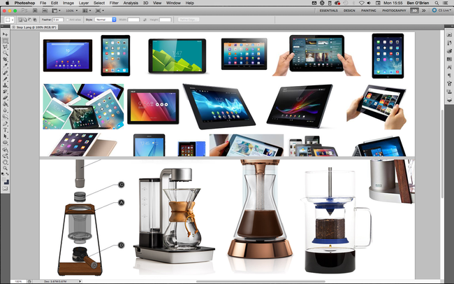
In this Adobe Illustrator tutorial I'll show you how to create icons simply and easily, so you can create large volumes of them in no time at all. I’m going to design two icon sets: a set of digital phone/tablets and a set of coffee-making items.
01. Know what you're representing


Whatever your set of products is, do your research! A client would want all the products to be correct, and you should too. Even if it’s a personal project, you can’t accidentally add a camera button to an original Nokia 3310 or put a two-pin plug on a British kettle. If you’re illustrating a product for a client, ensure you know how it looks all the way round, so you understand it as a real-world object.
02. Draw it in pencil


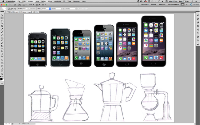
You can start off however you wish – I always draw everything in pencil, but for many products you can trace a photo. If you have a tricky shape to draw and it happens to be symmetrical – for example a lightbulb – you can just draw one half of it (I’ll come to that later!).
03. Get rid of kinks


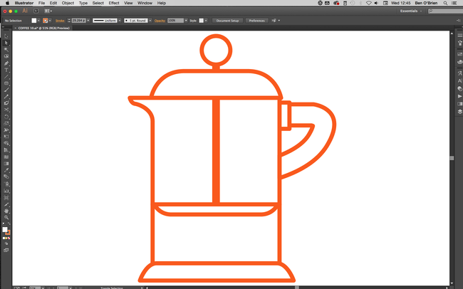
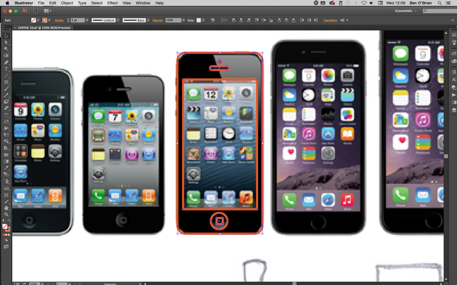
When creating linework, always keep lines and angles straight and clean. Your illustrated product icons may be used quite small on the page or screen, and unnecessary kinks or curves can confuse the eye and make things unclear.

There are two main tips for this. First, with the Shape tool, hold down the Shiftkey to get perfect circles and squares or polygons that sit straight. And second, with the Pen tool hold down the Shift key to only draw angles at 45 degrees or 90 degrees to an axis.

04. Make use of symmetry


Many products are perfectly symmetrical, which makes things nice and simple. Once you have the linework, select it all with Selection tool (cmd+V) and you’ll see a range of Alignment buttons appear in the top bar. Click either the horizontal or the vertical Align Centre button, depending on what you need, and everything will snap into symmetry. You can also group objects together, and then align them with other objects or groups.
05. Reflect more complex objects


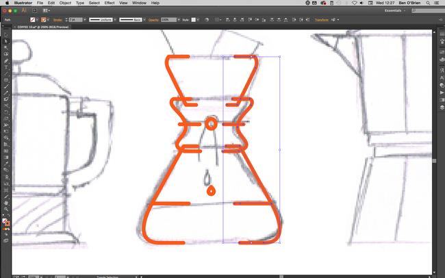
For symmetry on more shapely objects, illustrate one half perfectly, then select these halves and copy and paste them all in one go by holding down shift+altand hitting the right Arrow key, this will keep these lines level with their originals.

Still with the copied objects selected click Object > Transform > Reflect from the main menu, select the Vertical option and click OK. Place this side of the object to get the width correct (using only the left and right Arrow keys so they stay aligned with the other half).

Using the Direct Selection tool (cmd+A) join up the two sides of each line by selecting the two line ends and clicking cmd+J.
06. Maintain consistency


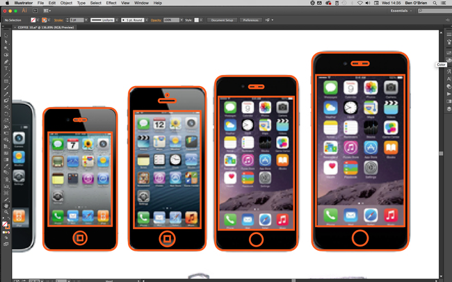
If you’re working on a collection of products, make sure you're always considering the other items in the collection. If buttons are the same across products, then copy and paste them, if the curved corner is always the same size, then make sure you’re using the same corner.

Often (with tech products especially) you can make one device, then copy/paste it and simply adjust the proportions to make the next icon, which can really speed up your workflow.

07. Add some colour


With your linework complete, move on to colour. Generally, you want to get the tones as close to reality as possible, but there are some exceptions. For example, most metals are a mid-grey, which is boring for everyone! Instead, I use a variety of blue-grey tones (light or dark) and usually stray into turquoises.

Try using a transparent blue for glass, too, as white can feel cold. I also recommend oranges and yellows for wood surfaces to really bring some warmth.

08. Explore gradients


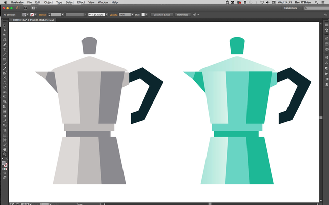
As we’re creating illustrated icons, you don’t want to go too far on minor details and textures. However, you can really sell the surface of a product with a gradient. To get the best out of Adobe Illustrator, don’t create gradients from one colour to the next (it often results in banding when printed).

Instead, choose a flat colour for an object/shape, select the shape and duplicate it (in the layers panel), then add a gradient to this top object going from an opacity of 100% down to 0%.

09. Try including shadows and highlights


When I'm not using gradients, I often duplicate an object and then cut it at a corner. I use the Pen tool (again holding down the shift key) to create a shape cropped at a 45-degree angle, which I then colour in a lighter or darker shade to add a simple but effective shadow or highlight.
10. Add extra details

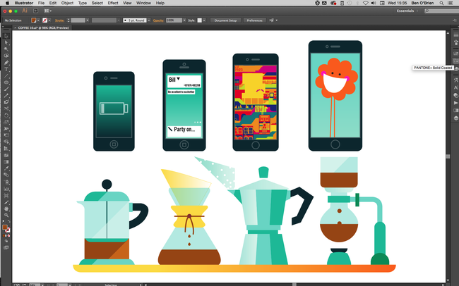
Finally, if the size you’re using the icons at allows, you can really bring them to life. A tech device looks uninspiring with nothing on the screen, so use this space to demonstrate its functions or sell an app. Graphic product illustrations used within a bigger illustration (for example, if these coffee facilities were part of a wider scene) will draw the viewer in.
Share:

Create your own Calligraphic brush in Illustrator

One of the best things about Illustrator is the ability to create your own brushes. You can find some amazing free Illustrator brushes online, but sometimes designing your own is the better option. I created my own shading and line work brushes to give my Spider-Man image (above) a more natural feel, while still keeping it 100 per cent vector-based.

Over time, I've developed a library of Illustrator brushes. This means I have precise control of drawing with the Pen tool, but I can also give my linework a more natural, hand-drawn appearance.

I create all my work in Adobe Illustrator CC. Getting to grips with the software can be tricky, but there are a lot of brilliant Illustrator tutorials around to help hone your skills.
01. Start with weighted lines

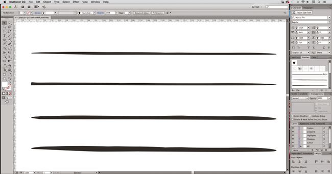
Create custom brushes by drawing your own weighted lines, either with a drawing tablet in Photoshop, the Blob brush tool in Illustrator, or good old-fashioned pen and paper.

Then, bring your linework into Illustrator and create outlines from the strokes by selecting them, and navigating to Object > Path > Outline Stroke.

02. Refine your lines


Once you have your brush stokes outlined, use the Pen tool or Anchor Point tools to refine any part of the line to get it just how you want it.

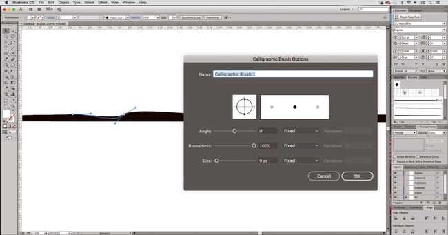
Next, create a new Calligraphic brush by selecting the shape you want to make into a brush. Open the Brush panel (Windows > Brush), click Create New Brush and select Calligraphic brush.

03. Create a brush library


You can follow this technique to create a library of different brushes and effects to suit your style. To create a new brush library, add the brushes you want to the Brushes panel (Window > Brush Libraries).

Then, in the Brushes panel, click Save Brush Library, and put the new library file in one of the following folders so that it will appear in the Brush Libraries menu when you restart Illustrator.

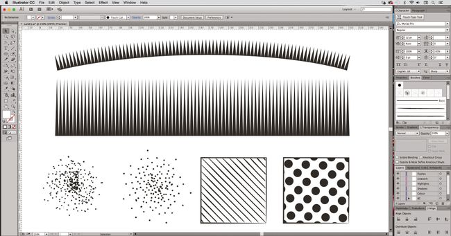
You can also use this technique to create Pen brush strokes, as well as shading effects such as stippling or half-tone effects – and you can create ‘fills’ as well as ‘strokes’.
Share:

How to turn day into night in Photoshop

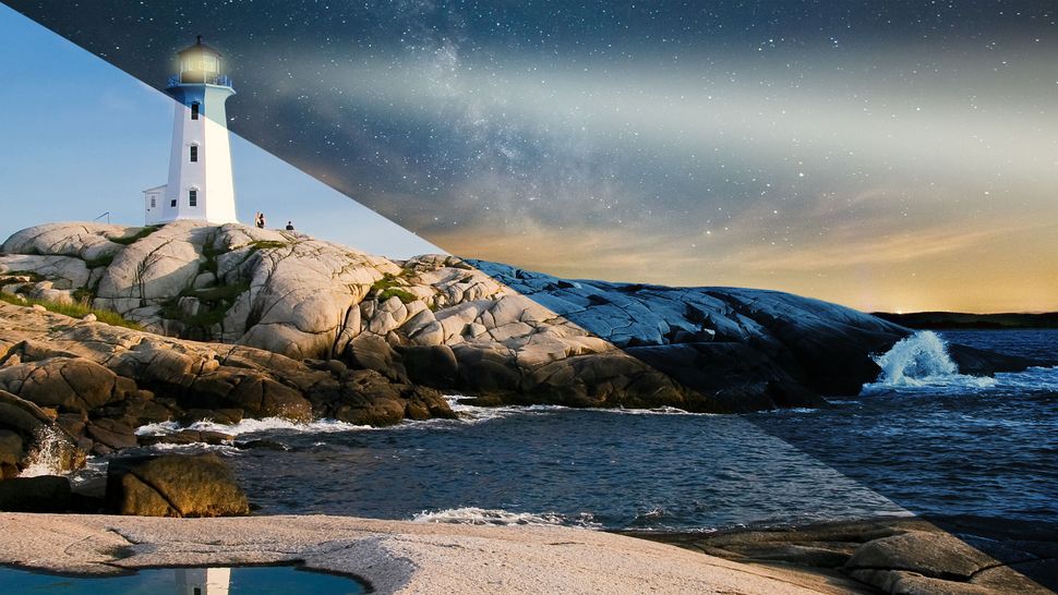
Day-to-night conversions have been around for as long as Photoshop has had adjustment layers, but mastering the effect takes lots of practice. The key to making a day picture look like night in Photoshop is in learning to navigate the various adjustments, such as the Gradient Map and Curves, to achieve a believable tone.


Darkening the image to such an extent that there's hardly any detail left in the shadows is part of the technique, and we can further the effect using brushes to alter the balance of light on layer masks. The deep-blue tone is created with the Gradient Map adjustment and some of the photographic presets in Photoshop CC. Selections then come into play, swapping out the day sky for a star-filled nightscape.

01. Begin with the Gradient Map adjustment


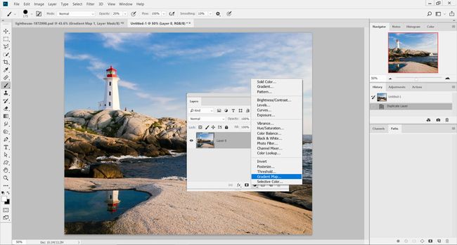
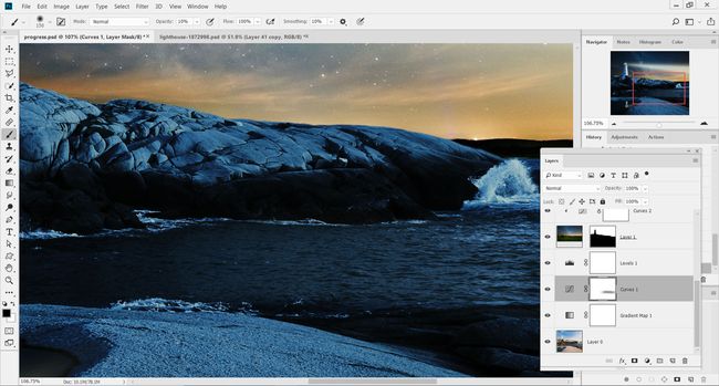
Load up the start image 'pix_lighthouse_1872998.jpg' into Photoshop, and head to the Layers palette. Locate the adjustment layer icon and select Gradient Map.

02. Initial tint


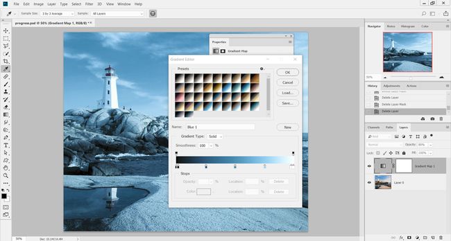
Inside the Gradient Map editor, select the Photographic Toning set of presets from the drop-down menu. From the array of thumbnail gradients, select the preset Blue 1 and hit OK. This will tint the image with a light blue all over.

03. Black of night


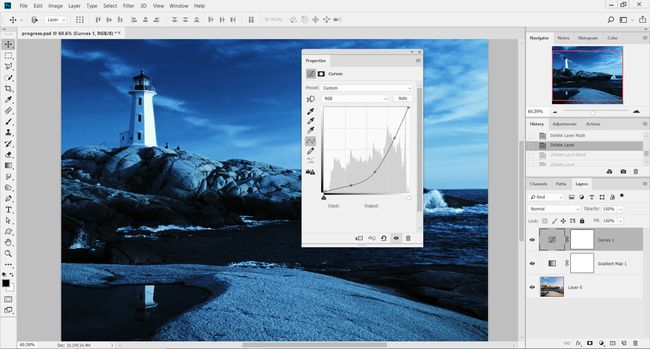
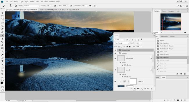
Lower the Opacity of the Gradient Map layer to 80% to reduce the effect slightly, head back to the adjustment layers and add a Curves adjustment. Darken the image by dragging the curve downward from the centre. The idea is to darken the shadows and midtones here.

04. Darken even further


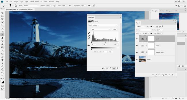
Add a Levels adjustment layer above the Curves adjustment. Inside the Levels dialog, set the midtones marker to 0.95. Then, under Output Levels, set to 0 and 196. This adjustment should darken the image further, making it appear as though it is night.

05. Select the sky


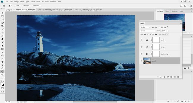
Now we've converted the image to night, we need to swap out the sky. Press W for the Quick Selection Tool and click on the image's layer. Drag a rough selection over the sky and around the lighthouse.

06. Improve the selection


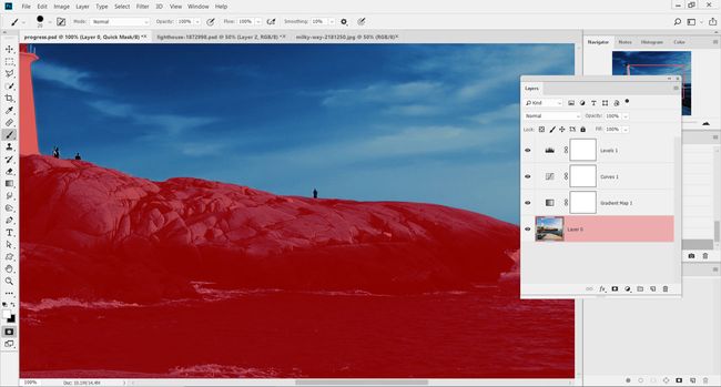
Hold opt/alt to remove areas of the selection that spill over onto the rocks and lighthouse. Press Q to load the Quick Mask Mode and preview the selected area. Use the Brush Tool to refine the edge of the mask, and press Q to return to normal view.

07. Save the selection


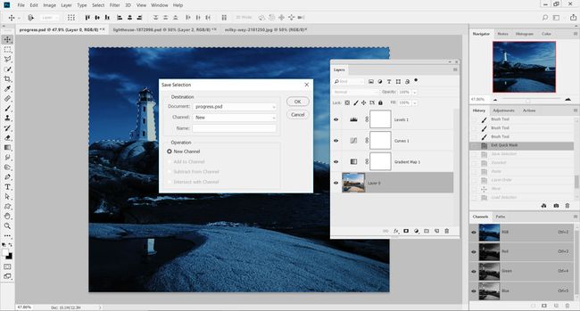
Go to the Select menu and down to Save Selection. In the pop-up menu, set Document to the current image, and set Channel to New. Leave Name as blank and hit OK to add the selection as a new Alpha Channel (Window > Channels to view).

08. Quick copy and paste


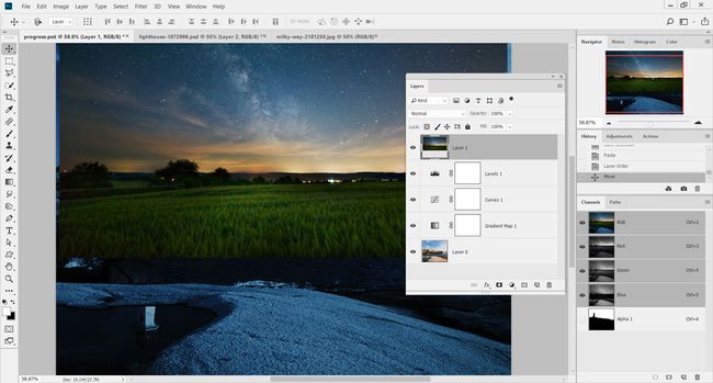
Load up the image 'pix_milkyway_2181250.jpg' from the FileSilo and press cmd/ctrl+A to select the entire image, then cmd/ctrl+C to copy. Head back to the lighthouse image and press cmd/ctrl+V to paste the new sky onto the image. Move this image to the top of the layer stack.

09. Apply a layer mask


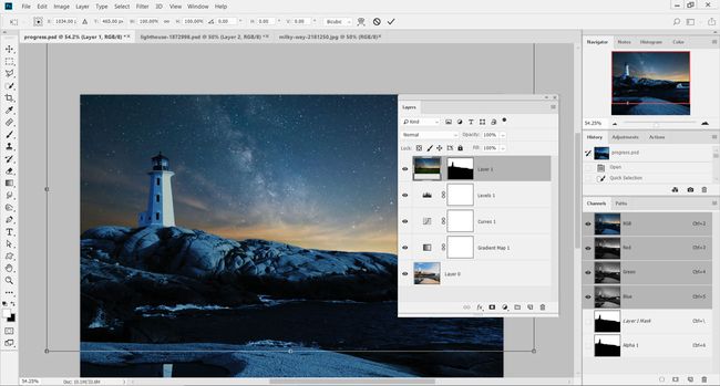
In the Channels palette, cmd/ctrl-click on the thumbnail of the Alpha Channel created in step 7. On the new sky layer, add a layer mask to apply the selection. Click on the small chain link symbol between the mask and the thumbnail, and press cmd/ctrl+T to resize the sky to fit over the area.

10. New Curves adjustment


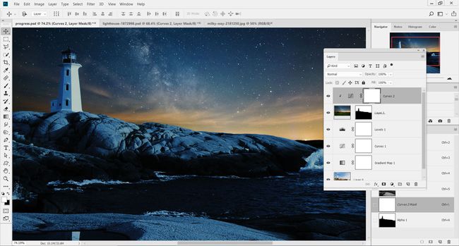
Add a new Curves adjustment above the new sky layer and clip them together (opt/alt-click between their layers). Lower the brightness of the new sky layer by pulling down the centre of the Curves adjustment. Adding three points along the line and lowering them all slightly provides more accuracy.

11. Paint in light


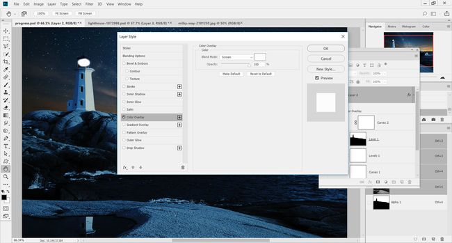
Add in a new layer and select the Brush Tool. Set the tool to black and 0% Hardness and paint in the small light for the lighthouse. To choose the colour of the light, double-click on the layer to load the Layer Style menu, and then select the Color Overlay option.

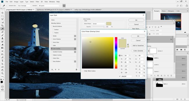
12. Add a Color Overlay


Change the colour of the Color Overlay style to an orangey yellow and set its Mode to Screen. Setting colour this way will enable you to change it later on, if needed. Hit OK and lower the Opacity of the layer down to 85% to fade it slightly.

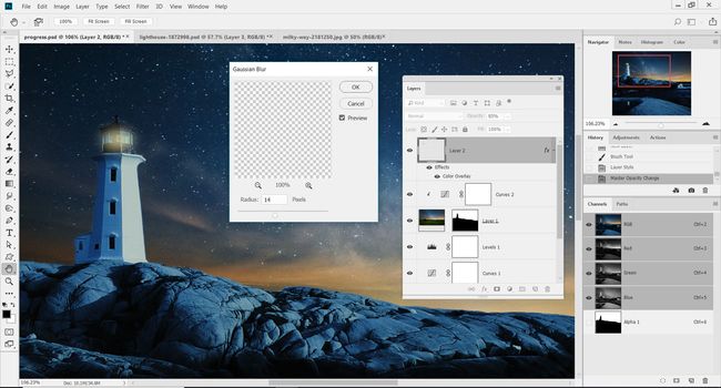
13. Blur the light


Head to the Filter menu and down to Blur > Gaussian Blur. Set the Radius slider to 14px and hit OK to soften the light in the lighthouse. Load up the Free Transform controls (cmd/ctrl+T) and resize or rotate the light to fit within the lighthouse.

14. Create the reflection


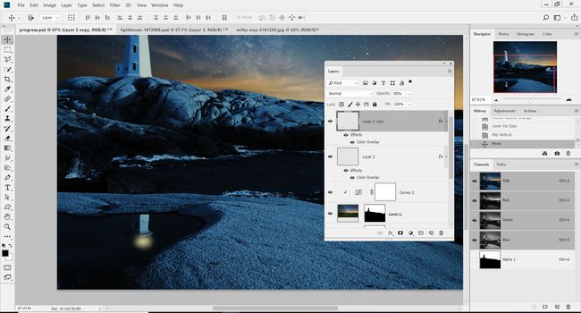
Press cmd/ctrl+J to duplicate the light layer onto a separate layer. Go to Edit> Transform> Flip Vertical to rotate the light and flip it. Use the Move Tool to position it over the reflection of the lighthouse in the pool in the foreground.

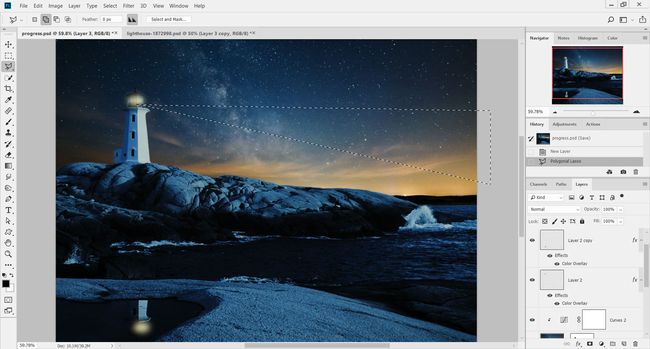
15. Light rays


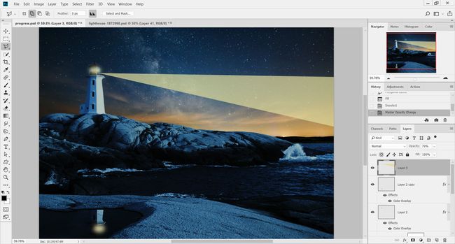
To add the beams of light from the lighthouse, on a new layer (cmd/ctrl+shift+N) create a long rectangle using the Polygonal Lasso Tool (L). The shape should extend out from the lighthouse and across the entire image.

16. Fill with colour


Go to Edit > Fill and choose Color under Contents. Set this to a yellow colour that is similar to, but lighter than, the colour used for the main light in the lighthouse. Hit OK, then cmd/ctrl+D to remove the selection, and then reduce the layer's Opacity setting down to 70%.

17. Soften and colourise


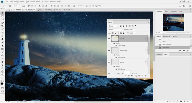
To soften the light beam, go to Filter and down to Blur > Gaussian Blur. Set the Radius for the blur to 36px and hit OK. Double-click on the layer and add a Color Overlay style to change the tone of the light, if you think it's required.

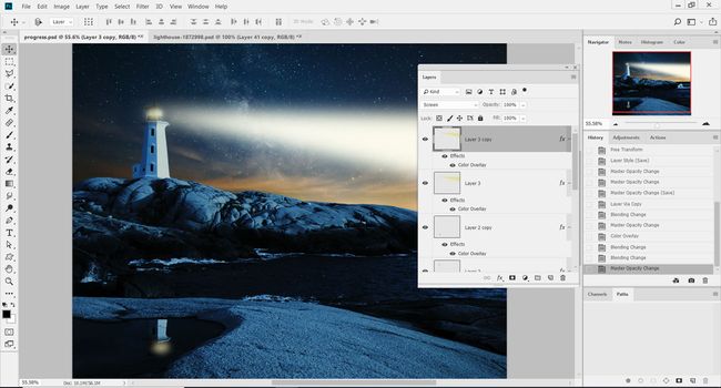
18. Double the light


Duplicate this layer (cmd/ctrl+J) and then change the Color Overlay style to a lighter yellow, almost white. Set the layer's blend mode to Screen in the Layers palette to blend into the light beam underneath.

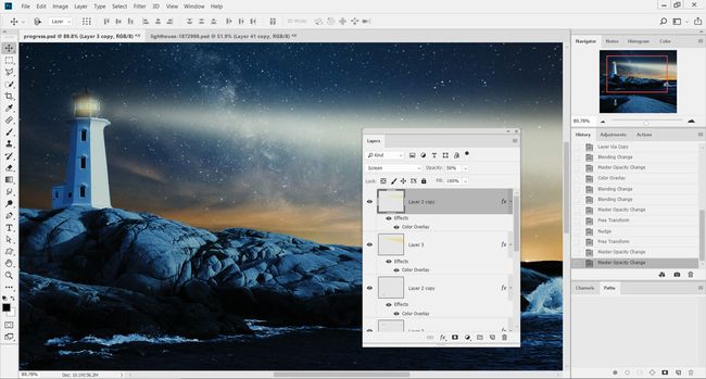
19. Resize the second beam


Shrink the second light beam so that it's smaller than the one underneath. Lower the Opacity of this layer to 50% to make it fainter. The result should be two light beams coming out of the lighthouse, one on top of the other.

20. Duplicate and reposition


Group the two light beam layers together and press cmd/ctrl+J to duplicate the group. Flip the group vertically (Edit > Transform > Flip Vertical) and position so the light beams are included in the reflection of the lighthouse.

21. Control with masks


Add a layer mask to the group and brush away the light that falls outside the water. Also, on the Curves adjustment layer's mask, use a low Opacity brush over the sea in the foreground to reveal more detail on the water.
Share:

The 9 best alternatives to Photoshop

You could be mistaken for thinking there are no real Photoshop alternatives around. Photoshop is such a powerful brand that, like Google, it has actually become a verb: 'to Photoshop' is shorthand for editing an image. This might make you believe that no other software could possibly do as good a job, and stop you from looking any further for your image editing needs.

In fact, Adobe doesn't necessarily have the market cornered and the backlash against Adobe's move to the Creative Cloud in 2013 actually helped to spur on a wide range of alternatives to Photoshop. These options can be just as powerful, and produce results that are just as professional.

So whether you're looking elsewhere because you can't afford the subscription, you want to support smaller development houses, or you just don't need all the millions of features that come with Photoshop CC, there are a number of image editing tools open to you. Here are the best Photoshop alternatives.

01. Affinity Photo


  • Platform: Mac, Windows, iPad
  • Price: £48.99/$49.99 (one-off payment)
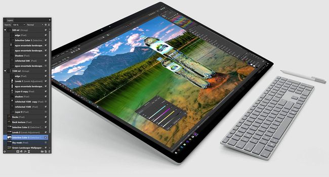
Fully compatible with Photoshop and other file formats, Affinity Photo is aimed squarely at professional photographers and designers, and although it is hugely cheaper than Photoshop (with no subscription), its creators argue it's actually better. We think it's perhaps the most serious Photoshop alternative we've seen to date.

It comes with a promise of higher speeds, fewer crashes and unlimited undos but in truth, the amount of improved performance you'll get will probably depend what equipment you're using (it's been specifically designed to take advantage of the latest quad core technology).

Available on Mac and Windows, Affinity Photo for iPad had an update in 2018. If you're looking for an alternative to Photoshop, Affinity Photo is definitely worth investigating.

02. Sketch


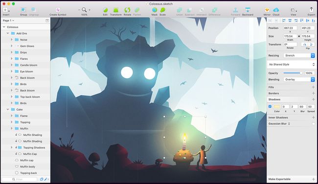
Sketch is a professional vector graphics app for creatives that has created enormous buzz within the design community, and web designers in particular.

The development team behind Sketch has made it as flexible as possible, with it supporting infinite zooming and vector shapes that are perfect for multiple resolutions. You can build a new graphic from primitive shapes or start a new one with the Vector or Pencil tool.

It has a pleasingly simple UI and has many features similar to that of Photoshop and Illustrator, including layers, gradients, colour picker and style presets. Its popularity means there are also plenty of community-created Sketch plugins you can use to extend its functionality.

If you're looking for vector graphics software, it's also worth checking out Figma. Figma is browser-based, totally collaborative and it is creating enough noise to be some serious competition for Sketch.

03. GIMP


  • Platform: Linux, Windows, Mac
  • Price: Free
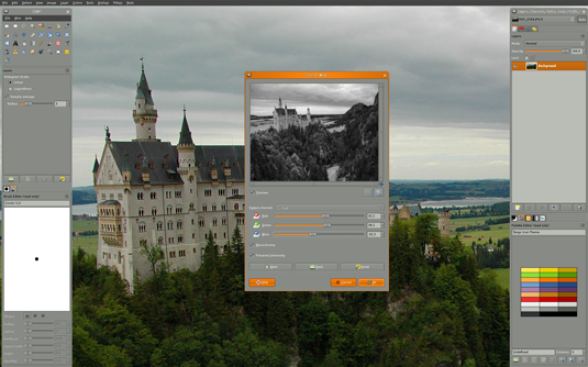
A free, open-source alternative to Photoshop that's been around for donkey's years, GIMP stands for GNU Image Manipulation Program. Today it's available in versions for Linux, Windows and Mac.

GIMP offers a wide toolset, similar to Photoshop in many ways, and is a great option if you're looking for a no-cost image editor. The interface differs somewhat from Photoshop, but a version of GIMP is available that mimics Adobe's look and feel, making it easier to migrate over if you're ditching Photoshop.

The full suite of tools is available here – everything you're accustomed to is within easy reach, including painting tools, colour correction, cloning, selection, and enhancement. The team that oversees development has worked hard to ensure compatibility too, so you'll be able to work with all the popular file formats without any trouble at all. You'll also find a very capable file manager built in, along similar lines to Adobe's Bridge.

Overall, this is a great option whether you've either got a limited budget, or want to move away from Photoshop for other reasons.

04. Pixelmator Pro

  • Platform: Mac
  • Price: $39.99
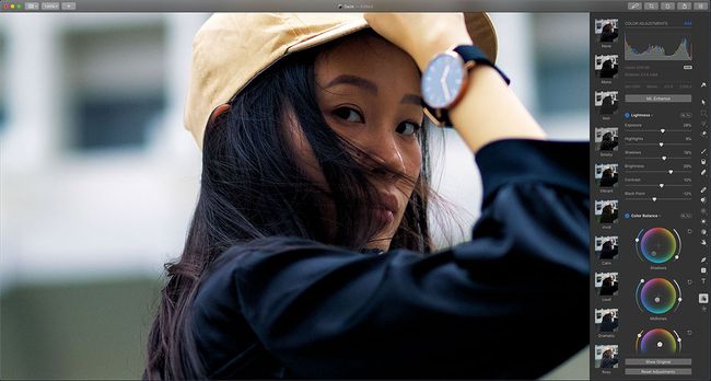
Pixelmator has been around for a while now, but more recently the team released the Pixelmator Pro. While the previous tool used floating windows, the Pro version has a more usable single-window UI, and offers non-destructive image editing. The team have pared back the interface, which should make it easy to pick up – and there's a 'hidden interface' option you can activate if you just want to see your image, with no distractions.

This Photoshop alternative is geared up especially for use on a Mac, and it supports features like tabs, fullscreen and split view.

05. Pixlr

  • Platform: iOS, Android, web app
  • Price: Free
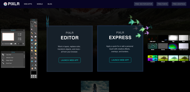
Pixlr is a free Photoshop alternative that boasts more than 600 effects, overlays and borders. It also lets you do all the main things you'd expect from a basic photo editor, from cropping and re-sizing to removing red-eye and whitening teeth.

And if you're used to using Photoshop, then you'll find Pixlr's user interface easy to pick up quickly, as it's very similar. This free app is available in both iOS and Android varieties, or use can use it as a web app.

06. Corel PHOTO-PAINT

  • Platform: Windows
  • Price: $599.99 / £599.99 (entire CorelDRAW Graphics Suite) or try for free
PHOTO-PAINT is a dedicated photo editor in the CorelDRAW Graphics Suite. The suite has been updated for 2018 to offer a Corel AfterShot 3 HDR support, as well as interactive tools for straightening photos and adjusting perspective. There's also improved stylus control, with the PHOTO-PAINT responding to different pressures, bearing tilt and rotation.

The suite is geared up to work perfectly with Windows 10, offering multi-monitor viewing and support for 4K displays.

07. Paint.net


  • Platform: Windows
  • Price: Free
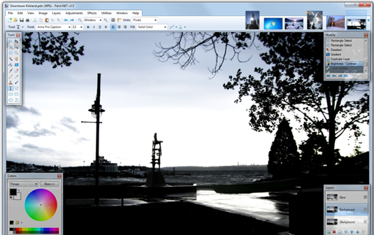
Paint.net is a Windows-based alternative to the Paint editor that Microsoft shipped with versions of Windows. Don't let that put you off, though: it's a surprisingly capable and useful tool, available completely free of charge. The software started out life as a Microsoft-sponsored undergraduate project, and has become an open source project maintained by some of the alumni.

The focus is on ease of use, and there's a definite tendency towards photo editing rather than artistic creation. That said, there are a range of special effects available, allowing you to easily create fake perspective, blend and push pixels around the canvas, tile and repeat selections, and so on.

A good range of selection tools, support for layers, and adjustments such as curves and brightness/contrast mean that Paint.net is a great alternative to Photoshop for photo editing, especially if you can do without some of the more recent additions to Photoshop's toolset.

08. SumoPaint


  • Platform: Browser or iPad
  • Price: Free (basic), $4/mo (Pro)
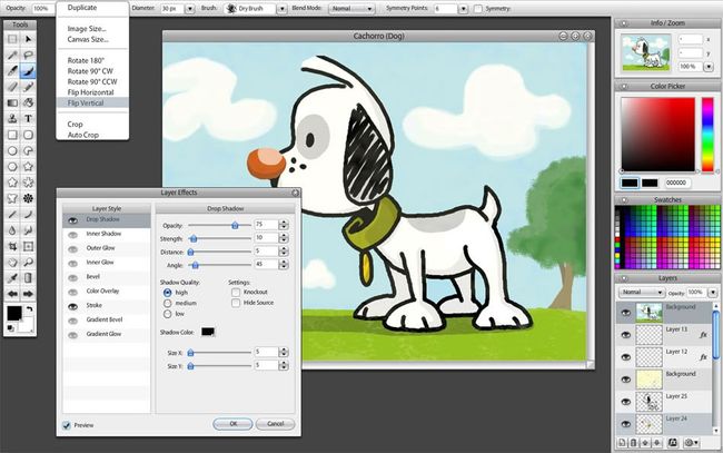
SumoPaint is a highly capable, free browser-based image editor. All the standard features you'd expect from a desktop tool are present and correct. It's lightweight and quick to load, and the free version is very usable. There's also a paid-for Pro version and a paid-for iPad app.

The standard range of tools and adjustments you'd expect are all included. Brushes, pencils, shapes, text, cloning, gradients, etc are all quickly accessed from the Photoshop-esque floating toolbar. It can also open saved documents from your hard drive, making SumoPaint a perfectly viable option for editing and reediting.

Some tools work in different ways to Photoshop, offering possibilities that would be difficult to match in Adobe's offering. There are, however, limitations that will put off some users.

09. Acorn


  • Platform: Mac OS X
  • Price: $29.99
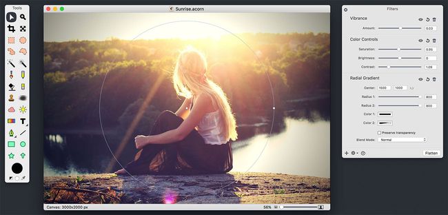
Image editing software Acorn debuted back in 2007 and has provided hobbyists and artists on a budget with a great, affordable alternative to Photoshop ever since. Features of the software include layer styles, non-destructive filters, curves and levels, blending modes and much more.
Share:

Photoshop color change: 2 tools you need to know

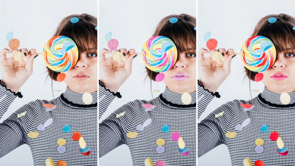
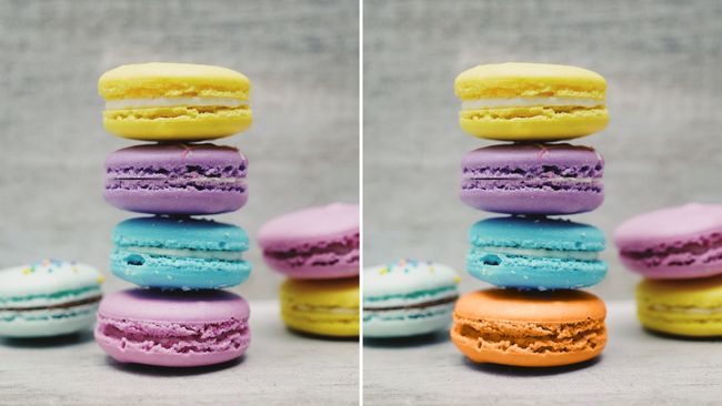
In this tutorial you'll learn two of the most basic techniques for making colour changes to selected areas of an image in Photoshop. From the quickest approaches with the Color Replacement tool, to the slightly more advanced techniques of using the Color Range command, these tips have you covered.


We'll also talk you through the tools and panels to give you a good understanding of what they do and how to get the most out of them. Not only that, you'll pick up handy Photoshop shortcuts along the way.

As we mentioned, this tutorial covers the most basic Photoshop colour change tools, the Color Replacement tool and the Color Range command. If you know which one you'd like to explore, simply click on the above links to jump to the relevant sections in this article.

Photoshop has many different ways of doing things, but this tutorial is a great starting point that will give you the basic information you need to get started with making a Photoshop colour change.

The Color Replacement tool


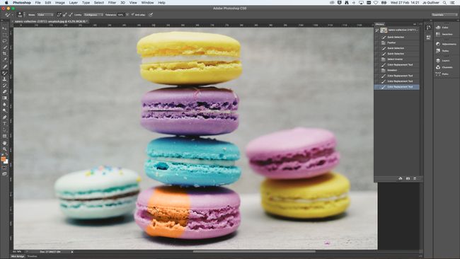
The Color Replacement tool is the quickest way to make a colour change in Photoshop. It works by sampling the original colours and replacing them with your selected foreground colour.

The great thing about the Color Replacement tool is that it maintains the midtones, shadows, and highlights of the original image so you get a realistic-looking colour adjustment. On the downside, it’s destructive. Any changes you make will permanently adjust the pixels in your image. Unless you undo them, that is.

The Color Replacement tool can be found under the flyout menu of the Brush Tool in the Tools panel (for PhotoshopCS - CS2 users, you’ll find it in the flyout menu of the Healing Brush). Simply right-click (Control-click) on the Brush Tool to select the Color Replacement Tool.

Alternatively, press B to select brushes. Then use the shortcut Shift + B to toggle through the different brush options until you select the Color Replacement tool.
Get Adobe Creative Cloud here

How to use the Color Replacement tool


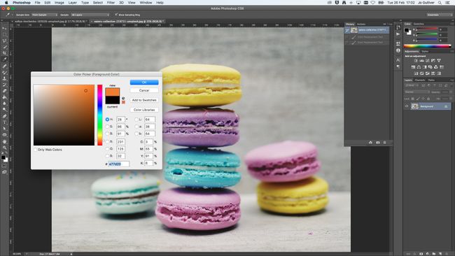
With your image open, the first thing you want to do is select your replacement colour and add this as your foreground colour. To do this, click on your foreground colour box and select the colour you wish to use. Then have a look at the original colour you want to replace.

For a realistic look, you will want to select something that has a similar luminosity. You don’t want to go too bright or too dark as the change will look obvious. With the Color Replacement tool selected, you can start making the colour change by painting over your chosen area in your image.

Refine the Color Replacement tool


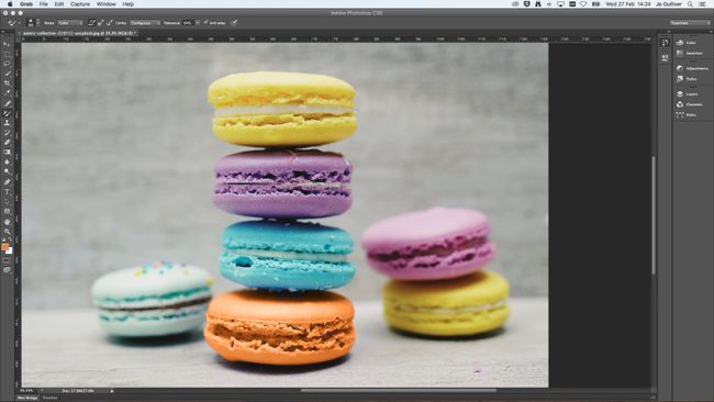
Just like any other brush tool, you can make adjustments to the functionality of the Color Replacement tool. This includes the ability to tweak the size, hardness and spacing of the brush. Just head to the flyout menu found in the Control Panel. Here you'll also find the option to make additional adjustments to the mode, hue, saturation, sampling methods, limits and tolerance.


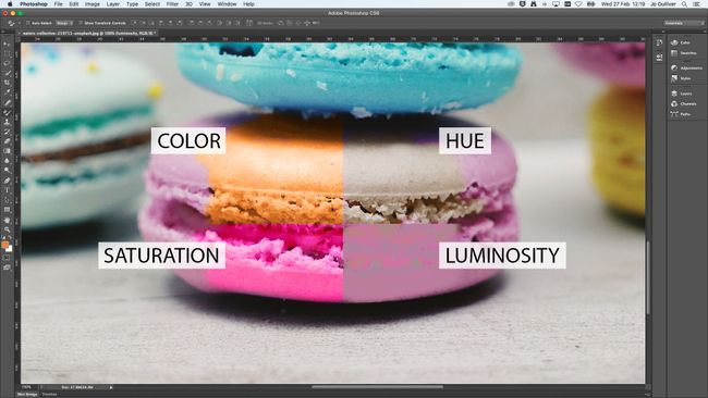
By default, the mode will be set as colour, which as you'd expect is the best option for adjusting the colour of an image. Hue will give you a similar colour to your selected foreground colour. Depending on what you are recolouring, the colour might appear more muted or more intense.

Saturation will more often than not increase the intensity of your colour. Meanwhile, luminosity does the opposite and desaturates the selection and is generally best avoided when working with the Color Replacement tool as the results are not great. If you want to explore this tool, you're best off experimenting to see the results you get with the different mode settings.


The sampling options, which include Continuous, Once and Background, are the icons between the mode and limits menus. They are set to Continuous by default. As the name suggests, the continuous option samples and replaces the colour continuously while you move the mouse. By choosing Once, you will be only be able to replace the colour sampled in your first selection. Finally, background replaces the colour only in the areas containing your background colour.

Limits, which is set to Continuous by default, replaces the pixels and adjoining pixels within the brush area. Meanwhile, Discontinuous replaces the colour of the pixels of the foreground colour within the brush area whether they are adjacent or not. Find Edges will replace the colour while maintaining the edges of the objects. It works best when there is a defined line, if the focus is soft or blurred you will not get as good a result. In this case, you're better off switching to a softer brush and sticking with Continuous.


The Tolerance slider is used to control how similar a pixel colour needs to be to the sampled foreground colour. Reduce the tolerance to select only colours that are close to your sampled colour, or increase for a wider selection. And finally, you can choose to add anti-aliasing to smooth out jagged edges.

The Color Range command

If you want more flexibility and a non-destructive method to manipulating colours in Photoshop, the Color Range command is the option for you. It works in a similar way to the Magic Wand tool by making a selection based on colour and tonal values. For a quick look at how to use the magic wand tool, check out our how to remove a background in photoshop walkthrough.

Unlike the Magic Wand tool, the Color Range command allows you to select specific colours throughout your whole image, or a pre-existing selection, instead of just the pixels adjacent to your selection point.

You have a great deal of control with this command too as there are multiple options for making selections. From using the colour picker, to the predefined colour range of CMYK and RGB, to the tonal selection of highlights, midtones and shadows and skin tones and out a gamut.

How to use the Color Range command

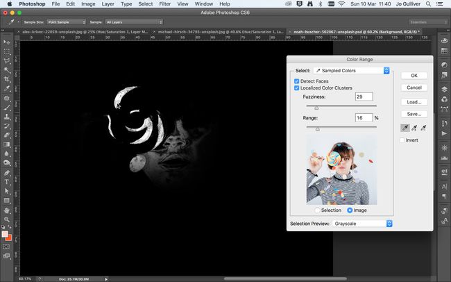
The Color Range command is found under the Select menu in the Menu Bar. With the image you wish to work on already open, select Color Range… to open the Color Range dialogue box. To get started, we are going to look at the default selection of the sampled colour.

With the sampled colour showing in the select drop-down menu, use the Eyedropper tool to select a colour from your image. You can use the Eyedropper on your main image or within the image frame inside the panel. This function is pretty self-explanatory, simply select different colours from within your image and they will appear in the selected colour range in the dialogue box window.

Color Range: Refine the selection


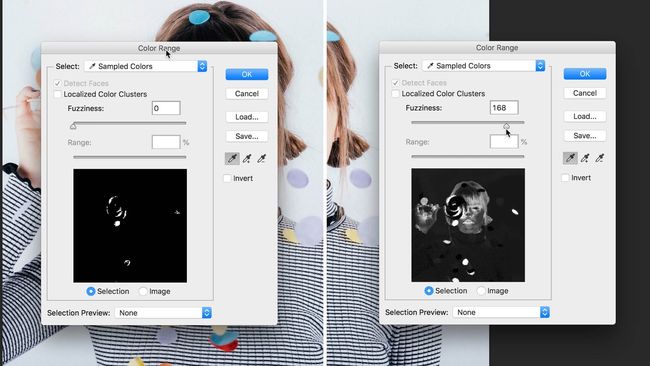
You might find that the Eyedropper isn’t picking up all the different tones of your chosen colour. That's because the Eyedropper will select all of the pixels that are the exact same colour as the pixels selected, plus all of the pixels that are within a particular brightness value.

By adjusting the Fuzziness level you can control the range of colours selected. The tool is set to 40 by default. By increasing the value you extend the selection of the colour range, while decreasing the Fuzziness reduces it.

In addition to this, you also have the option to use the Add to Sample Tool and the Subtract to Sample Tool. Appearing as an Eyedropper in the Color Range dialogue box, the Add to Sample icon is accompanied by plus symbol, while the Subtract to Sample icon is accompanied by a minus symbol. Use the shortcut with the Eyedropper tool, shift to add, alt/opt to subtract.


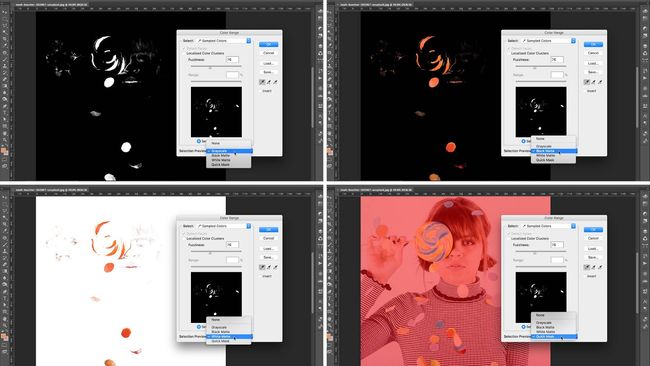
With your colour range selection active you can toggle through the Selection Previews in the drop down menu. This will show your selection in different view modes on your main canvas, giving you a clearer picture of your colour selection.

Your selection isn’t going to be perfect, so you may have areas missing or unwanted parts of your image included in your selection. Don’t worry too much at this point though as we can perfect your selection later. Once you are happy with your selection, go ahead and hit the ok button.

Color Range: Activate Localized Color Clusters


If you want your selection to focus on particular area of an image, you can activate the Localized Color Clusters – available in CS4 and higher.

With this selected, the previously greyed out Range slider becomes active. By reducing the Range, Photoshop will localise its selection to the points closest to the areas you selected with your Eyedropper tool. In this case, we're not going to use this as we want to select all instances of the foreground colour in our picture.

Color Range: Add Adjustment Layers


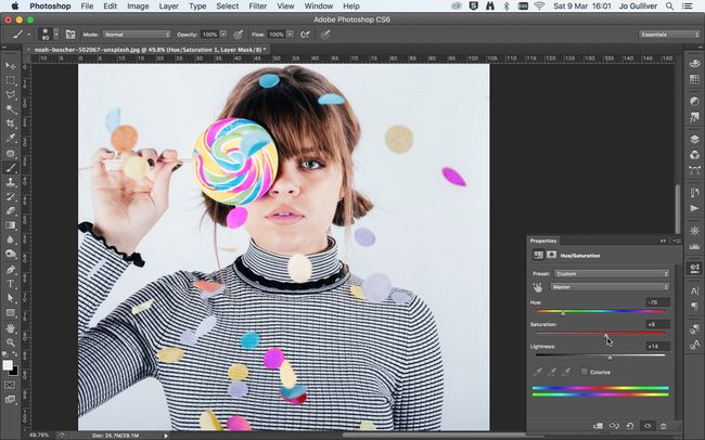
With your selection made and active you now want to add a new Adjustment Layer. This is how you are going to change the colours in your image. Go to Layers > New Adjustment Layer > Hue/Saturation, or use the shortcut button at the bottom of the Layers panel.

Name your layer and click OK. This will add an Adjustment Layer (visible in your layers panel) and open the Hue/Saturation Properties panel. Inside the Properties panel, you will see a number of sliders: Hue, Saturation and Lightness. Adjust the Hue slider to change the colour of the selection.

The Saturation slider controls the intensity of the colour, while the lightness slider controls the brightness and darkness. As you adjust the slider the colours will change in the bottom coloured bar. The first bar shows the original colour, and the second bar displays the adjustments you made.

Color Range: Finesse your selection


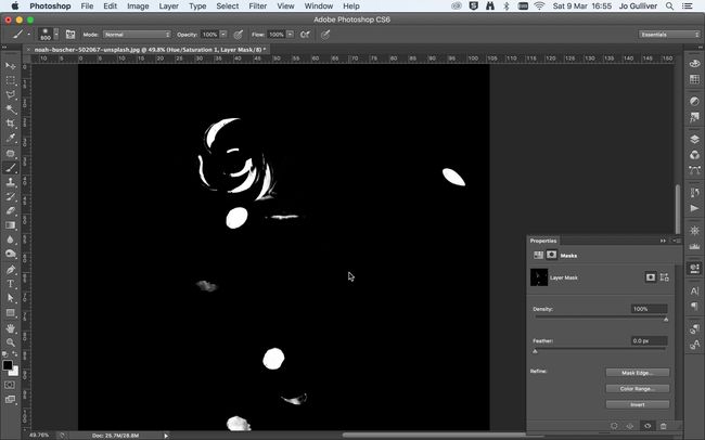
Now it's time to tidy up your selection. In the Hue/Saturation Properties panel, switch to Mask view by selecting the button at the top of the panel. alt/opt and click on the Layer Mask image and your main canvas will switch to the Mask view. Using a Brush tool, you can begin to paint out the areas you want to remove from your selection.

Switch back to the normal view to paste in those bits that the Color Range Command didn’t pick up using different brush sizes. The great thing about using this technique with the Adjustment Layer is that you can easily turn the layer off, go back and make changes to selection, and make adjustments to the colour. What's more, nothing is permanent.

Color Range: Invert a selection


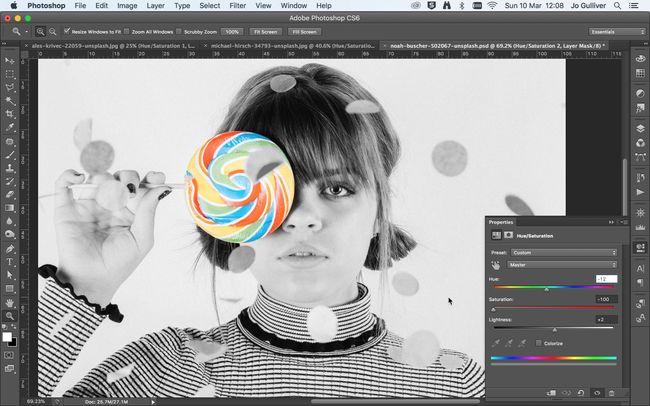
It’s worth noting you also have the option to invert your selection when creating your Color Range selection. All you have to do is check the invert box. This is a great function if you want to add/maintain colour to a selected area and make the rest monochrome. You can do this by using the Black & White adjustment layer.

Alternatively, you could experiment with some of the presets in the Hue/Saturation preset drop down menu. Here you have the option of choosing effects like Sepia and Old style. On the other hand, you could use the custom option and reduce the saturation to zero to create a monochrome effect.
Share:

Popular Post

Web Design

5 Quick-fire portfolio tips from design experts

Your design portfolio is one of your most useful tools. It can win you commissions, help you snag a new design job, attract collaborators, a...

Labels

Most view post