In this article, I'll share some editorial design tips to make sure your life doesn’t suck while designing editorial layouts in InDesign CC. If you want to take things further, check out our guide to brochure design and our article that teaches you how to design a book cover.
01. Get organized first
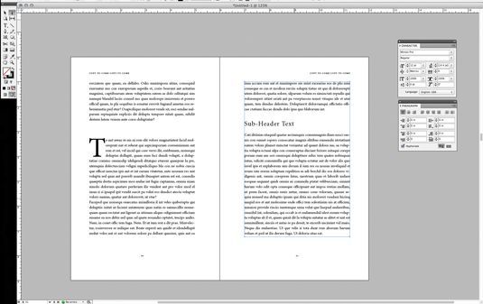 |
| InDesign is set up specifically for editorial design |
Keep chapters separate and use InDesign’s book feature to link them all together. Never, ever, try to work with one long InDesign document for multiple chapters in a book. It will make your life a living hell.
02. Set up master pages
Set up your Master pages before doing anything else. Your Master pages will include any design elements that will carry through the whole layout, such as folios and automatic page numbering.Use separate Master pages for different editorial layouts within your document. For example, if you have a sidebar column, set up a master for that type of layout. If you have a layout for the beginning of a chapter, set up a master for that. If you have an Appendix with no formatting, set up a blank master for that... you can see what I’m getting at.
You can use as many Master layouts as you need. This will be a huge time saver in the end.
03. Establish a visual hierarchy
Make sure you establish a visual hierarchy, and stick with it. No matter the editorial content, a hierarchy is key. As well as being more aesthetically pleasing, a hierarchy will enable readers to skim the page and find the content they’re looking for. A basic outline for text hierarchy might look something like this: Main headline, subhead 1, subhead 2, pull quotes; body content, captions, folios.It is very important to make sure the design of each level of the hierarchy is consistent throughout the document, which is where Styles come in. Styles are your best friend; use as many Paragraph and Character Styles as you can. The more efficient you are with these, the easier it is to make sure everything is consistent.
04. Create a balanced layout
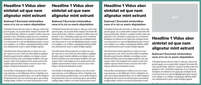 |
| Use images to offset text so headlines don't line up |
Ideally, you want to make sure headlines don’t crash into each other. For example, in a 2-column layout, you would not want to have both columns starting on the same line (above left). Add images to offset the columns (above right), or use the Span Columns function to create a headline that runs across both columns of text.
05. Don't forget about screens
It's not unusual for print articles to be made available to view as PDFs online, so you may need to consider this in your design too. If designing an editorial piece for print, make sure it will be readable when viewed on a screen.PDFs will often have live hyperlinks, so check these all work. Also consider using links within your table of contents, so readers can quickly jump to the chapter or section they want.
06. Choose fonts carefully
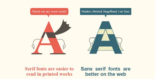 |
| This infographic compares serif and sans-serif fonts |






No comments:
Post a Comment