Today's landscape is very different. Universal apps may support everything from the Apple Watch to the iPad Pro. Screen sizes vary enormously, and so does scaling – a 9.7-inch iPad Air display boasts the same number of pixels as a 7.9-inch iPad Mini's. And interaction models across Apple's iOS, watchOS and tvOS devices vary wildly too.
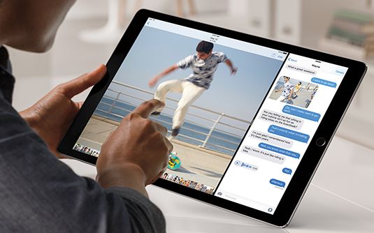
With Apple's current range of touchscreen devices, input remains similar to that first iPhone, but there are new gestures and additional features within iOS, mostly to cater to the larger iPad displays. The Apple Watch, though, accepts touch interaction alongside utilizing the Digital Crown and voice input. And you interact with the new Apple TV using a remote rather than by directly manipulating objects on a screen.
Playing the game
Developers creating games to work across iOS and tvOS devices seem largely unconcerned. But then games often cope well with screens of very different sizes. "I do all my layouts in such a way they're scaled relative to a screen's dimensions," says games designer Paul Pridham, who admits that this "doesn't matter much, since most of my games are chunky and lo-fi by nature". Nitrome MD Matthew Annal uses another common trick for cross-device mobile games: his titles have a 'safe zone'. Important elements are kept within that frame, and elongated screens simply show more of the surroundings.With apps boasting more conventional menus, buttons, panels and workspaces, things become trickier. Text editor Ulysses currently supports only iPad, but an iPhone version is imminent. Co-creator Max Seelemann of The Soulmen explains the app therefore utilises two screen modes: a split view where sections sit side-by-side, and a narrower 'stacked' layout.
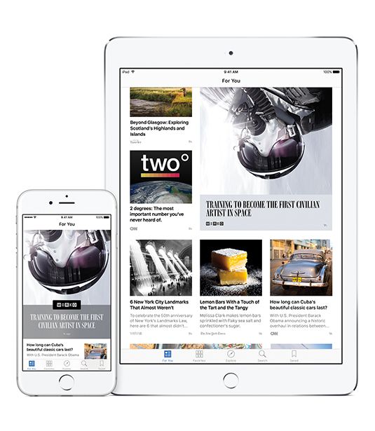
Mode changes are automatically triggered by iOS, which Seelemann says is helpful as Apple's operating system becomes increasingly complex – an iPhone 6 Plus in landscape apes an iPad, and iPad Split View is akin to a tall iPhone; even so, plenty of thought must go into how even relatively simple interfaces scale from the smallest iPhones through to the iPad Pro.
Seelemann's approach recalls modern web design: concentrate on content and show more as available space increases. Eternal Storms Software founder Matthias Gansrigler reckons this is even more important when tackling Apple Watch and televisions: "Start designing your interface with the smallest device you're targeting in mind." As screens increase in size, you can introduce more elements, although Gansrigler warns this isn't always necessary: "Sometimes, keeping things minimal is beneficial, even though space allows for more. It's all about the user experience: overwhelming someone can be as bad as underwhelming them."
What feels right
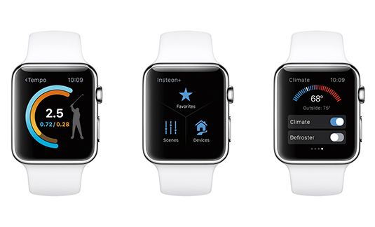
Developer James Thomson's PCalc is also available on every Apple platform, and his process involves "figuring out what makes sense on a given device". He explains: "I can't get more than 15 usable buttons on a watch screen, and even that can be cramped. But on a TV, you'll be across the room, so want everything as big as possible."
As with Ulysses, the distinction on iPad and iPhone is more muddied – PCalc on the former makes use of space through sidebars and popovers rather than switching between full screen views, but in the iPad's multitasking modes, the app uses the iPhone layout when available space narrows.
Sometimes, other practical considerations impact on the layout, as Streaks creator Quentin Zervaas explains: "Building Streaks to work with over twenty languages forced us to think how text would fit and be laid out, which naturally made it easy to scale to different device sizes." For example, a string of German text takes more room than English – "which is like fitting something designed for a 4.7-inch screen into a 3.5-inch one" – while Chinese characters need less space. Apple's Auto Layout was a boon, aiding layout across multiple devices and also robust language support.
A question of scale
Rasters can still work, but you must plan ahead. Producer Ron Packard, Jr. says he too has had "difficulty in needing to upgrade image sizes," and "faced the daunting task of redoing all our renders". So for game Castle Breakout, "all the renders are ginormous, and can be downgraded to smaller screens as necessary". For Annal, whose games mostly use pixel art, scaling can also be a problem: "So we tend to stick with a much lower than screen-density pixel size that matches the density of the lowest supported devices. That way, pixels look crisp on older devices, and newer ones have such high pixel density that everything looks great anyway."
In terms of specific user interactions, we ask whether scale can be a concern, not least on iPad Mini. Seelemann, whose Ulysses is mostly keyboard-driven, mulls that "Apple determined 44pt is the minimum size every element should have" and as long as you follow along with that, you should be okay. "So although some devices have different PPI values, users will have adjusted to them. We don't see a need to deviate from Apple's recommendations."
A sense of focus
In fact, some developers say Apple's rapidly expanding ecosystem may soon make such decisions commonplace. "I design for a 'main' device and then adapt my work for others, but then indie developers don't have access to the full range of devices for testing," explains developer Álvaro Maroto Conde. Complaining developers can't all afford to keep investing in new hardware every six months, Conde says they must take their chances with one or two and the "buggy emulator". He adds Apple's secrecy combined with the "race against launch dates" also results in App Stores stuffed with software that's "not properly tested and proffers this might have instigated Apple's surprising decision to issue Apple TV dev kits.
Where possible, though, Gansrigler says developers should try to get at least one example of each major piece of kit they intend to ship something for. Primarily, this is because simulators are rarely as nuanced as the real thing: "The Xcode tvOS simulator doesn't do the Siri Remote justice, for example. You use a mouse or trackpad, but the remote's touch-sensitive area is used with a thumb. You must try it and get a feel for how it works." Additionally, he says new methods of interaction may need thought when porting apps from other systems: "Tap a Siri Remote touchpad edge and focus advances one step in that direction. That interaction is not available out of the box on iOS, and so must be considered when bringing an app to Apple TV."
Together, but apart
This, according to Zervaas, must be twinned with an awareness of usage. With Streaks, a key feature is the payoff people feel on tap-holding a task to mark it as done. "But this interaction model isn't possible on Apple Watch or Apple TV," he says. "On Apple Watch, we therefore use Force Touch, which is a different interaction model but still provides that visceral feeling of having completed a task. On Streaks Workout for Apple TV, we use a simple click on the remote to mark exercise as done. This suits the style of app, but you still get the payoff of an animation filling up the progress bar and showing the big tick."
Any notion of trying to go too much further, effectively creating the same app across platforms, is roundly dismissed. "Our goal as designers and developers is not to reduce our workload, but to make great products," says Murrison. "Remember common UI frameworks across Mac and Windows? Horrible. You end up with something that's not at home anywhere. It's the same when building apps for different device families in the Apple ecosystem."
Perfect fit
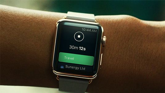
Successful development for the modern Apple ecosystem is, then, primarily about context; as Thomson notes, you must "where the possible design for the strengths of each platform". With PCalc, he reasons people won't perform long multi-stage calculations on a watch but might tot up groceries or split a bill. "So while my app on tvOS, iOS and watchOS is similar from a coding perspective, the interfaces are designed to fit – even on iPhone and iPad, you do things differently."Dodd has found the same with OfficeTime – people use the time-tracker on various platforms, but not for the same tasks: "They may start a timer on a watch, stop it on an iPhone, edit details on an iPad, and build invoices on a Mac: "Each app has progressively more power but a slightly steeper interaction cost. Each plays to the strengths of the device."
All this choice, though, could also serve as a warning of an ever more complex future. We began by noting things were once simple: one device; one screen size; one interaction model. Now, although Apple's ecosystem will never have the diversity of Android, it will continue to grow. "You'll see new challenges, such as iPad's Split View," says Seelemann. "In one release, this introduced five completely new UI sizes with unprecedented aspect ratios. It became clear apps must support any arbitrary screen size. Optimizing for them all is no longer feasible and no longer makes sense."
According to developer Enrico Susatyo, anyone creating apps for Apple kit should no longer be surprised by such changes. "Apple is good at ushering developers towards the future of its platforms without revealing much," he says. "In 2011, we got Auto Layout, a year before the iPhone 5. Size Classes appeared a year before the iPhone 6, making it easier for developers to support bigger iPhones and iPads. Image Assets were introduced before @3x Retina devices."
He advises to, therefore, pay attention to what Apple's doing so you won't be caught out: "Apple wants us to adopt new technologies. They might not be immediately obvious, but sooner or later they'll all be adopted for new features."






No comments:
Post a Comment