

And if you're fully convinced and inspired to make your own site, you can get started here with a Wordpress tutorial.
1. The Ink Tank
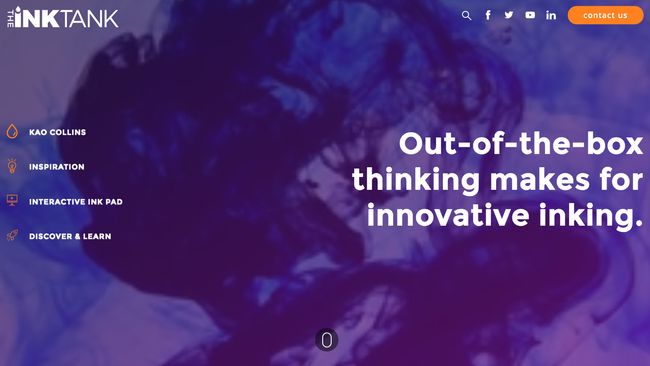
Built by DBS Interactive, The Ink Tank is an eye-catching WordPress site that pulls out all the stops to bring you cutting-edge news from the ink industry and showcase some of the creative ways businesses and artists are currently using ink. The highlight, as far as we're concerned, is its History of Printing section: a gorgeous parallax single-pager packed with animation and effects, taking you all the way from clay tablets to today's high-speed single pass printing, and looking ahead at some of the future possibilities of printing.
02. Sea Harvest
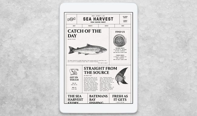
"When we think about seafood, many of us are taken back to a memory of eating fish and chips by the beach with friends and family," says designer Cam Tidy. "Often these takeaway joints would wrap your food in the newspaper, so it felt natural to explore that as a visual idea."
Replicating a static, print layout on the web wasn't without its challenges, though. The team used CSS Flexbox to reposition content whilst maintaining consistent spacing, regardless of screen size. Nearly every measurement is based on a responsive scale using REM units, making it easier to maintain control over type and image proportions as the browser scales.
03. KOBU
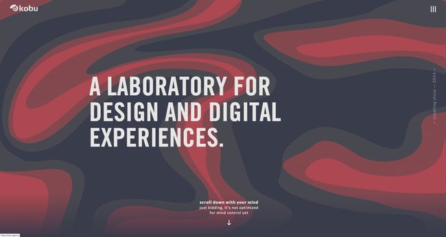
Over a series of elements, we get a reminder of how CSS and SVG can be combined for maximum frontend character. Absolute positioning is used to overlay charming wireframe motifs, breaking up the lines between bold background color blocks and linking sections together. A looped HTML5 video panel gets a unique wiggly edge using an SVG shape as a mask positioned above before case study images have their border-radius halved to go circular. The site makes neat use of the slick.js carousel library to ‘trot’ the KOBU team, with office horse, through the middle of the main page.
The zenith, though, is probably the bit we see first, opening on an undulating lava lamp-style header produced by manipulating SVG paths. Utilizing the anime.js plugin, a polyvalent JavaScript animation engine, it’s an eye-catching trick for establishing color palette, if nothing else.
04. Noformat
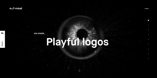
"We used vertex and fragment shaders to optimize for GPU rendering and made it pulsate and flash the noformat logo inside," continues Brewer. "We then applied post-processing effects to give it a more organic and less 3D look by blurring the edges and adding bloom to the highlights."
The rest of the site lives up to the impact of that first page, with slick on-scroll transitions and subtle parallax effects showing off tech skills without impacting usability.
"We chose WordPress for our site for speed to launch and flexibility," explains Brewer. "Over the years we have built our own libraries and module-based editing systems that allow us to create or edit a site faster than any other CMS solution."
05. Femme and Fierce
Dutch experience design studio Wonderland has delivered e-commerce with sass for Femme and Fierce. The WordPress website's in-your-face, clash-tastic color scheme delivers the online fashion retailer's brand message from the off. Animated 'stickers' – twirling lollipops, jabbing arrows, licking lips – create a cheeky feel and should resonate with the Snapchat/Instagram generation at which this range is aimed.06. Puree Maison
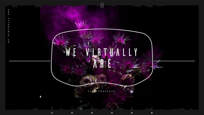
07. We Virtually Are
08. Asaro
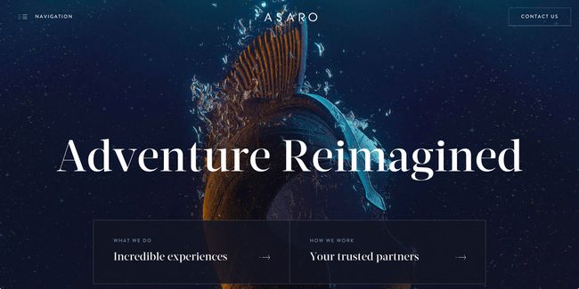
Built on a custom WordPress framework to keep ongoing content editing easy for the client, visitors are taken on a voyage of discovery packed with charm. Subtle scroll effects are linked neatly to an interactive dotted line, plotting navigational progress in the way a yacht captain might mark charts. Custom CGI renders have been utilized as a graphical device for representing Asaro’s exclusive service offerings, in light of a scarcity of photographic assets due to the private nature of the events.
“The art direction was inspired by a mixture of water drop photography and theatrical poster design,” explains creative director Tom Anderson. “We loved the aesthetic of the photography style and felt that it tied in nicely with the underlying nautical theme of the project.”
Responsive enough to not only look beautifully consistent on smaller screens, access speed was also a motivation for streamlining performance. With boat dwellers at the mercy of marine web connectivity, load times are more chipper than choppy across desktop, tablet, and mobile.
09. Design Museum Denmark
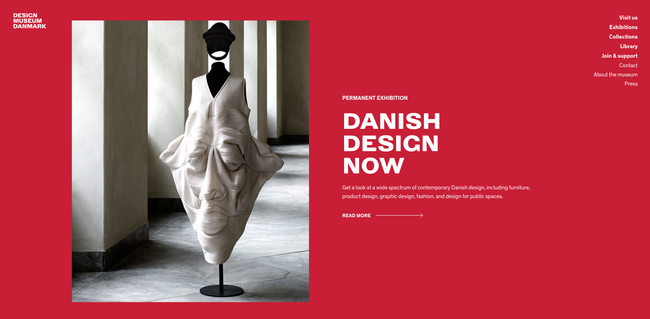
Built by Copenhagen-based design and branding agency Stupid Studios, the site for Denmark's Design Museum not only showcases the museum's archives, collections, and research but also presents it in a bang up-to-date style. From its opening SVG animation of the museum's logo, through to eye-catching parallax scrolling and mood-enhancing palette swaps as you scroll through the content, it's the perfect online presence for an essential design destination.
10. The Walt Disney Company
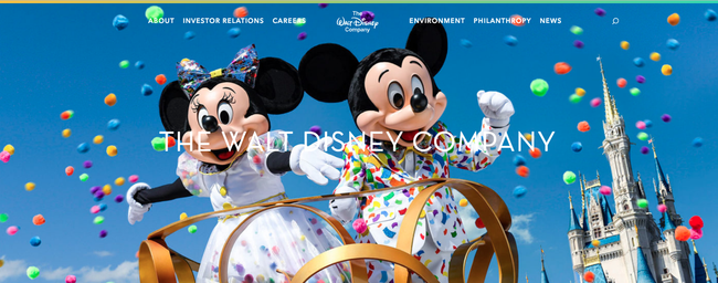
The mission of The Walt Disney Company is to be one of the world’s leading producers and providers of entertainment and information. Via its professional website, it can showcase its portfolio of brands to help differentiate its content, services, and consumer products.


No comments:
Post a Comment