9 Steps to perfect solo UX design

The UX design process itself is very flexible and can change significantly depending on the circumstances, with different design teams having different ways of implementing their process.

However, without a solid UX design process in place, a design team could be working completely in the dark. A clear and concise UX process, on the other hand, makes it possible to craft amazing and less problematic experiences for the user.


But how do you implement such a process if you're working as a solo designer – which is a common position to find yourself in these days? In this tutorial, we take a look at a simple UX process to help streamline your solo workflow – including which web design tools to use along the way.
Generate CSS is a bespoke conference for web designers: Grab an early bird ticket now

01. Define your problems

Define the problem(s) first! You need to understand clearly what you’re trying to solve: ask your clients if you are working in an agency and ask business stakeholders or the product manager if you are in a product team. UX design is a problem-solving discipline and helps the end-users to achieve their goals with ease. So discovering if your product idea will fulfill these needs is your first step.

02. Gather data from real users

Surveys enable you to get a decent amount of data from real users. By using clever questions, you can discover more about who they are, where they are and what their needs and goals are. You can use many available tools to carry out surveys, such as SurveyMonkey and Google Forms.

03. Analyze your competitors

By looking at who your competitors are, you can get a much better feel of how you can create something more unusual. However, this shouldn’t be a long process, as all you’re doing is seeing how viable your product idea is and whether or not it has a place within the market.

04. Create personas

With the data you have from the user surveys and analysis of your competitors, you can now create personas. Personas are not the customers you want but the customers that actually exist, whether they’re the ones you already have or potential customers in the market. Even though these personas are fictional, they should represent real people’s behaviors, motivations, goals, and needs. Although the effectiveness of creating personas has been hotly debated of late, it is a very good way to remind yourself that you’re not the user.

05. Define user flows

With the information we now have within our personas, we can begin to map out the flow our users would take. This is a user flow – the path taken by a prototypical user on a website or app to complete a task. The user flow takes them from their entry point, through a set of steps towards a successful outcome and final action, such as purchasing a product. In most cases, user flow is a visual chart that shows each screen a user will or could find themselves at. Even though this is a great way for designers to visualize and work with the site, it can also help developers see and understand the typical user journey.

06. Brainstorm!

Brainstorming is a combination of informal problem solving and lateral thinking. It’s a great way to generate ideas that you would not be able to come up with by sitting down with just a pen and paper. However, this will be the hardest step to follow as a solo designer because, in most cases, this is done within a group. So here are some steps you can follow to make your solo brainstorming a success.

Firstly, break out of solitude, get outside and look around as small scenes can lead to big ideas. If you’re working for a company, go and ask questions of the developers, project managers, receptionist – even the boss! Getting fresh perspectives can spark all kinds of ideas. Now using sticky notes or a blank sheet of paper, spend 15-30 minutes writing down as many ideas as you can. Don’t judge them; just keep writing down what you’re thinking.

07. Create paper wireframes

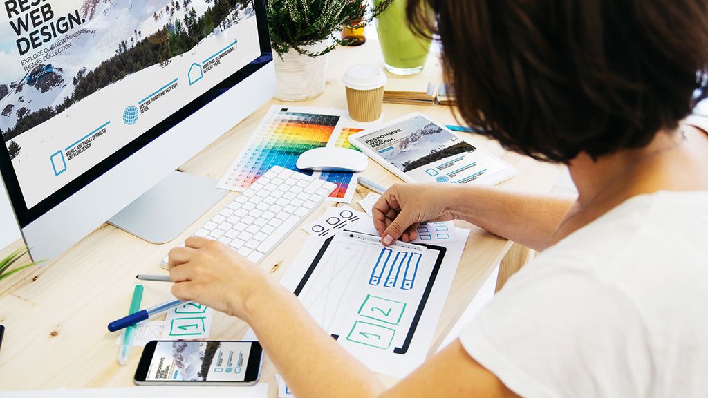
By now you should have a decent number of ideas, either on sticky notes stuck to a wall or scribbled on paper. Now it’s time to get even more creative and start sketching out those ideas on paper – sometimes referred to as paper wireframes.

Sketching things out is a very efficient way of trying out a multitude of ideas and iterating them before settling on the best one. Using a pencil first, we can draw a lot of basic sketches to look at the problem from many angles and consider different solutions. Once you’ve settled on the solution, you can now go over your sketches with a pen and then rub out the pencil.

To make things clearer, make sure you add annotations and notes where possible. Once you’ve done a few sketches, go and have a break and come back to your sketches a while later. Take a look at them and see if they still make sense.

08. Develop the wireframes

Low-fidelity wireframes include the most basic content and visuals and are usually static (non-interactive). They are often used to help map out the shell of the interface, its screens, and basic information architecture.

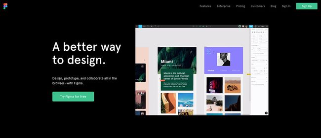
There are many wireframe tools available nowadays, including Figma, Sketch and even Photoshop. Whatever tool you use, your low-fidelity wireframes usually serve as a checkpoint for the beginning of the design process for stakeholders and product teams and you should be able to present clear solutions to them.

09. Build a basic prototype

At this point you have all these nice wireframes designed with your favorite design tool, so now what? Well if you’re using a tool such as Figma, Sketch or InVision Studio, then it’ll be nice and easy to create a low-fidelity prototype. 


The prototype is a simple and easy translation of the product and design concepts. It’s used to turn the design ideas into testable and tangible artifacts, collecting and analyzing the user demands at this early stage, refining your product as you go.
Share:

How to become a UX expert

Good web design is imperative to attracting users to your site, but in order to keep them when they arrive, you have to make sure the user experience is spot on too. When it comes to creating an excellent website, user experience (UX) and user interface (UI) go hand-in-hand.

The UI & UX Design Bootcamp is an online training course that will teach you how to build digital products that both look and work beautifully. Across six lessons and over 39 hours of premium content, you'll get to grips with what makes the world's most visited websites tick.


The training covers everything from UX and UI basics and essential design principles to how to design apps from start to finish and top tips for creating habit-forming products. And if you're in need of some resources to help you along, check out our round-up of the best UX tools from around the web. Here's a sneak peek of what to expect from the UI & UX Design Bootcamp course:

Mobile User Experience: The Complete Guide to Mobile

This course covers the design process involved in building mobile apps that not only look great but work beautifully too. You'll be introduced to the design principles and considerations behind the world's most popular apps, get to grips with understanding users' specific needs and testing designs that resonate with them and run usability tests to find the design that would get people hooked. To fortify your learning, you also get to ask questions and consult the instructor on course material.

How to build habit-forming products

This two-hour course revolves around mastering the art of building a successful product with an active user base. Instructed by Hooked: A Guide to Building Habit-Forming Products Author Nir Eyal, you'll explore habit formation principles and how they can be applied to the design process, as well as comprehend common design patterns of popular digital products. You'll also learn how to optimize products for user retention and get acquainted with the Hook Model, a framework that highlights the design components that influence user behavior.

Become a Senior UX Design Strategist

Want a career as a UX professional? This course will equip you with the knowledge and skills to build a successful UX consulting career. In the three-hour lesson, you'll get an overview of UX strategy fundamentals, learn how to develop and streamline a UX strategy, and acquire tips on how to lead a design team. You'll also get to master essential skills like interviewing users, developing projects from start to finish, and a whole lot more.
Share:

10 Platforms to DIY Mobile Apps

These software platforms provide a suite of development tools which allow anybody to create a mobile application easily without having to write a single line of code. One can create a range of mobile applications and mobile websites for various mobile devices, smartphones, and tablets.

Similarly, these platforms provide technical support as well as other useful resources to build and publish a branded mobile application for various platforms like Windows, Android, Apple, BlackBerry and more.


So, here I am providing a list of popular names of DIY mobile app building solution providers in the market. Alright then let us check out the list of 10 DIY mobile application building platforms.

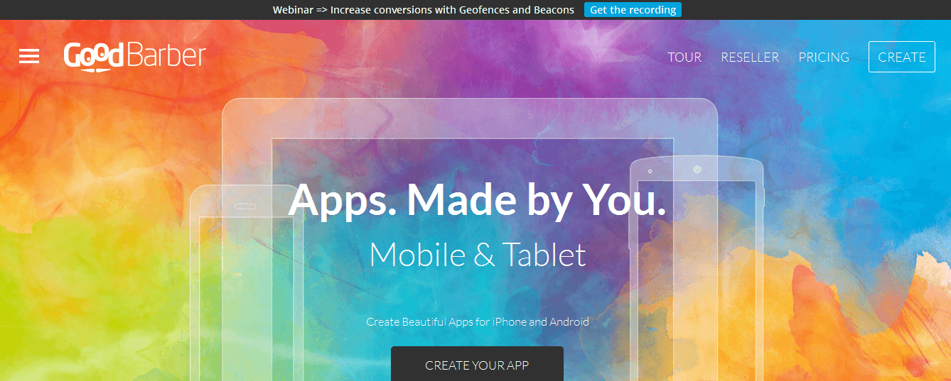
1. Good Barber


Good Barber is a robust DIY mobile app creation platform which allows anyone to design feature-rich, a mobile app for multiple mobile devices like smartphones and tablets. A striking feature of Good Barber lies in its impressive collection of ready-to-use app designing themes, UI components, and content blocks. One can also design and publish apps for native platforms like iOS and Android.

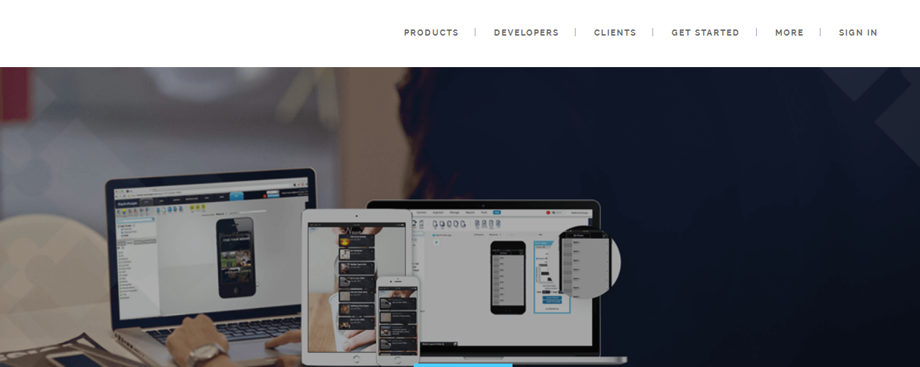
2. EachScape


EachScape is a mobile application development platform which allows web developers to easily create responsive mobile applications for multiple platforms, such as iOS and Android. The platform provides a modern drag-and-drop IDE (integrated development environment), which allows building HTML5 mobile applications as well as cross-platform, hybrid apps. Besides, EachScape also generates native source code for iOS and Android which allows developing native applications.

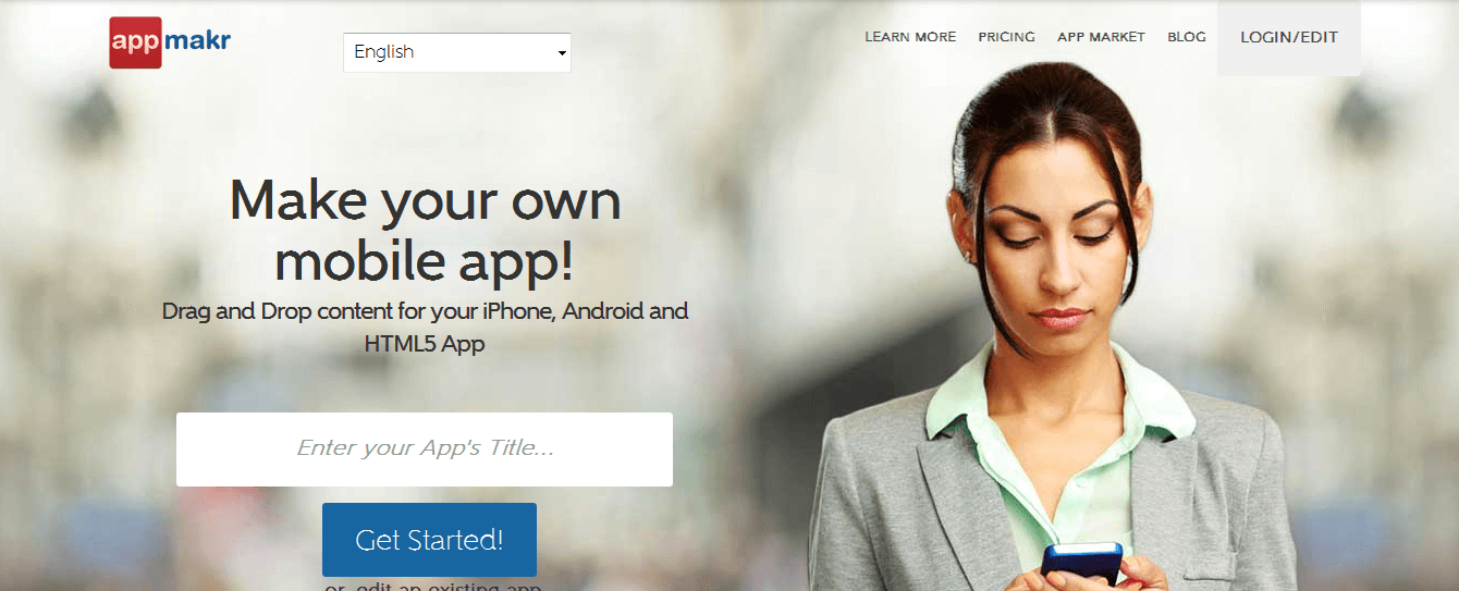
3. Appmakr


Appmakr is one of the most popular do-it-yourself mobile application building platforms in the industry. Appmakr provides a simple drag-and-drop interface which allows developing a variety of native and HTML5 mobile applications easily. 

It offers an iPhone app-maker which allows developing native mobile applications for various Apple devices. Appmakr also makes it easy to develop and publish native applications on Google Play and the App Store. Moreover, one can build an HTML5 mobile website which works with any HTML5-compatible smartphones and mobile devices.

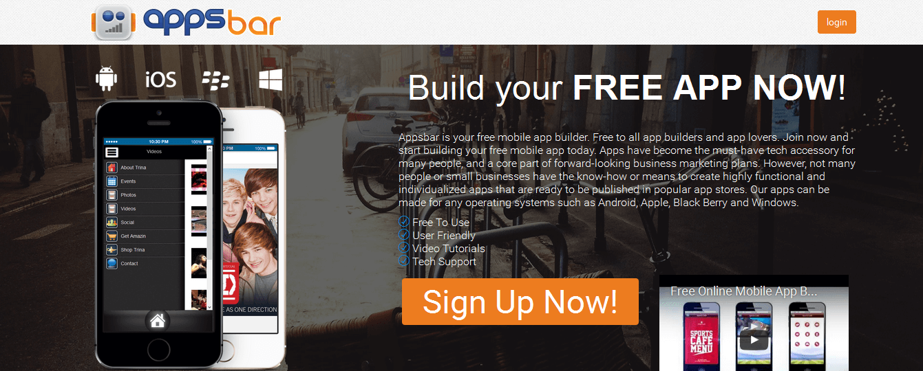
4. Appsbar


Appsbar is a robust do-it-yourself mobile app builder which allows building mobile applications for a range of platforms, including Apple, Android, Windows, and BlackBerry. 

With several app-building tools, technical support and training videos, Appsbar makes it convenient for businesses or individuals to create a mobile application for free without having to do any coding. One has to simply select the application type from various available options, like business, music, games, and others and start building a mobile application instantly.

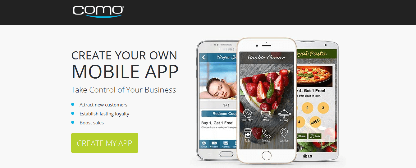
5. Como


Como is one of the leading providers of mobile application building solutions in the market. It provides a DIY mobile app development platform which caters to small businesses, professional retail chains, and large corporate brands. 

Como makes it simple to build an enterprise-level, mobile application and integrate a full-fledged customer engagement solution which resonates with the company’s brand image. Como Premium is a full-service, CLM (customer loyalty management) solution which offers business analytics and customer management services as well as several auto-pilot tools for executing business intelligence, app promotion, and branding solutions.

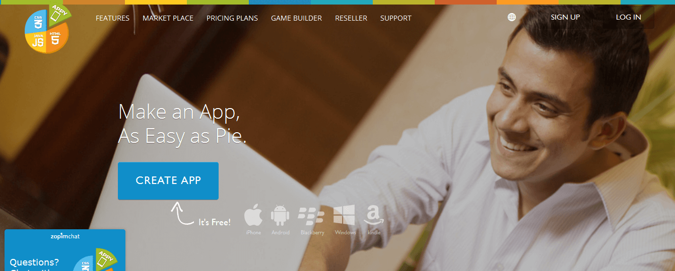
6. Appy Pie


Appy Pie is another prominent name in the list of mobile app building tools. The product is very suitable for start-up firms, modern businesses, merchants and large companies. Appy Pie provides cloud-based, mobile app building software solutions for a range of platforms, including Android, Symbian, iOS, Windows and BlackBerry. The company is committed towards providing excellent technical support and customer service and provides a range of video tutorials to provide help with app creation, publishing, and monetization. One can easily build a variety of mobile applications, such as the mobile-friendly online store, chat application, mobile business website and real estate mobile app.

7. Bizness Apps


Bizness Apps is one of the widely used mobile app building tools in the market which is suitable for small businesses and start-up companies. One can choose from a range of in-built app building templates or create a custom mobile app for native platforms and web. The company’s website displays a good collection of sample app examples catering to various industries, such as restaurants, fitness centers, real estate companies and law firms.

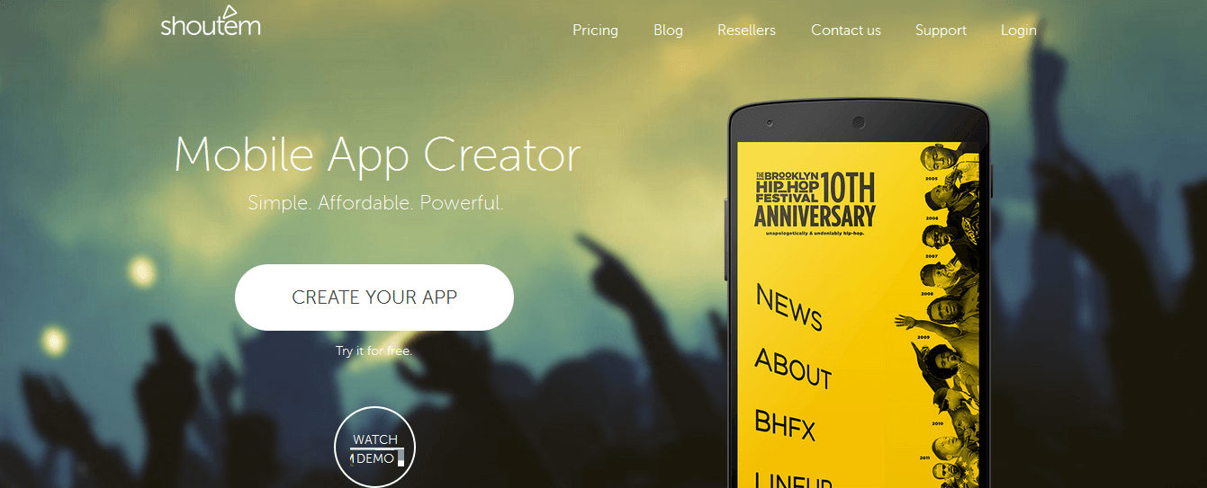
8. Shoutem


Shoutem is an advanced mobile app building solutions provider in the market. The platform features a user-friendly drag-and-drop interface, integrated CMS solutions, and modern mobile app designing tools. 

Shoutem allows building mobile apps for churches, event management firms, restaurant companies, music companies, artists and corporate businesses. The platform also offers other great features, such as application previewing, app monetization, user activity analytics, user management, and push notification dispatch support.

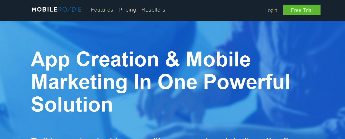
9. Mobile Roadie


Mobile Roadie is a powerful cloud-based platform delivering mobile application development solutions as well as mobile marketing and mobile app promotion services. One can easily create a custom enterprise mobile application or a native mobile app for iOS or Android. 

Mobile Roadie provides several useful mobile app marketing features, including support for sending push notifications, geo-targeted marketing services, and user analytics.

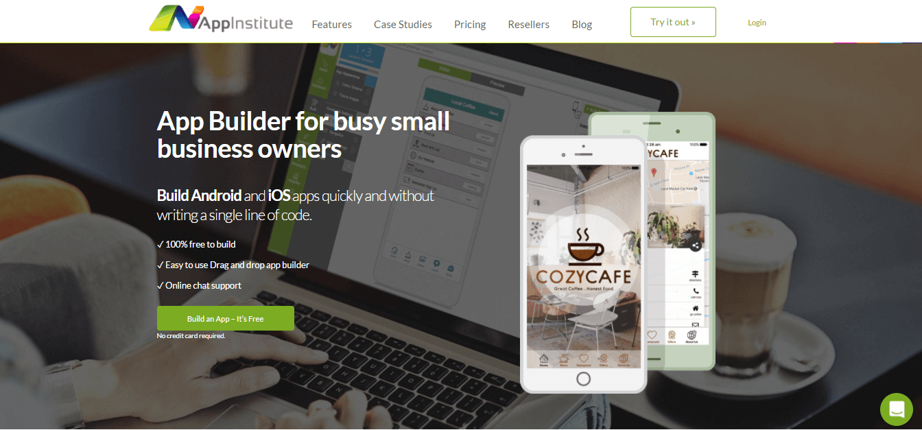
10. AppInstitute


AppInstitute offers a code-free app builder solution that is targeted at all manner of small business – from beauty salons and restaurants to lawyers and car dealers. Their app maker offers a wide range of business templates in a drag-and-drop system that offers an intuitive way for people with no coding knowledge to make apps for both iOS and Android. Some of the features offered by AppInstitute include advanced push notifications, a built-in loyalty system, and a food ordering module.

Conclusion

Modern Do-It-Yourself mobile app building platforms provide a variety of features which cater to a range of business requirements. So, businesses owners should choose a suitable platform depending upon the kind of mobile app building solutions they are looking for. If you have some more names to add to the list or would like to share any feedback, then kindly write your thoughts in the comments section below. Thank you!
Share:

10 Best blogs to follow for Android developers

Software development is an interesting theme. There’s a significant amount of fragmentation of devices and Operating Systems (OSs) with the three leading mobile platforms including; iOS for Apple, Android for Google, and Windows for Microsoft fighting for the best spot in the industry.

As to which of the three is the current best is a discussion for another day. Today, however, we’ll take a tattletale preview of the other current best, the top 10 best android blogs you can follow to catch up with the latest software’s, mobile apps, and alternative tech-related topics in the industry. Check out the following:

1. Android Developers


It’s certainly top of the top 10 best android blogs to follow. This is the professional web page for Android software development engineers. It provides credentials of software developers, Android studio and SDK. It’s also rich in-app tools, training, app code samples and much more.

The site is also helpful to individual developers as it allows them an opportunity to sell their apps to other people. But in order to acquire this service, you may have to register and pay $25 in fees.

2. YouTube Channel

Other than the official web page, Android App developers have a separate youtube channel with videos often posted live from Android events, App launches, Demos, and Tutorials. The channel has also been airing high-quality inspirational stories from companies such as Hunt and Haystack
Besides the official web page and YouTube channel, the developers also run a twitter account for both the developers and Android users to meet, interact, learn and share in their best experiences.

3. Android Open Source

If you’re into software development, unlike in the above two, you will find an entire source code available here. This blog offers the data you need to create personal variants of the Android stack and the Intel you need to port other accessories to your Android device as well as how-to guides.
The software stack is a project led by Google. The open-source code also allows you free access to Android security advisories and a chance to ensure your devices meet standard compatibility requirements. That’s on top of the opportunity to restructure your own device’s security settings.

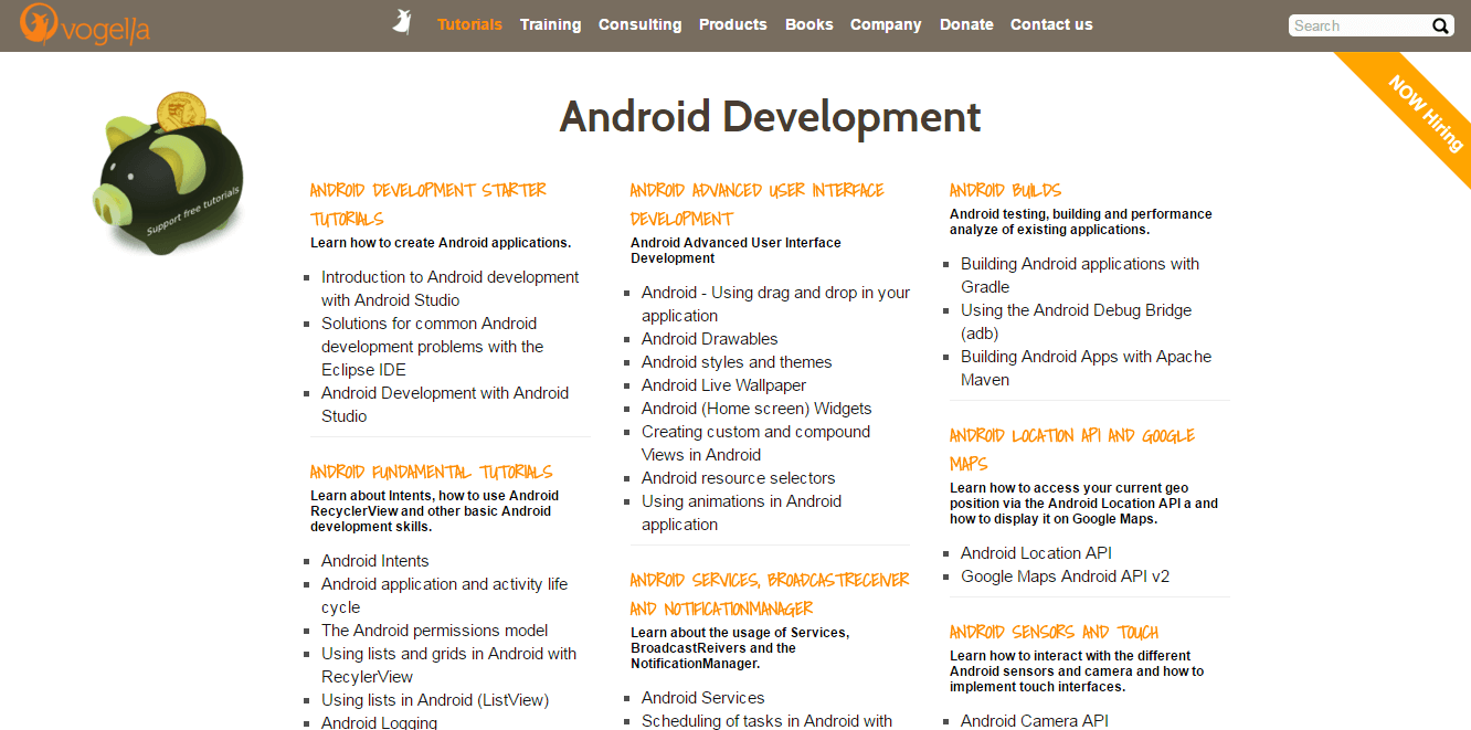
4. Vogella


You’ll probably find Vogella the most comprehensive of the top 10 best android blogs. This one covers everything Android; from programming tutorials, Android software, Debugging, Google Maps such as Android API and other mobile apps as well as how to guides among other services.

If you’re just learning how to develop an app, vogella has not only the right training program for you but also the right supporting materials such as Git development and implementation support. And what’s more? You can as well store and access your data using the SQLite database system.
5. Android Guys


Like Vogella, Android Guys covers everything Android. It’s the place to be when looking for a comprehensive package in software development, news, reviews, interviews, podcasts, insights, and apps. They even have an accessories store for Android software and brand mobile devices. And also there's always a step ahead of the rest with top rumors on trends and unreleased apps and devices.

6. Android Community


From the name you can tell this is about a family. Or so a couple of families brought together. In this blog, Android developers, customers, tech enthusiasts, and other professionals come together to share in their Android experiences. The blog works closely with Google to get the latest news.

Beyond the news, Android Community is also popular for its comparative product reviews, apps, games, phones, tablets, and software sales as well as a collection of the best deals of the same at a particular time period in the market.

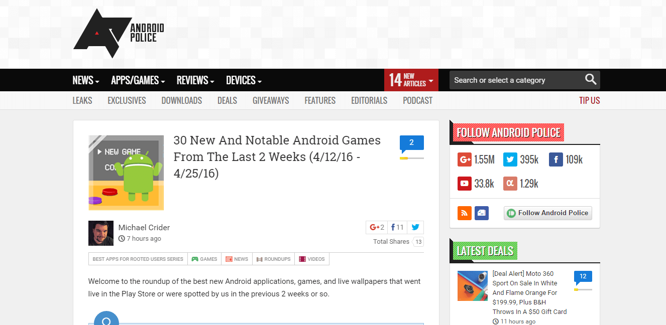
7. Android Police


With the many Android contract links, contests, and winners’ giveaways Android Police most certainly merits the top 10 best android blogs in 2016. You wouldn’t be so kind if it missed or would you? Guess not! Other than the giveaways, the blog is also phenomenal with important leaks on essential Android products; software, smartphones, tablets, and TV plus mobile apps.

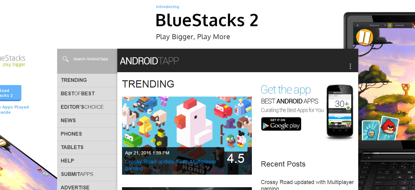
8. Android Tapp


This one is very engaging. Other than the usual; apps, news, and review segments, AndroidTapp also runs socially engaging pieces including HD games, racing games, and brain teasers for kids. That aside, you can also count on the blog to get you up to date with trending topics on Android services and products.

9. Fragmented Podcast

You’ll find something new to learn about software development every time you visit Fragmented Podcast. Donn Felker and Kaushik Gopal often engage other Android developers on the same on a biweekly basis. 

The topics range from Android tools to patterns, practices, apps, and creativity
For instance, last week on Monday, Felker, and Gopal shone the bright light on vector drawables; how to use the same today in Android development, the recommended usage and formats, merits and demerits of using the same among other essentials of the technique in software development.

10. GitHub


Of the top 10 best android blogs, this is the largest code host with more than 22.7m code sources. In their own words; the blog helps individuals create personal projects, try out new programming languages, and also host their earlier projects. The blog also helps businesses by supporting their development processes as well as by providing the platform to securely make up their software.

Also, if you want to collaborate with other developers in handling payable projects, just click on the link below for interesting programming gigs.

Besides this list of top 10 best Android blogs, you can also find everything Android by following the following experts, namely: Paul Buirke, Cyril Mottier, Taylor Ling, Roman Nurik and others.
Share:

5 Little portfolio details that make a big difference

Our portfolio is one of the most personal projects we create. We can get so close to the project, obsessing over the typefaces or layouts, that we forget other important details that may be obvious to anyone else using our site.

I see a lot of fantastic portfolios in my work with Semplice, a portfolio system for designers. I also see a lot of great portfolios that could be better with more thought and care.


I’m all for starting simple and shipping early, but sometimes it’s these small details that can make or break your site. Whether you are working on your portfolio now or launched long ago, these optimizations will make a big difference.

01. Optimize image and video file sizes


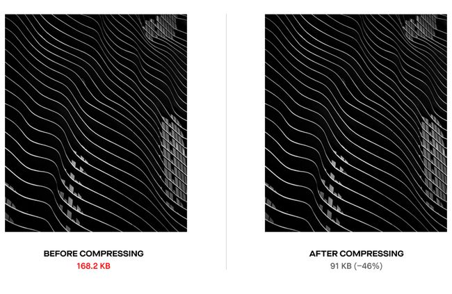
Sounds obvious, but you would be surprised how many times I’ve seen poorly optimized websites made by skilled designers. They want pixel-perfect images and upload files at insanely high sizes. This affects more than just your loading time. It can mess with the animations on your site, transitions, basically everything. But people won’t even get that far because they’ll exit a site that takes more than two seconds to load.

Resize and save out your images for the web. Plenty of plugins exist that allow you to do this in batches. You can still share perfectly crisp images while keeping the file size small.

02. Add social share images & SEO titles

Online, you are a brand. You are a business with something to sell. Thinking of your portfolio this way helps you remember the important details you would recommend to your client, but would easily forget for yourself. SEO and social optimization are big ones.

Customize the title and description of your pages. This is not only good for SEO, but ensures your portfolio doesn’t look like some unfinished template site. Imagine your dream company pasting the link to your portfolio and seeing some generic placeholder like “My First WordPress site!” Not ideal.

It’s also a bit of a bummer to find a great portfolio and go to share it only to see a placeholder image or no share image at all. Almost every social platform revolves around imagery. Tweets with images receive 150% more retweets than tweets without images. If you want people to share your site and you want people to click it, add unique share images for each of your main pages.

03. Don't forget your favicon

Yes, that tiny little image at the top of our browser when we visit your page. Add one. Make it unique. This speaks to your attention to detail and shows what kind of effort and thought you put into your work. And think of that recruiter with dozens of tabs open viewing portfolios from applicants. They probably want to click the one with the banana favicon first.

04. Consider your website user flow


For some of us, UX is our expertise. Yet when it comes to our portfolio, we are so focused on making a masterpiece that we often forget our users. For example: Most of us know that we can find your contact information in the footer or on your About page. If you have an about page AND a contact page, you’re forcing me to stop and think to choose between the two.

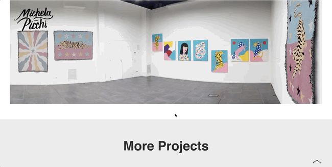
Or think about what keeps people engaged with your work. Should your case studies end with a standard footer, or can you tease your other projects to keep people clicking through?

Consider how you would design a client’s website to convert. With your portfolio, the goal is simple: Get people to contact you. Make it as easy as possible for your viewer to navigate your portfolio and reach out to you.

05. Never neglect your mobile view

Again: Sounds simple, often overlooked. We all know about designing for mobile, but it’s the easiest thing to skip when you’re working on desktop and just ready to launch the damn thing – especially when you’re working on your own site. I know. I’ve done it myself

Your portfolio is what speaks for you when you're not in the room. You never know what opportunities you might be missing because someone got fed up with using it your site or couldn't load it in the first place.
It’s these tiny little things that say a lot about your work ethic and attention to detail when a potential client is viewing your portfolio. Show that you care about doing excellent work for your clients by doing excellent work for yourself.
Share:

10 Free Resume Templates

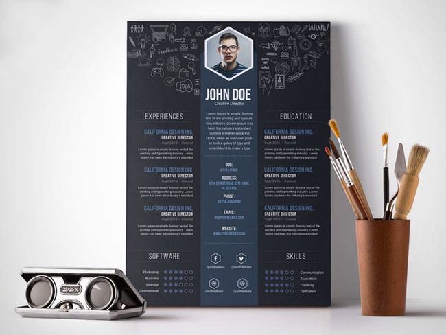
If you need some quality resume inspiration before you start, take a look at these creative resumes, which are brilliant examples of how to stand out from the crowd.

01. Anam free resume template


Download here
Kicking off our free resume template list is this stylish design from graphic designer Fadhli Robbi. Created in Adobe Illustrator, with this template you can edit to create new colour schemes, add or delete selected sections and change fonts so the overall design fully reflects your style. An attractive design and great starting point to developing your own stand out creative resume.

02. Clean and professional resume


Download here
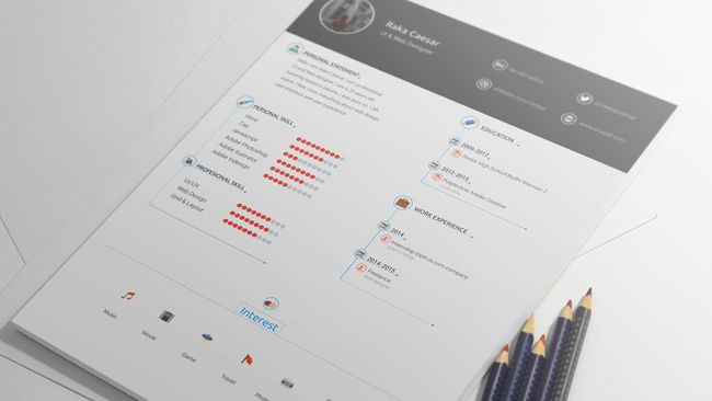
Simple but elegant, this free resume template designed by Raka Caesar has nothing but need-to-know information on it, making everything very clear for prospective employers. More of a visual guide, this resume template uses icons to reveal interests and a chart-type system for strengths in various skills. The file is in .psd format, so fully customisable if you wanted to replace or add any content.

03. Free resume template with business card


Download here
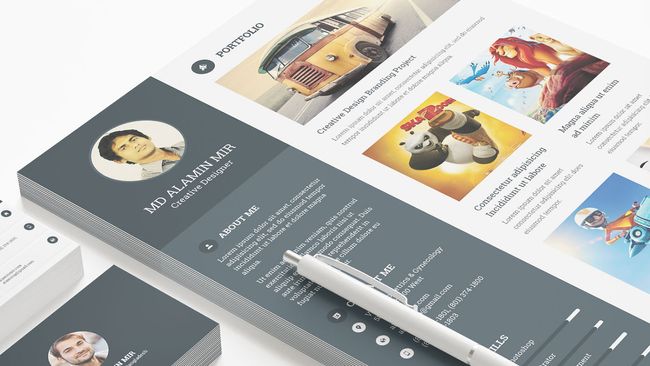
This standout free resume template design created by Alamin Mir, in collaboration with Grapphiora (was Pixelll), provides the perfect starting point to update your CV. A multi-page resume including cover letter, CV, image portfolio page and bonus two-sided business card, this free pack is fully customisable. It also uses a free font, which is great for anyone wanting to keep the same design as displayed.

04. Graphic designer resume


Download here
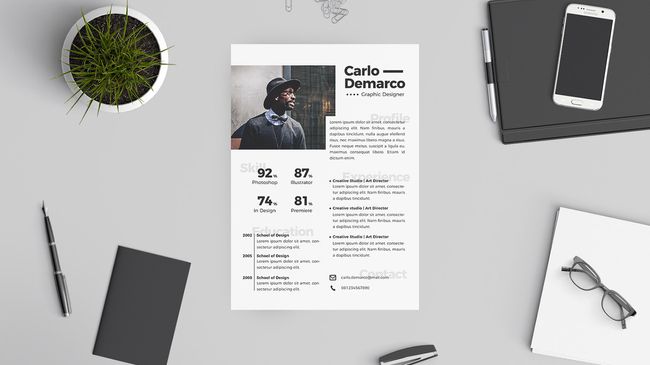
This A4-sized free resume template is a great starting point for any graphic designer looking to update their CV. The PSD file is fully customisable within Photoshop, with multicolour options and well labeled and organised layers ready for making your own. It's clear, professional and there's room for a mug shot right at the top – smile!

05. Material design resume


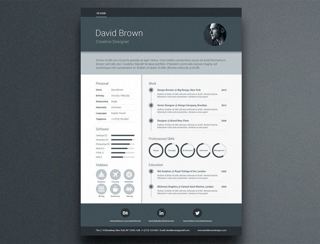
For a stand-out resume with an on-trend look, this template, inspired by Google's Material Design framework, is excellent. It includes areas for professional profile, work experience, education, skill circles, skill bars, social media icons and images, and it's supplied in A4-size format for Adobe Illustrator, InDesign and Photoshop. 

It uses free fonts, and if you'd like a covering letter and portfolio template to go with your resume, there's a premium version that also includes new colour options plus matching business card templates and custom icons.

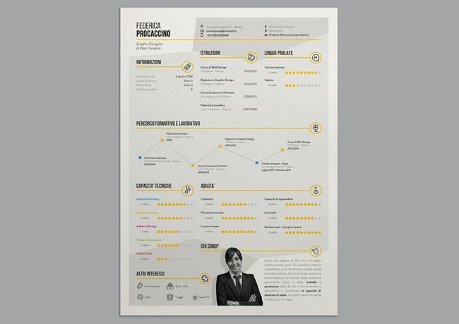
06. Stylish infographic resume


Download here
Want to get all your relevant information across in an eye-friendly, graphical way? Why, you'll be wanting some kind of best infographic, then! And this stylish template by Federica Procaccino delivers just that, enabling you to get your message across on a single page without overwhelming everyone with text.

07. Creative resume


Download here
If you know your way around Adobe Illustrator and don't mind getting your hands dirty, then this template is perfect for producing a great-looking resume that you can customise to your personal taste. You can either use it as-is, changing the text and adding a photograph, or you can spend time editing the colours and tweaking the layout until you have something that more accurately reflects your personality.

08. YA free resume template


Download here
Created by Indonesian graphic designer Angga Baskara, this elegant template covers all the bases with three sections – a main CV info page featuring eye-catching progress bars to illustrate your main skills, a covering letter and a portfolio section where you can add a selection of your work in the form of images and short descriptions.

09. Creative Vintage Resume


Download here
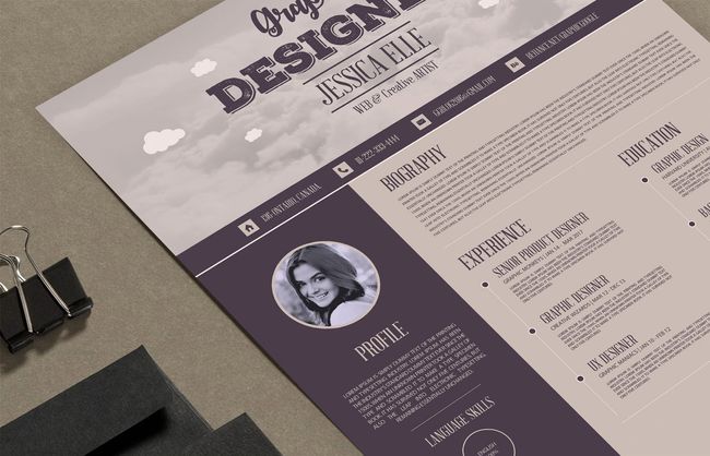
This is a splendidly vintage-looking resume template in deliciously earthy tones, and it comes as an .AI file so that you can adjust it to your heart's content. Be aware, though, that the fonts aren't included, so you'll either have to hunt them down yourself (they're all free fonts, luckily) or substitute your own.

10. Creative Designer Resume Template


Download here
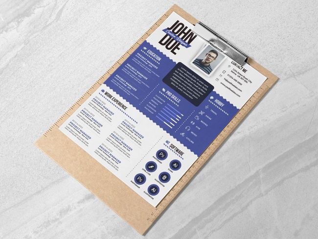
Fully layered and well-organised to keep customisation nice and easy, this bold and punchy visual template enables you to get yourself and your skills across quickly, without any messing around. It comes as a print-ready 300dpi A4 PSD, ready for editing in Photoshop.
Share:

12 Best collaboration tools for Designers

In this article, we gather together some of the best online collaboration tools that enable creatives to work together in real-time. Some are created specifically for designers, others serve as a concept crafting whiteboard. We've also included some more full-on project management tools for when you need to take your collaborative project to the next level.

After something different? Take a look at our guides to the best infographic tools, web design tools, or tools for graphic designers.

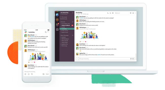
01. Slack


Want to improve communication within your team? Or work remotely but still stay in touch? Collaboration tool Slack is a fantastic solution for clear, real-time communication that keeps everyone in the loop. It's so popular now, chances are you're using it already.

Perfect for anyone managing a team of remote employees, Slack enables project development to move forward more smoothly. Different channels help keep conversations on track, while having all team communication in one place ensures no one gets left out of the loop. Slack can also help you grow your design business by reducing email and meeting times.

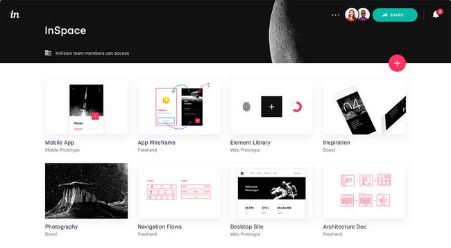
02. InVision


Created specifically for designers, InVision is a web-based tool and mobile app that turns your designs into fully active prototypes, complete with gestures, transitions and animations. 

Clients can provide feedback in the form of comments on your designs , and you can keep them up to date with the project’s progress in real time through actionable to-do lists. Getting started on your first project with InVision is free, but any more than that and you'll need to move to a paid plan.

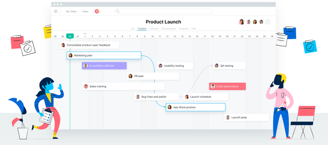
03. Asana


Asana will help you stay on top of your workflow by enabling you to create to-do lists, keep track of tasks via a project 'board', set deadline reminders, comment on others' posts, and send requests to colleagues. Employers can also use it to keep track of how projects are progressing. This collaboration tool first launched in 2008, and is still very popular.

04. Trello


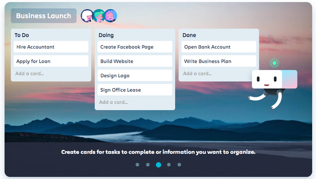
This project management tool is like a magical customisable to-do list on a single interface, which you can share with others in real time. Based on a system of 'cards' (which are essentially Post-it notes), you can categorise and order text, photos, drawings and mockups whichever way you want. There's also a nice progress gauge so you can keep an eye on your project's pipeline, as well as the ability to set appointment reminders. Most brilliantly of all: Trello is completely free.

05. Visme


Browser-based collaboration tool Visme collects all your team activities in one place. It's especially good for designers because it enables you to create a variety of visual projects, including presentations and infographics. There are built-in features to help you monitor on each user’s workload, progress, and activity on ongoing jobs.

06. Google Keep


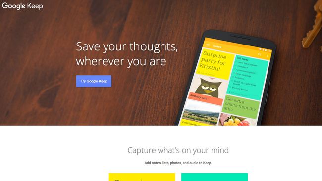
Google Keep is a fantastic way to share lists and ideas (or keep them to yourself). You can access Google Keep through its website or using the iOS or Android App. If you're looking for an easy-to-use list app, the check is a collaboration tool that's definitely worth checking out.

07. appear.in


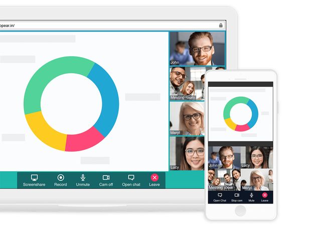
You want to see all your team's smiling faces, right? That's not always possible when working remotely, but online collaboration tool appear.in is the next best thing. This brilliant video conversation app allows up to eight people to converse in a chatroom, with no login or downloads required. It's free to use, or you can bump up to a paid Pro plan for extra features.

08. Basecamp


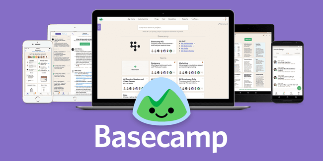
The daddy of project management, Basecamp was created when 37Signals couldn't find a project management app that wasn't insanely complicated, and so decided to build its own. It worked so well that clients wanted to use it, too, and things grew from there.

Featuring a whole suite of collaborative tools including to-do lists, wiki-style documents, file sharing and messaging, it packs in just about everything you need to keep any project running smoothly. You can use it via the web or with iOS and Android apps, and if you want to get a feel for it you can sign up for a 30-day free trial.

09. Podio


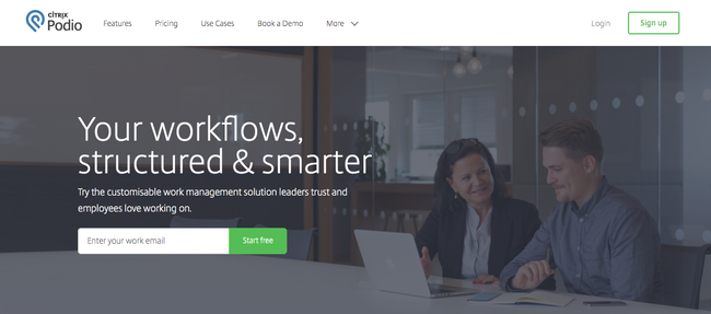
Online collaboration tool Podio aims to help you improve the structure of your workflows by offering a way to organize unwieldy stacks of work and assign different employees specific tasks. It enables you to share files, get feedback on work, and view the status on ongoing projects. One of the most enticing features is its third-party integrations – it works with a whole load of services, from Dropbox and Google Drive to Evernote. There are also mobile apps for use while you're out of the office.

10. Red Pen


More fun than a teacher's marking pen, this feedback tool is particularly great if you're a freelancer looking for some constructive criticism on a project. Specifically created for designers, Red Pen lets you drag and drop your designs into a dashboard and invite specific colleagues (or even clients) to let you know their thoughts in real-time as you roll out your latest updates. One of Red Pen's best features is that it keeps track of the numerous versions so you can always reclaim that earlier design if you change your mind.

11. Mural


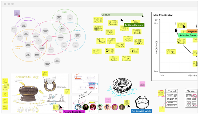
Mural is a creative tool for you to drag-and-drop rich media files, links and documents onto a big HTML5 drawing board, which is a great way to collect inspiration and gather your thoughts. It also supports collaboration that allows designers to brainstorm cool ideas remotely. Plus, it is optimised for iPad and gesture-friendly.

Mural is not just designed as a pinboard like Pinterest – its main goal is gathering and organising ideas. Anyone can join you to edit and collaborate, and changes are reflected on the board in real time. Just send an email invitation or set up a password for the board and you are ready to go.

Tools like Mural are lighter than some of the more traditional brainstorming tools, and if you're new to collaborative brainstorming then this could be a good place to get started.

12. GoVisually


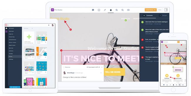
Free tool GoVisually allows you to mark annotations and place comments on any part of your project. With it, designers and clients can collaborate to revise projects online without sending painful emails, which should ultimately increase productivity.

For your annotation you can chose an elliptical, rectangular or lasso selection, as well as customising its colour and weight. These functions are very useful, and are as simple to apply as you'd find in a basic drawing app.
Share:

How to use color to shape UX

The validity of colour psychology and colour theory as a marketing strategy is an often-debated topic because we each have different preferences. Your favourite colour may be blue. Or it may be orange. Or purple. Red? You get the point.

But couldn’t that suggestion also relate to any design methodology? When designing a website, are you trying to design it for one person or are you trying to connect with a generalised audience that is representative of your ideal customer? The base of a successful design requires you to remove the bias of an individual and step back to see how it affects a larger audience.


Design around audience expectations

When it comes to selecting the 'best' colour for a brand, research has found that predicting consumer sentiment toward the relevance of colour and a brand is more important than the colour selection itself.

For example, when thinking of health, many people correlate that to the colour green. If a new health initiative for a large organisation or food product decided to brand themselves with bright red, something would feel off about that choice. We may not always consciously realise why it feels that way but behind the scenes that feeling is our brain's way of filtering through what aligns with past experiences that were learned or conditioned. This is even more apparent in colour choices.

Much like in UX, it's important to consider how jarring things that don't match user expectations can be.

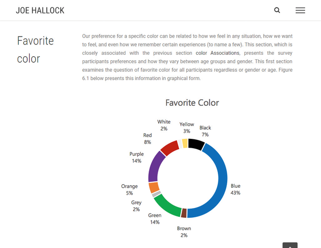
In 2003, Joe Hallock wrote an undergraduate paper on colour assignment. He surveyed a sample size of 232 people and was able to distil core colour associations by gender and age. For example, he was able to determine that the emotional resonance of trust correlated mostly to blue (34 per cent of all survey participants).


Again, whether you personally feel blue best represents a trust or not isn't the focus. There were plenty of others that felt white (21 per cent) or green (11 per cent) conveyed trust.

When designing for larger audiences or market segments, we want to assess the ideal customer over anyone else's personal bias. If you are Microsoft and you'd like to position Bing in the marketplace to imply trust, you look at it as a numbers game. Internet Live Stats suggests there are over 3.5 billion searches per day on Google; it has a market share of about 93 per cent of all searches. If Microsoft is looking to gain more of a market share, a focal point of that effort may be establishing trust through design and branding.

According to a recent survey facilitated by SurveyMonkey, 65 per cent of all participants said that trust influences either a lot or a great deal in their decision making when supporting a brand. If blue represents trust in 34 per cent of that (1.19 billion) audience, that’s a large segment of people over white (735 million) or green (385 million).

Percentages on a graph can be misleading until you apply the context of what they really represent. Building trust with the colour blue is often used with businesses that carry out transactions using personal or financial information. It’s why you see banks and social media rely on blue as a primary colour in their branding. Leveraging small subconscious triggers, like using blue in branding, can help new customers connect quickly.

It's not magic but meeting the expectation of an audience will prevent their brain from firing off a warning signal that something isn’t quite right. Buying a few extra seconds to solidify sentiment toward your brand is highly valuable.

Know the financial power of a single colour

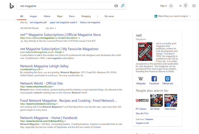
Bing’s three top colours are white, grey and blue. The top two are neutral, meaning anything blue pulls the user’s primary attention toward it

Did you know that 84.7 per cent of a customer's purchasing decision is influenced by colour usage? Selecting the right colour can have a large impact on revenue and conversions.


When Microsoft was designing what would eventually become Bing, its design team explored a large variety of colours to represent links. In 2010, Bing's user experience manager Paul Ray gave a presentation at MIX10, a long-gone Microsoft conference. He discussed the level of multivariate testing done on the factors of colours and typography – among others – and the impact they had on revenue, return rate, time to first click and more.

Microsoft's testing was so granular that it included multiple shades of blue for the link colour. It found that a specific colour blue (#0044CC) drove an estimated $80m to $100m dollars a year more than the lighter blue that was originally used.

This shade of blue is special. It goes beyond the colour psychology 101 understanding of blue being a representation of trust. What's fascinating is that this particular shade of blue uses the golden ratio mathematically.


The golden ratio – closely tied to the Fibonacci sequence – is best known as the rule of thirds. It's used in photography to frame composition by dividing the image into three equal vertical rectangles and three equal horizontal rectangles. This is something designers do innately as our brains are conditioned to perceive value in compositions that align to that ratio.

So how does this golden rule of thirds factor into a website Hex code for Bing’s blue? Hold on. We’re almost there.

Hex codes represent the red, green and blue markers of a pixel. The first two numbers of a hex code determine the value of red, the second two the green, and the final two blue. Bing's blue is #0044CC. Converting that to a standard RGB colour spectrum results in Red: 0, Green: 68, Blue: 204. Still with me?

What do you get when you divide the blue value by the green? Exactly three. Paul Ray’s presentation defined Bing’s shade of blue as a perfect mathematical blue.

Keep in mind your design context

It’s important to note that the perfect blue doesn’t increase conversions by itself, much in the way that having a red button doesn't magically generate more sales. Selecting a single colour for an element of your design is a portion of the collective design psychology. As with user experience, colour theory is best understood in context.

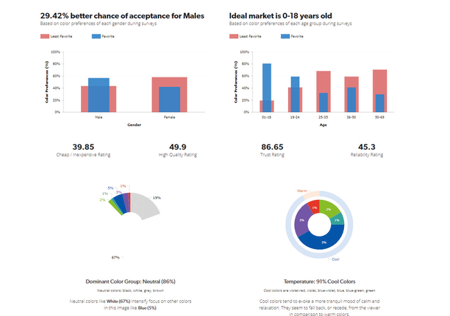
Bing's blue stands out because it's paired with a large percentage of neutral colours. Eighty-six per cent of the 'above the fold' search results on Bing is neutral according to a study done by UX Triggers (UXT).

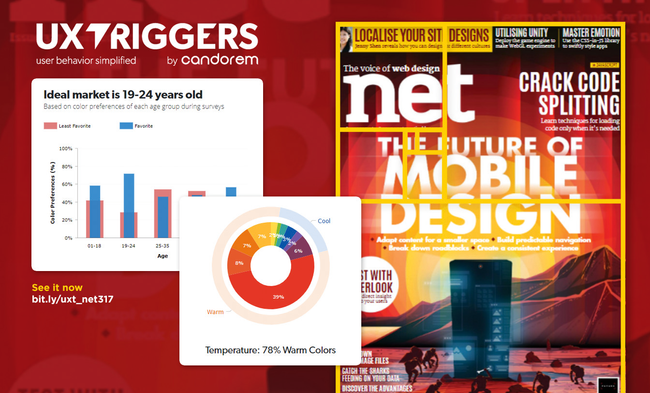
UXT is a colour psychology analysis tool that breaks down each pixel of an image to determine the percentage of colour use in relation to other colours and how that context impacts the perception of different genders and age groups in terms of factors such as trust and quality.


In the study, neutral colours (predominantly white with 67 per cent of the image) intensifies the focus on secondary non-neutral colours. In this case, blue was the most prevalent colour used at 5 per cent of the screen. The overall design focuses heavily on cool colours (91 per cent). Cool colours tend to evoke a more calm or tranquil mood. Which is important when looking at the context of the design itself.

Search results pages contain a massive amount of information. Each page only has ten total results but includes hundreds of words describing each page, the website URL, the page title and additional sidebar callout information that may be pertinent to the user.

This is why colour selection plays such a crucial role in user experience and design overall. It’s not about the colour blue or red: it’s actually about all of the colours surrounding it.

Bing’s three top colours are white (67 per cent), grey (19 per cent) and blue (5 per cent). The top two are neutral, as already discussed. Because of this, anything blue pulls the user’s primary attention toward it. When you factor in that the blue text links are also larger than the secondary description text (20px for the enlarged links versus 13px for body copy), it creates tunnel vision and enables users to focus on the page titles, which provide the most value on the page.
Share:

Popular Post

Web Design

5 Quick-fire portfolio tips from design experts

Your design portfolio is one of your most useful tools. It can win you commissions, help you snag a new design job, attract collaborators, a...

Labels

Most view post