I see a lot of fantastic portfolios in my work with Semplice, a portfolio system for designers. I also see a lot of great portfolios that could be better with more thought and care.
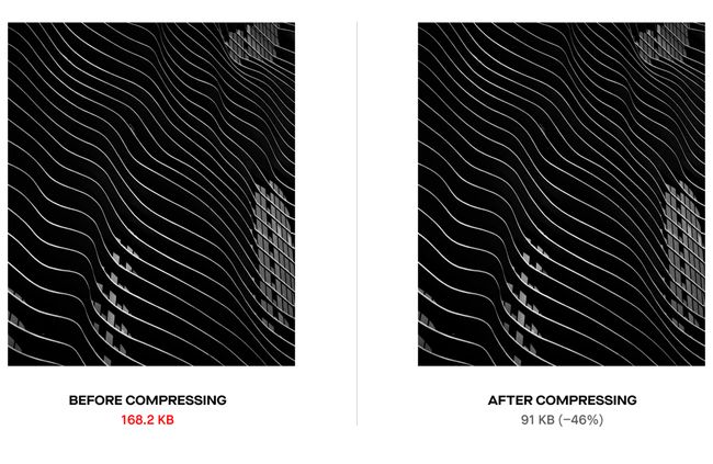
01. Optimize image and video file sizes
Resize and save out your images for the web. Plenty of plugins exist that allow you to do this in batches. You can still share perfectly crisp images while keeping the file size small.
02. Add social share images & SEO titles
Online, you are a brand. You are a business with something to sell. Thinking of your portfolio this way helps you remember the important details you would recommend to your client, but would easily forget for yourself. SEO and social optimization are big ones.
Customize the title and description of your pages. This is not only good for SEO, but ensures your portfolio doesn’t look like some unfinished template site. Imagine your dream company pasting the link to your portfolio and seeing some generic placeholder like “My First WordPress site!” Not ideal.
It’s also a bit of a bummer to find a great portfolio and go to share it only to see a placeholder image or no share image at all. Almost every social platform revolves around imagery. Tweets with images receive 150% more retweets than tweets without images. If you want people to share your site and you want people to click it, add unique share images for each of your main pages.
03. Don't forget your favicon
Yes, that tiny little image at the top of our browser when we visit your page. Add one. Make it unique. This speaks to your attention to detail and shows what kind of effort and thought you put into your work. And think of that recruiter with dozens of tabs open viewing portfolios from applicants. They probably want to click the one with the banana favicon first.04. Consider your website user flow
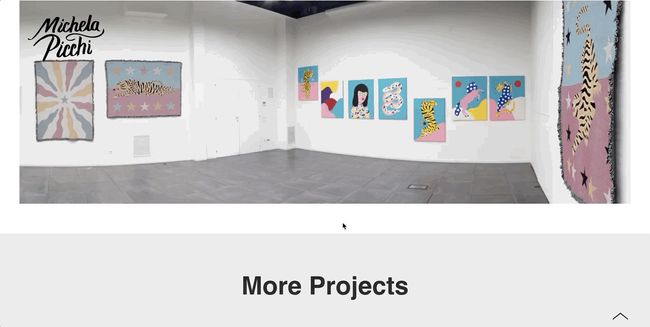
Or think about what keeps people engaged with your work. Should your case studies end with a standard footer, or can you tease your other projects to keep people clicking through?
Consider how you would design a client’s website to convert. With your portfolio, the goal is simple: Get people to contact you. Make it as easy as possible for your viewer to navigate your portfolio and reach out to you.
05. Never neglect your mobile view
Again: Sounds simple, often overlooked. We all know about designing for mobile, but it’s the easiest thing to skip when you’re working on desktop and just ready to launch the damn thing – especially when you’re working on your own site. I know. I’ve done it myselfYour portfolio is what speaks for you when you're not in the room. You never know what opportunities you might be missing because someone got fed up with using it your site or couldn't load it in the first place.
It’s these tiny little things that say a lot about your work ethic and attention to detail when a potential client is viewing your portfolio. Show that you care about doing excellent work for your clients by doing excellent work for yourself.


No comments:
Post a Comment