

For logo designers, Easter eggs are used to add an extra element of meaning to their work. These Easter eggs usually tie into the message of the associated brand, and are there to be discovered and passed around by fans and followers. This is a satisfying way for viewers to interact with logos and helps to spread a brand by word of mouth.
01. The National Lottery
 |
| Who wouldn't be happy to win the lottery? |
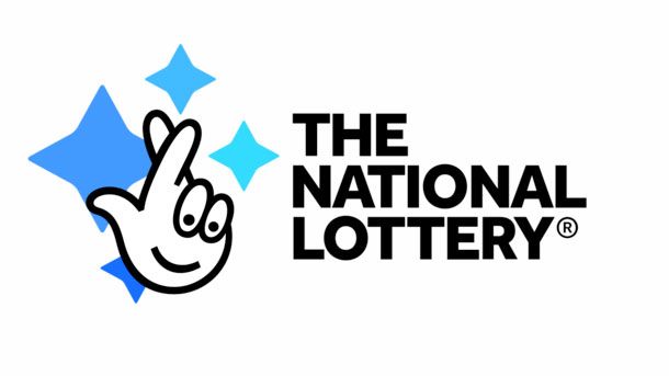
The logo for The National Lottery has one of those Easter eggs where, once you've seen it, you can't un-see it. Summing up all the hope that comes with entering, the 'crossed fingers' logo has been used in various iterations since The National Lottery was introduced by Camelot in 1994. However, if you look a little closer it also suggests the happiness that comes with winning a sack full of cash, or even just a tenner.
It does this by turning the fingers and curve of the palm into a smiley face. The logo has been doing this since The National Lottery began over two decades ago, but newer versions have made the hidden imagery a bit more obvious.
Originally designed by Saatch & Saatchi, the 'fingers crossed' logo subtly suggested a pair of eyes and a mouth, although you could argue that this was more by coincidence than design. An update by Landor a few years later turned the shape of the fingernails into a more expressive and excited pair of eyes.
And with the latest version created by Wolff Olins in 2015 (above) the motif has been made more obvious than ever. The dotted eyes and simple, smiling mouth of the palm take on an almost emoji-like quality. Remember, you've got to be in it to win it.
02. Museum of London
 |
| The Big Smoke's never looked so colourful |
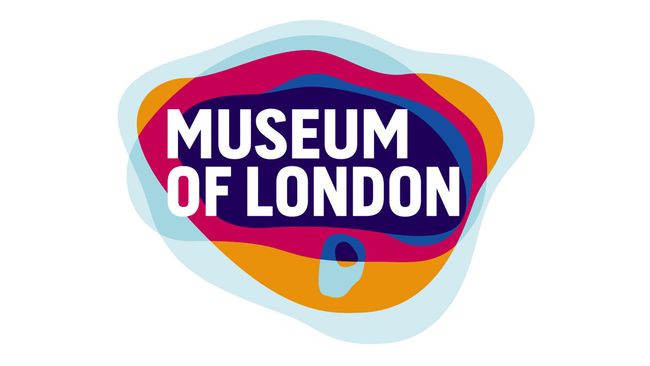
That's because this logo, with its overlapping series of bold blobs, represents how the geographical area of London has evolved over time. What could be more perfect for a logo that represents the UK capital? Not only does the design dodge using cliche landmarks, it also attracts viewers who are unaware of the secret meaning. No mean feat.
This identity replaced a more straight laced logo design that wasn't engaging with the public. But after the introduction of this dynamic logo, the Museum of London saw visitor numbers shoot up by 79 per cent.
03. Ready Player One
 |
| Easter eggs are at the heart of the plot in Ready Player One |
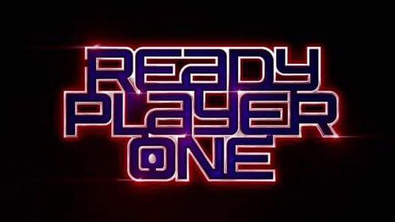
As well as bumping into an array of pop-culture icons along the way, Watts' quest for Easter eggs means that the film's creative team had the perfect excuse to sneak secret images into the promotional branding. Take the logo, designed by Pentagram's own Emily Oberman, which turns the typography into a miniature maze.
Unveiled at San Diego Comic Con, this clever piece of typography interspersed with subtle gaps captured the attention of fans eager for the film's release. And what's that at the end of the maze, inside the letter 'o'? That's right, an actual Easter egg... egg.
04. Wizarding World
It's been a busy couple of decades for J.K. Rowling. As well as writing some of the best-selling books in history, she's also responsible for getting a whole generation of children into reading. And somehow she also found the time to oversee the Fantastic Beasts spin-off movies.
All of this means that Harry Potter is more than just a series of books, it's a bonafide brand. Bringing all of these assets together is the British-American fantasy media branding umbrella The Wizarding World (originally known as J.K. Rowling's Wizarding World).
Given that the series has dedicated fans, this set of subtle references is the perfect way to engage their attention. The lightning bolt design in the letter 'w' references the lead character from the books and sets the whole logo off nicely.
05. Toblerone
 |
| Can you see the mountain creature? |
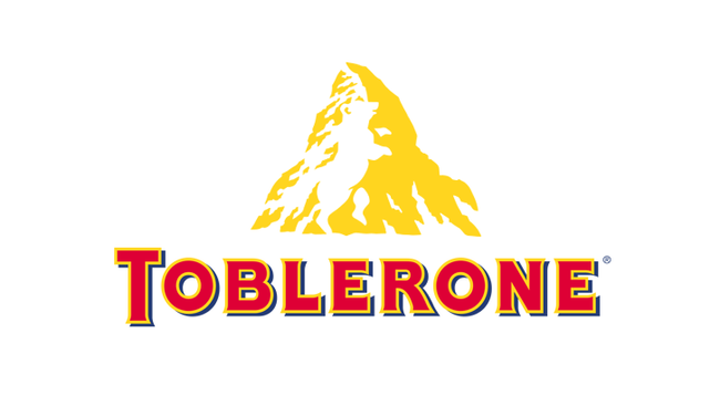
When it isn't making the headlines due to its diminished size, Toblerone is better known for being a tasty triangular chocolate hailing from Bern, Switzerland. This alone gave the company plenty of options to work with when it comes to designing a logo, yet it still found the time to incorporate a hidden motif.
Given that Bern is the home of the Matterhorn mountain, it makes sense that the famously near-symmetrical pyramidal peak takes centre stage in the logo - especially seeing as it inspired the shape of the delicious nougat-y chocolate.
However Bern is also known as the 'City of Bears'. And, not ones to leave any cultural signifiers behind, Toblerone included a bear in the negative space left by the snow on the craggy mountain face.
Toblerone's logo contains one of the more better known design Easter eggs, but that's partly because it's so well done. Have you found the bear yet?
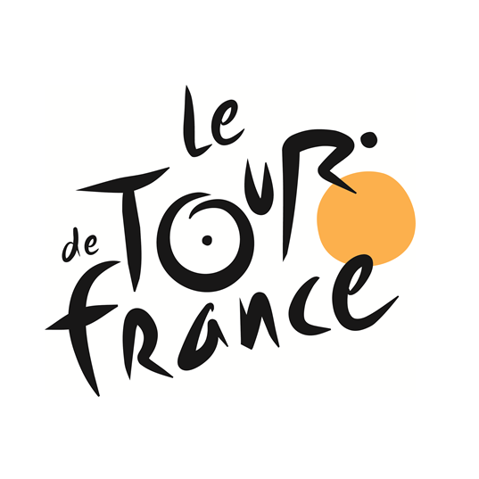
06. Tour de France
 |
| On yer bike! |
The brainchild of French designer Joel Guenoun, this playful brush script logo made its debut back in 2002. A pair of dots, one inside the 'o' and one next to the bowl of the 'r' are the giveaway here, as they build up an image of a cyclist pedaling away furiously on their bike.
Meanwhile the circle which forms the front wheel of the abstract bicycle is yellow for a few reasons. Thanks to its color it doesn't get lost among the typography, and the yellow reflects the jersey's awarded to the winner of each stage. Its radiant hue also represents the stages of the race which only take place in the daytime.


No comments:
Post a Comment