


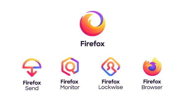
This design appears in the new branding system (below) as the logo for the Firefox browser. Alongside this logo are three line-based graphics for other services including Send, Monitor, and Lockwise. The whole system comes under a general Firefox logo umbrella, which relies on the motif of a circular, swooshing fox tail.
Having run two design systems by audiences, they concluded that "we got a very clear signal that we didn't actually have to show a fox for people to know that it was Firefox".
In a blog post announcing the designs, Mozilla also says that the new brand "is about more than logos". To be specific, it's based on four key word pillars, namely 'Radical', 'Kind', 'Open' and 'Opinionated'.
This also ties into Mozilla's aim to create a design system that has what it takes to last long into the future. Included in this system is a new and expanded color palette that makes it possible to use gradients. A modern and rounded typeface that reflects the logos completes the rebrand.
And seeing as all of these elements were developed with an emphasis on accessibility standards in mind, it looks like the new Firefox is set to deliver user-friendly products. The brand's focus on privacy only sweetens the deal.
Notable designers have been linked to the development of these logos. Michael Johnson provided early inspiration, while the designer of the original Firefox logo, Jon Hicks, was on hand to give advice. Meanwhile, Ramotion's Michael Chu has been credited as a driving force behind the new brand.
Mozilla also adds that we can expect more from the rebrand: "We have to stretch our brand guidelines even further in the months ahead, so we’re interested in hearing your reaction to what we’ve done so far."


No comments:
Post a Comment