

The channel, which describes itself as the Home of the Olympics in Europe, settled on the logo (above) as a way to bring Eastern and Western cultures together. It claims that the angular typography borrows from the comic books aimed at both adults and children. Eurosport also hopes the Tokyo 2020 logo also wants to usher manga into a new era.
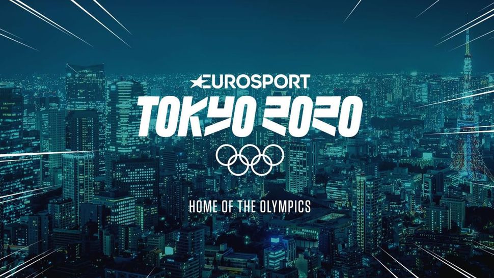
In a blog post about the new identity, Eurosport's Vice President of Marketing, George Aivazoglou, said: "We wanted our Tokyo 2020 brand identity to create a unique symbol that incorporates and respects Japanese culture and the iconic Eurosport logo, to become instantly recognizable and resonate with millions of people watching the Games across Europe."
And over the next 18 months, sports fans and viewers can expect the identity to underpin Eurosport's marketing campaign ahead of the opening of the games on 24 July 2020.
"With this design, we believe we have created a visual identity that is versatile, conveys the dynamic side of the Games and engages younger generations – truly visionary," Aivazoglou adds.
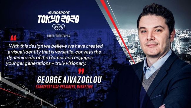
As it is, we're struggling to see the link between the design and manga. The angular lettering is, at a push, reminiscent of the Japanese alphabets. And while this is a nice touch, it currently feels like a bit of a stretch to make the comic connection. The lettering also has legibility issues as the number '2' in 2020 is easily mistaken for the letter 'r'.
For a list of amazing typefaces that do nail their design both in terms of theme and appearance, why not check out our list of the best free fonts available to designers right now?


No comments:
Post a Comment