

People are championing the new approaches that are about to change the way we work once again, such as Flexbox and CSS Grid. Rachel Andrew and Jen Simmons have been encouraging developers to look at these technologies now, in readiness for their arrival.
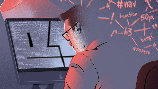
Although they make a good argument, I don't think there has been a time where there has been more choice (or opinion) about how to build digital projects. We are long past 'HTML, CSS and a little JavaScript'. Now there are CSS preprocessors and JS frameworks, and the components that make up a web project encompass a load of new elements – optimisation, CDN delivery and SEO, to name a few.
Pioneering web tech
The talks and conferences advocate best practices and cutting-edge tech – why we should be using X, Y and Z. This is 100 per cent necessary. After all, the web industry is relatively young and we are still defining the standards of the industry to an extent.The problem is, those not using these technologies day-to-day in their work can be left feeling inadequate or somehow lacking. It is a lucky few who get to make their living pushing those boundaries and telling us all about them. Don't get me wrong, it is essential to have these people pushing the bleeding edge, but it can result in an urge to jump into new methods too early, which can be the worst thing to do on live client work.
You want long, productive relationships with clients. Changing how you build sites means having to readjust and remember more skills. As much as good commenting and a README file will help, you need to make sure what you're delivering will remain effective and usable for as long as possible.
Educating junior web developers
Many junior developers have a real thirst for knowledge. It is often an inspiration to more senior team members when they arrive in the studio, eager to show a new method or technique that is emerging and explore how it might be used on a project.You want your staff to grow, to develop and to be able to work on things together, so again it's important to make sure that you're only taking on board advancements that are an improvement on what went before. But when the churn of technology is so quick that we have interns and junior designers who have never had to use a float and do not know life before Bootstrap, it becomes a real balancing act.
A good example of this is the move from LESS to SCSS and also from Grunt to Gulp. Both these technologies are similar, but different enough to mean returning to a project using LESS/Grunt becomes an exercise in re-learning – or in the case of juniors or interns, learning a new (old) technology from scratch.
Website layout gambles
Flex and CSS Grids are the current darlings of frontend talk. CSS Grid has the potential to revolutionise the way we will lay websites out in the future. At the moment it is still hidden in the latest browsers, although you can access it if you enable experimental features on the likes of Chrome. We can't use it in live work for this reason, though with an imminent launch date, Grid could bring about as big a shift in web development practice as the shift from tables to divs and floats.We are using Flexbox on live work now, but only in ways that are a benefit – for example for ordering content in responsive layouts or vertically centring items. To try to use Flexbox for a full site at the moment, with iOS and Safari's flaky support, would be a challenge that just may not be financially viable.
Embracing the old browsers
Clients, especially within larger companies, likely won't be running the latest browsers. They could also have restrictions on their web access that could affect your build. And if it turns out the main stakeholder is using IE on an old laptop, the site better work on it or the project just won't get signed off.Sometimes a client will have a good idea of what they want, or specify an incumbent system or technology that you need to work with. A key point for us as an agency is to be adaptive to these needs and to work with them, rather than dismissing what the client has and trying to force them down the route we would prefer. Sometimes this may mean having to extend an existing codebase in order to keep within the technology required.
Although you can make workarounds and shims, there often isn't budget to do this. And when a client doesn't have the right resources then you need to go with the solution that will please everyone.
When it comes down to it, the main aim of the studio is to produce great, forward-thinking work, which means being fully open to new methods but also picking the right time and project to use them. It is a tricky balancing act, but one that gives me a great feeling of satisfaction, especially when a new process finally becomes 'the standard' on live projects.


No comments:
Post a Comment