


However, you also need to think about how these elements are going to be viewed by visitors using their smartphones and mobile devices.
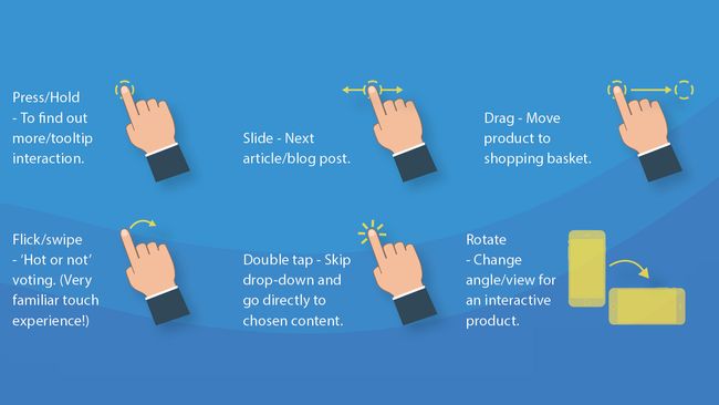
Rollovers, hover states and animations are what bring websites to life. Add support for touch gestures, and subtle movements of iconography to draw the user’s eye. A static webpage won’t be as engaging as something that’s a bit more dynamic.

There’s always a risk of mobile users losing engagement and being distracted by external variables. Ideally, try to make the interface easy to pick up from where they left off. Break big tasks and forms down, and make everything simple.

It’s beneficial to use real users to test if a design actually works. You can make design decisions based on fact rather than preference, and reduce the chance of confusion when articulating features to developers. Real user data is also more powerful when being challenged by the subjective taste of a client.
01. Include feedback where possible
02. Forget the carousel
Every time a carousel changes, the impact of the previous slide is immediately lost. Google data suggests less than one per cent of mobile users actually engage with carousels. Don’t hide key content behind a slider – stack it and the user will do the more natural vertical scroll.03. Build in scope for the future
If the approach is to get a release as early as possible, it’s easy to focus on only the most vital features. The problem with this approach is that it could make it impossible for developers to truly build scope. Always try to design for the most complex first.04. Remember that less is more
The mobile experience doesn’t have to be a replication of the desktop experience. Reduce certain features and content to accommodate the user’s device and screen size. For example, a long-winded product configurator to shopping basket journey could be cut down to a simple ‘quick add’ process.05. Design for the fickle
06. Reuse assets where possible
One of the key pillars of user experience best practice is consistency. It is always recommended to keep a consistent library of designed UX assets across all screens, devices and resolutions. With a mobile-first approach to UX, it’s harder to ignore this rule than disregard it.07. Listen to the best
Being the unchallenged leaders of the consumer mobile, both Google and Apple have regularly maintained documentation for UX best practice. This is hands-down the best starting point for any designer. Although guidelines could be seen to stifle creativity, it’s always best to find a happy medium.08. Focus on real user preferences


No comments:
Post a Comment