However awash with challenges induced by the Covid-19 pandemic, the interminable year 2020 still anticipated the emergence of outstanding web design trends in 2022.
Indeed, the quarantine period, in concert with remote working, has increased human exposure to the virtual world, especially websites. The ignorance of the latest design models can thwart people’s frequent visits and then make companies lose much of the potential segment. In this article, we’ll summarize the top possibly dominant website design trends in 2022.
Web Design Trends Will Take Over in 2022
1. The 1ST 3D Web Design Trend
3D technology has a growing permeation in numerous spheres, and web design is no exception. Although 2D design still accounts for some certain shares, the high application of its 3D counterpart cannot be overlooked and seemingly thrives in subsequent years, thanks to the advancement of 3D-friendly inventions (Figma, one of the top mobile app design tools, or Adobe Dimensions CC). Ranging from three-dimensional colors that use gradient schemes and shading to give flat objects a 3D feel, the technology is used to create illustrations and interactive content in both static and dynamic forms.
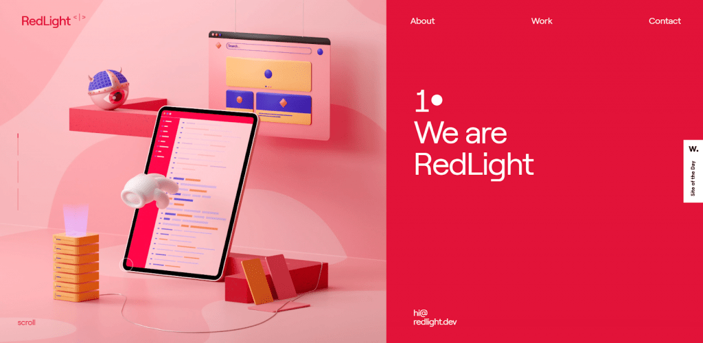
Even various e-commerce websites build 3D simulated products to help customers know how their products look in real life. In addition to rendering them more responsive, this future technology motivates user participation in websites.
2. Neumorphism
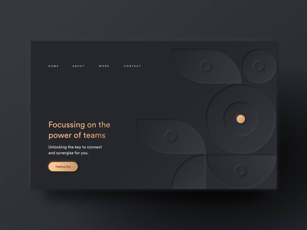
Since its debut in 2019, Neumorphism has been considered an atypical evolution in web design. Following its predecessor, Skeuomorphism, this design approach aims at both pursuing the minimalism style and imitating physicality by overlaying drop shadows. In other words, this trend applies embossed and debossed patterns to websites, subsequently producing a semi-flat design that looks more realistic than the traditional minimalist trend. Despite its young age, we’ll await its success this year.
Recommended reading: Top 7 Web Design Companies in Vietnam
3. Parallax Animation
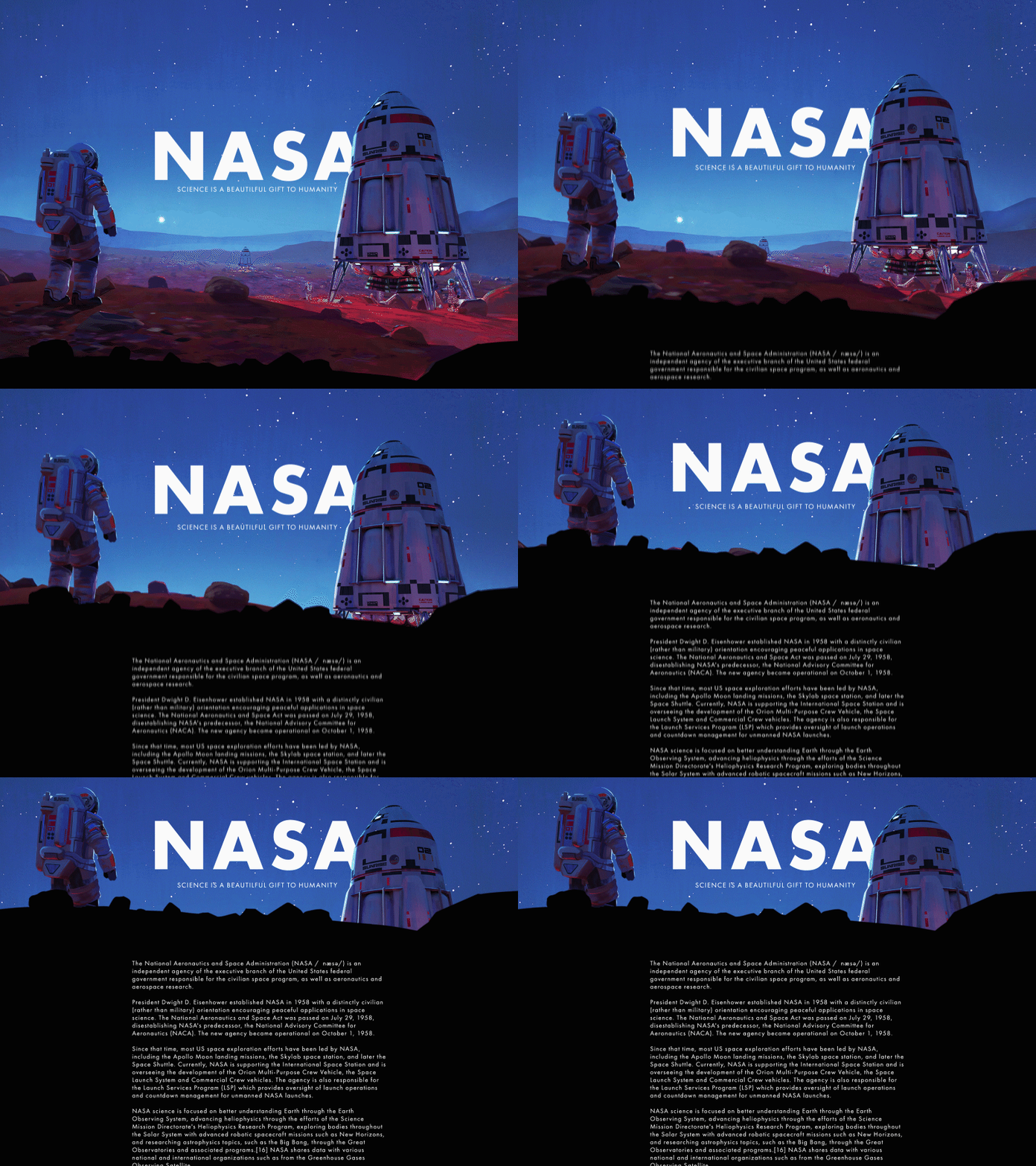
Utilizing web-based animations doesn’t sound bizarre among web designers and even web users. Apart from traditional techniques including micro animations, parallax effects have growingly appeared as a vague concept. By definition, parallax refers to the faster movement of foreground objects than background ones when users scroll up and down. Thereby, this technique produces an optical illusion about the distance of 2D or 3D scenes. When visitors navigate, the depth induced by this method makes them feel like being immersed in the great performance of websites and turns pages into something partly pragmatic.
4. Scrolling Transformations
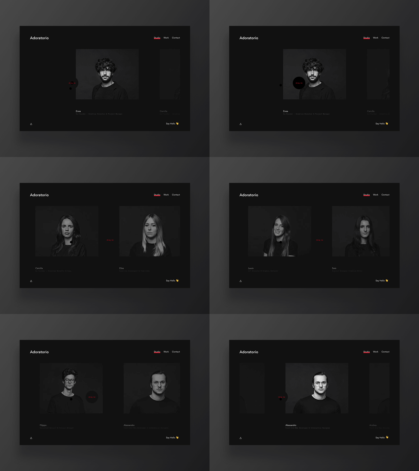
The way users navigate websites has already revolutionized with scrolling transformations. In 2022, this ongoing trend continues to stand out with the evolution of Horizontal Scrolling, Scroll Animations, and Scrollytelling. That being so, websites become more interactive and accessible rather than merely functioning as the bland machine to connect users with online activities. Therefore, those changes allow users to have more intriguing experiences but collect key information from websites.
Recommended reading: The 6 Factors to Choose a UI UX Design Company
5. Illustrations
Conventional websites are filled with words, numerals, and stock photographs, which are occasionally considered monotonous and generic. It comes as a little surprise that cartoon and hand-drawn illustrations have lately evolved and ridden a wave of public interest. Accordingly, designers have leeway to craft unique characters or items that make their brands more personable and consequently leave a lasting impression on visitors.

Illustrations connect with users in a more personal way than photos do. They offer warmth and a stunning depth of originality that simply can’t be matched by other visuals and add a unique element distinguishing your works from others.

Meanwhile, will you use illustrations in your works?
6. Comfortable Colors
The digital advancement undoubtedly accompanies the increased time of gluing eyes to screens, albeit large or compact. To buffer repercussions from this harmful act (e.g. eye strain), web designers aim at comforting the user’s sight with soft color palettes such as warm browns, wholesome greens, or pastel hues instead of dramatic color schemes like dark mode which was an overwhelming trend of the previous year. Concurrently, these comfortable colors naturally give them mental relief and higher concentration on work. This is one of the web design trends in 2022 we are anticipating.
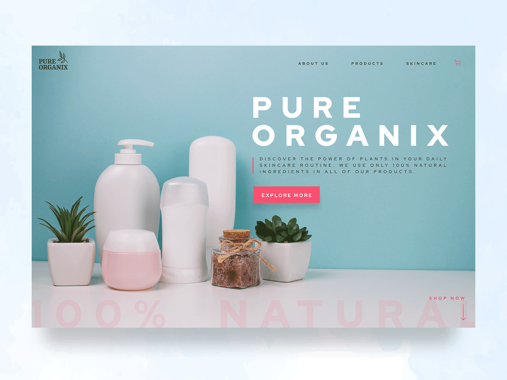
7. Minimalism (Flat Design)
Staying away from the hustling life, various people are seeking a more peaceful and simpler lifestyle that is reflected in minimalist designs. It’s not a novel design tendency, yet has so far been associated with much of the whiteness, typically Apple’s website. Though, this minimalist style is anticipated to expand to other colors but adheres to several certain design principles such as a user-friendly interface, the maximum 3-color layout, or the omission of excessive details (shadows, textures, or color transitions).
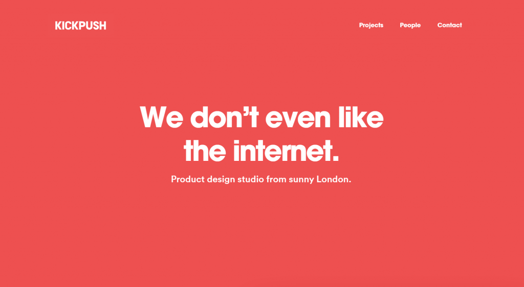
Minimalism is perhaps one of the most classic and timeless web design trends. The fewer elements and content on a website, the less information your audience will have to sort out. If a website is designed in the right way, it will show the visitors exactly what they’re looking for, or what the providers want them to see.

So there’s no doubt that minimalism will continue to reign in the digital market in 2022. Animations and fade-in effects that make scrolling more attractive will also give web pages space to split out their content and thus result in more contrast, whitespace, and clear typography without many distracting elements.
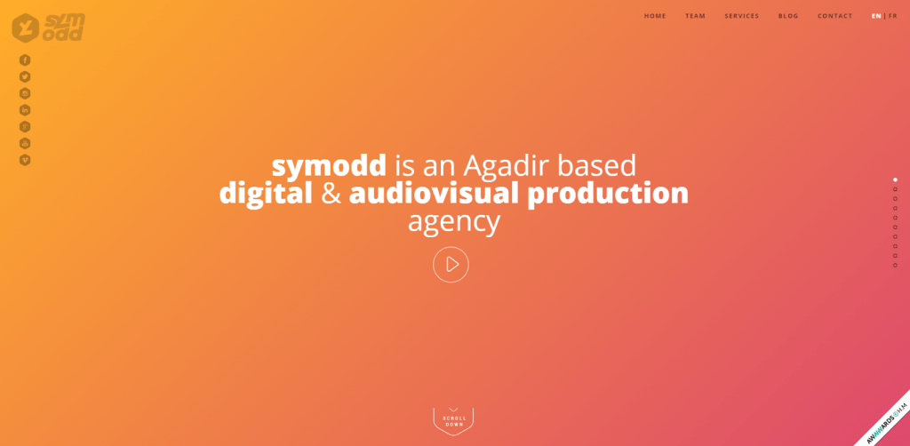
8. Gradient Color Scheme
The new gradient logo of Instagram received mixed success right after its rebrand in 2016. Until now, gradient themes have gained popularity and become a new inspiration among web designers and other creatives. The trend adds more intrigue and visual synergy by creating immersive overlays or backgrounds and building textures for illustrations. Gradient web designs might go with bold typography to emphasize the major content of websites.
Recommended reading: UI vs UX Design: Definition and Why This Comparison Should Not Exist?
9. Video-Embedded Design
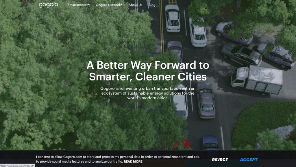
The combination of graphics, photos, and illustrations is a traditional fashion to convey different messages of brands visually. In addition, companies now tend to integrate pre-recorded videos into the website, which has become one of the captivating web design trends in recent years and shows no sign of flattening out from 2022 onwards. Prevalently used for the website homepage, videos showcase how the company operates or staff members interact. Visitors to the website can see the positive aspects of the company culture and track available services.
Check out this official website of Gogoro Global, and you will see how video-embedded design works.
Recommended reading: UX Design Careers: What You Need to Focus On?
10. Organic and Fluid Shapes
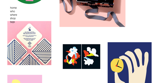
This year welcomes the explosion of organic and fluid shapes that topple the impregnable position of geometric shapes. Such graphics and shapes might resemble a hill, a leaf, a lava lamp, or any imaginable item. Going beyond familiar lines or angles, they are tellingly asymmetric and give visitors an extra sense of excitement. Some web designers could incorporate those abstract shapes with motion effects to produce vivid animations and bring websites to life.
11. Virtual Reality
The hectic life, in conjunction with the booming of cutting-edge technologies, reduces the frequency of physical visits to conventional stores for purchasing necessities such as clothes, furniture, or more luxurious products like automobiles. Highly applicable to various realms from education to healthcare industries, virtual reality (VR) technology now penetrates websites and becomes one of the web design trends in 2022. Particularly, the introduction of WebVR API attracts the attention of clients to websites and then encourages their buying decisions or improves user experience.
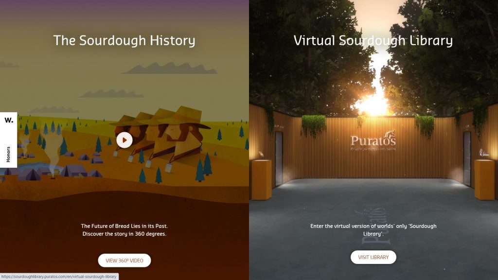
Visit the website of Puratos Sourdough Library, and you will see how VR is applied in web design:
Moving forward, we expect to drive virtual carts around Amazon marts, pick up our favorite products, make online payments and wait for the delivery. Or one day, we can virtually tour around rental apartments instead of our physical presence on those sites. These expectations imply the WebVR or WebAR’s prospects in future web design.
12. Digital Explanations of Physical Products
The harmonious blend of real products into the digital world has been widely employed in web design. This is one of the web design trends in 2022 that helps describe physical products from digital perspectives by displaying the cropped images of the smartphone’s rounded corners or coffee beans spread around the package like in the two following examples.
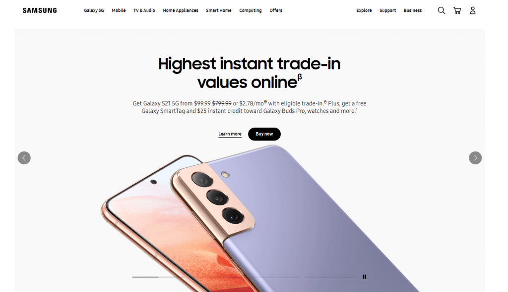
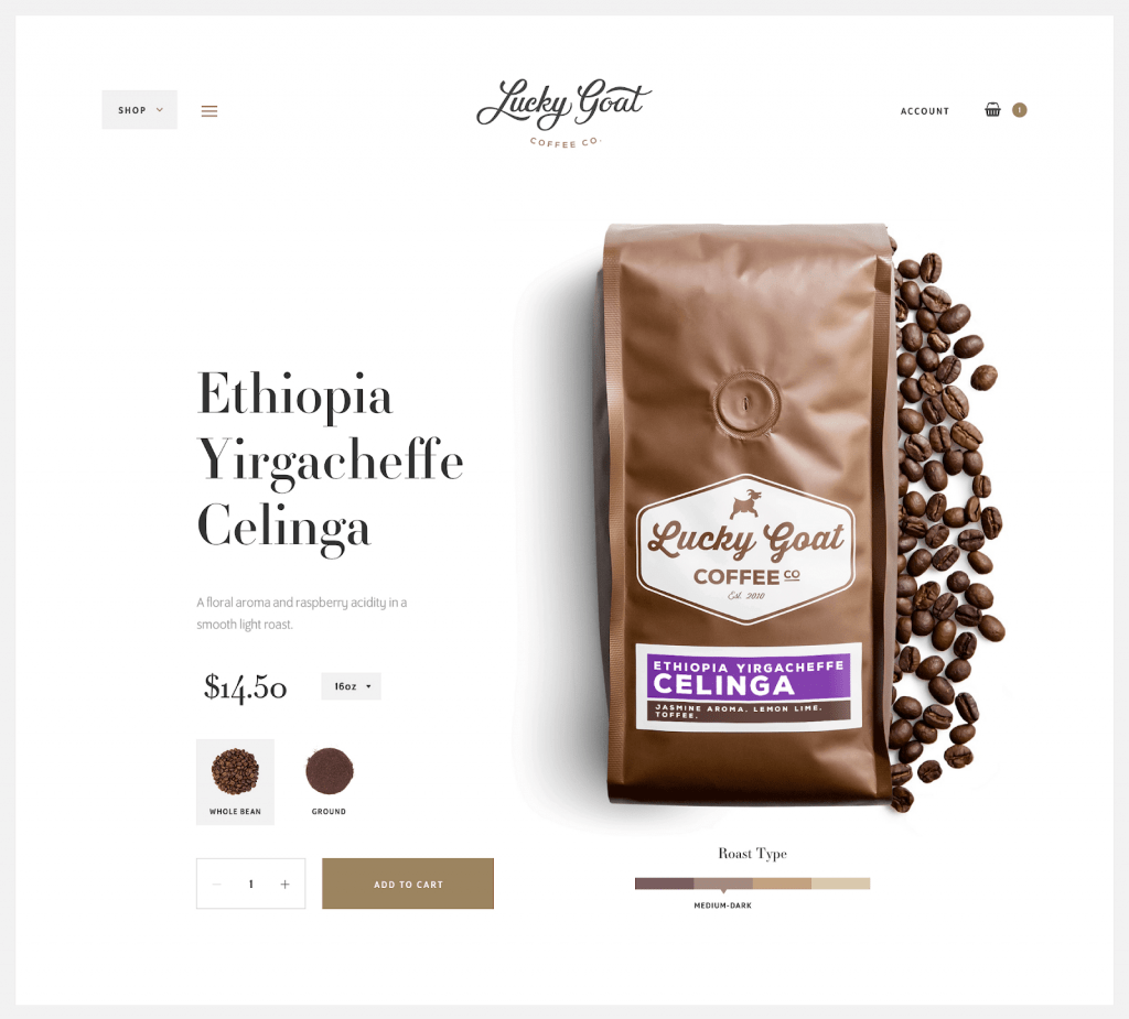
With that said, visitors would see the sophisticated design of the phone or the content of the coffee bag. Not only does this trend create visual impressions and spotlight products, but it also renders websites more original and captivating.
Maybe most people still don’t realize that 2022 means we’re heading to the last chapter of the decade. Over the past ten years, we’ve seen how mobile and the internet ruled the world. The introduction of AI, AMP, AR, VR, and many other acronyms. And where we could see and feel these changes most apparently is in web design trends.
In recent years, website design trends have promoted significant creativity. Say goodbye to grids and traditional stock photos and welcome vibrant illustrations, asymmetrical layouts, and vivid color schemes.
Especially for web design trends
It needs to come with both aesthetics and technology to make your website smart and beautiful at the same time.
Gathered here are the web design trends that are predicted to dominate business websites in 2022. But they are not meant to be exactly all the best in the upcoming creative innovation.
13. Serifs on screens
Most of us have heard the rule that serifs are for print while sans serifs are for screens. But how can it be a web design trend if it doesn’t give the convention a little shaking up?
While sans, with its fine readability, is still the top choice for websites that have word-based content. More and more brands are turning towards bold serifs for some aspects of their designs such as headers and callouts. One absolute reason for this: serifs were designed to be decorative making them perfect for emphasis.
Even though serifs are considered kind of outdated. They still have lots of characters and are more adaptable than you might think.

14. Black-and-white palettes
The color palette is one of the most important elements in a website and it is one of the web design trends right now too. It uplifts a mood, unifies a brand, and guides users through a flat interface by creating visual landmarks. As far as we can observe, for 2022, daring black-and-white web design might make impressive transforms.
When color (black & white are not colors) is missing. We see the world differently: shapes and textures become clearer, and movements seem noticeably slower.

White by itself is pure and reserved whereas black is strong and determined
Combine these two and you’ll get a striking and deep look for your website. Ironically, black-and-white designs can only do their best when being in combination with minimal amounts of color. So you should choose to add an accent color just when your website has points of interest or calls-to-action that need to stand out.
Recommended reading: 5 Skills for Web Design Every Designer Should Know to Grow in Your Career
15. Natural, organic shapes of web design trends
I have to admit that geometric structures such as squares, triangles, and rectangles with their sharp corners do bring viewers a sense of stability. But 2022 web design trends are more concerned with the feeling of comfort and accessibility. That’s when smooth lines and natural shapes take the spotlight.
Thanks to the natural imperfection and asymmetric of organic shapes. They can provide depth to a web design that makes highlighted elements of the page stand out. These shapes are from nature, like the curving forms of rivers and hills. Using natural, organic shapes make web designs feel human and alive in every illusion of movement.
16. Glitch art
At the end of 2018, retro made its comeback in the world of photographing and designing. In the case of glitch art, it’s a kind of retro gone wrong. The featured moments of it are a crinkled film or a slow dial-up connection that led to a distorted but unintentionally striking image. And it’ll surely continue to be a great choice for web design style in 2022.
Glitches become special in our modern times when technologies are so pervasive. We have the fear of losing control over machines, but we also don’t know what we’d do without them.
Hence, people tend to lean on the past in some aspects
Mostly in aesthetics, Glitch, with the impressive retro style, is one of a kind. The Glitch can draw the viewers’ eyes to those parts of the site that are glitchy, warped, and double exposed. With Glitch art, website design trends are given a distinctly psychedelic look. And that amplifies visitors’ feeling of disorientation in a nostalgically artistic way.
17. Chatbots evolution
There are still lots of surprises in store and pretty much time for you to contribute your own creativity to this list of trends. Despite our prediction and imagination for what 2022 will bring, it is finally up to you. Now, I speak directly to you – the web designers who are reading this article: It’s already 2022, this is the last year – the last chance for you to make your mark on the decade, let’s check it out and get started.

Chatbots have been a quite popular choice for a while but it will finally move into the spotlight in 2022. The main reason for this is the advancements in AI and machine learning, making them more efficient and intelligent.
The evolving chatbots are going to up! More and more on web pages with higher levels of customization than we’ve seen in previous versions. Bright colors will make your websites not only more prominent but also more inviting. We can also turn chatbots into types of friendly mascots to represent brands and give these bots a personable face.
Recommended reading: 8 Best AI Chatbot Smartest AI Chatbot in 2022
There are still lots of surprises in store and pretty much time for you to contribute your own creativity to this list of trends. Despite our prediction and imagination for what 2022 will bring, it is finally up to you. Now, I speak directly to you – the web designers who are reading this article: It’s already 2022, this is the last year – the last chance for you to make your mark on the decade, let’s check it out and get started.
18. Card Layouts
Cards have been known as a visual way to communicate between people for a long time. In fact, we are using cards every day. We send birthday cards and greeting cards. When we travel, we send back postcards. My wallet is also full of cards such as credit cards, debit cards, store cards, even a driving license having the standardized format of the card, etc.
Taking advantage of this idea, card layouts were born and now become very popular in web design. In a nutshell, cards play the role of a “content container” into which all the most relevant information about a certain topic will be organized.


Suppose you have a site with a lot of data that need to be scanned, then the card layout is the best choice.
19. Flat designs and Material design
Flat design is always the designer’s favorite choice and it isn’t going anywhere anytime soon.


Nonetheless, for those who prefer a more realistic approach, you can choose a material design which is a simple google design layered language.

20. Animation
The web has never looked more vigorous than it does today. Cool animations are used more and more to enhance a site’s storytelling. They make a site seem more like communication where visitors can interact than a simple portal to find information.
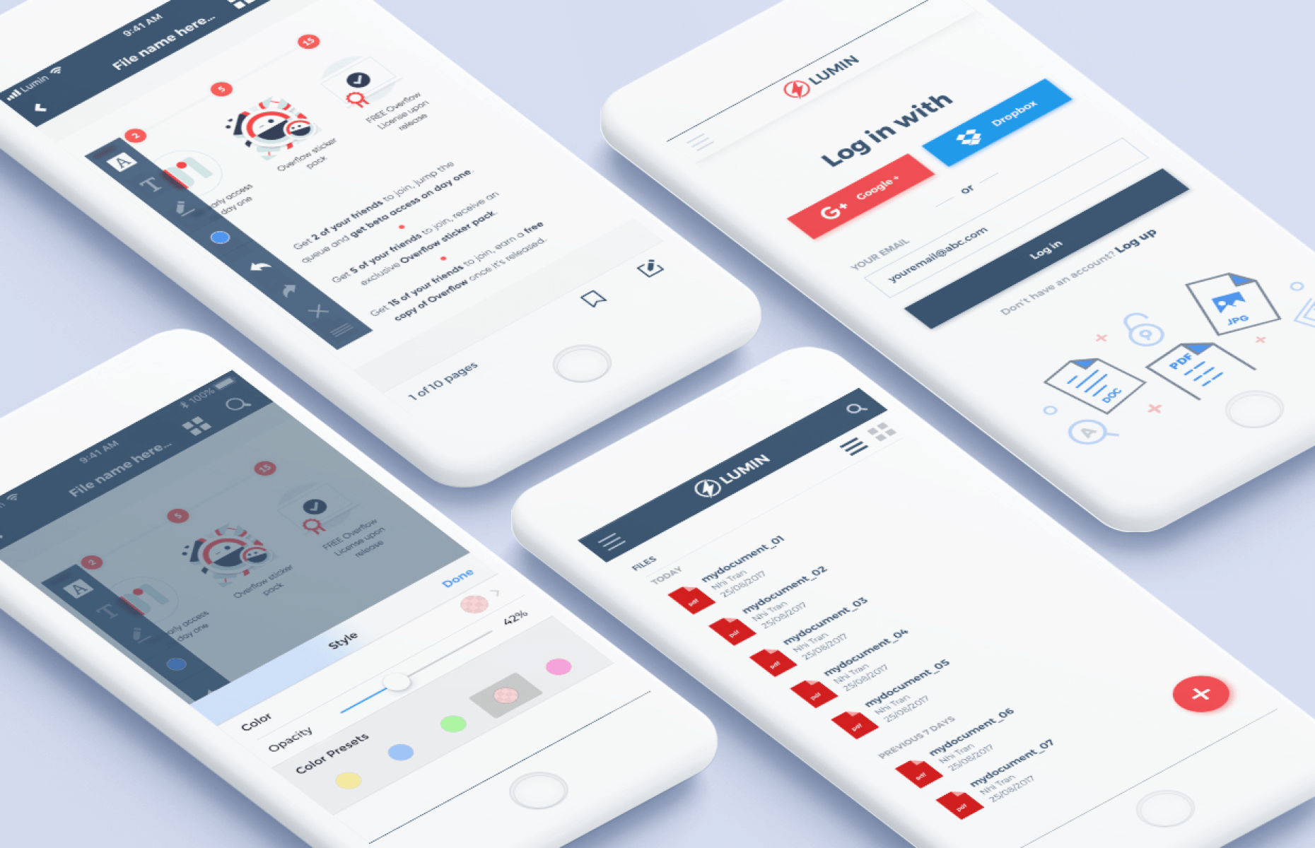
From smoothly animated gifs to small hover animated or page loader, it’s the perfect tool to draw users’ attention.
Long Scrolling
The days of “above the fold” are over. Long scrolling sites are more and more common lately. It’s the increased usage of the mobile screen making the success of the long scroll.
Long Scrolling offers us, designers, the opportunity to tell a story and promote interaction. Infinitely scrolling sites also entice the user to stay longer. Especially, it works well with touch controls and opens the door for more intense, immersive experiences.
21. Responsive Website Designing
Want to know what responsive design is? Let’s open this blog on a desktop browser, then slowly make the browser thinner and wider. Do you see it? The layout magically adjusts itself to fit any size of the browser. That is how responsive websites work!
With this design, instead of creating different websites for different devices, you just need to rearrange the elements to fit into any screen size. Your sites will look awesome everywhere. It’s time to say goodbye to zooming on a smaller device to read the content. Visitors will get a better experience. And as a result, you will get more happy visitors which also lead to more happy clients.
7 Tips to Make a Web Design Trend in 2022
1. Think outside the box with video
If a picture paints a thousand words, then a video can do that hundredfold. Everybody loves video. To make my point clear, you can read a report from Google that said that 74% of all Internet traffic will be video by 2017. Unbelievable, right?
Embedding an interesting video to your website header can be a big hit. It will instantly capture the user’s attention, impress potential customers and keep them on your website longer. Just a little reminder that your video should offer warmth and a stunning depth of originality and add a unique element distinguishing your works from others.
Video not only diversifies your page but also serves well the on-the-go audience who don’t have the time to scan through a bunch of text.
According to most surveys, video content takes up the biggest percentage of attracting viewers on both social media and website design trends.
What’s new here is the move Google has made toward mixed search page results. Websites featuring video content above standard web pages. This has led web designers to prioritize video production to make the websites more searchable. And display content in the most efficient, shareable way.
Recommended reading: Top 6 Best Productivity Apps for Business Owners
2. More animation and GIFs, please!
If you want your website to rock in 2017, you still need to stick with animation and GIFs. They will bring your web design trends to life, and create one that can express your own story in a more visual, engaging, and interactive way.
If I cannot convince you with my words, let’s consider what the animation design guru, Val Head, proclaimed at 2016’s Design & Content Conference: “Designers should build animations as per the brand voice and image.” Also, I highly recommend you to use these factors on things you want to highlight such as sale banners, best-selling products, etc.
3. Pay attention to Cinemagraphs
The human eye loves motion. How many times do I need to repeat that saying? That’s why in this post, I mentioned animation, GIFs, or video above. However, sometime these may waste a lot of bandwidth and make your website slow.
Cinemagraphs came to your rescue. They are photos with elements that have repeated movements. People just don’t see them very often, so they will be impressed when cinematography do. With cinematography, you will become the coolest kid in the web design world
Recommended reading: 7 Key Elements of a Modern Successful Website
4. Micro-interactions are everywhere
Micro-interactions have played an important role in web design trends for a very long time. And there is no reason to think that they will fade away in 2017.
Take this as an example of micro-interactions. When you see the red and white box icon on Facebook, you automatically know that you have a new message and immediately click on it to read messages. That’s how micro-interactions work.
People always want to be heard, seen, or listened to. So, there is no doubt that if you make a website that does not include some elements or moments that users need to interact with, they won’t spend much time per their visit. Long story short, micro-interactions make devices more human-like in their moments. As a result, the design is more usable and enjoyable.
Micro-interactions are small events with one purpose. To make sure that users have a certain impression and connection with your site. Every time you take a small action on an app or website and there is a specific response to it, it’s a micro-interaction. When you check Facebook, the red icon displaying your message and notification count is a micro-interaction. Or when you refresh a Twitter page and hear a beep sound, this is also a micro-interaction.
Those examples are just the most common uses of them
In 2022, web pages will heavily feature more interactive tools. Hover, chimes, scrolling animations, and much more. All in all, this is a very useful way to involve audiences in your website. To subtly impart information to the users about their actions and usage, and make web pages feel a little smarter and more active.
A young software developer, Nick Babich said that: “The best product does two things well: features and details. Features are what draw people to your products. Details are what keep them there. And details are what actually make our app stand out from our competition”.
This saying is one of the most concise ways of describing how crucial micro-interactions are! From tapping an alarm to turn it off to liking a Facebook post to set a status message, micro-interactions seem to happen all around us. They are an important part of almost every design project.


People always want to be heard, seen, or listened to. So, there is no doubt that if you design a website that does not include some elements or moments that users need to interact with, they won’t spend much time per their visit. Long story short, micro-interactions make devices more human-like in their moments. As a result, the design is more usable and enjoyable.
5. Typography goes bigger
Typography is also a powerful visual element that evokes your brand and defines your voice and much more.

Let’s face the facts: People come to your website to read the content of what they are looking for, not to see what colors or design elements you used!
You see, in a world where people seem to be bombarded with too much content, providing a concise statement really does make a difference.
Therefore, by becoming a master of typography, your website is 90% successful.
6. Don’t forget about Parallax Scrolling
This technique is not new. Parallax Scrolling sites are more and more common lately. It’s the increased usage of the mobile screen making the success of the long scroll.
Long Scrolling offers us, designers, the opportunity to tell a story and promote interaction. Infinitely scrolling sites also entice the user to stay longer. Especially, it works well with touch controls and opens the door for more intense, immersive experiences.
7. More focus on conversation
At the end of the day, the purpose of web design is to reach out to your users and turn your visitors into your customers. That’s why people nowadays try to make an effort to better communicate with potential visitors through bots.
When someone accesses your website, a chat window will pop up, and then, you’re ready to interact with them and personally engage your website visitors.
I recommend you to try Poppi Live Chat which is a powerful communication application developed by Designveloper. It aims to provide a range of services for reaching out to your prospective clients and monitoring the website traffic.
Did You Ready to Rock in 2022?
As a web designer, it’s essential to know what the current and upcoming trends are. It helps you not only stay ahead of the competition but also meet your client’s expectations. Without any further delay, let’s get started to examine these web designing trends dominating in 2022.
With the aim of saving time in our day-to-day workflow, these trends clearly show a real concerted effort to make the process of building a website much easier. Not all of these trends may be useful for your business, but it’s always beneficial to know what’s happening in the industry.
As Picasso said: “Learn the rules like a pro, so you can break them like an artist.” So why don’t you get your hand dirty, make your own stunning website and share it with me in the comment box? Who knows, you might make a trend by yourself? 🙂
The Bottom Line Regarding Web Design Trends in 2022
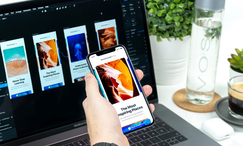
People have different views about which design elements would appeal to them. Despite the prediction of the twelve upcoming 2022’s web design trends, no propensity outweighs others. Therefore, web designers might combine assorted web design styles as per purposes in order to whet users’ interests and reduce the bounce rate afterward.
The post 21 Web Design Trends and Tips to Make Your Own Trend appeared first on Designveloper.
August 08, 2022 at 09:12AM






No comments:
Post a Comment