

If you really want to grab clients' attention then you need to put as much thought, imagination and personality into your studio site as you do with every other project. Visitors can quickly get a handle on who you are and what you're about, making them that bit more likely to have a look through your work and decide if you're someone they want to work with.
To inspire you, here are eight sites that have surprised and delighted us recently, sometimes by using cutting-edge techniques and sometimes by doing something completely unexpected. Check them out and have a think about how you could revamp your own site to deliver an experience that's similarly engaging.
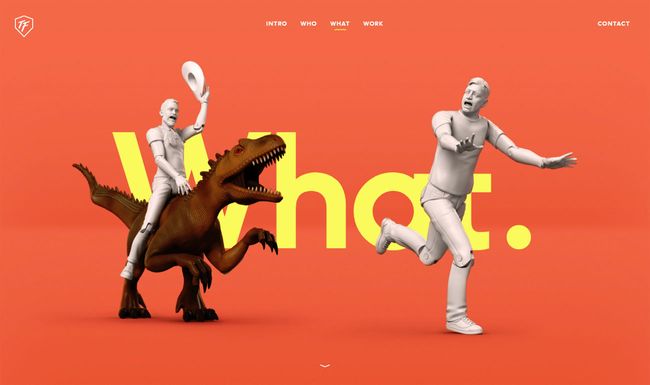
01. ToyFight
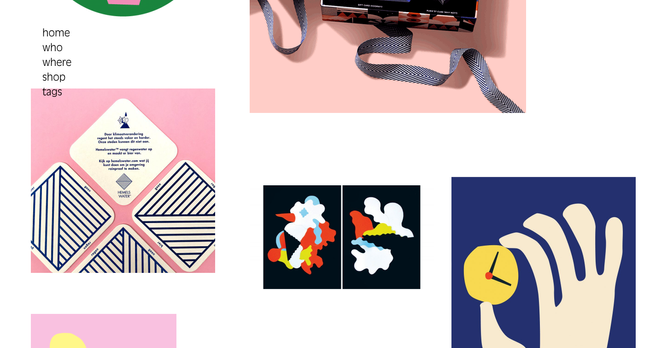
02. Dogstudio
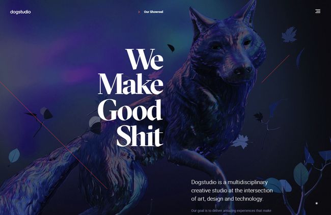
There's plenty of great technique on show, but none of it's overpowering, and it's more than enough to entice you to check out the studio's recent work.
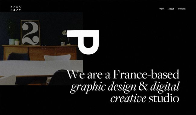
Just a little bit of movement can really draw a viewer's eye, and France-based studio achieves this brilliantly with its use of imagery; it overlays a subtle animated film grain on its main images and combines that with a light warp effect as you mouse over them. It's all beautifully understated and cleverly executed, and enough to convince visitors to explore P2MV's projects further.
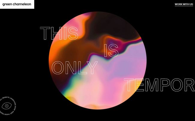
We love it when a temporary website looks better than many studios' full-on sites. Bristol-based Green Chameleon promises that its full website is launching soon, but this holding page, packed with parallax and image warping effects, is a visual treat, and it's enough to make potential clients wonder what the studio's capable of when it really puts in some effort.
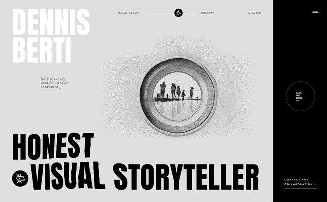
You'd expect a photographer's website to put the photography front and centre, right? Not so with Dennis Berti; his site confounds expectations by leading with typography and illustration, and it's not until you've been through the opening splash and home page that you can actually click through to the photography. It all serves to emphasise his positioning as an honest visual storyteller, and it makes getting to the photos all the more rewarding.
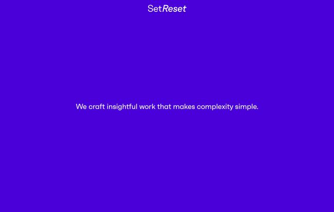
Playing it mysterious can be a dangerous game; get it right and you can pique visitors' curiosity enough for them to want to find out more, but if you overdo it then you'll just confuse them and lose a potential client. Set Reset's site is an incredibly ballsy proposition; it outlines its studio principles in just 36 words, provides contact details and that's it. We like the cut of their job; it's a wonderfully minimal site that makes a refreshing change from being bombarded with endless stuff.
Phantom's site looks pretty standard when it loads, with a stark black-on-white list of projects in a fat display font taking centre stage. Once you move the mouse pointer over the list, though, it explodes into rippling motion, and as you focus on a particular project a wobbly animated portal expands around it, giving a little glimpse of the work that you feel compelled to explore further. A brilliant way of drawing clients in to see what you can do.
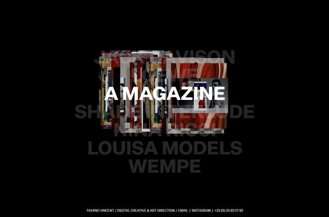
Finally, French designer Tavano Vincent has come up with a striking way of drawing attention to his recent work; there's a different mouseover effect for every project, and once you click through, each one is presented in its own unique and unexpected way.
03. P2MV
04. Green Chameleon
05. Dennis Berti
06. Set Reset
07. Phantom
08. Tavano Vincent
We're particularly keen on the page showcasing his work on Nina Ricci's e-commerce portal, beautifully sampling a vintage Speak & Spell toy as you mouse over the scattered letters spelling out the company name. It's all very strange and baffling and we love it.


You there, this is really good post here. Thanks for taking the time to post such valuable information. Quality content is what always gets the visitors coming. Great lead magnets to boost your email list
ReplyDelete