But then comes the spine. How big should it be? And don’t forget the back. Have you got all information you need for the back cover to look official?
Over the following steps I'll walk through everything you need to know to design a book cover in InDesign Creative Cloud. This tutorial is based off Pariah Burke's course on Pluralsight.
01. How big will your book be?
Most of the time, if you’re designing a book cover, the printing of the book will already be determined and the printer will have a template for you. However, in special cases, you might need to calculate some of these things yourself.
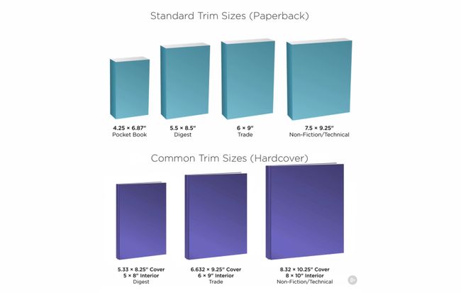
Ask yourself: am I designing for paperback or hardcover? Is my book fiction, non-fiction, digest, trade or technical? Will it have a lot of images or be mostly just text?
Smaller books work well for text-heavy publications without pictures or diagrams. You’ll see bigger sizes used when images are necessary. Standard trim sizes for paperback are the same dimensions for front and back, while hardcover designs allow for some overhang.
02. Set up your template in InDesign
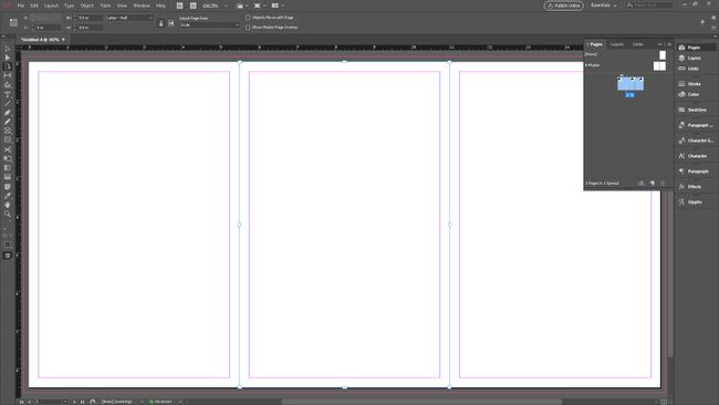
You might think it makes sense to design the entire cover – front page, back page and spine – on a single-page layout. After all, it's all printed on the same piece of paper, right? However, this isn’t the best approach if changes will be made at some point during the process.
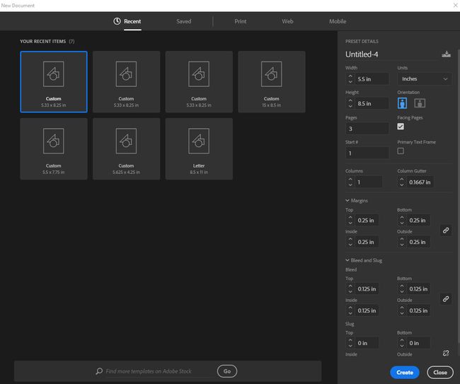
If you don’t have the final page count, for example, or if another design element changes half-way through, you would have to make those changes and realign the design across the whole cover. It’s better to assign each piece of the cover an individual page. I’m going to be using digest size for paperback.
03. Set up the bleed
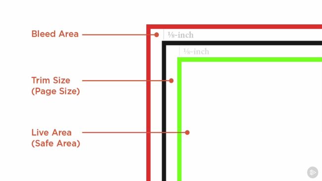
Anything that’s meant to go off the edge of the page should extend to the bleed boundary when you’re setting up a template like this one. This is so if anything shifts in printing, you'll still have a small margin for error before the final cover is accidentally cropped.
To set this area up, go to the bottom of the New Document dialog. Open the Bleed and Slug drop-down menu. InDesign calculates bleed by ⅛ inch increments, so if you click the up arrow, it will change the bleed from 0 to 0.125 inches (which is the same as a ⅛ inch). 0.125 inches is a standard bleed area, but don’t be alarmed if your printer asks for something different.
Next, let’s set the margins: this will be the guide for the live area in our document. Give yourself a minimum of 0.125 inches; I prefer 0.25 inches for a lot of projects. We’ll leave the slug alone, so click okay.
You have now set the bleed and live areas in your document. It’s time to make it look like a cover.
04. Arrange the cover panels
Now, let’s resize the spine. Choose the Page tool from the Tool panel. In the control panel at the top, you’ll see the Liquid Page Rule field appear. This is set to Controlled by Master, but for us to get the most flexible options for making changes later on, select Scale.
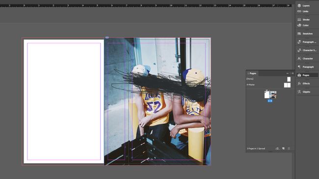
Next, hit Opt/Alt and pull in one of the edges of the spine to roughly the width that you think your spine will be. When you let go of the mouse, the pages will snap back together.
05. Calculate the width of the spine
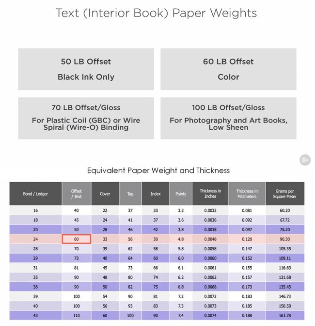
Let’s say you have 348 pages and use 60lb stock. To calculate the spine width, find the thickness in inches and multiply by page count: 348 x 0.0048 = 1.6704 inches.
Now jump back into InDesign. With the Page tool still selected, you’ll see a Width field in the control panel at the top. Enter the value you calculated here – in my case, it’s 1.6704 inches. Now your spine is the right size, and you can drop in your design.
06. Design the background of the cover and spine
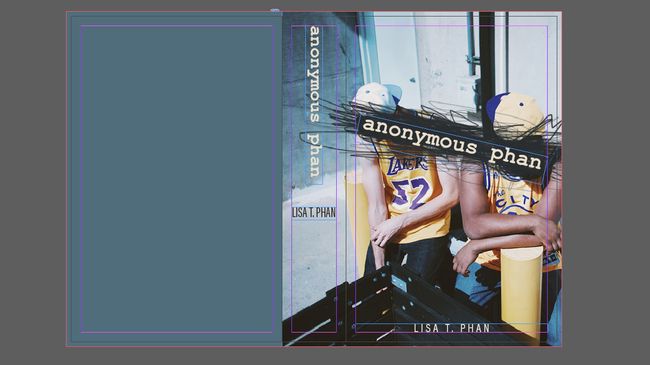
I’m using a photo for the background of my front cover and spine. Then, I’ll use a solid colour on the back. To create the frame for the picture, select the Rectangle Frame tool and drag it along the panels you want. Don’t forget to include the bleed area all the way to the edge of the other page.
Now place your image in the box and resize it so that the brown box fills the whole rectangular frame. Do this with the Direct Selection tool.
07. Design the back cover
We know the width is 5.5 and the height is 8.5. InDesign lets you type the addition of the bleed right into the Width and Height fields, so type 5.5 + 0.125 for the width, and 8.5 + 0.25 for the height. This way, InDesign will calculate and resize everything in one step.
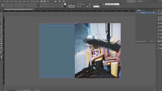
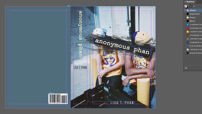
Now select the rectangle. In the Fill and Stroke settings, set it to have no stroke. The default black fill will work for now. Next, select the Eyedropper tool and, with the rectangle selected, choose one of the colours from the image on the front and spine (I’ve chosen a blue tone). Jump over to the Swatches panel and add this colour as a swatch.
08. Lay out the typography
Create a text box that spans from live area to live area on the front cover using the Type tool. Now add in your title – here, ‘Anonymous Phan’. Highlight the text, go to the Fill and Stroke settings (which will now show the T symbol for type, instead of the square swatch) and double-click the fill colour.
The Color Picker dialog will open. In the lower-right corner, you’ll see an eyedropper. Select a colour from the front cover that you’d like to use, and click-and-drag it. In my case, I’m picking the light yellow from the hat. Click OK. Don’t forget to add this second colour as a swatch.
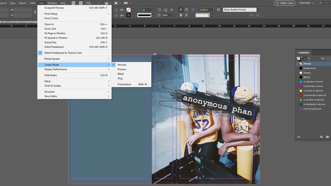
I’m using Courier New for the title because it makes sense for this book. We’ll also use a nice sans serif for the additional text that we have on the back, and for the author’s name. With the title highlighted, choose Courier New from the control panel at the top. Choose a bold weight. I also want to rotate the type frame so that it’s diagonal, along with the scribble. It might be helpful to change your Screen Mode to Preview to get the angle just right.
09. Add the author's name
Now let’s add the text to the spine. Press Opt/Alt and drag the title to make a duplicate of it. Rotate it until the beginning of the title is at the top and it’s at 90 degrees. Next, duplicate the author’s name. You may need to choose a more condensed version of Acumin to get it to fit horizontally on the spine. Let’s also change the colour of the author’s name to a dark colour, since it’s not on the dark background anymore.
10. Add the barcode
There are also some recommended but non-essential items to consider. You’ll likely want a summary of the story or some other information. You might want to include any endorsements or awards, for example, and maybe an author bio. Sometimes if there isn’t room for an author bio on the back, it might go at the very end of the book or on the jacket. You can also add bullet points. These would provide quickly scannable information that helps sell your book, but it's more relevant to non-fiction works.
To add these elements to the Bacover, first get an ISBN. You can do this through this website My Identifiers. Fill out the info as needed, and you’ll get an ISBN number that you can use to generate a barcode. You can pay for a barcode through the same site, but you can also get one here for free. Enter your ISBN code, fill out the rest of the fields and choose whether you want a PDF or PNG format for the barcode. Once you get your barcode, place it into your document.
11. Flow in the copy
Now flow in the copy for the back of the book. Don’t forget to add the publisher's logo on both the spine and the back of the book. And that's it: you have a book you can be proud of – and one that’s taken the guesswork out of whether everything will be printed in the place you intended.






No comments:
Post a Comment